In completing assignment 3, I decided to take a break from my Migos’ corpus and use the ‘Baptized Indians’ dataset. Mainly because I felt that the given dataset was more compatible with Palladio and Fusion tables. I inserted my original data but it didn’t offer much graphical expressions that I felt was meaningful, which is why I ultimately chose the alternative data. I extracted the data from the tables and converted them into a .csv file which I then transferred them into Palladio/Fusion tables.
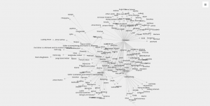
The first graph (left, palladio) displays an individuals’ name in relation to their corresponding nation of origin. This tool surprised me as it showed the similarities of how all these people were in some ways connected to one another. Then, I used a similar table tool in Google Fusion (right) and it’s graphic was similar as it displays the connection between the names of the individuals to their origin location. The symbols were connected to it’s relation but it lacked a detail that showed the “close-knit” relation towards the nations. I felt that the Palladio graphic helped me gain more knowledge as the visualization added another element to the data’s information.
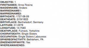
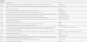
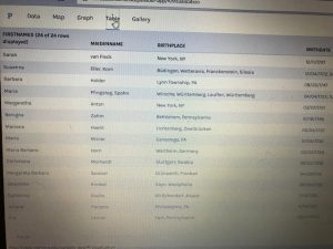
The first table(fusion) above provides a complete description of an indians bio followed by their life details. This supports the representation of a person and provides the viewer with a clear visualization of the basic facts of the people. The second table (palladio) wasn’t very useful in my opinion because the program restricted the creator to three linkages in the settings tab which only allowed me to show the data above rather than a full background which the fusion table provides. This may lead to a viewer misinterpreting a visualization due to a lack of information.
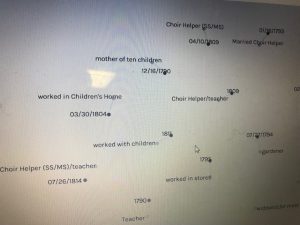
This palladio table allowed me show multiple layer tools into a column styled graphic which allows a viewer to view data clearly as their is no chance for misinterpretation being that these rows information is straightforward. It lays out the an individuals name and their family relation. Also, it displays their nation in which they ‘belong’ to. This visualization is interesting to me as it links the data together in a standard fashion but conveys a meaningful expression. The mapping tool(bott
om right) from the fusion table pinpoints the geographical location of the baptized indians that make up the dataset. It is plotted by their latitude, longitude coordinates which provides a pin at it’s exact location rather than a relative distance. This tools serves as a knowledge generator, discussed by Drucker, as it models the data in a form that goes beyond charted data. It allows the viewer to analyze geographical regions from a spatial aspect and draw comparisons within places as their individuals relates together.
I think that all of my visualizations above all have their own meaning which allows the viewer to analyze information further than just viewing it on a standard data table. These graphical expressions use spatial forms to influence meaning to place as well as people. In the Drucker reading, it discussed how a viewer could take away lessons from “galleries of good and bad, best and worst…they are useful for teaching and research”(239) It doesn’t matter if the graph has flaws, there is always a learning experience that you could take from an expression and use to further knowledge and gathered information.
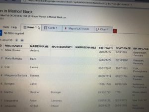
For this week for Assignment 3, we were to compare and contrast Google fusion tables with the Palladio platform. For this assignment, I used the given dataset from the sample data in Palladio (Women in Memoirs). I then proceeded to upload each of the 31 women information separately from google spreadsheets to Palladio. From here I started to play around with the visualization tool to help familiarize myself with the platform. After using both visualization tools I must say Google Fusion Tables was easier to navigate and create different visualizations with.
The first tool I used after I created the Palladio dataset was the graph(mapping) visualization. Tools like this one allow a person to see the connection these women have that you may not initially notice. For example, at first glance, I didn’t realize that most of these women died in Bethlehem, Pennsylvania. This correlation between these women is very important in looking at the data. This tool allowed me to come to the conscience that most of these women during their lifetime sailed the Atlantic to move to the United States for a better opportunity. Not only do graphs like these show trends but they can add additional importance to reports. The Google Fusion Table graph similar to Palladio, however, is much more user-friendly and eye-catching using colors. In Google Fusion Tables it takes the visualization process to the next level by even showing the day and time each woman passed away a feature Palladio doesn’t have.
The next visualization that I used on both platforms were the table tools. The information similar to google spreadsheets allowed me to see each and every one information. From their birthdate/place, death date/place, occupation, and many other aspects of their lives. This tool makes it easier to learn about each woman’s background specifically. Of course, I compared this tool in Palladio with Google Fusion Table. This time around I couldn’t really find that much of a difference between the two platforms other than the fact in Google Fusion Tables I was able to rearrange the woman’s death dates in chronological order that made it stand out.
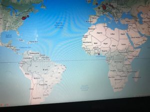
Unfortunately while using Palladio though I wasn’t able to access the feature of the map yet I still got a sense of how it works through Google Fusion Tables. As you can see in the picture of the United States and European countries the visualization tool allows the viewer to see where each woman originated from. I found this tool the most interesting because it shows how overtime eventually most of the women in the dataset somehow ended up locally in Bethlehem, Pennsylvania.
I believe these visualizations are representations of how the arrangement of elements carry meaning. Like I stated before humans are prone to miss things at the first time. Visualization tools like the ones above help divulge information that isn’t always given.
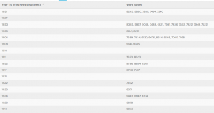
For assignment 3, I chose to go with my own data and continue observing the collection of Sherlock Holmes short stories. As said in my second assignment, the metadata is pulled from the 56 short stories written by Sir Arthur Conan Doyle. The categories I went with were title, creation date, larger collection, major location, illustrations, and recurring characters, and word count. Going into the analysis of visualizations, I didn’t have a exact goal on what to look out for. Of course there are some things you can postulate before seeing them such as the progression in writing style, but I chose to let the data speak for itself in this instance, which is why I found a lot of it. Title was chosen as a way of ID’ing the works, so that category is self-explanatory. Creation date is the date of creation of each short story. Each short story is part of a greater collection: Adventures, Memoirs, Return, The Last Bow, and Casebook, released in that order. Each work also has a cover illustration that depicts an intense moment in the story, the url’s of which are in illustrations. Sherlock Holmes has an extensive list of characters, most of which only appear once. Aside from Holmes and Watson, there are a few returning characters that make multiple appearances, the most important of which I have in recurring characters. Major locations is a category where I have the most important location within the that story, useful for seeing if Doyle expanded Holmes’s horizons. And lastly there is word count, which I thought would be useful in analyzing the writing style of Doyle.
This first visualization is of all of the images categorized, by recurring characters, with illustrations and years provided. This view allows us to see how illustrations are affected through the years and by who is appearing. The art became much more of a selling point as the years go on. At first the roughly drawn images barely help communicate the story, but in later years, color and detail are added to the characters, giving them life and personality. Its interesting to see how it becomes more important, especially after a climatic event like the Reichenbach Fall. We can also see that the Doyle doesn’t like to spoil the events of the coming story. When we have recurring characters, we still have the picture focused on Holmes and Watson, despite having popular characters like Moriarty in the story.
This next visualization is of locations with respect to works. I went back and forth on using the map for this one but I felt this conveyed the messaged I wanted to get across better. Doyle loves England, and especially London. That large dot in the middle is London, with tons and tons of stories coming off of it. The scant few surrounding it are the few other stories where main events happen
Locations and names
away from the city, such as Kent and Essex. Holmes rarely travels far from home to do most of his sleuthing, which I found rather interesting.
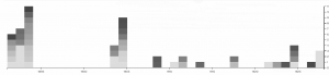
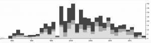
This last two visualizations are of the same information, but I decide to present it in two ways. I did this because I thought that it showed how much more dynamic and eye opening information can be when displayed correctly. This information depicts years and word count. There is an interesting trend going on here. As you can see Doyle wrote far less as time went on, doing most of his writing in spurts earlier to create the earlier collections. On average however, it appears that the stories are most word dense in the middle of his writing, perhaps when heavy plot elements and more complicated stories, such as the Final Problem, were being written. Nonetheless, the gradients are also pretty pleasing to look at, so I like this visualization quite a bit.
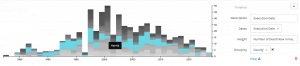
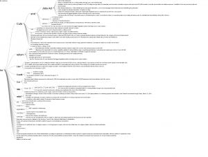
In the previous visualizations, I simply used 50 files of Trump’s tweets with 30 tweets in each file. This construction of corpus does not provide special meta data and thus is useless when analyzed by Palladio or Google Fusion Tables. In order to make the network visualization make more sense, I reconstructed my data set. My data set is now constructed with Trump’s tweets from 10/01/2017 to 02/25/2018, each file including all tweets posted that day. Also, I wrote code for extracting metadata from the original data set. The main parts of the metadata that I collected are date, day of week, number of tweets, time block in which Trump tweeted most in a particular day and so on. Enlightened by Professor Faull, I think although it’s not feasible to find out the relationship between tweets and events related to Trump, because I did not combine my data with Haipu, it may be interesting to figure out the living habits of Trump if I look into his usage of Twitter during different time blocks and number of tweets in different days of week.
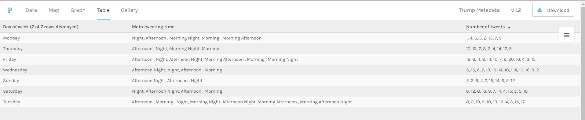
Palladio Table for days of week, main tweeting time and number of tweets
The above visualization shows the relationship among days of week, main tweeting time blocks and number of tweets in a day. It’s obvious that Trump mainly tweets in the afternoon and night on Sundays, which means he might sleep more on Sunday mornings. Also, on Wednesday, Friday and Saturday, he usually tweets more than on Monday and Sunday.
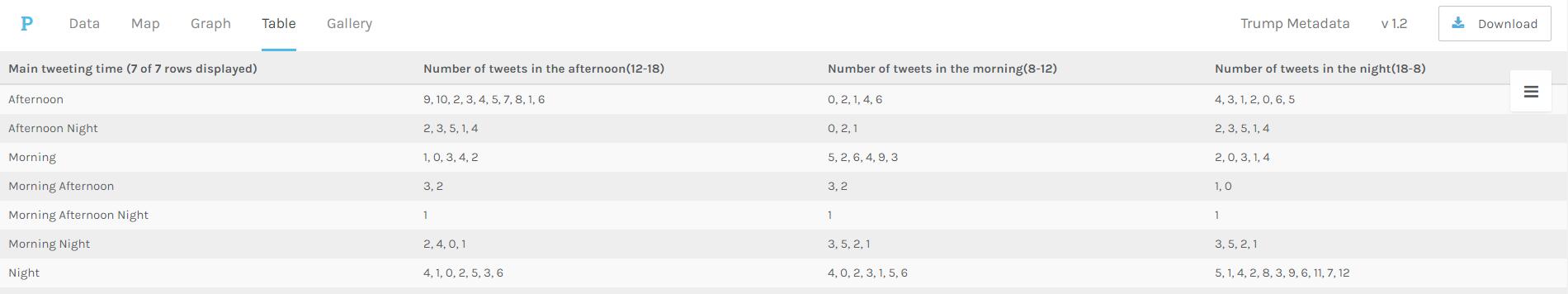
Palladio Table for main tweeting time blocks and number of tweets in different time blocks
The above visualization shows the relationship between main tweeting time blocks and number of tweets in different time blocks. It’s evident that Trump is accustomed more to tweet in the afternoon and night, since there is no number more than 10 appearing in the “Number of tweets in the morning” column. Also, if he tends to tweet in the morning one day, he will not tweet much that day.
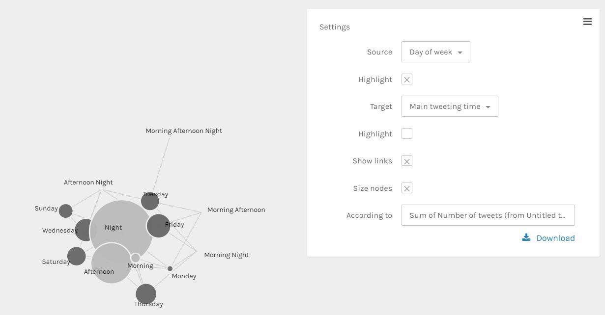
Palladio Graph for days of week and main tweeting time grouped by sum of number of tweets
The above visualization can better show the relationship than the table ones. The size and color dimensions definitely provides me with more information. Since the size of nodes ‘Night’, ‘Afternoon’ and ‘morning’ are really different, I can say that Trump tweets much more in the evening than in the afternoon than in the morning. Similarly, I can see that Trump tweets more on Friday, Wednesday, Thursday and Saturday than other days of week.
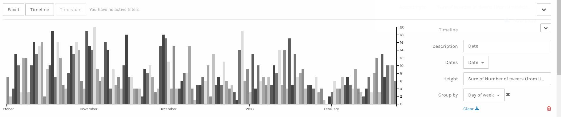
Palladio Timeline with height as number of tweets grouped by days of week
I think the above visualization is the best among all visualizations I made through Palladio. Since I have my corpus constructed in the order of date, I can easily make a nice looking timeline and see the trend of a period of nearly 5 months. It’s obvious that the number of tweets Trump made has a period. The number of tweets reaches the climax in the middle of week and declines after that and rises again when a new week begins. Also, it’s obvious that he tweets more in last year than in this year. Especially at the end of January and beginning of February, he tweeted much less than usual, which is strange. Some events might take place during that period and I hope after I combine my data with Haipu’s I can figure it out.
I think these visualizations are actually representations of information. A lot of information may be veiled at the first glance of data. However, after clever organization and visualization, these informative knowledge can be revealed. As discussed above, in the network visualization, the sizes and colors are dimensions that carry critical information. And I can make a guess that the distance between nodes shows how close relationship they have.
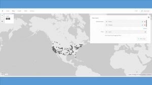
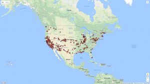
The data I used for the Palladio exercise is the meta-data from the Charles Weever Cushman Collection of photographs (the CSV file is taken from the sample set), located at Indiana University. I extracted about the first 3600 records from this data set and loaded into Palladio. The first image I created using Palladio’s map tool was a geographical representation of where the photos were taken.
This output gave a good representation of the distribution of photos in the United States, but it lacked significant detail. I performed the same graphing exercise this time using Google Fusion for comparison reasons. For Google Fusions I uploaded the entire CSV file. As shown in the figure below, the Google Fusion map provides more details automatically. This includes the state boundaries, state names, and a clearer demarcation of individual photos. On the other hand, both tools confirm generally identical results- photos were taken across the nation with a concentration in the west coast with very little in the central north.
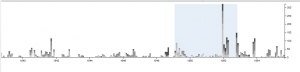
Using Palladio, I then created a timeline view to visualize the number of photos taken over the course of Charles Weever Cushman’s journey.
This demonstrates the most active years in Cushman’s endevour (1952). This shows he started slowly, hit a peak in 1952, and kept up the volume somewhat until he finished (through 1956). This simple to use tool lets researchers get a sense of the time perspective of the data they are observing.
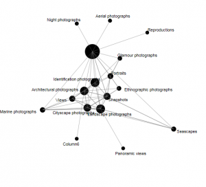
Next I used Palladio to create a network graph, which is a useful process for mapping a system of relations, which is up to researchers to define. Network graphs can be useful to find otherwise hidden patterns or trends in data being researched. For example, in the Cushman photo library, I created a network graph that showed the relationships of the kind of images depicted in each photo. For this graph, I related “genre 1” to “genre 2” categories, which produces a map of the relationships of the kind of images that simultaneously occur in each photo. For an additional layer of information, I chose the “size” option, which depicts the frequency of connections by the size of the network node between each genre.
In terms of Palladio’s ability to demonstrate Drucker’s notion of spatialization, I think the map view will be useful in triggering different ideas to research regarding the data being analyzed and its relationship to geography. In this example, the results are simple – the map shows the locations where photos were taken. However, with more complex data, there could be more interesting spatialization perspectives that can be discovered.
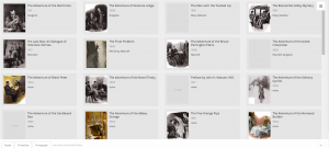
Palladio Gallery view (unfortunately image URL’s were not behaving)
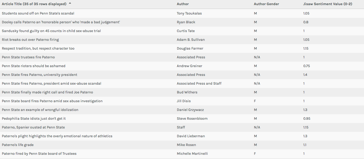
For this assignment, I continued my investigation of journalistic sources involving the firing of Joe Paterno at Penn State University in 2011. In addition to the university newspaper sources I analyzed for our previous assignment, I added several non-collegiate journalistic sources to my corpus (articles from The New York Times, The Chicago Tribune, The Seattle Times, The Los Angeles Times, The Denver Post, and The Dallas Morning News). In terms of metadata, I chose to classify my data into the following categories: institution, institution location, institution geolocation (lat,long), institution connection to Penn State, article author, author gender, article title, article word count, date of publication, article classification upon original publication (ex: ‘Opinions’), and a quantitative sentiment valuation for the article (taken from Jigsaw and altered by adding one to the value given in Jigsaw to put all scores in a numerical set ranging from one to two). While my metadata certainly contained values for many constituent aspects of my articles, I believe each could be visualized in an epistemological way. When it comes to sentiment and word count (my two numerical categories), each of these facets could be visualized in such a way that aids in generating arguments regarding quantity and quality of discourse surrounding Joe Paterno’s firing. In addition, these values could be paired with author gender or geolocation to determine which areas (in general, as there is still subjective interference in article selection) or genders are speaking more or less and more or less pleasantly about the event. Although publication date did not turn out being too helpful for my data visualization, a larger corpus may foster some sort of conclusions tying article publication (denoting temporal proximity to the actual firing) to geographic location, institution classification, or institution connection to Penn State. I also believe it is important to keep article title and author name present in certain visualizations, as these things can both become pertinent to discursive analysis (understand particular author bias if a name is familiar and get a sense of article tone by looking at title).
Palladio Table view showing multiple layers of metadata
In both the Table and Gallery views in Palladio (Left: Table View, Above: Gallery View) I found the most important function of the platform to be keeping researchers from being too far divorced from the metadata and corpus in question. One of Johanna Drucker’s most poignant comments from her chapter mentions that “almost all information visualizations are reifications of mis-information” (Drucker 245). In my opinion, these two windows in Palladio prevent this from happening on some level. While they do not necessary alleviate concerns regarding data as capta (constructed and gathered by biased subjects), it does allow for those who engage with a corpus and set of metadata in the platform to see for themselves exactly where visualizations are coming from. In the Table view, this is accomplished by presenting metadata exactly as it was uploaded. The Gallery window (when linked to URL’s) not only does the same thing, but can allow (at least in my case) for researchers to return to the component articles/documents of a corpus with the click of a button. Essentially, each of these views in Palladio helps to increase familiarity with a data set/corpus for the benefit of better understanding visualizations in other views.
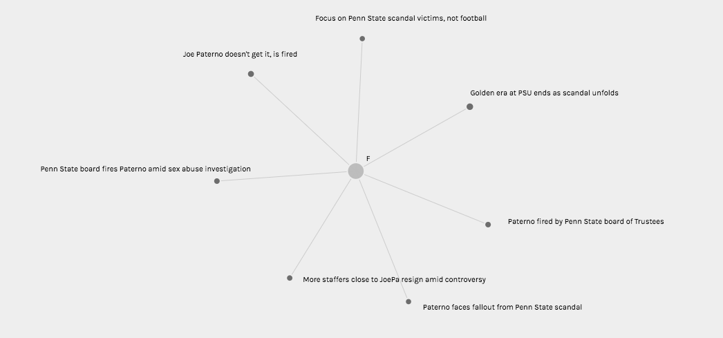
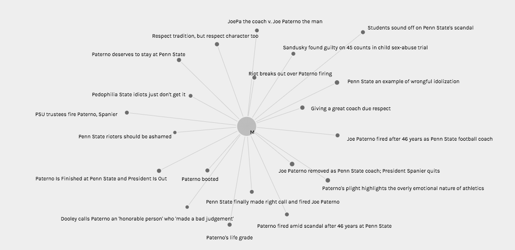
Palladio Graph view visualizing article titles authored by women (and sentiment value in node size)Palladio Graph view visualizing article titles authored by men (and sentiment value in node size)
In the Graph view (Pictured Twice Above), I chose to visualize connections between author gender (M, F, and N/A in the case of collective publication) and article title with node sizing governed by Jigsaw sentiment score. While node sizes were not remarkably illustrative in an argumentative, epistemological, or hermeneutic sense, this could potentially be attributed to the small range of achievable sentiment scores keeping nodes at similar sizes. In addition, because the metadata being visualized comes from a journalistic corpus, it is understandable that wild swings in sentiment from one article to the next are not necessarily evident in the visualization (most articles must conform to a customary journalistic prosaic style). However, when node sizes are combined with the sentiment conclusions rooted in article title (as this conveys tone), one can use these visualizations to begin to discern a connection between gender and article “feel.” It appears to me that female authors, based on article title in particular, were more willing to tie the Paterno firing back to Sandusky’s sexual abuse explicitly, whereas male authors were more likely to use their platform to honor Paterno or frame the event through a less criminal lens.
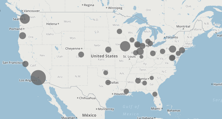
Palladio Map view showing institution geolocation and sentiment value
I also found the Map view (Above) to be quite interesting in terms article sentiment and publishing institution geolocation. When I began to construct this corpus, I theorized that article sentiment would become more negative as proximity to Penn State decreased. However, according to the map, it seems that some of the highest Jigsaw sentiment scores (denoting more “positive” vocabulary in the source document) were found further from State College on the map (except in the southern United States). This could have had something to do with closer, Big Ten affiliated, schools being more saddened by the symbolic loss of one of their conference’s most recognizable icons. It is also important to remember when looking at this visualization that the documents in question are journalistic, and, for that reason, may not be the most perfect texts to analyze in terms of sentiment (although some articles are opinion pieces).
All in all, I believe my visualizations presented above can be perceived as flawed in some sense, but also intellectually constructive in another. Importantly, Palladio’s provision of the Table and Gallery views is helpful for preventing researchers from being barred from a conception of the “translation” process that occurs in the visualizations in the Graph and Map windows. That being said, I believe my visualizations, at least in terms of sentiment analysis, are hindered by forces of concealment and reduction that come along with an imperfect (and hidden) Jigsaw sentiment computation (in some sense these visualizations can be seen as simple representations or mis-representations of sentiment). However, what I do believe my visualizations were successful in doing is putting on display some of the ambiguity or more nuanced aspects of my corpus. For this reason, I believe some of my visualizations would be considered successful knowledge creators to Drucker, for their “denaturalizing” effect on viewers. These visualizations are certainly novel ways of interrogating journalistic discourse surrounding Joe Paterno’s firing, and thus can help to serve as stepping stones for new understanding.
When it comes to Drucker’s discussion of spatialization creating meaning, I believe the map view can be used as a tool for knowledge creation. Due to the fact that article sentiment is tethered to proximity to the focal event, one can begin to create arguments regarding geographic location governing attitudes toward the Paterno firing in local newspapers. Article titles could also be added to these visualizations (found by hovering over a point) to help with this aforementioned pattern recognition.
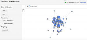
The dataset I used for this assignment was the same dataset I used for Voyant and Jigsaw. I am using the metadata from the Death Row inmates’ last words corpus. I had a lot of metadata from the website that I thought would be very interesting to investigate further. Although the last words themselves were extremely interesting to analyze, I was also very intrigued by other aspects of the data, such as the age, race, and county of the Death Row inmates. These three aspects of the dataset caught my attention because I figured that I would be able to paint a better picture of the inmates by looking at these other aspects in addition to their last words. It allowed me to see the breakdown of the inmates. I also decided on these three aspects because I figured if there were any underlying biases of which prisoners were sentenced to death, it would be evident in there race, age, or what kind of area they come from (such as a low socioeconomic county).
The screenshot above shows the racial breakdown of each county in Texas that at least one of the Death Row inmates was from. I found it interesting to organize it in this way because the counties in the middle that connect to each race node are more diverse in that they have people of more than one background. It is reasonable for me to assume that the counties on the outside of each of the three race nodes and that are not connected to more than one race are the counties that are more segregated. I found it interesting that the counties on the outside of the “White” node had significantly more counties without any other race or any type of diversity in comparison to the counties outside the “Black” node or the counties outside the “Hispanic” node.
This screenshot shows the breakdown of each race by age. The most interesting part about this visualization is that the white prisoners tended to be much older than the black and hispanic prisoners. The white prisoners had the greatest spread of age in comparison to the other races represented.
In this screenshot, I used the timeline function paired with the race of the prisoners. This shows how the racial breakdown of the prisoners on Death Row changed over time. From 1998 to 2006, it seems like the majority of prisoners executed were black and there were much more executions going on during those years. However, as we get closer and closer to present day, the number of prisoners executed drops significantly and the prisoners seem to be a little more diverse. I figured that the reason the number of executions dropped is because of the legal issues and heated debates that arose regarding capital punishment.
I also did another timeline visualization, but this time I paired it with the county the prisoners were from. This gave me insight into what some of these counties were like and how they might have changed over time. I figured that the counties that the most prisoners originated from are potentially the counties that are more dangerous or may have lower socio-economic status and higher crime rates. Harris county seemed to have the most prisoners and up until recently, it seemed to be very popular. Today it seems to be a little less represented.
This screenshot is from Google Fusion and it shows age and race. I wanted to see how the Google Fusion visualization would compare with that of Palladio. I felt that it looks similar to the Palladio visualization and it tells me the same thing about the data, which is that the white prisoners seemed to be much older whereas the other races seemed to be much younger. The white prisoners had a wider age range than any other race represented.
After doing a similar analysis project in my IP course, “Approaches to Digital Humanities,” I decided to create data visualizations to analyze at the scripts, descriptions, and character relationships of the Fox TV show, New Girl.
In creating my corpus, I was really interested in a few things. The first was character names and descriptions. I looked at how often they appeared, and how often they were related to others. I was looking to analyze the relationship between the roommates throughout the show, along with their different relationship histories. Specifically, my main objective was to see whether or not it was possible to predict the ending of Season 6, where Jess and Nick end up together.
Below are the Voyant visualizations:
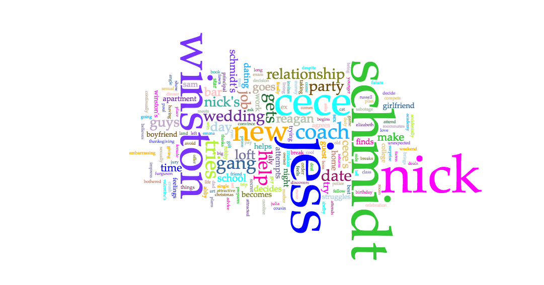
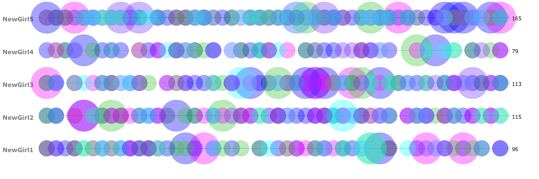
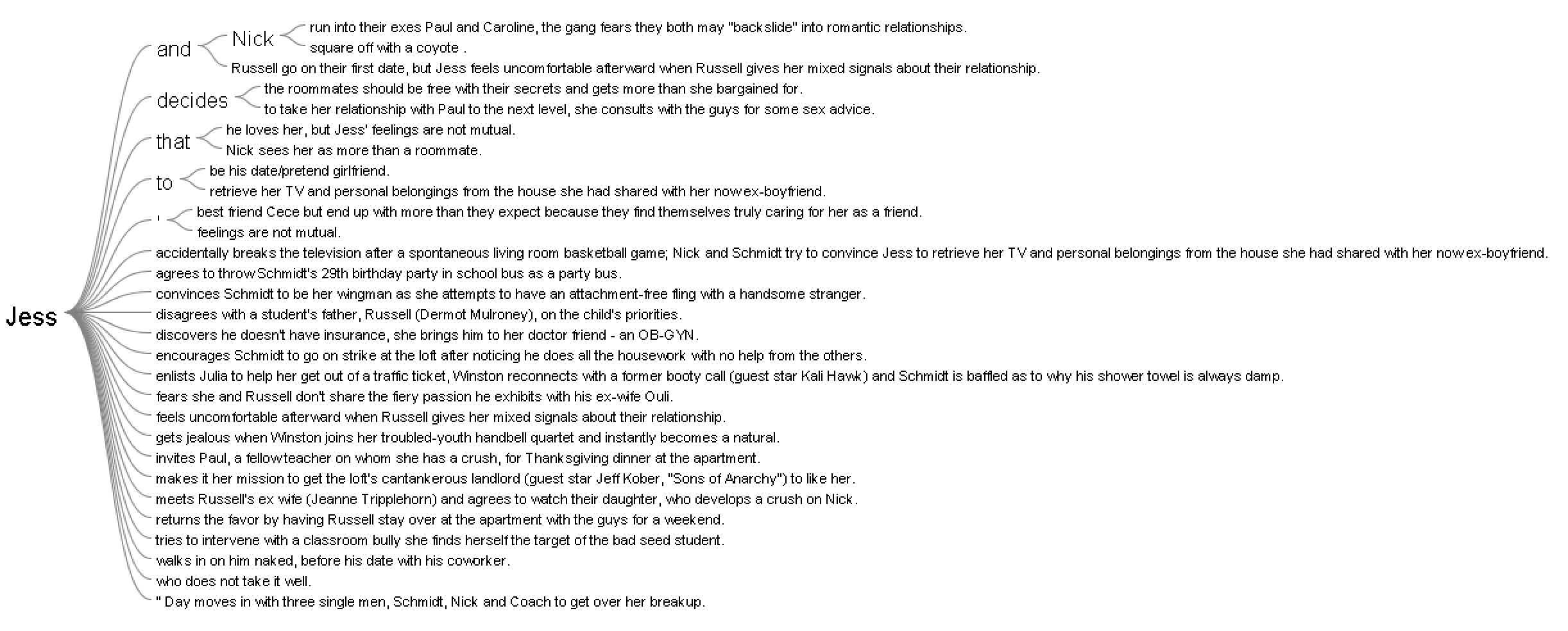
In analyzing the character frequencies and relationships, I found Voyant extremely useful. The Cirrus tool was interesting to use. Immediately, I found that the most frequent words are the main characters of the show, including Jess, Nick, Schmidt, Winston, Cece, and Coach. Through the Bubblelines, I was able to see the overlap and frequencies over time of when these individual characters were mentioned throughout the seasons. And then lastly for Voyant, I used the Links, which was a good visual of the various connections between key terms, and it supports the strong link between Jess and Nick in the texts.
The Voyant tools, including Cirrus, Bubblelines, and Links tools, were extremely helpful in analyzing the text across the different seasons in showing trends and connections throughout. One tool that I believed would have worked in my favor is the Phasing tool. I struggled with this tool many times, and tried to get it to behave properly, however it wasn’t very user friendly and resulted in poorer results that what I had expected. One tool that I would have loved, that would have been slightly more advanced would be a stronger linking tool. I would have loved to see how words were more intertwined with one another than just the Links tool was capable of showing. Lastly, it would be useful for the Voyant Tools to interpret different versions of words or understand synonyms when analyzing how frequent similar themes or messages appeared.
Below are the Jigsaw Visualizations:
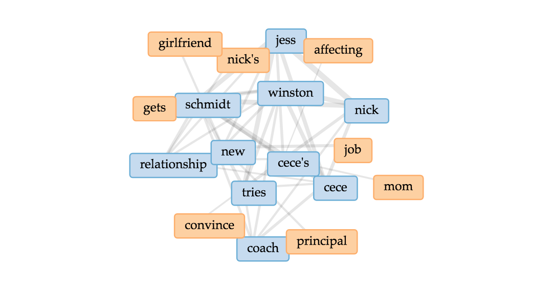
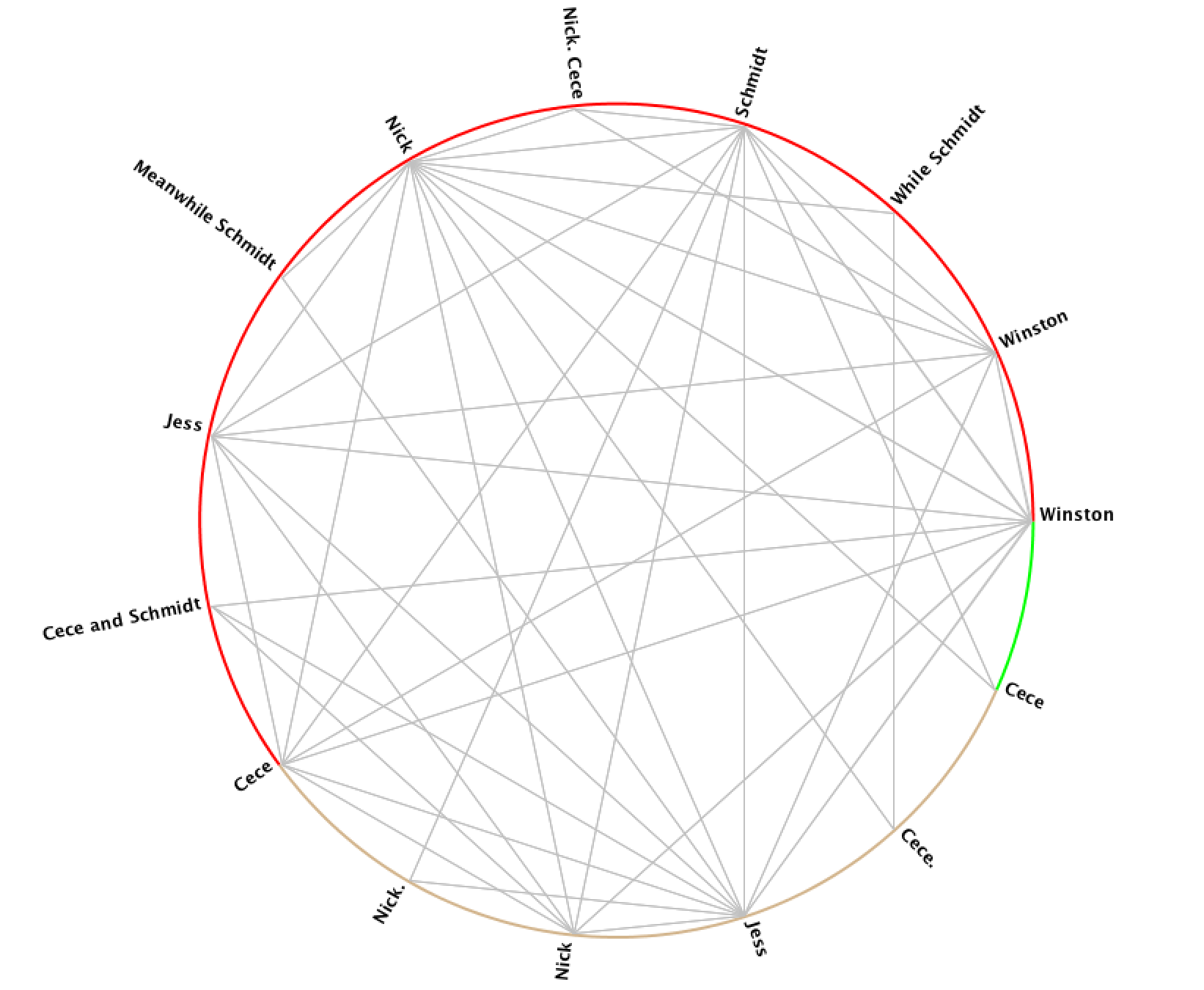
In using Jigsaw, I utilized the Word Tree and Circle Graph tools to look at the various connections between the characters. From the Word Tree, it is clear that “Jess and Nick” is a reoccurring phrase, and it nicely shows how Nick is mentioned in sentences that relate to Jess. One further investigation that would be interesting to follow up on this would be to see what words and phrases are before the term “Jess.” In addition to the Word Tree, the Circle Graph creates a pleasing web of connections between the various characters. However, it’s unclear exactly how and why the character names are divided the way they are between the different “groupings” on Jigsaw. Another flaw is that the visualization doesn’t portray the strength of the connection between characters, which I would have loved to see.
Overall the process of analyzing the data was an enjoyable one, but I would be interested to look deeper into the written scripts themselves, rather than just the summaries that were short and necessary for Jigsaw.
In comparing the two platforms, Voyant was more useful in terms of making sense of and creating the visualizations. Jigsaw was not nearly as user-friendly, and the graphics weren’t of the same caliper as Voyant. That being said, with other data, Jigsaw could be more beneficial if there were more layers and details about the time, place, and location of the data.
Overall, the process of creating the corpus and visualizations has been an amusing experience. As Tanya Clement discussed, the creation of these visualizations gave new insight, and a “vantage point” that allowed me to see the text from a different angle. Additionally, with the text simplified down to significant words and connections, the visualizations allowed for “a feeling of justice of authenticity that is based on plausible complexities, not just simple immutable truths.”
An innovative mapping project is trying to understand why conflict happens where it does.
Disclaimer: The BBC is not responsible for the content of this email, and anything written in this email does not necessarily reflect the BBC’s views or opinions. Please note that neither the email address nor name of the sender have been verified.
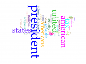
My corpus is consisted of news related to president Trump posted on the official website of the White House. The files are named with the date of the news and include presidents’ readout, statements, memoranda and etc. Because I only focus on news related to president Trump, I filter out those posts from January 12th to February 11th.
Voyant Visualization
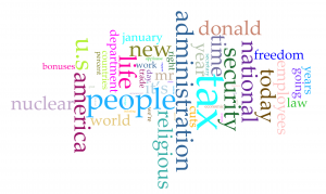
Word clouds above are produced with Cirrus tool in Voyant. To have better visualization about words with high frequency, I filter out words like “trump” and “trump’s” in the first word cloud and “president”, “american”, “americans”, “united” and “states”. From the rest of words in the cloud, we can have a direct view of what topic are focused by president Trump in last month. Tax, nuclear, religious and security have been four popular topics. Although word cloud is an aesthetic tool for data visualization, but it is hard to know exact frequency of each words. Viewers can learn from the graph that “president” appears much more than other words, but they can barely judge that how much more frequent is the word “president” more than for example “people”. So I also took a look at trend graph.
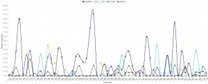
Because files of corpus are named after the date of the news, we can take the advantage that the trend graph’s horizontal axis is also the time line of last month. So we can derived more information than I expected from trend graph:
The word “nuclear” and “security” is highly related.
Topics of tax, religious and “nuclear” are excluded with each other in each news, because news posted from the White House website is usually concise to cover only one aspect of a topic.
I searched hot news last month and results match with this trend graph very well.
In my opinion, trend graph can perform better on larger data set, which can show better shift from one topic to another. If I can apply all speeches of all American presidents, I guess the trend graph can provide a clear view of focusing topics of each president.
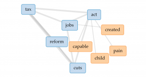
From popular topics, I use links to have more insight into word “tax”. The four most related words are “jobs”, “act”, “reform” and “cuts”. So we can speculate from the links that the government might want to cut tax and have tax policies related to jobs. But obviously, links don’t perform well enough to show how are those words highly related.
Jigsaw Visualization
(Sorry about high resolution of my computer, so the font size is extremely small)
Although Jigsaw is a really old software, but I prefer word trees produced by it than Voyant. Because I apply corpus into Voyant first, I directly search four most frequent words in word tree of Jigsaw. Word tree in Jigsaw can perform much better than link in providing text information but showing phrases and even sentences. Word tree is a kind of visualization combines word cloud and link together. The size of connected word is proportional to the frequency and the lines represent the links between word. However, word tree provides more information and function than both word cloud and link. Users can specify the starting word to have more insight into certain topics of text and lines in word tree are directional from the specified word to words connected after it. But word tree also has the disadvantage that the sentence takes too much space in the graph and might be incomplete because they are limited to initiate from the specified word.
Comparison
Both platforms provide users with multiple ways of data visualization. Because Voyant is newer, it runs much faster to analyze texts, and due to the limitation of memory used by Jigsaw, the text size imported into Jigsaw is very limited. Voyant also provides more kinds of visualizations which Jigsaw doesn’t have, but the word tree in Jigsaw definitely performs better than that in Voyant. So I guess Voyant is much better for analyzing text from multiple aspects with diverse graphs and Jigsaw is better for deeper insight into content of text.
Summary
In the process of applying the same corpus into different platforms and diverse data visualization tools provide users with deeper insight and more dimensions into the data set. As Tanya Clement said, the use of visualization form can provide multidimensional viewpoints. My trend graph can provide more information in the time sequence; dragging words in Voyant’s link can have better visualization about complex connections; the meta information with multiple dimensions in word tree can lead to better speculation of contents based on graphs. Besides merely providing superficial and statistical information of contents, the process of data visualization can also lead user to deeper understanding of the focus, clue or even metaphor of the context.
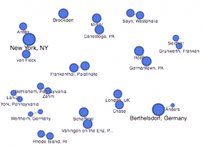

 This palladio table allowed me show multiple layer tools into a column styled graphic which allows a viewer to view data clearly as their is no chance for misinterpretation being that these rows information is straightforward. It lays out the an individuals name and their family relation. Also, it displays their nation in which they ‘belong’ to. This visualization is interesting to me as it links the data together in a standard fashion but conveys a meaningful expression. The mapping tool(bott
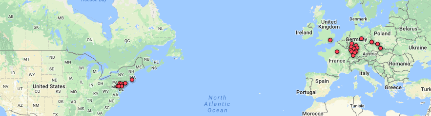
 le of Doyle.


 (Sorry about high resolution of my computer, so the font size is extremely small)