Categories
Assignment 5

Assignment 5 – Steve

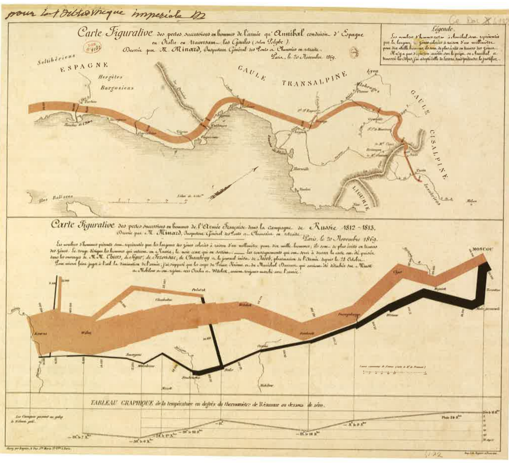
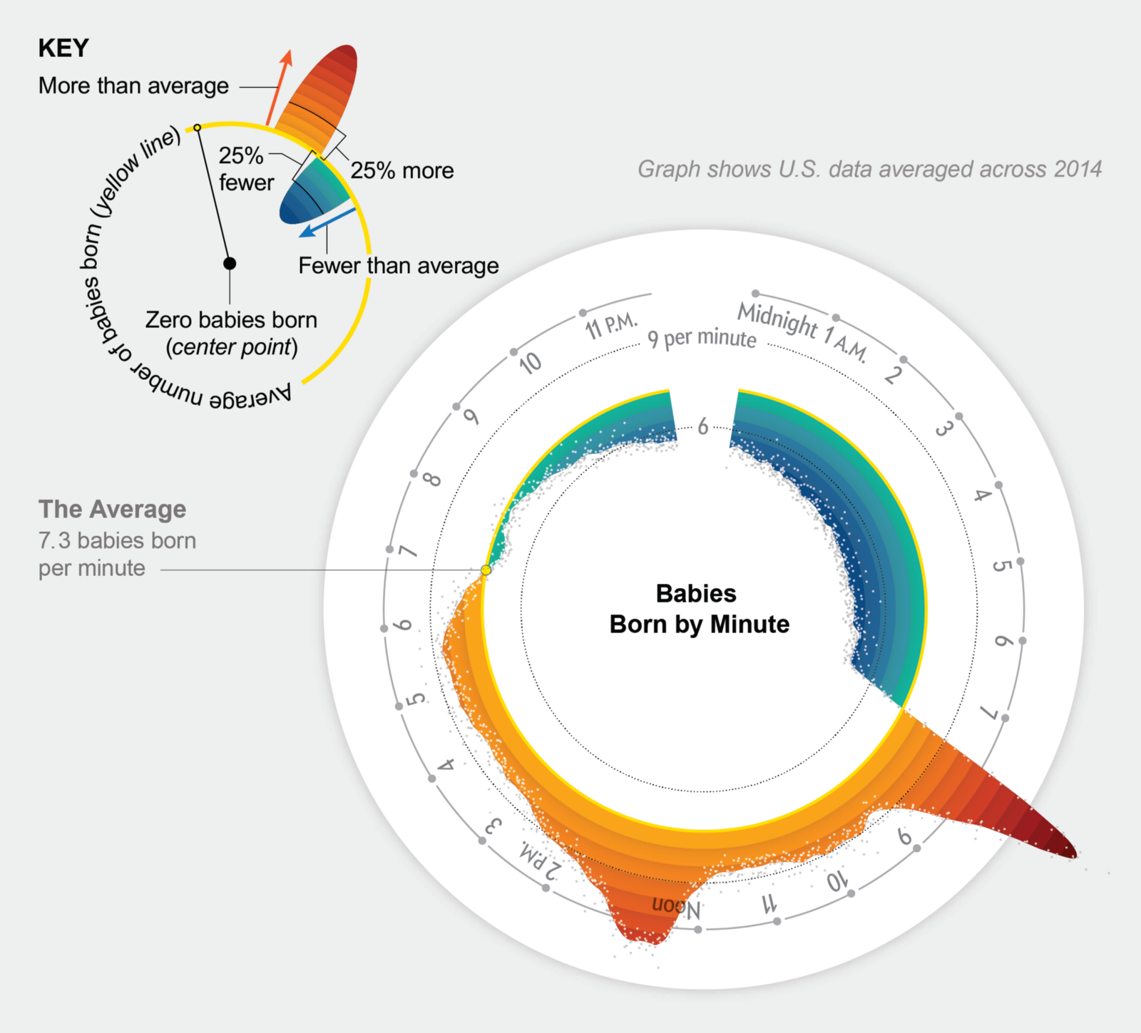
As Paranyushkin observes, the ability to visualize relationships between multiple dimensions of data “unlocks the potentialities present” by seeing data in “a non-linear fashion, opening it up for interpretations that are not so readily available” (Paranyushkin 2011).  Gephi, a network analysis and visualization tool, is invaluable in helping researchers generate detailed network graphs and metrics that may otherwise remain hidden in data or text.  By manipulating different options within Gephi, a variety of relationship maps can be created which emphasize different aspects of the relationships within the data.  This flexibility opens the door for researchers to explore new meanings and interpretations of the data.

The process my partner (Katie) and I took to learn about Gephi included viewing video tutorials found on the Gephi website (https://gephi.org/) and reading the training collateral that walks users through ‘starter’ projects from beginning to end (e.g., http://www.martingrandjean.ch/gephi-introduction/).  These seem helpful for novice users like ourselves, though Gephi is an advanced tool which we feel expects users to be acquainted with the concept and metrics behind network graphs as a prerequisite.  Although, I believe it is important to state that even with the help of these tutorials, I sometimes could not get Gephi to work properly on my computer.  Luckily, my partner Katie’s laptop was capable of acquiring the visualizations we wanted.  (Therefore, most of these screenshots come from her laptop).

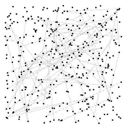
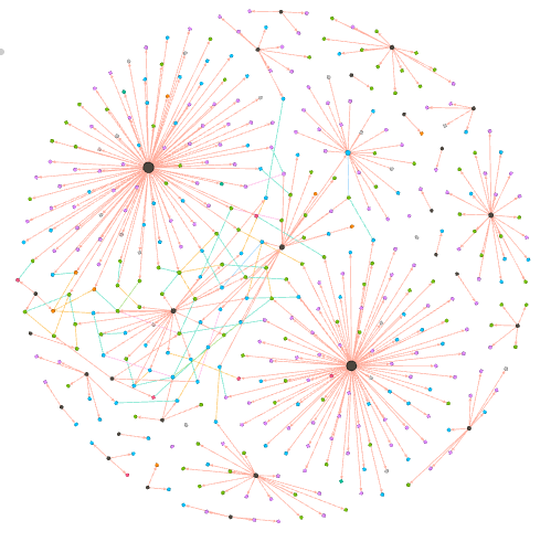
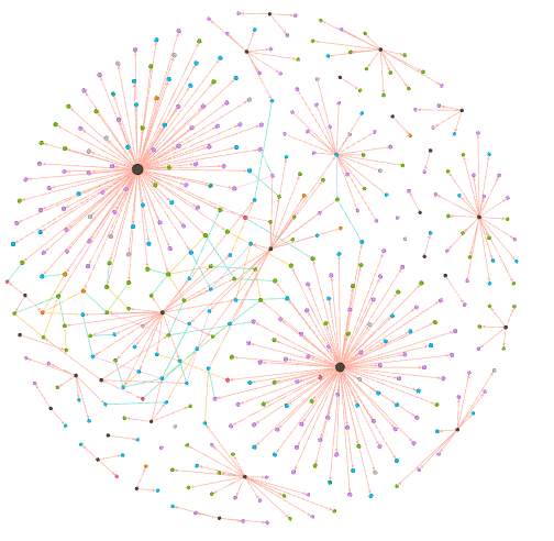
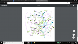
Once we were comfortable enough to begin the process of using Gephi, we built the nodes and edges data, which is the cornerstone for driving graphs and statistical metrics within the application.  The data used for this project consisted of a subset of records produced by the 18th century Moravian missionary on Native Americans being baptized in the Mid-Atlantic states (each missionary, as part of their spread of Christianity, wrote down key data on each person baptized including names, where, when, location, family relations).   For our edge data, we focused solely on the family relationships within the baptized Native Americans. The process of building the edge data was time consuming, because it involved reviewing records and creating links manually. Once this was completed and loaded into Gephi’s Data Laboratory, a network graph was immediately produced, below.

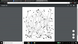
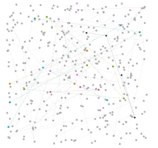
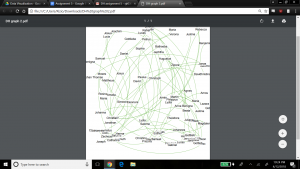
As the Gephi training modules explain, this initial graph is meant to show only a basic network model, and at this point it is up to researchers to explore relationships in more detail and variety using the power of Gephi’s visualization options. As a first step, we chose to produce a view that overlays the node labels onto the graph so that the context about what the graph represents is shown, and colored the edges to present a different aesthetic, below.

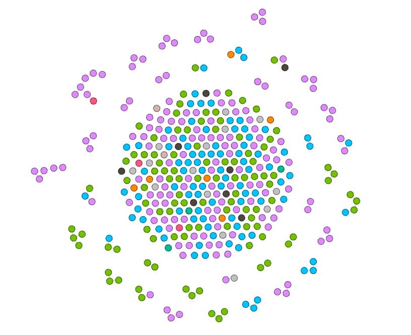
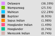
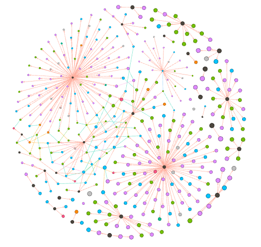
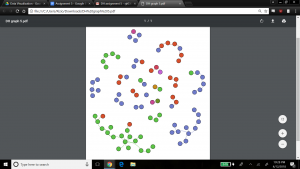
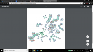
For the next view, we expose another dimension of the data by including the ‘nation’ property.  This view helps visualize if any one nation was more likely than others to have family members baptized together (rather than individually).  This would help explore the importance of close family in the spread of Christianity across the Native American nations.  Katie and I made the nation visible by selecting the ‘partition’ option under the ‘appearance’ widget, and selected ‘nation’ as the attribute to color, with the result below.

The edges in the graph are now colored by nation – the top 3 nations represented by the family relationships in the graph are Wampanog (41.6%, purple), Delaware (31.5%, green) and Mahican (20.2%, blue) – which together represent 93.3% of the total population in my dataset. This would indicate that family is an important aspect to the spread of Christianity at the time.

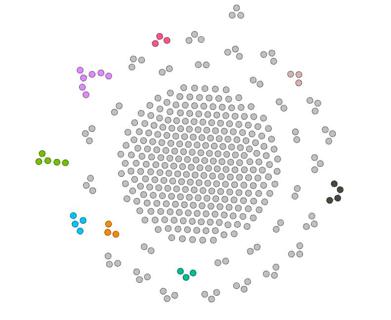
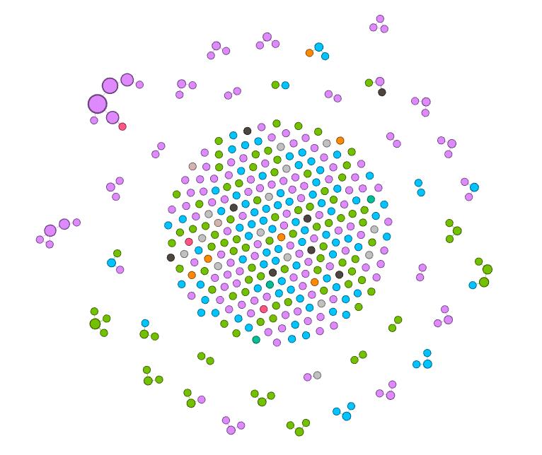
To spatialize the network, different layouts are possible within Gephi. The ForceAtlas 2 layout makes communities within the network transparent by bringing closer together nodes that are connected, and pushing out unconnected nodes. The result is below.

This graph is interesting because it clearly shows small pockets of members grouped together in family units, with little connection between them.  This might not appear to be a good sample of a network model with many relationships. However, I believe this visualization might well be expected from the data, since the data focuses on family relationships between the people who were baptized in my dataset.   Selecting the Force Atlas layout presents a nicer aesthetic I believe, as shown below, to see the groups of families who were baptized, and how these families have little to no family relationship to each other.

We kept the ‘nation’ aspect colored in this visualization, which indicates that most families are made up of members from the same nation, but interestingly there are a few families with members from different nations. Perhaps this shows that baptizing helped bring more people across nations together, or that families who already were made up of members from different nations were more inclined to be baptized.

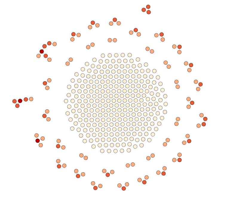
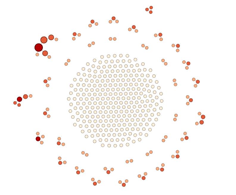
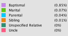
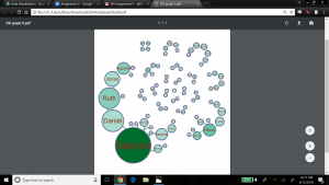
Next, we explored the statistical metrics embedded within my data – degree, modularity, and betweenness. In our dataset, there are 89 nodes and 70 edges. Degree is a measure of how many edges a node contains, which explains its connectedness to other nodes in the dataset. We wanted to visualize the nodes scaled to their degree – that is, the nodes with most relations would be the largest. To do this, we kept the layout as Force Atlas, selected the ‘nodes’ tab under the ‘appearance’ widget, and selected ‘ranking’ to be ‘Degree’. We entered a large range for scaling the nodes to emphasize results (since we expected most families to be somewhat of the same size) – min size was 5, max size was 200. The result is below.

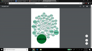
Salome has the highest degree which means she has the most family members connected to her, followed by Petrus, Caritas, Ruth, Augustus and Gideon. We also ran the Average Degree report in the ‘Statistical’ tab, which produced a value of 1.57. This would indicate that my dataset contains mainly small family groups on average, or larger families balanced by a fair number of individuals with no family connection. If we refer back to graph 4, which shows clear communities of small families, that could lead us to believe the network contains mainly groups of small-sized families.

The next metric is modularity which shows the community structure within the network. Nodes connected together, rather than with the rest of the network, are viewed as being in the same community. Regarding modularity, Paranyushkin states that a modularity measure greater than 0.4 indicates that the partition produced by the modularity algorithm can be used in order to detect distinct communities within the network. It indicates that there are nodes in the network that are more densely connected between each other than with the rest of the network, and that their density is noticeably higher than the graph’s average (Paranyushkin 2011). For this statistical calculation, we ran the ‘modularity’ report which showed a modularity value of .9, and number of communities equal to 21. Confirming Paranyushkin’s view, this network, with a modularity value of .9 (which is greater than .4) does contain distinct communities (a total of 21 according to Gephi’s count) within the network as I previously noted based on the visualization in my fourth and fifth graphs. The graph below visualizes my network’s modularity and was produced by ranking on ‘modularity class’ in the ‘appearance’ widget, using the ForceAtlas2 layout.

In terms of comparing different ways to view modularity, below represents another community visualization, this one produced by selecting the Fruchterman Reingold layout, which seems ‘prettier’ than graph 7.


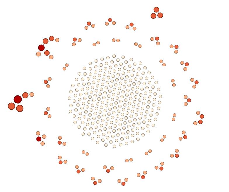
The last metric we revealed in Gephi is the betweenness calculation. Betweenness indicates how often a node appears on the shortest path between any two random nodes in the network. The higher the betweenness value, the more central or important the node is of being a connector for the entire network graph. Gephi calculates the betweenness centrality measure under ‘Network Diameter’ option in the Statistical tab. Gephi indicated that my graph has a Network Diameter of 8. To visualize the betweenness centrality, Gephi enables node resizing according to their betweenness value – the more central the node, the bigger its size. For this view we used the Force Atlas layout, and selected min size of 10 and max size of 100 for scaling the Betweenness Centrality metric. The result is below.

We also chose to add the betweenness values as label attributes for the nodes so we could read the actual measures Gephi calculated – Salome was the largest node with a betweenness value of 127, and Theodora (and others) had the smallest betweenness value of zero.

In terms of what did not work well within Gephi, I would say there are areas of maturity problems that linger in the tool.  For example, there were times when the application lost my work and I had to restart. In another case, I mistakenly removed the ‘Layout’ widget and it took Katie and I quite some research to figure out how to reinstate it.  However, on the whole, these glitches could be overlooked because Gephi is quite powerful. I found the relative ease with which graphs could be produced, along with their associated key metrics, most compelling. With a few clicks, we were able to visualize our data in new ways we would not have been able to do before.  This kind of tool offers researchers the ability to quickly identify new connections or ideas hidden in data that may open up the door for different research paths. As Paranyushking describes, unlocking new meanings within data becomes possible with a network visualization tool like Gephi because “it allows the text to speak in its multiplicity”.

Works Cited

Paranyushkin, Dmitry.  Identifying the Pathways for Meaning Circulation using Text Network

   Analysis. Nodus Labs, Berlin. October 2011.


Categories
Assignment 5

Assignment 5

The goal of this assignment is try to understand the data in the Baptized Indians database using Gephi visualizations. I made edges for people with ID 276-325, so all my visualizations have 375 nodes and 75 edges. Below is the default layout of my data sheets when I finished entering the 75 edges to the database.

Default Layout

In this visualization, I can only see some edges between nodes, most of which are thin and two of them are strong. Nearly nothing more can be shown by this graph. From this point, I begin to add features to this visualization.

Color-Modularity

First, I add modularity as a color attribute to this graph. This attribute shows people in different groups, connected with edges I add before. Now, I can see different small communities inside this large group of people in different colors. Moreover,these gray nodes are people that are not connected with others. In other words, they may have relationships with others, but since I only added edges for nodes with ID 276-325, their relationships are not shown in this visualization.

Color-Modularity, Layout-ForceAtlas

In order to view the inner relationship more clearly, I use Force Atlas as the layout. In this visualization, I can easily distinguish different small communities, in which nodes form a connected tree. I can see that the purple group at the top left corner contains most number of nodes, thus learning that Magdalene, represented as the center node in that group, has played an important role in that community.

Color-Ranking-Degree, Layout-ForceAtlas

Furthermore, I use the ranking feature and select degree as the ranking attribute and generate this visualization, in which nodes with deeper colors have higher degree. In this visualization, I can obviously see that the center nodes of the left group and the top left group have greatest influence on the relationship, since their degree are the highest. Also, I can figure out that the middle part of the visualization are the nodes that are not connected.

Color-Nation, Layout-ForceAtlas

Next, I try the nation feature. This attribute seems to be really meaningful, since it is evident that in most communities, people are in the same nations. Therefore, it shows that the native nation is a really important element to the spread of Christianity.

Color-Degree, Size-Betweenness, Layout-ForceAltas

Since I’m not satisfied with two-dimension visualization, I add size as a new dimension. In the above visualization, I visualize degree with color ranking and betweenness with size. The result is really attracting. I can see that nodes with more degree have more betweenness and there are a high-degree class and a low-degree class in most communities. Therefore, I can learn that during the spread of Christianity, active individuals are significant, since they can lead to wider spread. And I can speculate that if more edges are added, the spread will become hierarchical, with some most significant people with highest degree and highest betweenness.

Color-Degree, Size-Eigenvector, Layout-ForceAltas

In the above graph, I replace betweenness with eigenvector value. There are only a few differences between this visualization and the former one. First, I notice that nodes in the left group become larger. Second, nodes in the top right corner become larger. I think it is because eigenvector value takes into account the degree of their adjacent nodes, while betweenness only depends on the degree of nodes themselves. Therefore, the result I can get from this visualization is the same as the above one.

Color-Nation, Size-Betweenness, Layout-ForceAltas

Finally, since betweenness can show degree in some way, I replace degree with nation as the attribute visualized by color. This graph itself can now show a lot of information. First, I learned that nation is an important attribute of the spread of Christianity. In same nations, the spread may be easier. However,  in some situation, spread across nations can happen. It is because that the edges here represent some kind of family relations and it is more probable for people in the same nation to get married with each other. Therefore, I can claim that family relations is also a key element in the spread of Christianity. Second, I observe that the purple nation have the most people who are involved in this database, green and blue coming next. Therefore, I can speculate that Christianity is more popular in these nations than in black or orange nations. Third, this visualization shows that the purple nation tends to have more tightly connected communities, since some groups have large betweenness compared with others. Furthermore, I can identify that the largest node, which is the center node of the group in the top left corner, is the most influential people in this visualization, since this node has the greatest betweenness.


I’m surprised that simple actions on Gephi can reveal so much information in the database. And the beautiful graphs are really fascinating. As described by Edward Segel and Jeffrey Heer, “Crafting successful ‘data stories’ requires a diverse set of skills.” I think using Gephi is such a good skill to learn.

Categories
Assignment 5 Uncategorized

Adams Assignment Five

     In quoting Ben Schneiderman, Isabel Meirelles opens her chapter on network design structures by articulating the positive attributes of these types of visualizations, “‘Social network analysis complements methods that focus more narrowly on individuals, adding a critical dimension that captures the connective tissue of societies and other complex interdependencies’” (Meirelles 47). Throughout my experience learning Gephi by using the Native American baptismal database, I have found this program to be incredibly helpful in painting this picture of “interdependencies” and relationships that is difficult to see by looking at metadata alone. Unfortunately, gaining a true understanding of the relational characteristics Gephi is capable of visualizing takes a certain amount of discipline in avoiding the mutual exclusion of visualization and analysis. While Gephi does not necessarily “hide” anything in terms of calculations, as users are offered an intimate look into what is being done when statistics are calculated or force-directed layouts are implemented in visualization, this opportunity to truly understand how data is being translated is easily ignored by individuals caught up in the “click-aha!” trap that is so common with digital visualization platforms (for example, when using partition tool to color and size nodes or manipulate edges). In this way, my experience with Gephi harkened back to Elijah Meeks’ work: “…I spent my time teaching folks how to use Gephi, and I tried to spend some time telling them that the network they create is the result of an interpretive act. I don’t think they cared, I think they just wanted to know how to make node sizes change dynamically in tandem with partition filters” (Meeks 2). This experience of Meeks’, which I perceive as an all-too-common one for those working in Gephi, also opens the door to some of Johanna Drucker’s skepticism, “So the first act of creating data, especially out of humanistic documents, in which ambiguity, complexity, and contradiction abound, is an act of interpretative reduction, even violence. Then, remediating these ‘data’ into a graphical form imposes a second round of interpretative activity, another translation” (Drucker 249). Simply put, by tying my short time with Gephi to the writing of Meeks and Drucker, I was able to arrive at one of my most unavoidable critiques of Gephi: that the platform, hard as it may try to avoid this, allows users to ignore the fact that their data has humanistic, nuanced, and narrative elements behind it (although the Data Laboratory tab is helpful in keeping individuals from being too far removed from their database to begin with). Unless individuals take the time to slow down and understand what is going on when different statistics are calculated or relationships are generated, the true power of Gephi is rendered almost useless.


For reference below: Edge color key and proportionality
For reference below: Node color key and proportionality


In terms of my visualization, I chose to generate a relational network consisting of Native Americans and baptizers (nodes). These nodes were connected by edges representing both baptismal and kinship relationships (for individuals labelled in the database with Unique ID’s 26-75). In total, my multimodal visualization, which utilizes a force-directed layout based on the Fruchterman-Reingold Algorithm, has 404 nodes and 438 edges (with most nodes representing Native Americans and most edges being classified as baptismal). Once I created these connections in Gephi, I elected to color both nodes and edges with nodes being colored according to an individual actor’s nation (or “baptizer”) and edges by the type of relationship represented (for example, baptismal, marital, parental, etc.). The statistics that I elected to run in order to analyze the baptismal database were Degree, Modularity, and Eigenvector Centrality.

Visualization with nodes sized by “Degree”


Degree:

By using the “ranking” tool in Gephi to size nodes according to degree (not in-degree or out-degree due to some edges being undirected) I was able to glean several important conclusions from the network. I immediately noticed that the nodes representing baptizers were the most impacted by sizing according to degree (more so than Native Americans). Considering baptismal relationships make up a significant portion of the connective tissue of this relational network, running a calculation for degree shows how influential individual baptizers were in spreading Christianity (baptizers with high degrees, like Camerhof, Christian Rauch, and Marin Mack were more influential in the spread of Christianity than those with lower degrees, like Grube or Utley). The degree calculation, which shows the number of connections a node has, also introduced me to Johannes, a fascinating character in the story of the spread of Christianity. The node representing Johannes was noticeably larger than those of other Native Americans when size was dependent upon degree. This is because Johannes was not only a Native American and Christian convert, but also a baptizer himself. Therefore, he effectively helped to spread Christianity through baptismal relationships, not just kinship ties (which was a characteristic that distinguished him from the other Native Americans in the database).


Visualization with nodes sized by “Eigenvector Centrality”


Eigenvector Centrality:

Unfortunately, I did not find this statistic to be terribly enlightening while I worked in Gephi. I believe this is likely because a majority of the edges I have in my database are directed, baptismal connections. For this reason, the only members of the database that have a real opportunity of having a high Eigenvector Centrality are baptizers that are connected indirectly through the limited kinship ties I was able to generate (as these would connect well-connected baptizers to one another). In my visualization, this resulted in Martin Mack and Cammerhof (along with the Native Americans whom they baptized) to have the highest measures of Eigenvector Centrality, as their “baptismal worlds” were the only two that were brought into contact with one another through the edges representing kinship ties.


Visualization with nodes sized by “Modularity”


Modularity:

After sizing nodes according to modularity, I was faced with another interesting iteration of my network diagram. As can be seen above, the modularity calculation helped to present several “small worlds” hovering around the outside of my force-directed graph. Although I was initially confused by this image, I soon came to the conclusion that these small worlds likely would not exist had I manually entered edges representing kinship relationships for all Native Americans in the database (beyond just 26-75). In my visualization, some people may have artificially high modularity for this very reason (because baptismal connections are present but kinship are absent). Essentially, I believe I have created a visualization that contains satellite baptismal communities absent of the familial ties that could effectively deflate the modularity statistic.

Following from this, the fact that modularity is relatively low amongst certain baptizers connected to Native Americans with kinship ties present also helps to show the tendency of different baptizers to work with members of singular families (as well as cross national boundaries). This is due to the fact that multiple baptizers working with members of singular families (for example, spouses being baptized by different people) helped to generate a highly interconnected Christian network of Native Americans and baptizers and effectively eliminated the presence of “small worlds” in certain areas of the network (baptizers connect different families and limit isolation in the network).

Classifying edges proved to be extremely helpful in arriving at this inference, as it demonstrated that individual baptizers likely did not share intimate connections with specific Native American families. This is shown by the colored edges themselves, as kinship relationships visually represent connections between “small baptismal worlds.” (for example, spouses, brothers, sisters, parents, and children appear to be rarely welcomed into the Church by the same baptizer).

Categories
Assignment 4

Zeb Gordon

Professor Faull

Humn 270

3/27/18

Assignment #4

Data visualizations are far deeper than they appear. Much like a computer, the final resulting picture is the process of many tiny inputs and decisions which are all heavily involved in the power of the outcome. Most important of these decisions is the narrative of the data. Understanding that data is key to presenting it well, and many factors, from audience, to genre, to the creator itself can affect how this narrative is formed.

One important aspect of weaving a convincing and interesting narrative is understanding your target audience. Like anything made for public consumption, understanding who will be looking at this visualization is important for tailoring it to fit something relatable to them. Once you understand this who, adapting small details to make it more palatable for the viewer can drastically improve the perceived quality of the visualization. These things can be as sweeping as entire cultures. We in the West read left to right, and therefore are far more comfortable with visualizations going left to right (Segel and Heer, 2). Understanding key things as small as those can drastically change the reception of a visualization. Understanding your target audience can also affect how

According to Segel and Heer there are seven genres of visual narratives. They have created seven genres of narrative visualization: magazine style, annotated chart, partitioned poster, flow chart, comic strip, slide show, and video. Each of these styles comes with pros and cons and can be combined in ways to maximize the effectiveness of them. When choosing a genre, it is important to understand its pros and cons. Knowing them can help to accentuate your data to tell your narrative in the way that you want to be interpreted. These pros and cons fall into categories. These are also described by Segel and Heer, saying “Choosing the appropriate genre depends on a variety of factors, including the complexity of the data, the complexity of the story, the intended audience, and the intended medium.” (Segel and Heer) The final piece to the puzzle is author vs reader driven experiences. This descriptor essentially describes how focused the narrative is on leading the reader through the material.  These factors can be easily seen in the example provided by them. The “Steroids or not, the Pursuit is On” poster described by Segel and Heer is part portioned poster and part flow chart (Segel and Heer). This data, while interesting and serious to some, is not as formal as say, a business proposal. This leads the designer to more casual and static genres, such as a portioned poster. Then considering the audience, who is likely going to already understand the subject matter and will be taking a cursory glance, the designer can incorporate the visually leading aspects of a flow chart, which is a very reader driven method as it allows the reader to explore the visualization. This is opposed to the budget forecast, which is a much more business-related visualization. Here the audience wants to be led through a clean visualization that only has the goal of relaying the information. Therefore, an annotated graph is well suited for this. Annotated graphs present information well, if a touch uninspired, which is perfect for this visualization.

Visual sequence is composed by two factors. As described by Segel and Heer, these come from visual narrative tactics and narrative structure. Visual narrative tactics are the visual portion of sequence. This visual guide is composed of three parts: visual structuring, highlighting, and transition guidance (Segel and Heer, 7). Visual structuring helps the viewer to gain their bearings in the visualization and be naturally progressed through it. Lima’s fascination with trees is a great example. Trees are a natural and easy visual guide that assists the viewer through the narrative of the visualization. Highlighting needs no explanation. Its simply the changing of color to direct attention. This method is incredibly easy to see in daily life. The final piece is transition guidance. This is just moving the scene seamlessly to not confuse the viewer. In a static image this could be an arrow, or it could be an animated transition like in a power point. All of these facets are part of just the visual aspect of narrative sequence. The logical side is just as in depth. Again, Segel and Heer describe 3 forms: ordering, interactivity, and messaging. While all of these are easier for the layman to understand at first glance, they are just as important from a logical perspective. From all of these aspects we can synthesize that sequence is key to one thing, and that is keeping the viewer engaged and understanding. Visualization can often times be overwhelming, and it is the job of sequencing to lead viewers through that clutter. Additionally, we can observe the previously mentioned genres more deeply to analyze how the data the represent differs due to their narrative sequence. Segel and Heer created an incredibly useful chart that summarizes how these genres operate. To highlight these differences, using starkly different genres is best. Three genres that use very different strategies are the video, comic strip, and the annotated graph. The video genre is well known and finds its strengths in being able to show exactly what the designer wants the viewer to see at each step of the visualization. Because of that, it relies heavily on visual narrative sequencing tactics, such as well edited cuts, transitions, close ups, motion, and character direction. However, it also completely lacks interactivity, which can cause the viewer to lose interest. Comic Strips also lack this interactivity but make up for with an understood relaxed nature of the visualization, as well easy to follow visual transitions and linear narrative. However these can often contain large lie factor numbers due to the comic nature, as seen in Tufte many examples. Many times their exaggerated nature causes incidental lie factor. As said by Tufte, “Perhaps graphics that border on cartoons should be exempt from the principle” (Tufte, 73). The last example is the annotated graph. The annotated graph is a common visualization mainly used for its interactivity and ease of communication. It uses labeling and messaging well to explain the visualization and is easy to follow thanks to its linearity. This form also has the change of lie factors with poor annotations and markings however, as seen in Tufte’s example of traffic deaths (Tufte, 74).

The designer plays the role of the spyglass in the visualization. The designer allows you to see what they want you to see. Tufte describes six principles of visualization: representation of numbers, clear labeling, show data variation, use standardized units with money, the number of variables should not be more than the dimensions, and graphics must not quote data out of context(Tufte,77). Breaking any of these results in a skewing of data. With this many principles to follow, it is not easy for any impartial body to create a visualization. And simply by being human, it is impossible to be unbiased. The expert on biased visualizations is Tuft and he has many examples of lie factors that may be incidental, but none the less damage the visualization. In his example on page 70, where dollar purchasing power is compared by a graphic dollar, the areas simply don’t accurately represent the power. While the creator was attempting to be clever, he simply can’t be unbiased due to error and human bias.

In conclusion, narrative to a visualization is nearly as important as what’s being told. Its genre and presentation can even morph the data into revealing different conclusions. Understanding how these narrative devices affect the visualization can greatly improve the creation of and interpretation of visualizations and is an important thing to understand for anyone involved in the humanities.

Categories
Uncategorized

Luke Compare/Contrast Timelines


Categories
Uncategorized

Timeline Visualzation

Categories
practice

Visualization Comparison

Categories
Uncategorized

Timeline visialization


Categories
Uncategorized

Timeline Visualization

Creating a similar graph

“How Different Groups Spend Their Day”

Employed

Everyone

People 65 and over

Hip-Hop Content

Categories
Uncategorized

Timeline Visualization