Categories
Final Project

Adams Final Project Blog

Kyle Adams

Humanities 270 – Faull

May 2, 2018

Final Blog Post: Final Project Process

            As you have heard over the course of the semester, my final project involves an investigation of responses to the 2011 Penn State Child Abuse Scandal. What I have grown particularly interested in is using my newly acquired digital humanities competencies to drill down into the factors that played a role in conditioning discourse surrounding Sandusky and Penn State University’s crimes. For the final project, I chose to expand upon some of the original work I did this semester (Assignment 2) by utilizing new analytical tools (IBM Watson Natural Language Understanding tool for sentiment calculations) and looking at novel features that impacted responses to the scandal (for example, looking at response platform by adding fifty tweets to my corpus). My ultimate goal in working with this corpus and visualizing the impact time, geography, author gender, and response platform can have on discourse was outlined well in one of our early readings this semester, “…DH scholars who have successfully used visualization in their analyses … argue for the new hermeneutic of digital visualization, the way in which their visualizations produce both new knowledge and also invite ambiguity, the traditional province of humanistic critical thinking” (Faull 2). Upon completing my final project using Palladio and the WordPress platform, I believe I have accomplished each of these goals, as my visualizations not only clearly demonstrate that author gender, time, and response platform played some role in conditioning response sentiment and message, but also open the door for humanistic inquiry focused on the social dynamics and cultural mechanisms that allowed them to do so (show that there was an impact and welcome investigation into why these specific factors played a role).

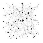
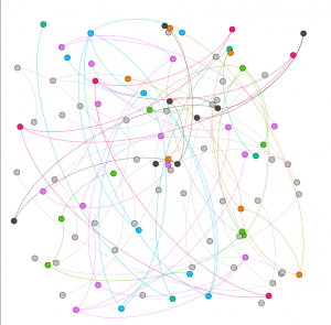
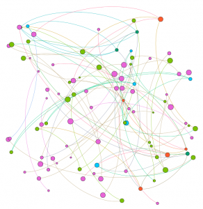
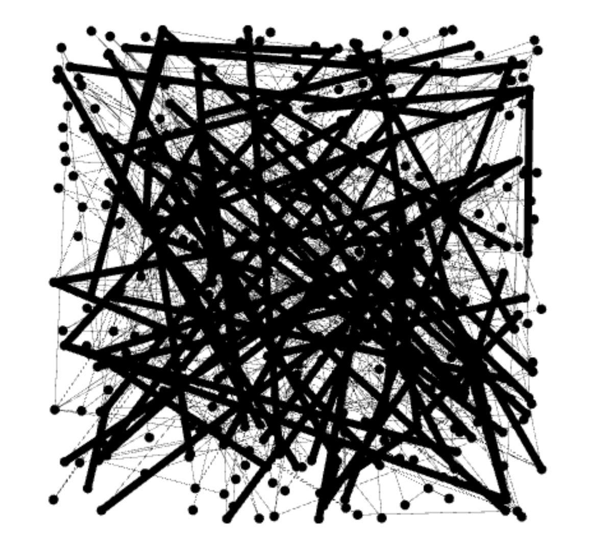
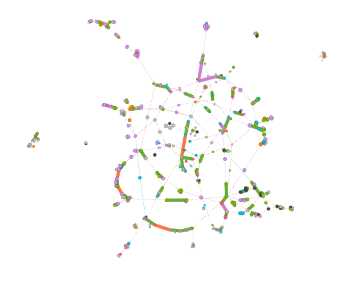
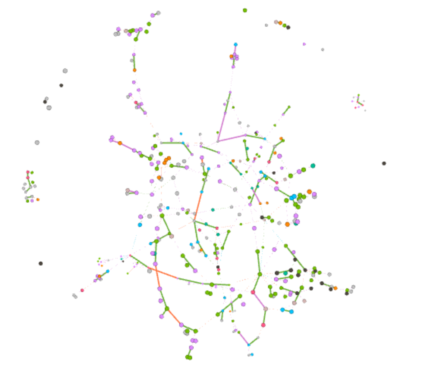
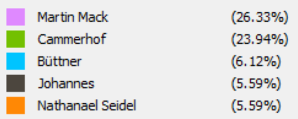
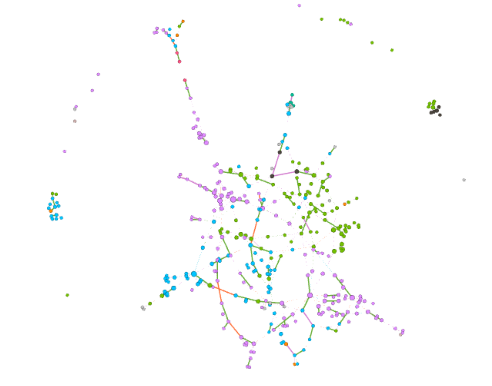
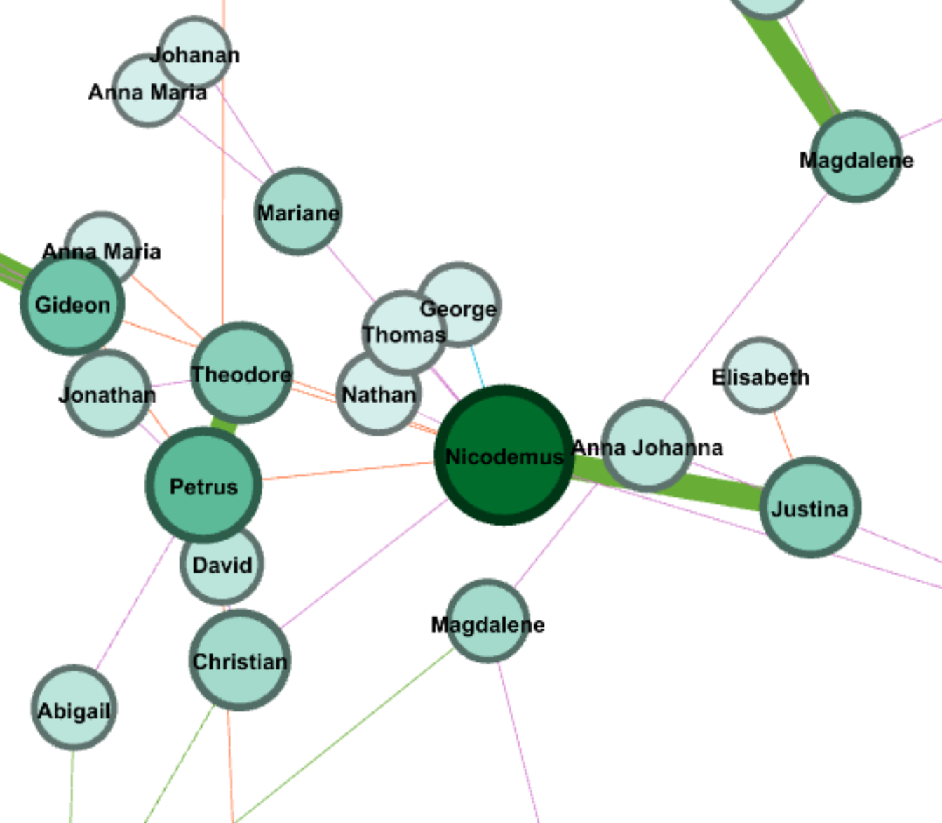
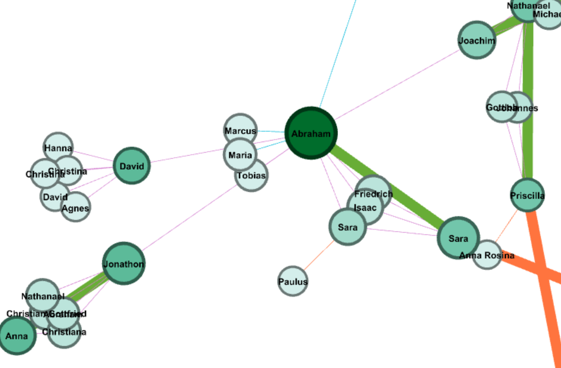
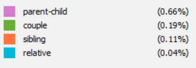
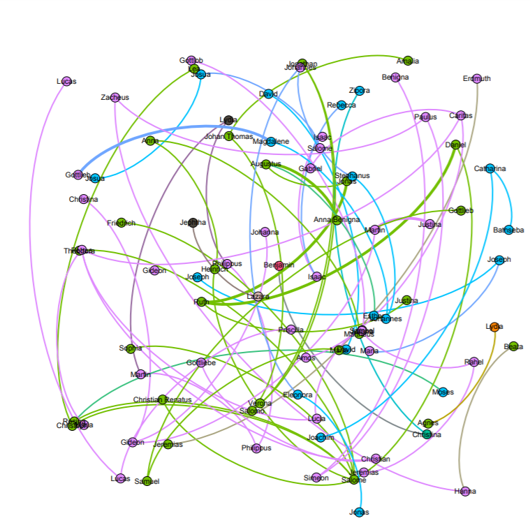
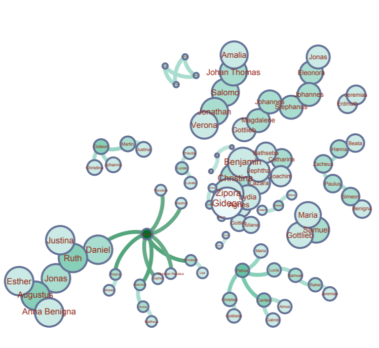
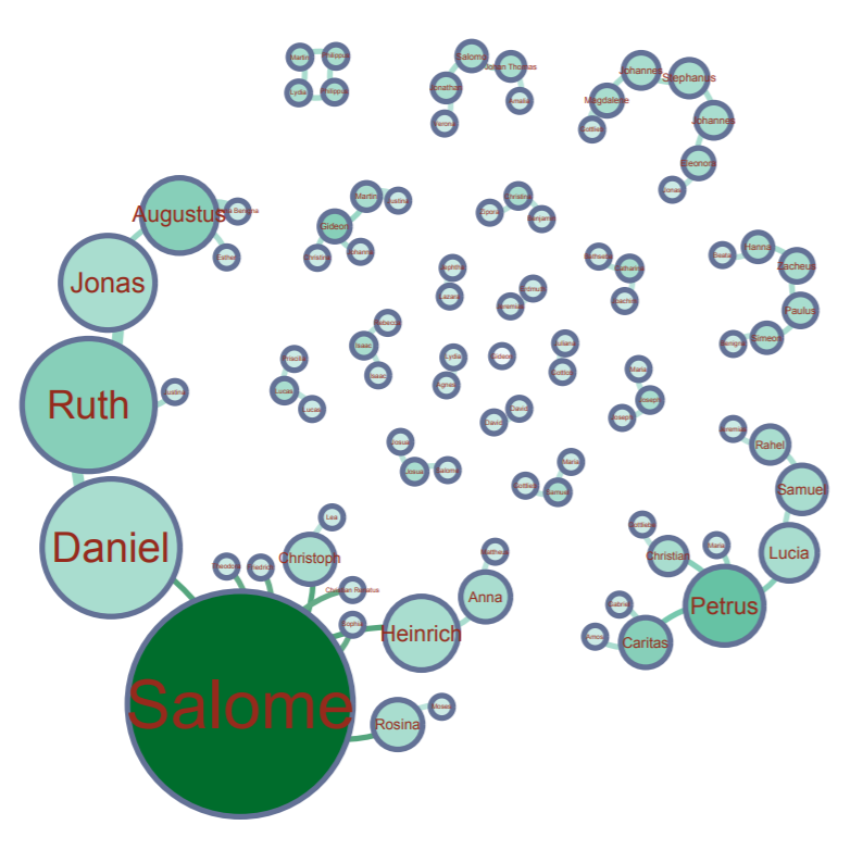
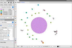
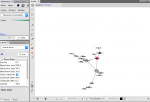
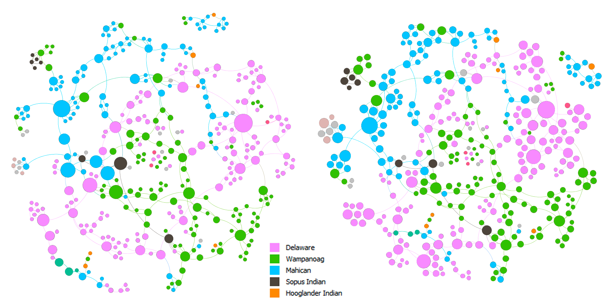
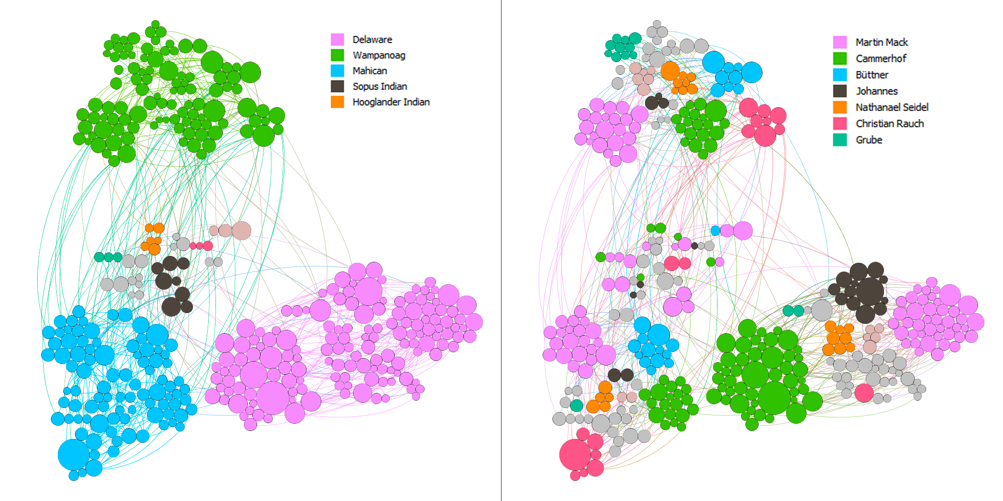
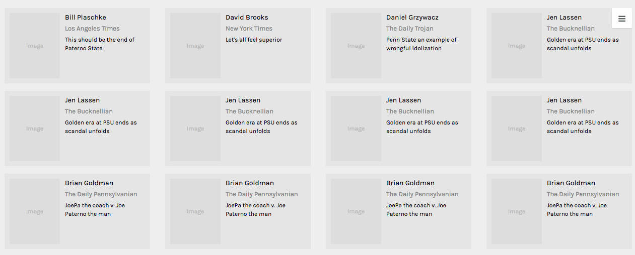
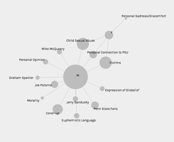
            Throughout the production process for my final project, I ran into several challenges in working with the Stanford Design + Humanities Lab’s Palladio platform. Over the course of the semester, I have found that Palladio is a fantastic tool for research like mine, as it gives individuals the power to visualize many dimensions of a corpus. In my case, this prevented me from overwhelming the interpretive capacities of audiences by attempting to visualize the multiple dimensions I was interested in on a single plain. However, the versatility of Palladio did not entirely prohibit me from suffering from a common problem identified by Elijah Meeks: “Regardless, the first step is awareness of what a tool or method is dong and how it will inflect your research. I’m concerned that humanities scholars show a willingness to defer to tools…” (Meeks 2). In my case, this problem came about when I had to reformat my metadata in order to get the narrative I was trying to visualize to “fit” the software. Initially, my metadata was structured in such a way that each element of the corpus (article or tweet) had multiple “Key Themes” assigned to it in a singular row. However, because this did not work with Palladio’s “Graph” feature (as I could only represent one theme per article/tweet, therefore leaving many subsidiary themes absent from my network), I was required to duplicate entries in my metadata to accommodate the fact that I wanted to visualize more than just one “Key Theme” per article/tweet (so I went from 105 elements to over 300). Unfortunately, my “deferring” to the tool I was using caused problems when I attempted to visualize other dimensions (for example, “Gallery” or “Map”) as my duplicate entries led to redundant material in my map visualizations and catalog of corpus elements. The only solution I was able to come up with for this problem (inability to reconcile my desire to portray multiple themes and have a logical gallery and map view) was to separate my work into two separate Palladio “artifacts.” One of these would be used to generate visualizations in the “Graph” tab (networks, timelines, and tables) and the other would be used for “Gallery” and “Map” views.

Early iteration of corpus gallery which shows redundant entries due to duplication of rows in metadata sheet

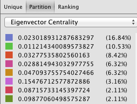
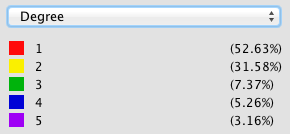
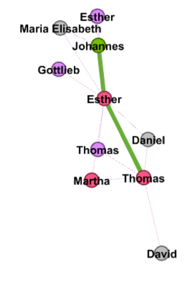
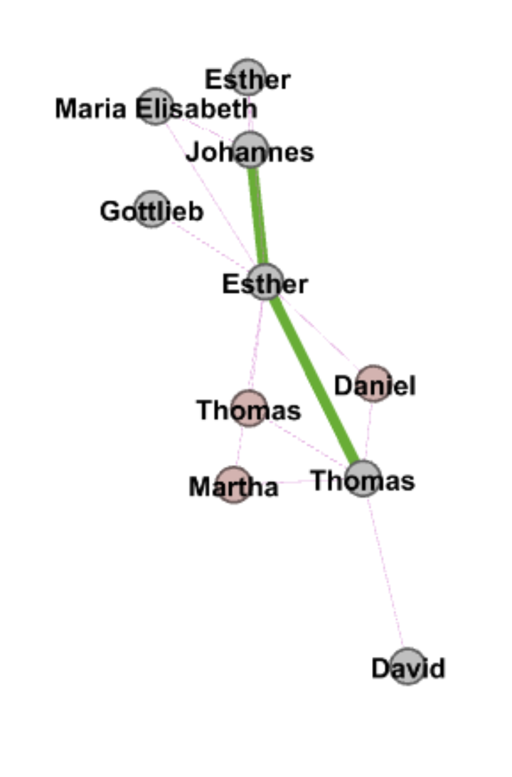
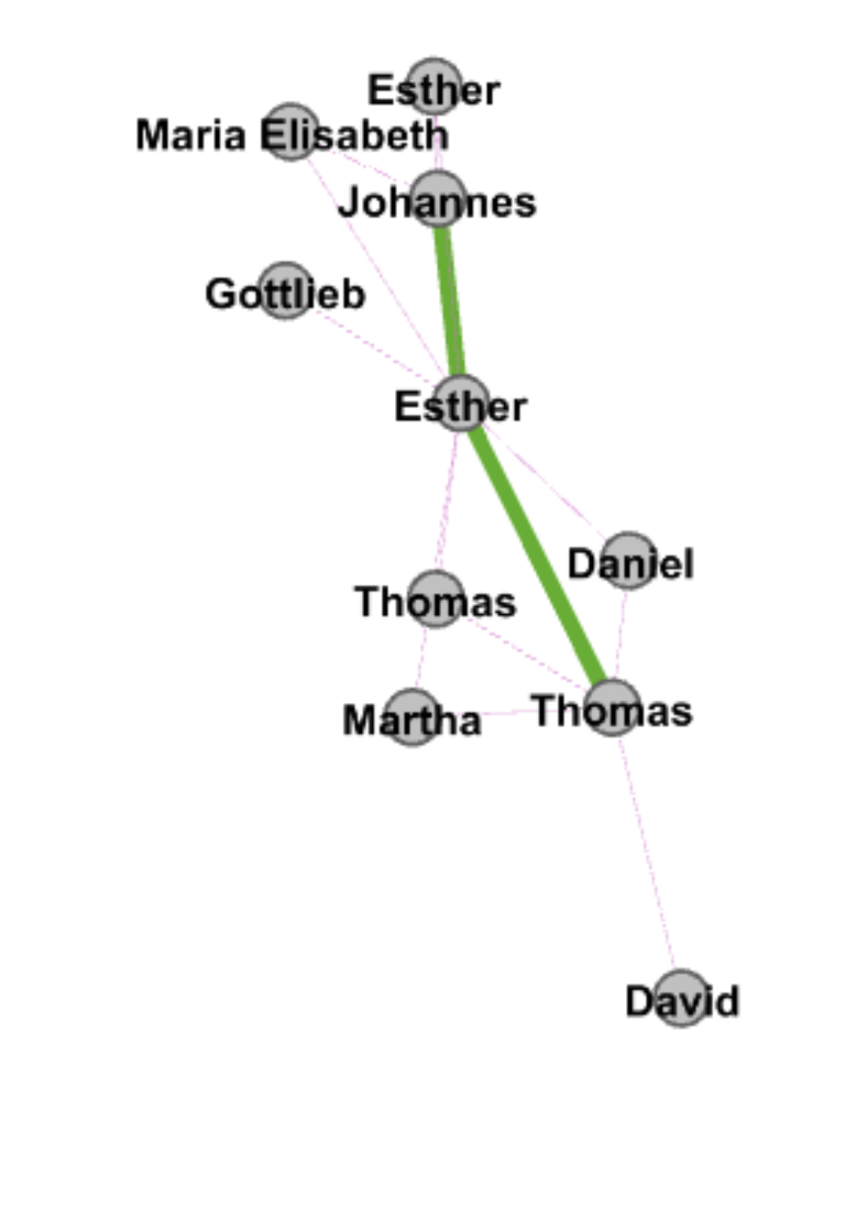
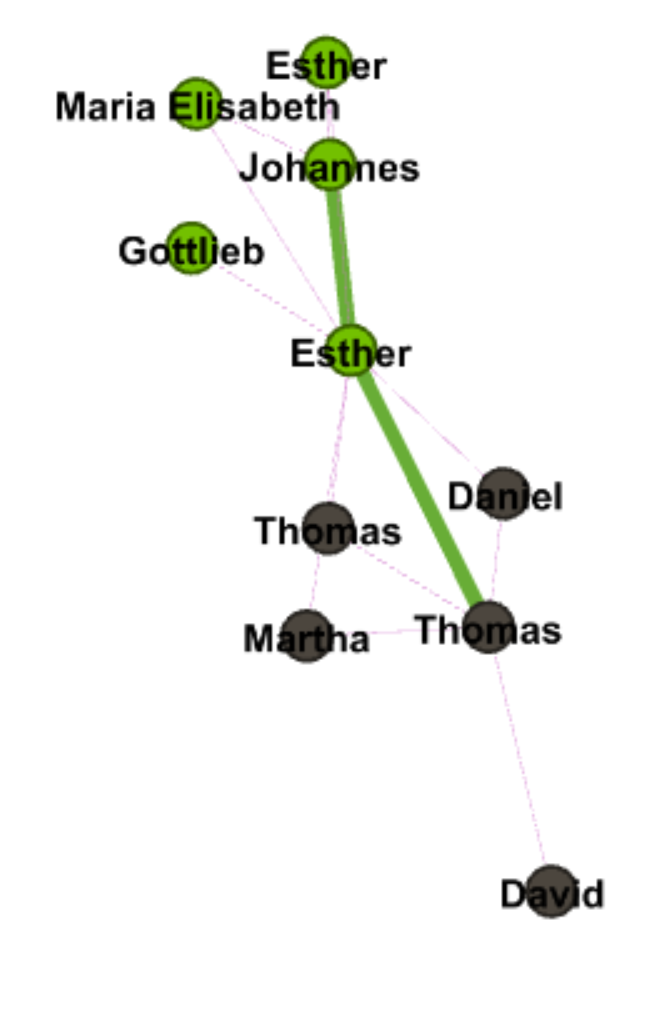
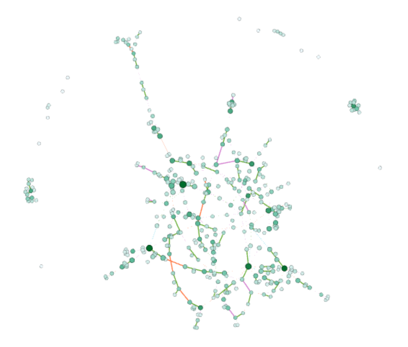
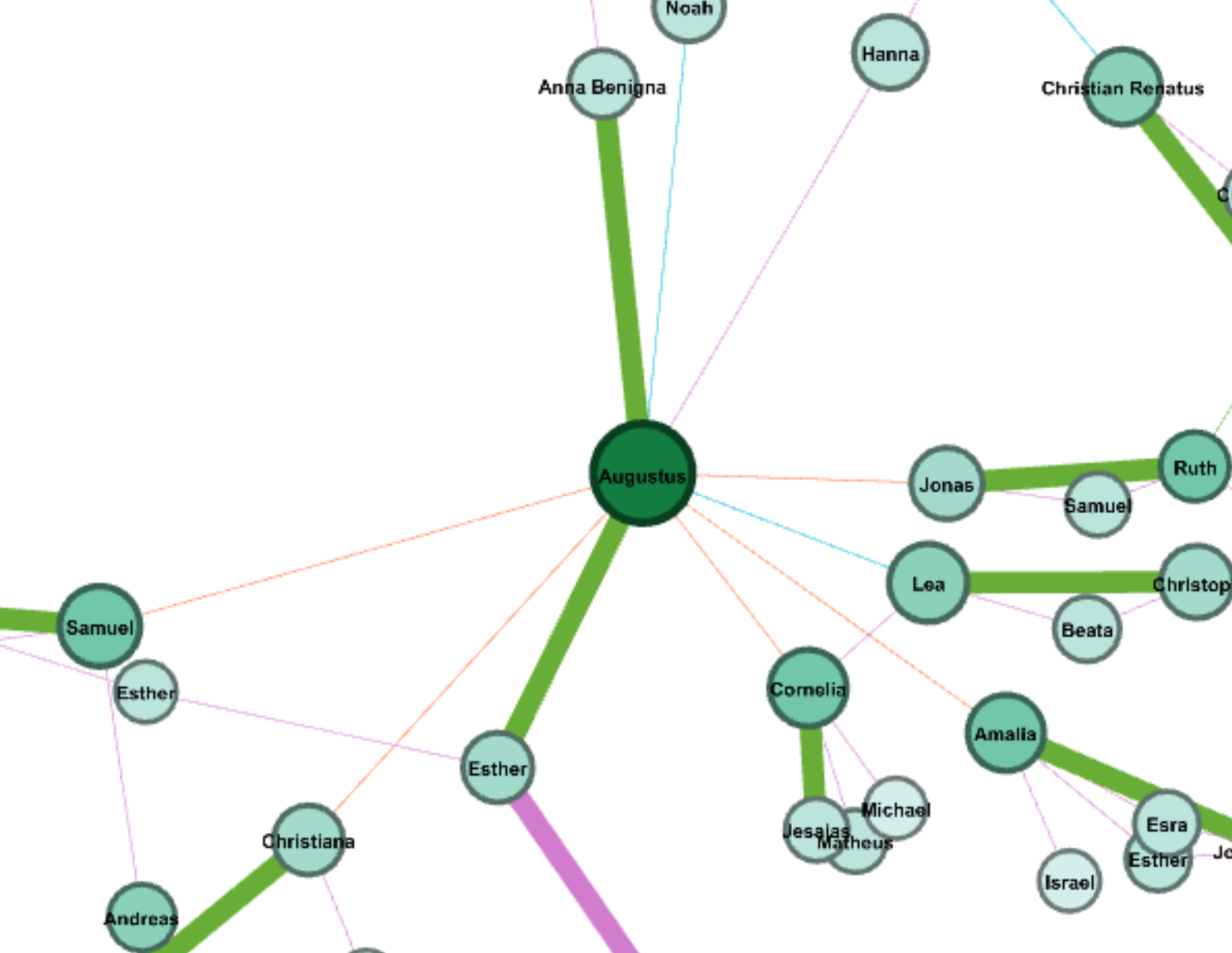
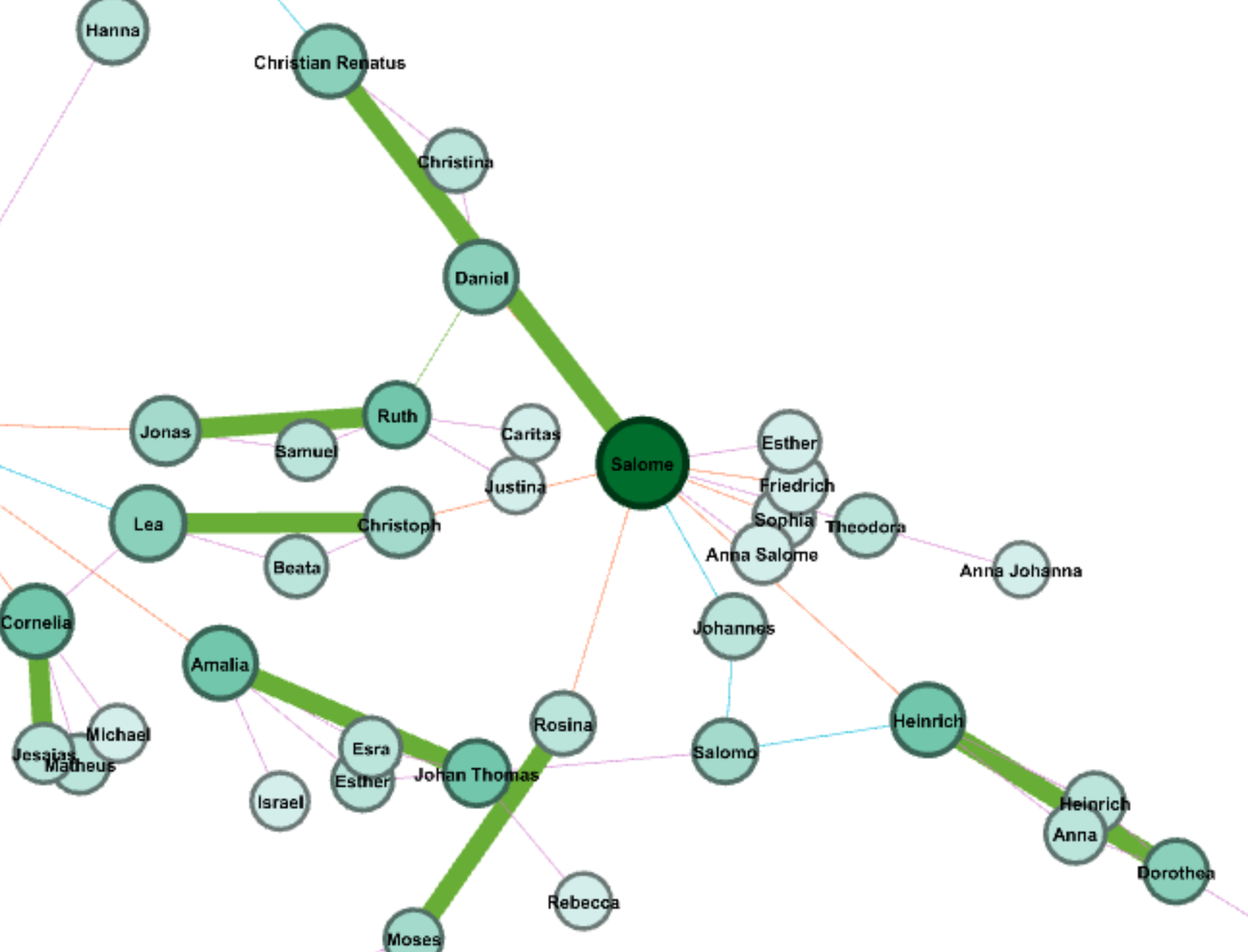
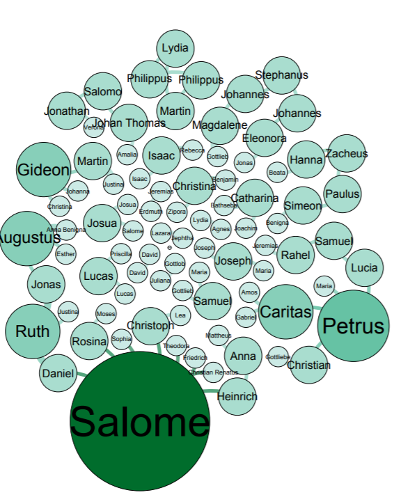
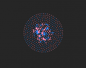
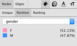
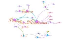
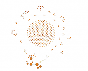
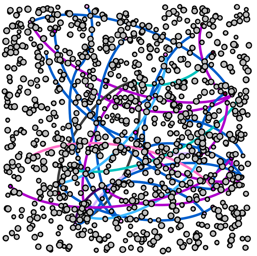
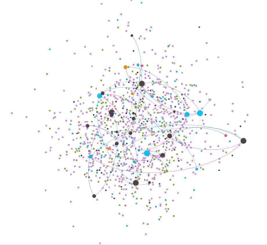
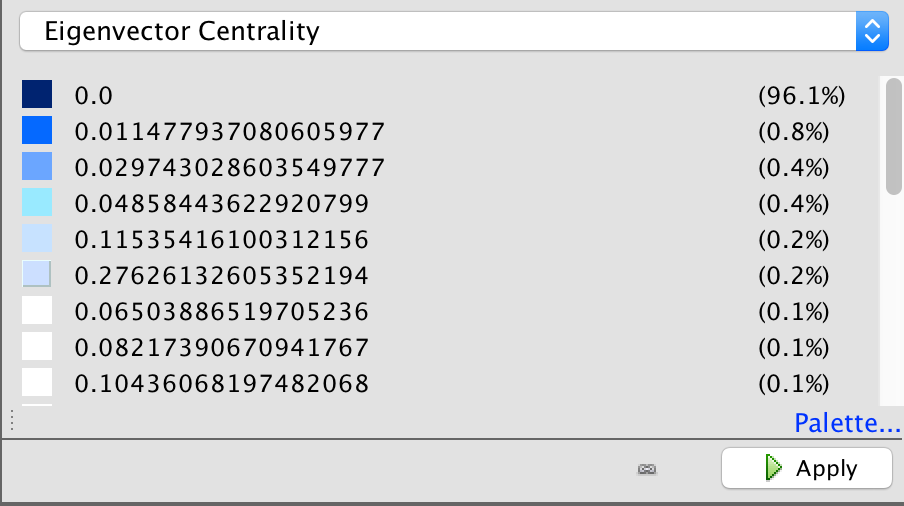
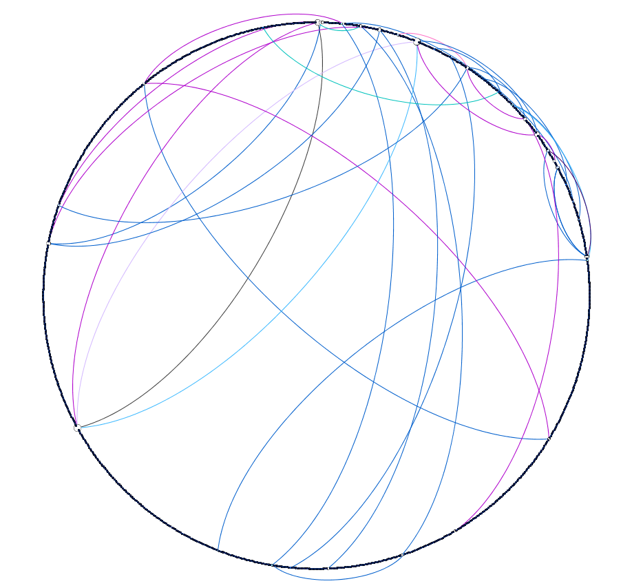
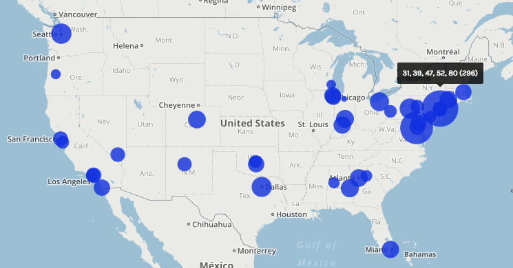
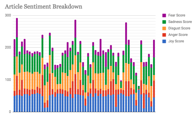
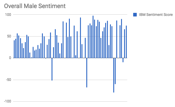
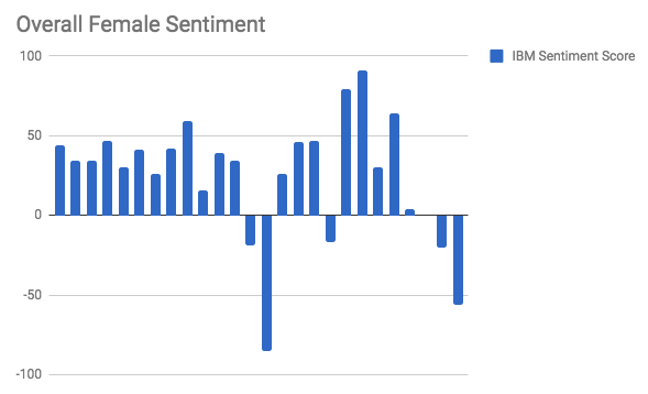
In my work with the “Map” and “Graph” features of Palladio, I encountered another problem coming in the form of automatic summation of sentiment values. As can be seen in the screenshots accompanying this blog post, node size was biased by the fact that multiple articles from the corpus came from the same location or shared common entries in other columns of my metadata. Thus, my visualizations involving node size as a reflection of sentiment were biased, and would have to be tampered with in some way. In the case of the “Map” view, the only solution I was able to come up with was to set up my visualization so that hovering over artificially large nodes (representing places like New York City) would show the sentiment values for the multiple articles that had their scores added together. In the case of sentiment summation as it related to theme or gender, I chose to go about solving this problem by incorporating a new set of simple stacked bar charts into my analysis. In doing so, I made it so that I would only have to worry about the dimensions of gender and platform as they pertained to theme (did not have to size nodes).

Early visualization showing nodes sized according to net sentiment value of constituent elements from the corpus (bias emerges due to the underrepresentation of female responders and different number of times certain themes are measured)
One “Map” visualization used in the final project that demonstrates hovering over artificially large nodes to reveal constituent sentiment values
Sample stacked bar chart representing targeted IBM sentiment values for articles in the corpus


Once I had generated all of the necessary visualizations for the development of an argument that certain factors (like gender, time, and response platform) have had an impact on responses to the Sandusky scandal, I had to develop a logical fashion for presenting my visualizations and arguments as part of a narrative. In their article on narrative visualization, Segel and Heer explain the importance of narrative to digital humanities scholars by quoting Jonathan Harris, “‘I think people have begun to forget how powerful human stories are, exchanging their sense of empathy for a fetishistic fascination with data, networks, patterns, and total information … Really, the data is just part of the story. The human stuff is the main stuff, and the data should enrich it’” (Segel and Heer 1140). With this in mind, I realized that a multi-layered WordPress site consisting of several progressive magazine-style pages would be the most appropriate way to present my data. A site of this format allowed me to sequentially paint a picture of the real people who chose to respond to the Penn State scandal. Breaking the different dimensions of analysis into different pages helped me to contain my arguments and observations as palatable narrative bits that build to a broader understanding of the story of rhetorical conditioning in responses to the Sandusky scandal.

A final challenge in working with a project of this nature is that there is no available database that truly encompasses all of the tweets and articles written in response to the Sandusky scandal. Therefore, rather than work with a pre-compiled and “objectively complete” database, I had to gather the articles and tweets that would come to make up my corpus with no assistance. This style of corpus construction (during which I considered things like geographic location of the response) facilitated what I believe is the biggest flaw in my project (although it may have been an unavoidable pitfall): the subjective inflection of my corpus. In thinking about this, I was reminded of one of Johanna Drucker’s primary critiques of digital humanities work, “All data is capta, made, constructed, and produced, never given … So the first act of creating data, especially out of humanistic documents, in which ambiguity, complexity, and contradiction abound, is an act of interpretative reduction, even violence” (Drucker 249). In the case of my project, this data being “capta” led to two weaknesses in my final product — a disproportionate amount of responses from men and an uneven geographic distribution of articles (bias towards New York City and Washington, D.C.). Throughout my work, I was unable to find a realistic solution to this problem, so I elected to mention these flaws in my work under the “Conclusions and Further Work” menu on my WordPress site.


Chart showing overall sentiment values for responses written by men (the high number of bars compared to the female visualization shows potential gender bias of corpus)
Chart showing overall sentiment values for responses written by women (the low amount of bars compared to the male visualization shows potential gender bias of corpus)


In conclusion, I believe my final product (WordPress site) was successful from a digital humanities standpoint. I hold this belief primarily because my visualizations help to generate a novel way in which to view the discourse surrounding the Sandusky scandal. In this way, my project harkens back to the assertions of Tanya Clement:”Sometimes the view facilitated by digital tools generates the same data human beings (or humanists) could generate by hand … At other times, these vantage points are remarkably different from that which has been afforded within print culture and provide us with a new perspective on texts that continue to compel and surprise us by being so provocative and complex — so human” (Clement 12). All in all, the conclusions that can be drawn from the admittedly author-driven narrative produced by my WordPress site helps to turn simple metadata into evidence of very humanistic behavioral patterns and motivation. Therefore, my final project has manifested itself as an example of the value of digital humanistic scholarship.

Categories
Uncategorized

Assignment #5

Our group worked within the Baptized Indians database, which was confined to sections ID 175-225. We then compiled this data into the Gephi program to create visualizations to interpret the information. This platform was difficult at first but it became helpful with establishing connections. Using the data laboratory, we created 86 edges and 97 nodes which exemplified the relationship connections of our sample group. I must admit, we ran into a bit of trouble when we were creating the edges as the metadata had some error within the connections. We scanned all numbered individuals to locate spouses, children, etc. however, there were some connections that were impossible which we could not create that edge to be connected in our visualization.

original raw dataset

At first, when we viewed our data in Overview, it didn’t seem very meaningful without any labels or information. However, once we started to experiment more within the tools, we began to make progress. The first appearance change was made by selecting “modularity”. This added color to the dots which showed us the comm

modularity appearance

on relationships. This gives the viewer a clearer understanding with the connections and relationship between communities. This visualization was a minor change that made a significant difference in data recognition. Next, we decided to switch the size of the nodes according to class and rank to further support the similarities. This implies that Christianity began to expand and spread throughout society. The main component was marriage and the interesting connection was seen through certai

node size enhancement

n nodes that connected twice to certain colors(blue and orange). In the data, there were individuals who had endured two marriages, being that they were divorced at one point. After playing around with the program, we explored the degree and eigenvector centrality which the data results changed but the appearance wasn’t altered much. Eventually, we came across noverlap which had labels and showed a different connection which


we were more accustomed to when viewing data information. The visualization shows their names and the various relationships between each baptized person. This indicates how each person is related or how they come in contact during some point of their lives. The color of the node revolves around an individuals relations with a certain number of people. We tended to gravitate towards this style more because it was clearer to understand and mapped out the community overlap that symbolizes the more important groups of people. Using this visualization along with the edge labels would help a person understand the relationships created and the relations between communities that have been created through marriage or the birth of a child. Overall, I’d say that Gephi was very helpful to our assignment. It allowed us to visualize a group of people in a creative way that brought many of them together. It’s always warming to create graphic expressions that tell a story without much text that we are accustomed to. It took us a while to understand the concepts and tools with using Gephi. There were some networks that didn’t run properly but we never gave up in trying. Also, the collected data translated into color coded was beyond helpful to distinguish certain levels and communities. Compared to the other platforms we used in the past, I would say that this was the most challenging and wasn’t very beginner friendly. Because of this, we didn’t uncover all the results that we hoped for but that’s fine because we learn a lot about ourselves and the power of visualizing. It was fun to play around and run test that generated different information, however jigsaw and voyant was easier to operate in which we could create visual masterpieces. However, it like we learned, it doesn’t always have to be cool or an attractive graph, as long as it is meaningful and could be interpreted by an audience.

Categories
Assignment 5

Assignment #5

Gephi is a really powerful data visualizing tool with comprehensive features, supporting calculations, formatting, filtering and etc. It also provide user abundant choice on layout and coloring with multiple ways of classification on nodes and edges. So in this assignment, I tried many combinations of layouts, ranking of nodes and partitioning to see how different dimensions are combined to show more information about baptism of native American.

After I go through what kinds of information provided in each columns of the provided csv file, I want to see how is family members related in baptism. However the all family relationship are not recorded with usable format and the file is sorted by timeline, which makes it hard to inspect the relationships of family members. Therefore, I attempted to involve all family relationships in edges. I classified edges with four kinds: parent-child, couple, sibling and relatives.

First image here is the default layout after I import the csv files of nodes and edges. The import of data in Gephi is very flexible and it allows user to do editions to the data tables and export the data. My original Gephi project went wrong and all data is lost, but thankfully I export my edges table right after I completed it. Each nodes represent a person and edge represent there is family relationship between two people. The data is consisted of over 300 nodes and over 500 edges, so it looks very messy at first, so we can hardly get any useful information from the graph right now.

Then I partition the nodes with by whom each person are baptized and use Force Atlas and Yifan Hu layout to the graph by sizing nodes with degree of them. From the graph we can see that the layout forms of both Force AtlasYifan Hu put closer related nodes together and each group of nodes are usually in the same same color, which makes perfect sense that relatives are more possible to be baptized by the same person. Then I use Fruchterman Reingold layout to have better view of relationships of all people.

When I partitioned the nodes with nation in Yifan Hu layout, Gephi provides me an interesting graph. We can see that most people are from three nations: Delaware, Wanpanoag and Mahican. The top right corner is mainly consisted of green, top left and bottom right are mainly consisted of purple and left bottom corner is consisted of blue. The obvious separation between three nations is actually very reasonable; it is intuitive that family members are usually in the same nations. But if look closer to the boundaries of each sub parts, we can see that the density of edges is significantly lower that the partition of each nation. So compared the Yifan Hu graph above we can assume that the difference between nations contributes more to the grouping of nodes than by whom each person is baptized.

Although the graph looks cleaner, it still provides limited information of the data. One advantage of Gephi is that users can use different partitioning and layouts to make comparisons. Therefore, I tried several different partitionings and had insights into one small group of nodes. Nodes are partitioned with baptized by whom, Eigenvector centrality, modularity and nations. We can see that family members share a lot commons in baptism. In the graphs I listed below, we can see that this group of nodes is mainly consisted by two sub networks, which are connected by “Esther” in the middle. And we can see that those two sub networks are partitioned with different colors in both Eigenvector and nations partitioning, so Gephi works great on separating nodes and family members are usually highly related in baptism.

I also apply ranking of degree on nodes, and I took insight into four nodes with highest degree. Interestingly, those four node have different features: Augustus has two wives connected by two thick green edges, who are Ana Benigna and Esther; Salome has a lot of siblings; Nicodemus has a lot of children; Abraham has a larger family tree. Although those four have different structure of family network, all of them show that family has big influence on the spread of Christianity.

Because I manually typed in all edges for the graph, I found many interesting features in the data, which are not revealed in Gephi due to the lack of consideration on time. Because people are sorted by the date of baptism, people who were baptized earlier are usually parents. However, there are special cases that parents were baptized later. Moreover, there are also a lot couples that one of them may be baptized after marriage (obvious for those who have second wives) and many kids are baptized in their young age. Therefore, we can assume that family relationship contributes a lot in the spread of Christianity.

I also found some weird problems when I was using Gephi. Apart from the failure of loading my previous object, the percentage calculated in partitioning of edge also seems wrong. The proportion of each kind of edge is right, but the sum of them is only 1%.

Above all, compared to all data visualization tool we have been learning this semester, Gephi is the most powerful one, which provide comprehensive tools, flexible manipulation on data and more aesthetically pleasing features. After this assignment, I have learned many useful skills of Gephi, but I found there are still many features I haven’t used, so I hope I can learn and use more powerful tools and features in Gephi in future data visualization projects.

Categories
Assignment 5

Assignment #5 (Omar G. & Bryan M.)

For this particular assignment, Bryan and I analyzed the data from the Baptized Indians Database. We were able to do so by using Gephi visualizations. Using Gephi help reveal patterns and also allowed us to explore and manipulate the data to point out trends of the baptism relationships between Native Americans during the time. We first started by making edges for the people we were assigned to with the ID 175-225. For our visualization, we ended up with 97 nodes and 86 edges. Each node specifically represents a Native American who fell under our category while the edges show the numerous interconnections made between the natives. When we first saw this visualization below we were confused to say the less about what Gephi was trying to show us due to a couple connections that weren’t found on the spreadsheet thus making it hard to follow along initially. You can only see some connections however its hard to follow along because of the lines crossing one another. We then proceeded to play around with Gephi in order to get a better understanding of the data.

[gview file=”http://humn2702018.blogs.bucknell.edu/files/2018/04/raw-version-1.pdf”]

We first started my adding color (modularity) to our visualization to help further break down the data given. By adding color to the graph Gephi allows the viewer to see what group each person is linked with. By doing this it gives a viewer an easier graph to look at compared to the visualization we started out with each node being the same color. You are now able to see the different communities within this visualization.

[gview file=”http://humn2702018.blogs.bucknell.edu/files/2018/04/modularity.pdf”]

We decided to break it down even more and looking at the different connections between each of the communities. In this visualization to highlight the interaction between each person(node), we decided to adjust the size of the nodes according to their class and rank. Furthermore one can imply by looking at this visualization to see how Christianity was spread back then which was usually through marriage which explains the connection between the different color nodes.

[gview file=”http://humn2702018.blogs.bucknell.edu/files/2018/04/indiansmarinekf.pdf”]

The last feature we decided to use was a visualization showing their names and the various relationships between each baptized person. This visualization shows how each person is either related somehow or come in contact with each other. The color of each node depends on their activeness within their community and spread of Christianity. I find this visualization more meaningful than the others because it shows the overlap of the communities and how they networked back then as well it shows you the more important people in the groups.

[gview file=”http://humn2702018.blogs.bucknell.edu/files/2018/04/noverlap.pdf”]

In conclusion, Bryan and I believe Gephi is a helpful visualization site but it can be very difficult at operating sometimes. Overall we both struggled with learning how to use Gephi but are very appreciative of being able to learn how to use another visualization site. However, as time passed Bryan became more comfortable in using the site compared to me. Compared to other tools we’ve used before Gephi isn’t the most user-friendly and because of this, it can be tough at pulling and analyzing the data with this visualization tool. We quickly realized though as we added more features to our data the more knowledge we were able to gain. We like that you could play around with some tools from the site however we both said we wish it could be more interactive like voyant or jigsaw which both had an ultimate amount of resources to play with and extract data from.

Categories
Assignment 5

Assignment 5

Gephi visualization representing relations between Moravian missionaries in the mid Atlantic states in the 18th century

Gephi is a data visualization tool that allows the user to input data and manipulate it in numerous ways. It has the capability to visualize different relationships within the data across multiple dimensions as well. Steve and I were taking a look at 49 different Moravian missionaries who had been baptized in the 18th century. Using the Moravians from ID number 126 to 175, we broke down their data into ID number, name, relations to others within the data set, and the nation they belonged to. After putting the information into Gephi, we started testing with the different options that Gephi had to offer to visualize our data with focuses on statistical calculations such as modularity, degree, and betweenness (or Eigenvector value). These were essential to the project since we were looking at a very tight knit community of people. Paranyushking writes about how all of this information can be allowed to “speak in its multiplicity”, where it tells the story through the information given (Paranyushkin 2011).

It was difficult to figure out the different aspects of Gephi without playing with the options first. To begin with, we had to build up our data. Connecting each Moravian within the table to their relative was the first step. After building undirected links between all 49 Moravians, we were able to begin visualizing the data. What we initially got was a very “bare bone” visualization of our information. It was after that that we started playing with the different options

Gephi “bare bone” visualization

What Steve and I decided to investigate next was adding in a different dimension of information to be visualized. We began to look at the Native American nation they represented.

Gephi visualization with a focus on nation within a family

With this visualization, I was able to start answering the question of how important it was for Christianity to be spread among family’s of Native Americans. By making the nation visible with the partition option, we got to emphasize the importance of how a family may have been baptized together with potentially the same baptizer rather than individually. The edges between each family’s relation also represent the top three nations in the data. These were the Wampanog (41.6%), Delaware (31.5%), and Mahican (21.2%), which made up a majority of the nations represented. This proves that family played a large portion in the spread of Christianity for the Native Americans.

Gephi representation of group mingling

Keeping the visual representation of the nations with the color schemes, we saw that some families had intermingling of other families. This showed that despite what nation you came from, something such as Christianity could still be spread from family to family, and nation to nation. This would then lead to more baptized natives, and more influential families that spread the idea of Christianity through their relationships with other families.

After playing with the different connections, we decide to look at the statistical concepts of modularity, degree, and betweenness or Eigenvector. To isolate each concept, we changed the way the visualization looked with a focus on each.

Salome appears as the biggest name, which means that Salome had the most connections with other family members. We used the average degree report to determine how often the natives were related to one another and came up with a value of 1.57. What this means is that our families were closely related, but not very large. With this information and information we have gather from the previous visualizations, we can determine that a majority of the Native Americans in the entire data set were more than likely small families.

Visualization of Degree
Visualization of Modularity

Modularity represents the community structure within a network. Modularity will focus on the nodes and edges in the visualization. Since we have 89 nodes and 70 edges, we used the Force Atlas visualization. After adjusting the “nodes” tab to show their ranking as a degree, we had to set a much larger range so that the nodes appeared much bigger than usual since many of the families were already so small. Paranyushkin talks about how modularity that is measured greater than 0.4 proves that a partition produced by the algorithm can show a distinct relationship within the data. In order to prove his point, we ran the modularity report in Gephi and measured a .9. This proves Paranyushkin’s theory that there are direct links in the modularity that are much stronger than the average links in the entire data set (Paranyushkin 2011).

Visualization of Betweenness

Finally, betweenness is represented as how often a node appears on the shortest path between two nodes in a network. The higher the betweennes value, the more important the node is based off of its presence in the network. Under the “Network Diameter” option in Gephi. It showed that we had a diameter of 8. With Gephi’s resizing tool, we could make the node bigger based on its connections. Salome had the largest betweenness value at 127.

There was definitely a learning curve when it came to using Gephi. Steve and I both had different problems at different times when it came to visualizing our data. More times than not, I would find that the program itself would lose portions of its functions, like my random inability to use the drag tool, or Steve completely losing the Layout widget entirely. But despite its random glitches and dropping our work before we’ve saved, Gephi is a very powerful tool to use when visualizing information in multiple dimensions. When you begin with the first visualization, it becomes almost like a waterfall effect. Each visualization reveals and builds onto a different dimension that can be investigated.


Works Cited

Paranyushkin, Dmitry.  “Identifying the Pathways for Meaning Circulation using Text Network”


Categories
Uncategorized

Assignment 5 Luke Hartman

Luke Hartman– Assignment 5

The purpose of this assignment was to become capable of using Gephi through an analysis of the Baptized Indians Database. I created a worksheet in Gephi and input the 376 names of Indians as nodes, and then created edges  (82 in total) for the names of Indians with ID numbers 225-274. The edges represent connections between Indians within the database with the edge source as the ID (225-274), and the target as the other related person. As is evidenced by the 82 total edges, some of the 50 Indians had multiple connections and thus multiple source-target edges created for their singular ID.

I also distinguished inter-generational relationships by using directed vs. undirected edges. For example, if the source was the son, and the target a mother or father, the edge was directed to show a generational gap. If the source-target relationship showed brothers, sisters, spouses, etc., it would be undirected.

When I initially put the information into Gephi, I was lost to say the least. Below is a screenshot of what the default visualization showed.

As one can see, it is very jumbled and does not show anything discernible at this stage. The next step I took was to run the modularity program that showed nodes grouped by communities allowing me to identify niches within the larger group. I then ran a program called Force Atlas that moved the communities to the outside edges of the data set in the visualization and I set the size of the node to correspond to “degree” which is a measure of how many people a specific person or entity has interacted with other members of the community. The color of the node also distinguishes related communities and relative proximity within the graph shows overlap in groups. This produced a very interesting visualization shown below.

While recognizing that this graphic had value in it’s principle structure, I struggled a bit with how to discern more meaningful comprehension from it because of the overlapping nodes and the lack of visible edge connections. In light of this, I increased the distance factor in between all the nodes in the graph for easier viewing, and then colored them based on closeness centrality, which is a measure of how close one node (or member of a community) is to all the other nodes in the network (or all the other members of the community in this case). Below is the result, followed by a zoom on one specific section of the graph.

(Bottom Right of graph is zoomed in on)

This zoomed in view has many of the desired qualities of a visualization I hoped to create when I began this project. First, the node size is visibly larger corresponding to the total amount of connection each person has in the network. The color of the nodes correspond to values between 0-1 listed in the chart in the top left of the first picture shown above and they display closeness centrality of each node. Next, each edge is shown as a thin line connecting nodes, and the directed edges have arrows at the end which represents a generational difference. This is extremely  informative as it allows the viewer to see the three brothers at the center of the community and then discern the relationships of all the other people in the network just from the graphic. If edges were created for all 376 nodes, this would be a great way to visualize many complex and interwoven connections within the larger set of data.

Overall the ability to use Gephi is something I certainly value. I definitely struggled with it and got frustrated at times but I learned a lot and when I finally made some progress it wasn’t difficult to see the value in the tools the platform offers. I feel much more equipped to tussle with complex and layered data given my knowledge and experience with this assignment and program, who knows what it will be useful for in my life and work going forward.

Categories
Assignment 5

Assignment 5

For this assignment, in order to portray the baptism information from the Moravian missionaries in the 18th century, I decided to create a visualization using Gephi that focuses on the gender of those that were baptised and how many connections they had to the others in the dataset. My visualization is featured below:

My visualization has 376 nodes and 70 edges. I used all of the nodes in the dataset, but I only created edges for the 50 people that I was assigned. Although I think the visualization presents the data that I included in a very useful way, seeing all the edgeless nodes surrounding the center shows how big the dataset was and how the edges that I included are just a portion of the people that were baptised. However, by only using these 50 nodes, it allowed me to visualize specific individuals more clearly.

I represented the data primarily through the color of the nodes and edges and also through the node size. The color of the nodes are either pink or blue, pink representing females and blue representing males. The edge color is pink if the connection is between two females, blue if the connection is between two males, or purple if the connection is between a male and a female. I found the gender aspect of this data to be very intriguing because I wanted to see if well connected individuals were typically male or female and what that could mean for the data as a whole. The size of the nodes represents the degree and how many connections a specific person has. The more connections, the bigger the node. The nodes on the outside are all equally small because I did not enter their edges into the data laboratory. All the edges that I added are visible in the center of the visualization.

So, what does this data show? This data shows that Elizabeth, Beata, Zipora, Christiana, and Esther are the females with the most connections and Petrus, Benjamin, Nathanael, and Thomas are the males with the most connections. There are 5 very well connected females and only 4 well connected males present in this visualization. Of the 50 people that I created edges for in the dataset, 31 were female and 19 were male. This is evident with the higher number of pink nodes that you can see in the center of the graphic. This tells me that the females overall had more connections than the males. This made me curious as to what the roles of the women are in these communities and how women are viewed by both the missionaries and by the males in the dataset. The women seem to play a very important role, given how many of them are so well connected to others. Also, most of the nodes that were the largest, meaning the nodes that represented the people with the most connections, tended to be related to the other people who also had the highest number of connections. For example, Zipora’s father is Petrus, her son is Nathanael, and her husband is Benjamin. All four of these names had some of the highest number of connections of the 50 people I included. This made me wonder about the roles of specific families and if some families were more active in the community or if they played specific roles in their community that were considered to be very important to others.

Figuring out how to create this visualization in Gephi was very challenging at times, but once all the data was in, it was very fun to play around with the many different layouts, statistics, and partitions that changed the look and meaning of the nodes and links, just as we’ve read about in our Meirelles readings. However, I wish Gephi allowed for more interaction and more features on the viewer’s end because I think this dataset would be very interesting to explore further. I also would like to see more dynamic visualizations because with such intriguing stories, being able to captivate the viewer would be easier with more freedom and creativity in the design. Just as we explored through the Segel and Heer reading, I think it would contribute more to telling the story of these people that were baptized rather than just showing them as colorful nodes. For example, seeing a time feature in the visualization would be another aspect that could offer insight into their stories. However, with that being said, I think Gephi is the most interesting platform we’ve worked with so far and I really enjoyed the challenge. I was able to explore this data thoroughly and I felt like I had a lot of possible directions to go in when doing so.

Categories
Assignment 5

Assignment 5

In this assignment, I created and analyzed network graphs by using the records of the Moravian missionaries in the mid-Atlantic states in the 18th century. After briefly looking at the data, there were a few questions that I wanted to explore:

  1. Were proximity and social connections important to the spread of Christianity?
  2. Who were the important people in the network?
  3. Were there any patterns in how the baptists choose people to baptize?

To be able to input the data into Gephi, I first ran a script using the original spreadsheet to generate an edge table, resulting in a database with 377 nodes and 490 undirected edges. Although my method is faster than manually extracting the data, due to my lack of text analysis knowledge, marriage, etc. relationships are all represented by the same kind of edge in my data (I feel like Drucker would not like this at all). This might hinder my further study of the data. However, for the questions that I proposed, I do not think it greatly influenced my interpretations.


Colors: nation. Sizes: betweenness centrality (left) & eigenvector centrality (right).


Above are the force-directed (Force Atlas layout) representations of the network. The nodes in both of the graphs are colored by nation. The nodes are sized by betweenness centrality in the left graph and by eigenvector centrality in the right graph. In both of the graphs, we can see that there are clusters of colors, which indicates that proximity did play a role in the spread of Christianity. In addition, there are also connections between clusters of different colors. This can imply that either Christianity expanded through marriage or those people married because they shared the same faith, which in turn, solidified the position of Christianity in the community.

I made two slightly different graphs because I think that one can be in the shortest paths of many connections and be somewhat insignificant at the same time, which can be seen in the change in size of some nodes between the two graphs. On the other hand, one can be influential in a large community, but that community is only in the periphery of a larger community, which might result in a low betweenness score. Hence, to find the most important people in the network, I used the graph on the left and filtered out nodes with eigenvector centrality < 0.5. The result is shown in the graph below.


Important people in the network.


I think that the baptists were somehow also aware of the importance of these people. I created two more graphs using the Circle Pack Layout with the first hierarchy being the nations and the second hierarchy being the baptists. The nodes in both of the graphs are sized by eigenvector centrality. In the left graph, the nodes are colored by the nations and by the baptists in the right graph.

Circle Pack Layout. Nations (left) & Baptists (right).


Most of the baptists seem to have focused on maximizing the number of regions they went to. In addition, they baptized the people with high eigenvector centrality in each nation. Although this is not rigorous, I arbitrarily checked the dates for some of the big nodes and the nodes surrounding them and found out that the bigger ones tend to be the ones that got baptized earlier. Thus, there seems to be a pattern among these baptists to baptize the most important people in as many regions as possible.

Overall, I think that Gephi is an amazingly versatile visualization tool with a quite usable interface. However, there are also some aspects of Gephi that I found limiting. For example, I was not able to embed a timescale in my visualizations, which is one of the four principles of network visualization mentioned in the 3rd chapter of Lima’s book. Nor was I able to easily put the nodes in a map layout as I could in Palladio.

While making these network graphs, I was also aware that they are not a representation of the data but rather a story that I wanted to tell about the data (again, Drucker would disagree with my method). I proposed questions about the data that I sought to answer. In other words, I chose to omit aspects of the data that I did not care about. I do not think that data visualizations can ever be subjective, even the act of collecting and organizing data contains biases in itself. However, as computer scientist Bret Victor said, “[a]n active reader doesn’t passively sponge up information, but uses the author’s argument as a springboard for critical thought and deep understanding.”

Categories
Assignment 5

Assignment 5

Final graphic representation of small community

In this visualization, we are observing a small sub-group of Indians that appeared in my data of 75 people. To arrive to this data, this first step was tackling the use of gephi. Gephi turned out to be far easier to use than expected. With a little bit of tinkering all of the basics are readily available and fairly self explanatory. After creating roughly 80 edges for my nodes, I used the Yifan Hu layout to not only make the data more aesthetically easier to inspect, but to find anything interesting in the rather sparse amount of edges. Additionally, the data displayed multiple dimensions of the data, namely Indian nation, sex, and community connections (spousal, generational, and sibling). With all of these inputs the data still looked uninteresting, so I chose a small group of Delaware Indians to focus on. For analyzing purposes the size of the names/nodes is proportional to degree. The color of the names is sex, male and female are orange and purple respectively. The color of the nodes is the nation they are affiliated with, most important for us are the purple Delaware Indians and the blue Mahican Indians. Lastly the color of the edges is the relation of the edge, green for spousal, purple for parent to child, and blue for siblings. Some edges I’ve removed for the sake of clarity. With respect to our three calculations of modularity, degree, and eigenvectors I found them mostly inconclusive.  Degree is well represented, and so is modularity by the communities displayed, however eigenvectors failed to make the visualization any more descriptive or interesting, and as such I left them out. Our story focuses on the family trifecta of Petrus, Nicodemus, and Gideon. These three brothers all appeared within my spread of 75 in some way. I think its just fun to observe that each has gone and done their own thing in life. Although difficult to visualize, each went their own ways, represented by them each dying in different places. Nicodemus ended up in Nain, and there he had 5 children. He was married to Lucinda, shown next to him in the visualization. Nicodemus was a randy fellow, as he had the most offspring of the lot. He also appears to have been fairly successful in what he made of himself. One of his children, Zacharias pictured in the top right actually married a daughter of a Mahican. Petrus holds a similar story. He married a Theodore, which may be in a error in the data, otherwise Indians were very forward thinking. Either way Petrus had two kids, one is explicitly mentioned to be adoptive, the other may be as well. If this isn’t an error in data, perhaps they were actually homosexual. Even more impressive is that Petrus clearly made a good name for his family as well.

One of his adoptive daughters married a man who was previously Mahican and married. After his divorce he married Abigail, the daughter. Of course we’ll never know what happened, but we could even postulate that whatever Petrus had going on for himself was enough for a man to divorce his first wife, switch camps to Petrus’s, and then marry one of his daughters, all while being gay in the era. Of course none of that may be true, but exploring these what if’s is what I think visualization is about. And then there’s Gideon, who just had a good life with a wife and some kids. I think this story I found is interesting because it doesn’t show anything incredibly interesting. It simply shows a small merging of people that likely had no huge impact, but we can see this little story play out with just a couple of data points.

Size here is represented by eigenvectors and color by modularity


Categories
Assignment 5

Assignment 5

Through using Gephi, the baptismal relationships between Native American Indians will be analyzed. From the initial dataset of 375 nodes, I closely analyzed the first 25 nodes, which each represented a unique Native American.

The main goal of these visualizations is to further understand the complex relationships between the various elements. As Isabelle Meirelles discusses in Design for Information, “Node-link representations use symbolic elements to stand for nodes and lines to represent the connections between them” (55). Using Gephi, a structure of nodes and link connections were created.

The given dataset was a Native America multidimensional, baptismal database. In the Gephi database, each element or person is represented by a node, and I connected the nodes with edges based on the relationships with one another. These edges in Gephi specifically represented husband, wife, brother, son, stepdaughter, widow, or null.

With these edges consistent throughout the visualizations, the three different dimensions that I examined closely were modularity, degree, and Eigenvector.


Modularity –

The first step of creating a visualization based on modularity was to color the nodes based on modularity class. To further emphasize differences in class, the node size was also adjusted based on rank.


The attribute of color distinguishes different modularity classes from one another. With the colors, the reader is able to see the main clusters and different groups that the Native Americans were in. Since not all the edges were created for the full data set, many nodes are left gray in the visualization, which represents them being disconnected from the rest of the data set.

Without many groupings showing up with the red through gray modularity color scale for the nodes, the most striking part of the visualization are the edges between the nodes, which show various relationships between the baptized Indians, or adjacent nodes.


Degree –

For the degree visualization, the nodes are colored based on the nation of the baptized Indian, and are sized based on the degree. This graphic visualizes the story of how nation and relationships between nodes are related.

Each node is colored based on nation.

The size of each node is based on the degree of the element.

With these ways to partition and rank the data, below is the visualization created.

From this, the reader can interpret how baptized Indians are related to one another based on node size (strength of degree), node color (nation), and edge color (relationship between nodes).


Eigenvector –

For the Eigenvector visualization, the nodes are colored based Eigenvector statistical calculation. This graphic visualizes the relationship between Eigenvector values and the relationships with adjacent nodes.

Each node is colored based on Eigenvector calculation.

Each node is sized based on the Eigenvector statistical analysis as well.

With the visualization, the Eigenvector calculation takes into account the degrees of adjacent nodes.

Overall, this visualization is difficult to read, and would be a stronger visualization if there were more connections within the numerous data points. There is an unproportional amount of nodes to number of edges, and overall the set doesn’t create the most meaningful visual.

This is my main disagreement with visualizations in the Gephi platform. The platform is not user-friendly, and is extremely difficult to work with as an author. As an author, the statistical analysis logic and creation is complicated, resulting in extremely complex visualizations that are potentially too sophisticated for readers to completely understand.

In addition to that, unless the visualizations are exported with the Sigma.js extension, the visualizations are static and are not interactive. This results in even more difficulty in analyzing the data further as a visual form.

As the reader can see from these visualizations, it’s very difficult to interpret much from this small a dataset. As Meirelles discusses, “most problems faced by node-link representations are caused by the occlusion of nodes and link crossings, which obliterates the structure it is supposed to reveal” (56). Since there were many gaps in this data set, the full narrative could not be visualized. Overall, the visuals are telling in the connections between the various baptized Indians, and the colorful edges tell a story about the connections. However, without the full extent of the connections between all nodes, the visualizations are not capable of telling the full story that the Moravian missionaries were trying to capture through their records.