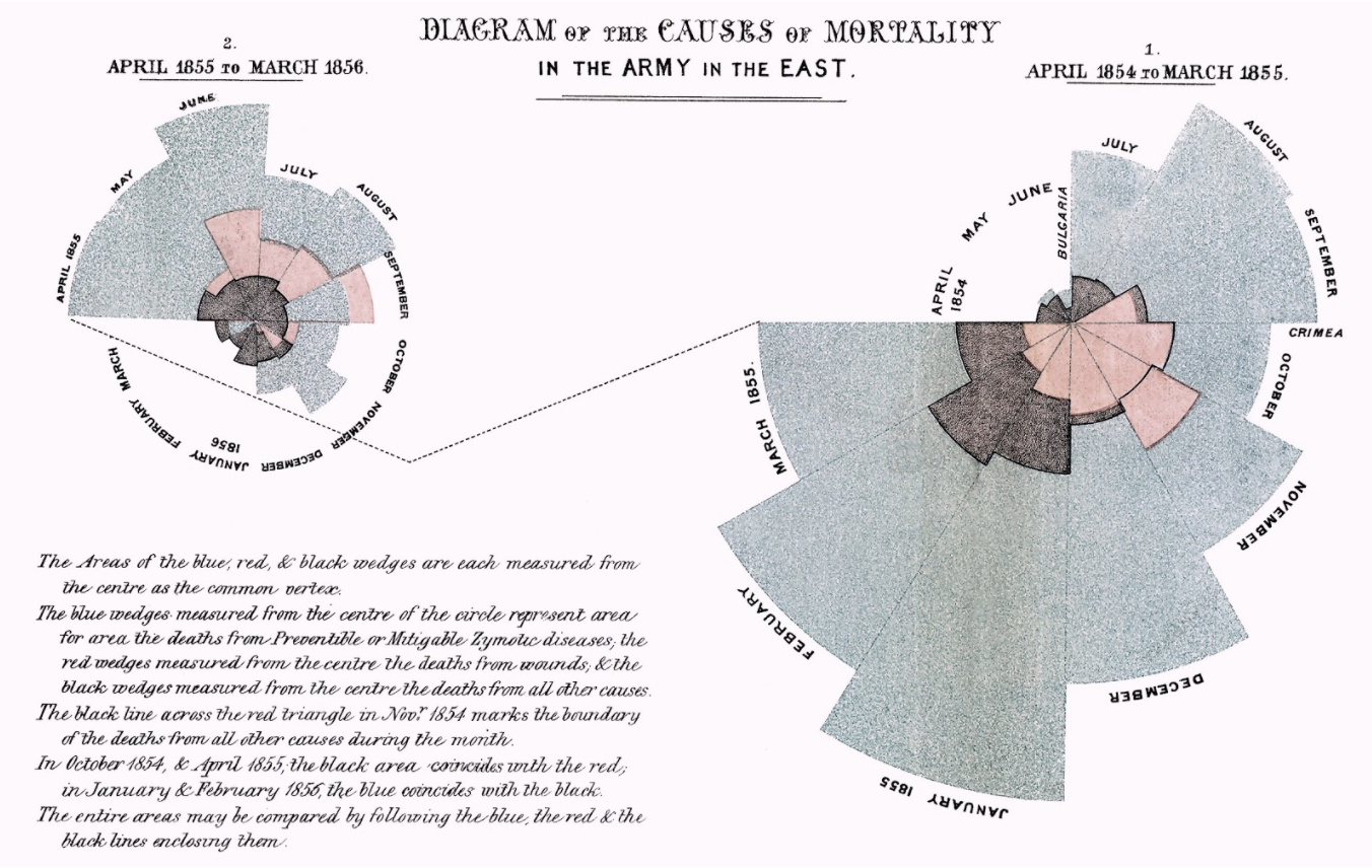
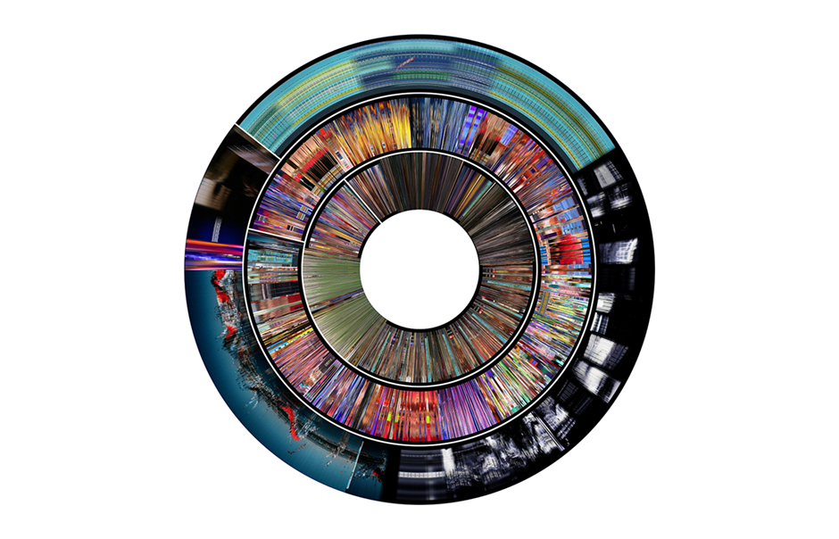
“Diagram of the Causes of Mortality in the Army in the East” (Florence Nightingale, 1858).
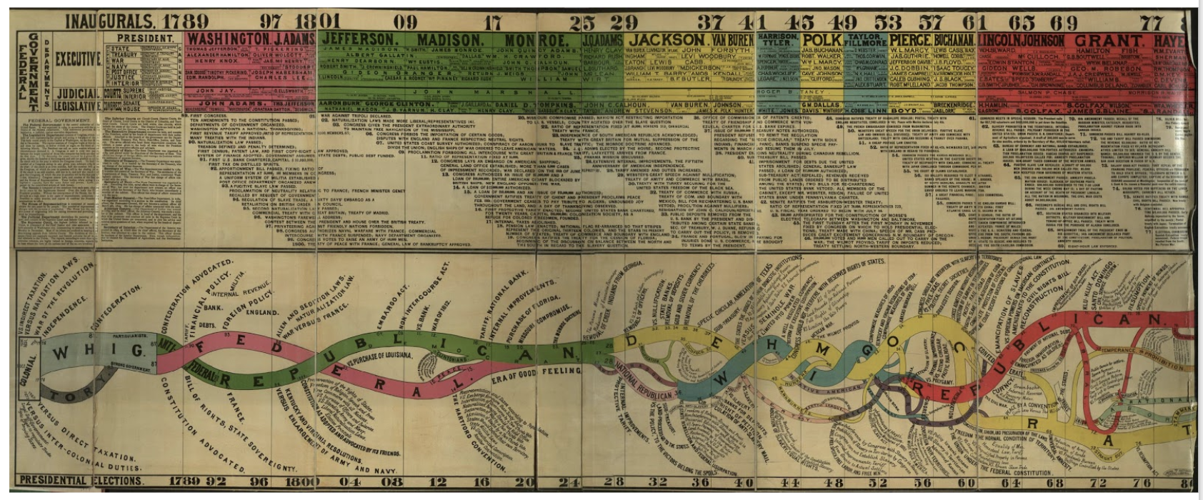
“Conspectus of the History of Political Parties” (1880).
“Last Clock” (Jussi Angesleva and Ross Cooper, 2002)
“Linear Chronology, Exhibiting the Revenues, Expenditure, Debt, Price of Stocks & Bread, from 1770 to 1824” by William Playfair

The different color lines are different categorical variables of the data such as the revenues, expenditure, debt, price, etc. Historical events in time are shown on the horizontal axis. It shows how they changed over time from 1770 to 1824. I thought this would be really interesting because it shows a lot of categorical data on one timeline and it shows the connection between them all during any given moment in time. This would be useful for my data of the Death Row Inmates because I have so much metadata about them, such as where they are from, what race they are, what they said, what they did, their age, their education level, and their gender. Seeing all of this information over a period of time and seeing how it has changed since 1982 would be very interesting to analyze. In the platforms we’ve used, like Palladio, I haven’t been able to look at all of these in one space or one timeline. This would give me insight into how the types of prisoners that we see on Death Row have evolved over time.
This visualization was interesting and very well organized. I figured it would be interesting to categorize the crimes committed by the prisoners sentenced to Death Row or even the racial breakdown. I think it would be beneficial to look at this over time, from 1982 until now because it could show how the crimes have changed over time.
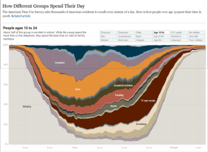
https://www.bls.gov/tus/charts/students.htm
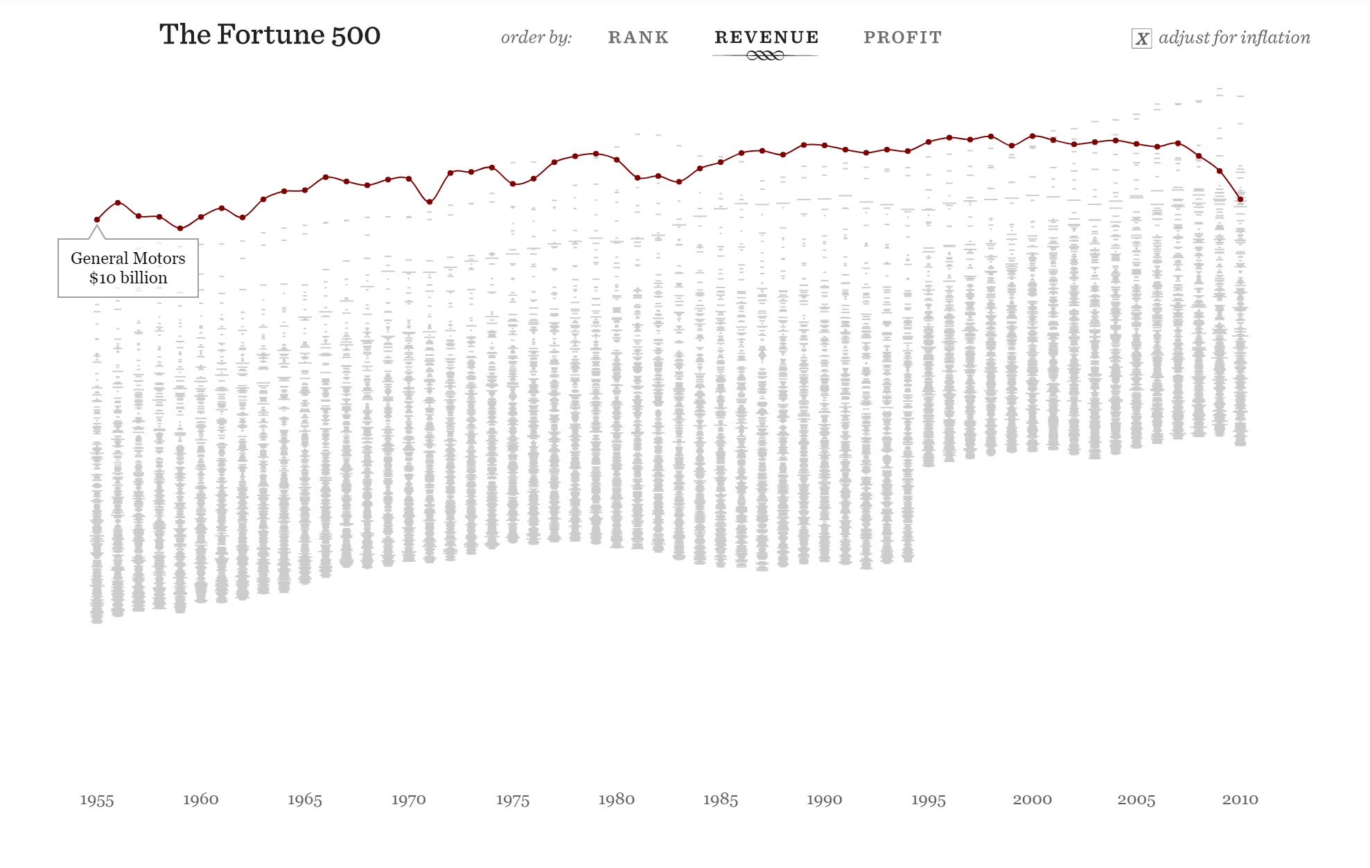
https://fathom.info/fortune500/
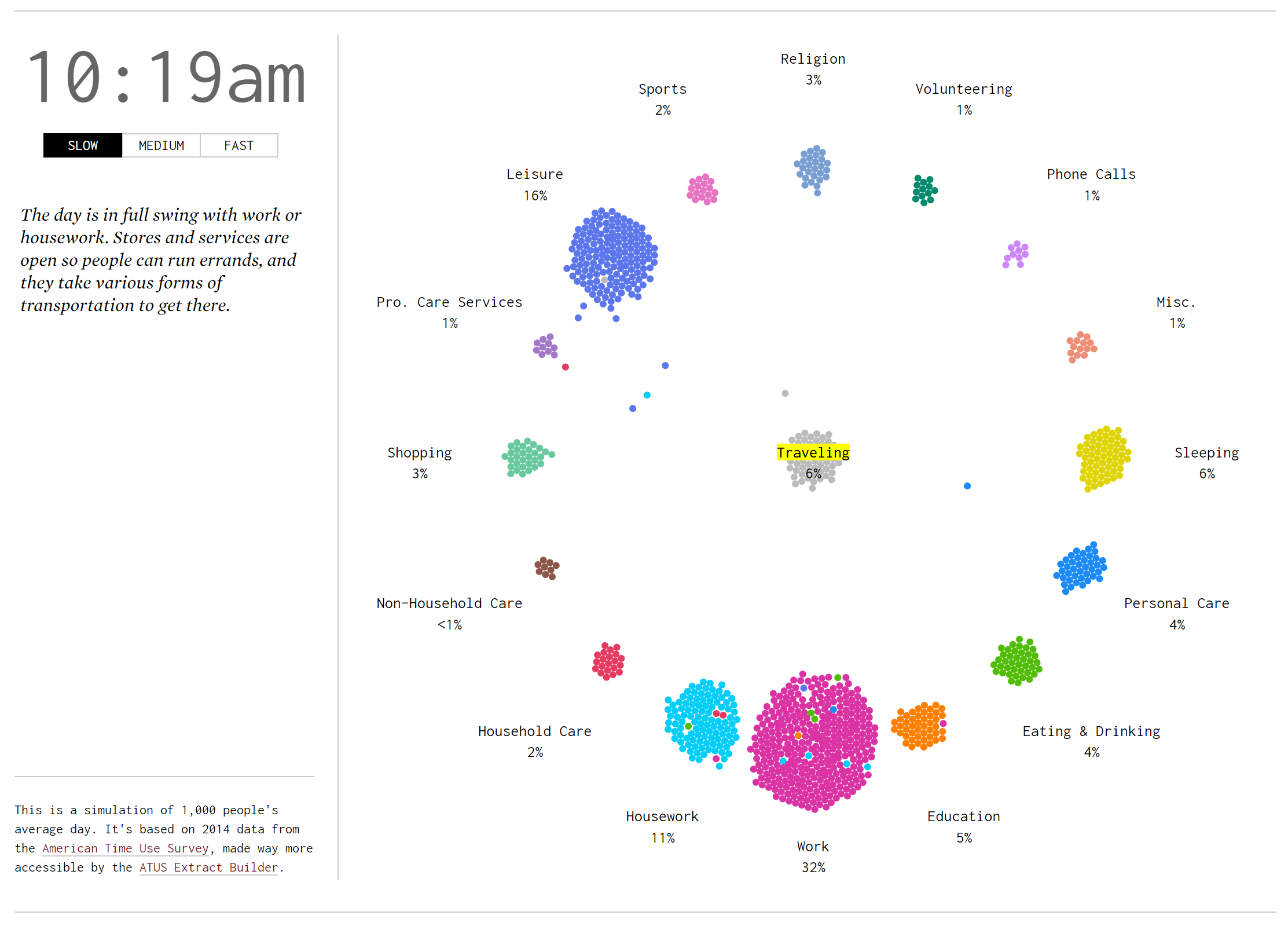
https://flowingdata.com/2015/12/15/a-day-in-the-life-of-americans/
[gview file=”http://humn2702018.blogs.bucknell.edu/files/2018/03/presentation-for-32F62F18.pptx”]
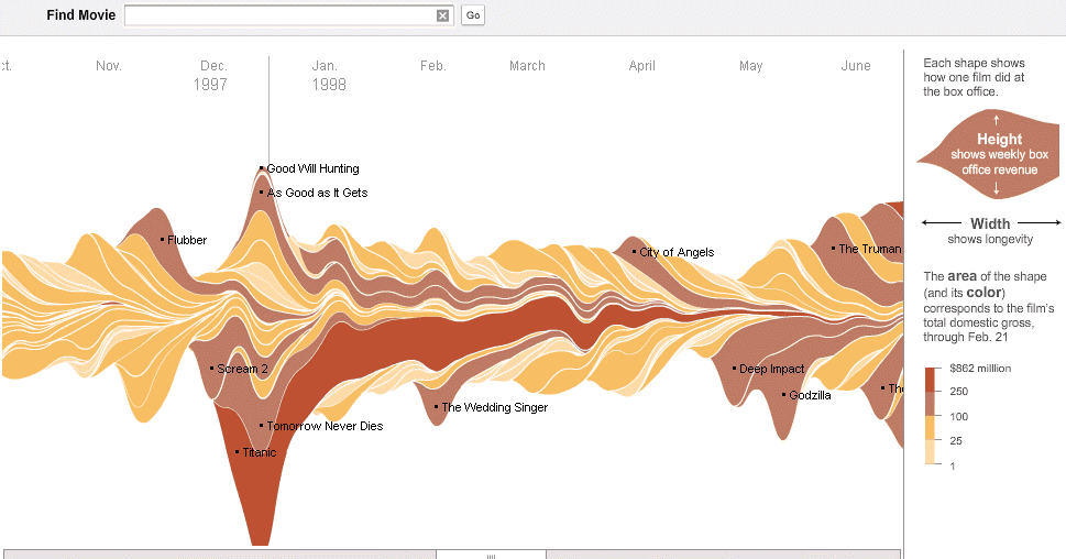
I chose this stacked flow visualization regarding ticket sales because I think it would be rather illustrative in the context of my data. I believe I could select one or more journalistic publications and collect information regarding the volume of articles written about Penn State over the course of several months, beginning in November 2011. In order to separate out layers as shown above, I could potentially differentiate articles by subject (ex: Sandusky, Paterno, football program, university, etc.) and see how volume ebbs and flows over time. I believe this visualization would help to depict the nuance of the narrative of scandal I am looking to depict. For example, I believe certain subjects will have their volume increase at certain points, showing turning points in the scandal (ex: Paterno’s volume will likely increase around the time of his death or the publication of the Freeh report).
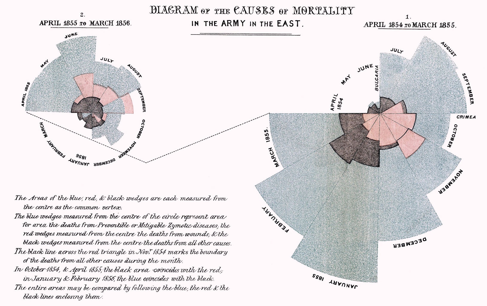
Florence Nightingale’s radial diagram could also be useful in visualizing the time dimension of my data (article publication date) as the pedals can expand to show volume, but also be broken up into actors, similarly to the layers of a stream graph. In addition, the circular layout of the visualization implies a repetitive aspect that would be interesting to incorporate should I choose to compile volume data for more than a particular year.
a.) My corpus is from one of the pre-packaged sets that Professor Faull gave us as an example. While this may seem like an easy way out, I have always had a vested interest in civil rights. Growing up in Birmingham, Alabama, and having grandparents who lived there during the 1950’s, I have always been interested in the civil rights movement in the United States. Also, I am half Palestinian. My grandfather on my mom’s side came to the U.S from Ramallah Palestine when he was 15 after his family was removed from his house at gunpoint by militants. Having been told his story from a young age, the issue of human rights has always been one I have been passionate about. All of this being said, I am still working on adding to my corpus, but for now I spent a good amount of time analyzing what I have in Voyant and Jigsaw.
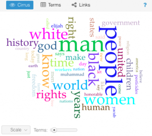
b.) Voyant provides many different ways to interact with a vast amount of text, I had a lot of interesting thoughts while playing with my data input. One of the first tools that shows up when one uploads their corpus is the “Cirrus” tool. It shows a puzzle-like picture of words where size corresponds to frequency of mention within the entire corpus. It gives an idea of what the central words in a piece or a set of works may be, but it is not an end all be all for the message as it’s simply a frequency representation. Below is the Cirrus for my entire corpus.
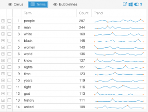
Another part of Voyant that I found interesting was the “terms” visualization. It shows the most frequently used terms in a list, but then on the side it shows relative frequency and trends for which documents they were most often used in and at what point in those documents. It is shown below as well. I found this very interesting as it’s not necessarily a takeaway one would have or even contemplate when reading the documents themselves.
c.) I found Jigsaw to be interesting in a very different way than Voyant. I felt as though it was pushing me to make connections between aspects of the texts, as well as the individual texts themselves. The word tree tool was fascinating as it allowed me to gain perspective on the context in which words were being used across texts throughout the corpus. For example, below is a screenshot of what happened when I searched the word “People”, which as voyant shows above, is the most often used word throughout the corpus.
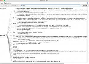
As can be seen, this image shows tons of different and unique uses of the word people in the corpus, and even this plethora is only 15% of the total usage overall. I also found the document grid viewer very thought-stimulating as it allowed the user (me) to sort the documents based on importance for a variety of factors.
d.) Maybe I am biased because I have likely spent more time with and have a greater understanding of how to use Voyant, but in my opinion its interface is so much more user friendly than that of Jigsaw. It presents easy to read menus and tools with adjustability of features without having to x-out of one window, research a word, and open a new window to see a new visualization. There are some levels of detailed text analysis that I thought Jigsaw was useful for to supplement the limitations of Voyant, and perhaps those are magnified the deeper one goes into analysis, but I found most of the things I wanted to do on Jigsaw, I could find similar data presentations on Voyant in more user friendly ways.
e.) I think that working with these two platforms has greatly contributed to the “multidimensional viewpoint” as Clement put it. I feel that I have garnered insights about these sets of textual data that I could have never surmised simply from reading each individually. The ability to visualize large sets of the data in quantitative and qualitative graphs, tables, etc. allows for a more comprehensive understanding of the meta characteristics of the corpus. It also sheds light on what may be “plausible truths” about the texts and works that would otherwise go undiscovered.
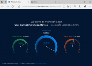
This is one is bad because the visualization is not to scale with the numbers. At quick glance, Microsoft Edge seems to be much faster than both its competitors. In reality, the raw numbers are pretty close.
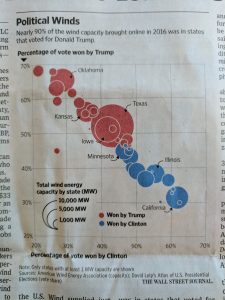
This one is bad because the graph gives no context whatsoever. I have no idea what this graph is trying to convey. Something to do with how each candidate won their respected states? It is hard to decipher.
I chose the following two visualizations because they stood out to me as being poor visual representations of data. The first (how india eats) has percentages that appear to be supposed to correspond to fractions of a circle that are not proportionate at all. The second (peak time for sports and leisure) is incredibly confusing in it’s nature, and although it was rather clever when I was able to finally decipher it, it took almost 10 minutes which is far too long for most readers hoping to see and understand quickly.

