Categories
Uncategorized

Work Flow for Moravian Lives

Flow Diagram of Work

Marleina Cohen, Student Researcher

Jess Hom, Student Researcher

Prof. Katie Faull, Moravian Lives, PI

Carly Masonheimer, Student Researcher

Carrie Pirmann, Transkribus Manager

Dr. Diane Jakacki, Encoding/CWRC Manager

Bhagawat Acharya, Student Researcher

Mike McGuire, Programmer

Leo Botinelly, Data Management/Database

Justin Schaumberger, Student Researcher

Prof. Brian King, Deep Learning, Computer Science 

[iframe width=”100%” height=”600″ src=”//jsfiddle.net/katiefaull/f9megqk8/53/embedded/result/” allowfullscreen=”allowfullscreen” allowpaymentrequest frameborder=”0″][/iframe]

Flow Diagram of Student Funding

  • Undergraduate students all paid through internal Bucknell funds/institutional grants
  • Bucknell’s Humanities Center funds:
  • Mellon AY Fellow
  • Faculty Academic Fellow
  • External Funding applied for:
    • NEH (x2)
    • APS
[iframe width=”100%” height=”600″ src=”//jsfiddle.net/katiefaull/81ovuyas/28/embedded/result/” allowfullscreen=”allowfullscreen” allowpaymentrequest frameborder=”0″][/iframe]
Categories
Final Project Uncategorized

Final Project Reflection

Final Project Reflection

Final Artifact link

Research Question

Sir Arthur Conan Doyles’ collection of works that create the original canon of Sherlock Holmes is considered some of the greatest detective fiction ever written. It’s influences can be seen in mystery stories to this day. Holmes and Watson are household names that everyone comes to know at some point. This effect is not excursively form that original canon however. Its many adaptations are just as important for keeping the stories and concepts alive. This is what as known as a stories afterlife, and can in many cases an afterlife of great magnitude, such as this one, can give rise to just as much mythos as the original. One fun fact I found while completing this project was that the infamous Deerstalker cap and Calabash pipe that Holmes was famous for were never even mentioned in the original texts, stemming for the noteworthy plays done by William Gillette.  This is just one example of how a work can be influence for neither better nor worse over time. In those adaptations however, some things were lost and gained, tropes formed and left behind all together. One hundred years of retelling can change a perception of a character dramatically. My goal of this project was to see how Holmes’s stories have changed over the years from a tone standpoint. To do this I did three things.

  • First, I used analyzed the tone of the original work and read about the portrayal of Holmes within it
  • I then would compare this to the tone of the adaptation  in Voyant
  • Lastly I would take note of the reception of the adaptation to see if people accepted this a the ‘new’ version of Sherlock Holmes


Methodology, Platforms, and Issues

After landing upon this goal, my first step was finding the adaptations that I wanted to work on. After doing quite a bit of research into plays, old tv shows, and forgotten movies, I found that getting a proper script or transcript of the production can be very difficult. After giving my computer probably more than one virus I decided to tailor my approach. I would go with the most popular Sherlock Holmes works , find their adaptations, and then use those which had public domain or easily accessible scripts or texts. I also already had all of the texts from the novels thanks to Project Gutenberg and my previous work with the Sherlock Holmes’s canon. My final approach ended up being a combination. For the meat of the project I decided to focus on the most successful novels since they have been thoroughly adapted. I also finished the slideshow with a overall view of the project

My next step was deciding on appropriate platforms for my project. I knew from the start that Voyant would be a very handy tool for as I was primarily analyzing texts. In the end Voyant would be one of my favorite aspects of my project as it was seamless to embed and looked gorgeous with no tweaking to it. The way I used Voyant was to give the reader something easily digestible upon first inspection of a work. It allows the reader to get a loose understanding and form and preconception of the adaptation or original work that they can then use to guide their thoughts when looking at the slightly more complex visualizations. This was not the main focus on my idea at first, but the way Voyant seamlessly embeds into the slideshow cannot be overstated and it adds another level of interactivity.

I also knew I wanted to do a timeline since the concept of an afterlife went hand in hand with a timeline. Luckily we had already worked a lot with Timeline JS which was the perfect platform for my project. Timeline JS is an incredibly user friendly platform that saved me a lot of time that would have otherwise been spent formatting websites. My biggest issue with timeline JS, and this is really an issue with my concept, is that a chronological layout makes sense at first, but limits my ability to control what the user sees, and that can lead to some jumbled information being reported and the visualization can lose focus.

Sentiment analysis became a problem in and of itself. Jigsaw never looked very pretty to me and when I heard other students were using IBM Watson I decided that would be my tool of choice. IBM Watson was very hard to tame in its application form, I spent hours in terminal with curl trying to get it to work, but in the end had to use the default web version unfortunately. The web version felt slightly stripped down, but was enough for me to work with. It provided scores in a range of emotions that could loosely describe the tone of a body of text. I used these scores to judge what the over all impression the work would leave on a person and used that as my basis for tone.

With that figured out, my last step was how I would present my comparisons. After looking at our previous platforms I decided that Palladio would serve me best as a flexible, simple, and user-friendly platform that accepted unformated csv files. I settled on using the graph functionality of Palladio. I pulled the graph sit created to compare the tones of an original to its adapations.

My last platform became Google Fusion Tables. My data, while interesting, was not very complex. This meant two things, I needed somthing to make data that was not quite as flashy appear like that at a cursory glance from a reader, and something that could present that data cleanly and not over complicate it. This suit google fusion tables simple charts perfectly.

In conclusion, I found this project to be an learning experience for a CS major such as myself.  This class is well outside of my comfort zone, so I’m proud of what I’ve created. I tried to not draw too many conclusions on the visualizations I provided as I want them to speak for themselves, but I fell as if they show a clear deviation in the personality of Sherlock Holmes. My original goal was simply to explore whether this deviation existed and I think I succeeded on that front. Some critiques of my own process would be to become much more intentional with my research and plan my moves for the future, as I ended up doing a lot of research and wasting a lot of time with tools that I would end up discarding. My biggest downfall was that I think I failed to convey my own opinions of the subject matter in attempting to not force them on the reader, but that could be up for debate.I also feel that my major critique of my visualization is that it lacks interactivity on an immersive level outside of clicking through a slideshow, but other than that I feel as if the project turned out excellently.


Screenshots:


Timeline JS in google sheets skeleton

Palladio in action


Palladio tables

Google Fusion tables


Metadata in google sheets

Voyant example


Bibliography:

“Canon of Sherlock Holmes.” Wikipedia, Wikimedia Foundation, 10 Apr. 2018, en.wikipedia.org/wiki/Canon_of_Sherlock_Holmes.

extensive use of this website: https://www.springfieldspringfield.co.uk/

metadata: https://docs.google.com/spreadsheets/d/1kQfdooVqIRx9hcd1z4Ot3XFDQILRTtcI6GapqkF3x0I/edit#gid=2047249578

timeline js skeleton: https://docs.google.com/spreadsheets/d/1MF4i-mdUfti8Li1FNT1O65a-WFFPa16ZUhUfkWwzVuw/edit#gid=0

voyant : http://voyant-tools.org/

palladio: http://hdlab.stanford.edu/palladio-app/#/visualization

ibm watson tone anaylzer


Categories
Uncategorized

Final Project Luke Hartman

Research Question: Are the overlaps in the text patterns/word choice of these speeches definitively associated with gender, nationality, location, or date?

Process:

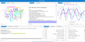
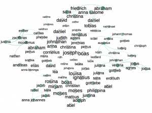
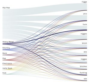
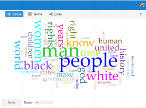
This question has evolved a good bit from the first time I interacted with this data corpus in the first two weeks of school. The first thing I did with this data at the beginning of the semester was to upload the entire corpus into Voyant to learn how to use the text analysis platform. The visualizations I was able to produce were very interesting and informative and I knew they could be useful for my final project if I was able to do more work with them. One that particularly intrigued me was the “Cirrus” tool which showed the most often used words throughout the corpus, displayed with relative frequency corresponding to size of the word. It is the interactive image embedded on the “Most Common Words: Overall” slide in the overview section of the timeline. A screenshot is embedded below for reference, although the timeline view is preferable in my opinion as it is interactive.

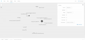
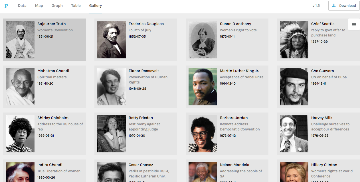
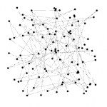
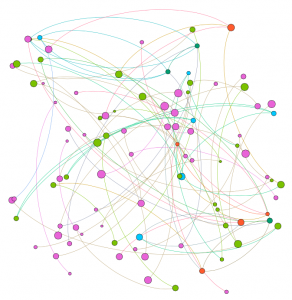
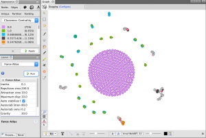
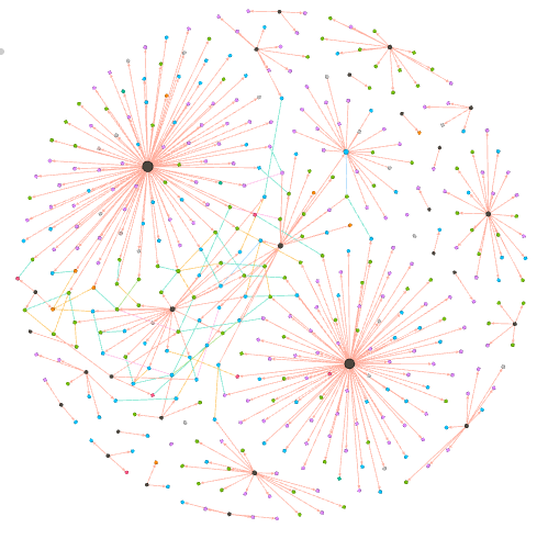
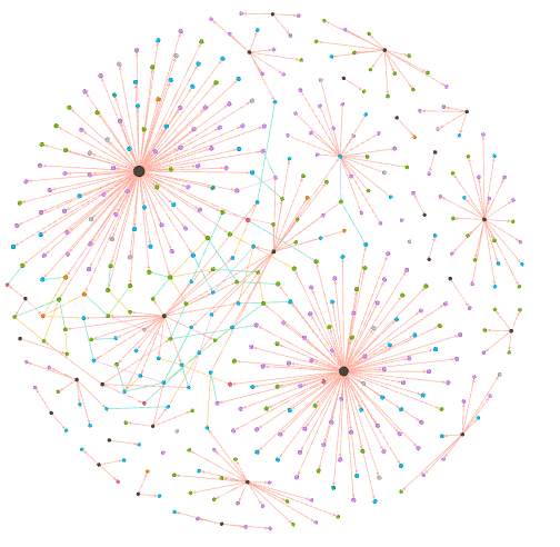
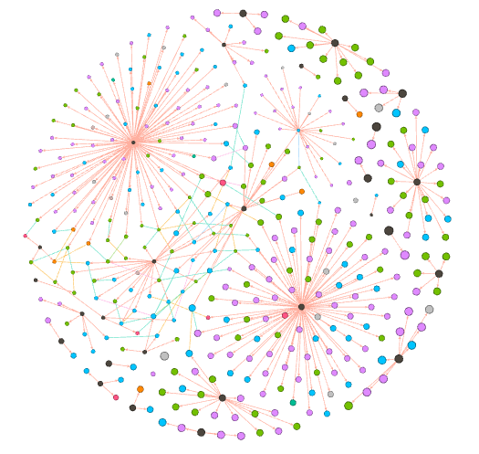
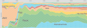
I knew that I wanted to continue working with this data even from this early point, but I wasn’t sure how to formulate a meaningful research question. When we used Palladio in class, I was able to create a visualization that displayed each of the authors of the speeches with pictures next to them for easy identification, as well as with text snippets about their speech topic and dates/locations of delivery. This was, in my mind, something that could be very useful for my final project as it would give the viewer an overview of the corpus provided baseline knowledge so that deeper text analysis from each speech would be more meaningful. This would allow me to ask a fairly specific research question, but not leave a viewer feeling confused or hopeless for where to start due to a lack of underlying knowledge about the topic. Below is a picture of the said Palladio Visualization.

That being said, my goal for this project was to produce what Hanna Drucker calls a “knowledge generator” in the form of an interactive learning experience for the reader. Because Palladio does not allow for it’s interfaces to be embedded on a third party website, and I felt that a screenshot would not be engaging enough, I had to go another route. Using Knight Lab’s Timeline.js template, I was able to create a timeline that includes data points for all 20 speeches on the dates they were delivered/published (if written statements). The timeline also includes 20 separate data points in another category that have bio’s of the speaker, lending a bit more to their background and giving the viewer context to help interpret each person’s speech with.

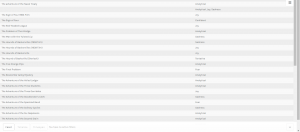
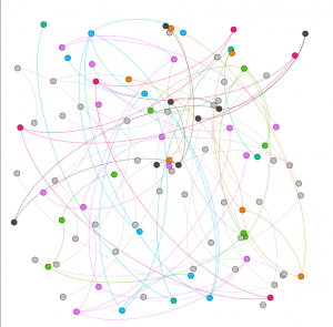
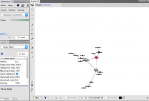
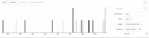
One of the initial problems I ran into on the knight lab platform was the ability to differentiate on the timeline itself (see bottom of image) between info that contained speech descriptions and visualizations, and those that contained bios and pictures of the authors. Initially I began trying to find new ways to name the slides so that they would be distinguishable, and even contemplated trying to put all the information (bios, and speech text analysis) on the same slide in order to avoid confusion. What I was able to do instead however  was a best of both worlds solution; I categorized certain data points into groups using an added feature called media grouping/type, thus separating them on the timeline. A screenshot is visible below.


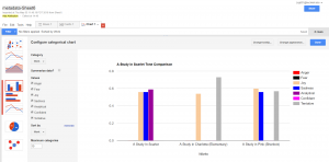
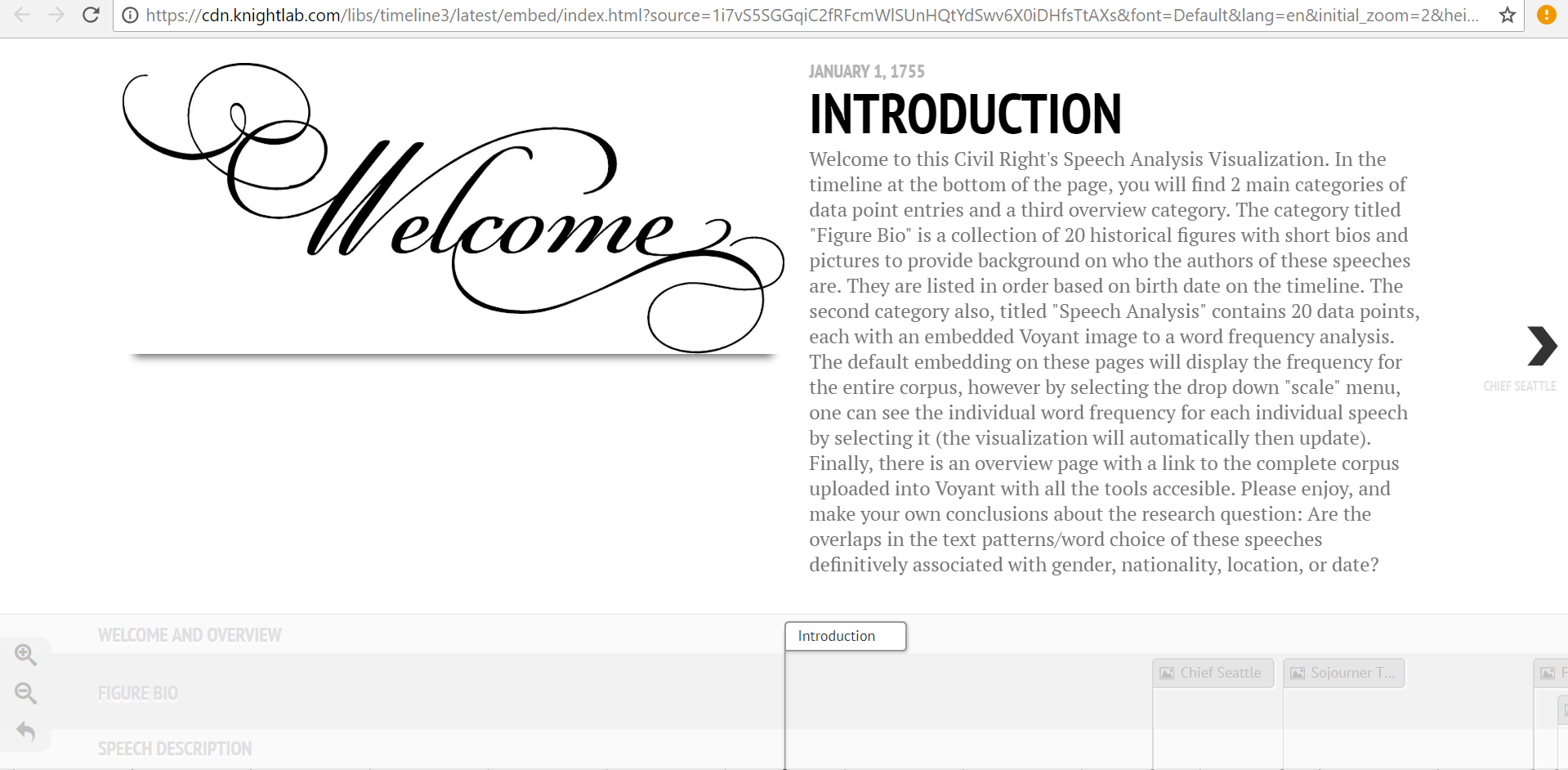
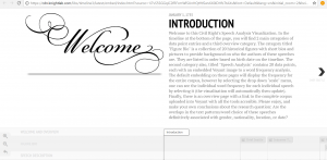
This fix was ideal in many ways, but it also presented a new set of problems. With two sets of data points, I needed to find a new set of images to help convey the speech analysis aspect of the 20 slides. I decided that a relative frequency graph that displayed the most frequently used words in each document and how they were used at different points throughout would provide a good standardized comparison between speeches. The issue was that the Voyant link for this visualization, when embedded, automatically reverts to the graphic for the entire corpus. Therefore, I linked this to each speech slide, and added a detailed note in the introduction section informing readers of how to view the individual frequency graphs for each speech as well as how to compare them using the drop-down menu. In the end, this was a frustrating setback, but it led to the creation of the intro slide, to which I then added other descriptive information about the nuances of the project. This was needed for more than just the details of the voyant interface, but I was unable to recognize this flaw until the “setback” previously mentioned made me aware of it. The intro page welcomes reader, outlines the layout of the site, mentions technical stymies the viewer may run into, and then presents the research question in a clear way that “gets the ball rolling” for the reader’s thoughts on analyzing the data. A screenshot of the Intro page is below.


Personal Conclusion:

My biggest takeaway from this project has been how incredibly difficult it is to draw conclusions based on text analysis alone. There are so many variables that have gone into each one of these speeches, from date, location, ideology of speaker, race, social context, cultural tone differences, and many more. One trend I did find more consistent than others was a tone of aggression from the African American Speaker’s in the corpus (with the exception of King’s Nobel Peace Prize Speech). I also realized that this tone recognition was far more apparent to me in the text analysis visualizations after having read the speeches which led me to recognize the limitations of Voyant in terms of “sentiment analysis.” This could be a good place to use Gephi for the same data if I or anyone else wanted to delve further into this analysis. As far as location and date, I was unable to draw any significant conclusions from the textual tendency similarities/differences of speeches with similar inputs.

Possible Improvements/Redesign/Reflection:

After completing a long project, I always like to reflect on the ways I could have improved it, and note all the things I realized I should have done differently once I was a ways to far down the road to go back and change it. The first of those things for me was that I wish I had defined my research question earlier so that I was more aware of how I could have used the platforms we tried in class to answer that question (for example how I mentioned sentiment analysis with Gephi).

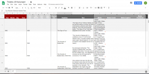
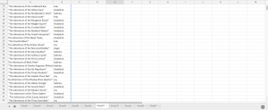
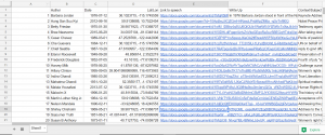
The other main aspect of redesign would be for me to keep much better track of ALL of my data from the beginning.For example, I gathered all the locations of the speeches one by one very early in the year, and then I input them into a google program that translated them to latitude and longitude. This was very helpful as it allowed for easy input into palladio, but I lost the locations in text form. When I decided then for this project that I was going to do write-ups on each speech… you can see the issue I’m sure. I wanted to include location naturally, as that was a defined category in my research section, but I had carelessly lost that data in a meaningful way, thus I had to go re-find it. When completing a long project like this, things like that can be defeating. Unfortunately, this wasn’t the only scenario like that as I did the same thing with looking up the dates of the speech, and then choosing to also use author’s birth dates when I went to separate data points for bios and text analysis. It’s a lesson I will not forget again when doing data analysis. Never write over anything, just make a new column; you never know when you might want that data in that format again even if it seems useless to you now. The overwrite mistake can be seen in the screenshot below (notice, lat/lon, but no english language location).

That being said, I am very pleased with how this ended up, I made a lot more progress than I thought I would and my final product on timeline is far more polished than I thought it would be when you first introduced the idea of me using this platform. Thanks for all your help, and I hope you enjoy this visualization!


Link to Timeline.js Site:

https://cdn.knightlab.com/libs/timeline3/latest/embed/index.html?source=1i7vS5SGGqiC2fRFcmWlSUnHQtYdSwv6X0iDHfsTtAXs&font=Default&lang=en&initial_zoom=2&height=650

Voyant Link:

https://voyant-tools.org/?corpus=196d419a39af8bde45a5cabb6afbf8da

Timeline Excel Template Link:

https://docs.google.com/spreadsheets/d/1i7vS5SGGqiC2fRFcmWlSUnHQtYdSwv6X0iDHfsTtAXs/edit#gid=0

Preliminary Corpus Info Link: 

https://docs.google.com/spreadsheets/d/1qVLefIlz_z_GGl8YJkAcJGqpx8lqMKinO_KNXFVnKxo/edit#gid=0


Categories
Uncategorized

Assignment #5

Our group worked within the Baptized Indians database, which was confined to sections ID 175-225. We then compiled this data into the Gephi program to create visualizations to interpret the information. This platform was difficult at first but it became helpful with establishing connections. Using the data laboratory, we created 86 edges and 97 nodes which exemplified the relationship connections of our sample group. I must admit, we ran into a bit of trouble when we were creating the edges as the metadata had some error within the connections. We scanned all numbered individuals to locate spouses, children, etc. however, there were some connections that were impossible which we could not create that edge to be connected in our visualization.

original raw dataset

At first, when we viewed our data in Overview, it didn’t seem very meaningful without any labels or information. However, once we started to experiment more within the tools, we began to make progress. The first appearance change was made by selecting “modularity”. This added color to the dots which showed us the comm

modularity appearance

on relationships. This gives the viewer a clearer understanding with the connections and relationship between communities. This visualization was a minor change that made a significant difference in data recognition. Next, we decided to switch the size of the nodes according to class and rank to further support the similarities. This implies that Christianity began to expand and spread throughout society. The main component was marriage and the interesting connection was seen through certai

node size enhancement

n nodes that connected twice to certain colors(blue and orange). In the data, there were individuals who had endured two marriages, being that they were divorced at one point. After playing around with the program, we explored the degree and eigenvector centrality which the data results changed but the appearance wasn’t altered much. Eventually, we came across noverlap which had labels and showed a different connection which


we were more accustomed to when viewing data information. The visualization shows their names and the various relationships between each baptized person. This indicates how each person is related or how they come in contact during some point of their lives. The color of the node revolves around an individuals relations with a certain number of people. We tended to gravitate towards this style more because it was clearer to understand and mapped out the community overlap that symbolizes the more important groups of people. Using this visualization along with the edge labels would help a person understand the relationships created and the relations between communities that have been created through marriage or the birth of a child. Overall, I’d say that Gephi was very helpful to our assignment. It allowed us to visualize a group of people in a creative way that brought many of them together. It’s always warming to create graphic expressions that tell a story without much text that we are accustomed to. It took us a while to understand the concepts and tools with using Gephi. There were some networks that didn’t run properly but we never gave up in trying. Also, the collected data translated into color coded was beyond helpful to distinguish certain levels and communities. Compared to the other platforms we used in the past, I would say that this was the most challenging and wasn’t very beginner friendly. Because of this, we didn’t uncover all the results that we hoped for but that’s fine because we learn a lot about ourselves and the power of visualizing. It was fun to play around and run test that generated different information, however jigsaw and voyant was easier to operate in which we could create visual masterpieces. However, it like we learned, it doesn’t always have to be cool or an attractive graph, as long as it is meaningful and could be interpreted by an audience.

Categories
Uncategorized

Assignment 5 Luke Hartman

Luke Hartman– Assignment 5

The purpose of this assignment was to become capable of using Gephi through an analysis of the Baptized Indians Database. I created a worksheet in Gephi and input the 376 names of Indians as nodes, and then created edges  (82 in total) for the names of Indians with ID numbers 225-274. The edges represent connections between Indians within the database with the edge source as the ID (225-274), and the target as the other related person. As is evidenced by the 82 total edges, some of the 50 Indians had multiple connections and thus multiple source-target edges created for their singular ID.

I also distinguished inter-generational relationships by using directed vs. undirected edges. For example, if the source was the son, and the target a mother or father, the edge was directed to show a generational gap. If the source-target relationship showed brothers, sisters, spouses, etc., it would be undirected.

When I initially put the information into Gephi, I was lost to say the least. Below is a screenshot of what the default visualization showed.

As one can see, it is very jumbled and does not show anything discernible at this stage. The next step I took was to run the modularity program that showed nodes grouped by communities allowing me to identify niches within the larger group. I then ran a program called Force Atlas that moved the communities to the outside edges of the data set in the visualization and I set the size of the node to correspond to “degree” which is a measure of how many people a specific person or entity has interacted with other members of the community. The color of the node also distinguishes related communities and relative proximity within the graph shows overlap in groups. This produced a very interesting visualization shown below.

While recognizing that this graphic had value in it’s principle structure, I struggled a bit with how to discern more meaningful comprehension from it because of the overlapping nodes and the lack of visible edge connections. In light of this, I increased the distance factor in between all the nodes in the graph for easier viewing, and then colored them based on closeness centrality, which is a measure of how close one node (or member of a community) is to all the other nodes in the network (or all the other members of the community in this case). Below is the result, followed by a zoom on one specific section of the graph.

(Bottom Right of graph is zoomed in on)

This zoomed in view has many of the desired qualities of a visualization I hoped to create when I began this project. First, the node size is visibly larger corresponding to the total amount of connection each person has in the network. The color of the nodes correspond to values between 0-1 listed in the chart in the top left of the first picture shown above and they display closeness centrality of each node. Next, each edge is shown as a thin line connecting nodes, and the directed edges have arrows at the end which represents a generational difference. This is extremely  informative as it allows the viewer to see the three brothers at the center of the community and then discern the relationships of all the other people in the network just from the graphic. If edges were created for all 376 nodes, this would be a great way to visualize many complex and interwoven connections within the larger set of data.

Overall the ability to use Gephi is something I certainly value. I definitely struggled with it and got frustrated at times but I learned a lot and when I finally made some progress it wasn’t difficult to see the value in the tools the platform offers. I feel much more equipped to tussle with complex and layered data given my knowledge and experience with this assignment and program, who knows what it will be useful for in my life and work going forward.

Categories
Assignment 5 Uncategorized

Adams Assignment Five

     In quoting Ben Schneiderman, Isabel Meirelles opens her chapter on network design structures by articulating the positive attributes of these types of visualizations, “‘Social network analysis complements methods that focus more narrowly on individuals, adding a critical dimension that captures the connective tissue of societies and other complex interdependencies’” (Meirelles 47). Throughout my experience learning Gephi by using the Native American baptismal database, I have found this program to be incredibly helpful in painting this picture of “interdependencies” and relationships that is difficult to see by looking at metadata alone. Unfortunately, gaining a true understanding of the relational characteristics Gephi is capable of visualizing takes a certain amount of discipline in avoiding the mutual exclusion of visualization and analysis. While Gephi does not necessarily “hide” anything in terms of calculations, as users are offered an intimate look into what is being done when statistics are calculated or force-directed layouts are implemented in visualization, this opportunity to truly understand how data is being translated is easily ignored by individuals caught up in the “click-aha!” trap that is so common with digital visualization platforms (for example, when using partition tool to color and size nodes or manipulate edges). In this way, my experience with Gephi harkened back to Elijah Meeks’ work: “…I spent my time teaching folks how to use Gephi, and I tried to spend some time telling them that the network they create is the result of an interpretive act. I don’t think they cared, I think they just wanted to know how to make node sizes change dynamically in tandem with partition filters” (Meeks 2). This experience of Meeks’, which I perceive as an all-too-common one for those working in Gephi, also opens the door to some of Johanna Drucker’s skepticism, “So the first act of creating data, especially out of humanistic documents, in which ambiguity, complexity, and contradiction abound, is an act of interpretative reduction, even violence. Then, remediating these ‘data’ into a graphical form imposes a second round of interpretative activity, another translation” (Drucker 249). Simply put, by tying my short time with Gephi to the writing of Meeks and Drucker, I was able to arrive at one of my most unavoidable critiques of Gephi: that the platform, hard as it may try to avoid this, allows users to ignore the fact that their data has humanistic, nuanced, and narrative elements behind it (although the Data Laboratory tab is helpful in keeping individuals from being too far removed from their database to begin with). Unless individuals take the time to slow down and understand what is going on when different statistics are calculated or relationships are generated, the true power of Gephi is rendered almost useless.


For reference below: Edge color key and proportionality

For reference below: Node color key and proportionality


In terms of my visualization, I chose to generate a relational network consisting of Native Americans and baptizers (nodes). These nodes were connected by edges representing both baptismal and kinship relationships (for individuals labelled in the database with Unique ID’s 26-75). In total, my multimodal visualization, which utilizes a force-directed layout based on the Fruchterman-Reingold Algorithm, has 404 nodes and 438 edges (with most nodes representing Native Americans and most edges being classified as baptismal). Once I created these connections in Gephi, I elected to color both nodes and edges with nodes being colored according to an individual actor’s nation (or “baptizer”) and edges by the type of relationship represented (for example, baptismal, marital, parental, etc.). The statistics that I elected to run in order to analyze the baptismal database were Degree, Modularity, and Eigenvector Centrality.

Visualization with nodes sized by “Degree”


Degree:

By using the “ranking” tool in Gephi to size nodes according to degree (not in-degree or out-degree due to some edges being undirected) I was able to glean several important conclusions from the network. I immediately noticed that the nodes representing baptizers were the most impacted by sizing according to degree (more so than Native Americans). Considering baptismal relationships make up a significant portion of the connective tissue of this relational network, running a calculation for degree shows how influential individual baptizers were in spreading Christianity (baptizers with high degrees, like Camerhof, Christian Rauch, and Marin Mack were more influential in the spread of Christianity than those with lower degrees, like Grube or Utley). The degree calculation, which shows the number of connections a node has, also introduced me to Johannes, a fascinating character in the story of the spread of Christianity. The node representing Johannes was noticeably larger than those of other Native Americans when size was dependent upon degree. This is because Johannes was not only a Native American and Christian convert, but also a baptizer himself. Therefore, he effectively helped to spread Christianity through baptismal relationships, not just kinship ties (which was a characteristic that distinguished him from the other Native Americans in the database).


Visualization with nodes sized by “Eigenvector Centrality”


Eigenvector Centrality:

Unfortunately, I did not find this statistic to be terribly enlightening while I worked in Gephi. I believe this is likely because a majority of the edges I have in my database are directed, baptismal connections. For this reason, the only members of the database that have a real opportunity of having a high Eigenvector Centrality are baptizers that are connected indirectly through the limited kinship ties I was able to generate (as these would connect well-connected baptizers to one another). In my visualization, this resulted in Martin Mack and Cammerhof (along with the Native Americans whom they baptized) to have the highest measures of Eigenvector Centrality, as their “baptismal worlds” were the only two that were brought into contact with one another through the edges representing kinship ties.


Visualization with nodes sized by “Modularity”


Modularity:

After sizing nodes according to modularity, I was faced with another interesting iteration of my network diagram. As can be seen above, the modularity calculation helped to present several “small worlds” hovering around the outside of my force-directed graph. Although I was initially confused by this image, I soon came to the conclusion that these small worlds likely would not exist had I manually entered edges representing kinship relationships for all Native Americans in the database (beyond just 26-75). In my visualization, some people may have artificially high modularity for this very reason (because baptismal connections are present but kinship are absent). Essentially, I believe I have created a visualization that contains satellite baptismal communities absent of the familial ties that could effectively deflate the modularity statistic.

Following from this, the fact that modularity is relatively low amongst certain baptizers connected to Native Americans with kinship ties present also helps to show the tendency of different baptizers to work with members of singular families (as well as cross national boundaries). This is due to the fact that multiple baptizers working with members of singular families (for example, spouses being baptized by different people) helped to generate a highly interconnected Christian network of Native Americans and baptizers and effectively eliminated the presence of “small worlds” in certain areas of the network (baptizers connect different families and limit isolation in the network).

Classifying edges proved to be extremely helpful in arriving at this inference, as it demonstrated that individual baptizers likely did not share intimate connections with specific Native American families. This is shown by the colored edges themselves, as kinship relationships visually represent connections between “small baptismal worlds.” (for example, spouses, brothers, sisters, parents, and children appear to be rarely welcomed into the Church by the same baptizer).

Categories
Uncategorized

Luke Compare/Contrast Timelines


Categories
Uncategorized

Timeline Visualzation

Categories
Uncategorized

Timeline visialization


Categories
Uncategorized

Timeline Visualization

Creating a similar graph

“How Different Groups Spend Their Day”

Employed

Everyone

People 65 and over

Hip-Hop Content