Category: practice
Homework 1
Interesting vizualizations
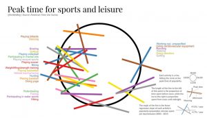
I chose the following two visualizations because they stood out to me as being poor visual representations of data. The first (how india eats) has percentages that appear to be supposed to correspond to fractions of a circle that are not proportionate at all. The second (peak time for sports and leisure) is incredibly confusing in it’s nature, and although it was rather clever when I was able to finally decipher it, it took almost 10 minutes which is far too long for most readers hoping to see and understand quickly.


Two Visualizations
2 Visualizations

Two Bad Visualizations

Principle of Graphical Integrity Violated:
- Representation of numbers should be directly proportional to numerical quantities
- This visualization utilizes a “lie factor” significantly higher than one to emphasize statistical imbalance (due to teams using five starters, it may also be more informative to show how Arkansas’ additional forty minutes of action was divided amongst its starters).
- Potentially utilizing “lie factor” to generate a justification for a predicted outcome.

Principle of Graphical Integrity Violated and Other Concerns:
- Clear, detailed, and thorough labeling should defeat graphical distortion and ambiguity
- Obviously, data is represented in an ambiguously relative fashion (with actual numbers being hidden)
- Difficult to say whether or not other principles are violated due to the lack of data labels or a key (cannot say whether or not data has been classified properly, etc.)
- May not even be an appropriate visualization based on data being represented, as shading is not necessarily always the best way to visualize singular quantities.
Two posts from viz.wtf
(1)

After the joyplot success, we must clearly rise again, for it's forgotten and less loved cousin. Behold: The depecheplot #dataviz! pic.twitter.com/h54jIuU9QU
— Henrik Lindberg (@hnrklndbrg) July 15, 2017

(2)

Two visualization selected


