Categories
Final Project Final Project

Final Project


http://humn270finalprojecthaipujunjie.blogs.bucknell.edu/

My research question has two parts. For my own part of the research, I want to discover how Trump’s tweets reveal Trump’s information. Are there any trends in his tweets? Are there any habits or routines of his that can be unveiled through his tweets? For the combined part of the research, Haipu and I are interested in finding more information after combing my data with his data, especially to figure out what he focuses most and what the news focus most and whether there is any relationship between his tweets and the news about him.

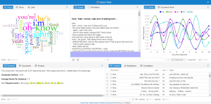
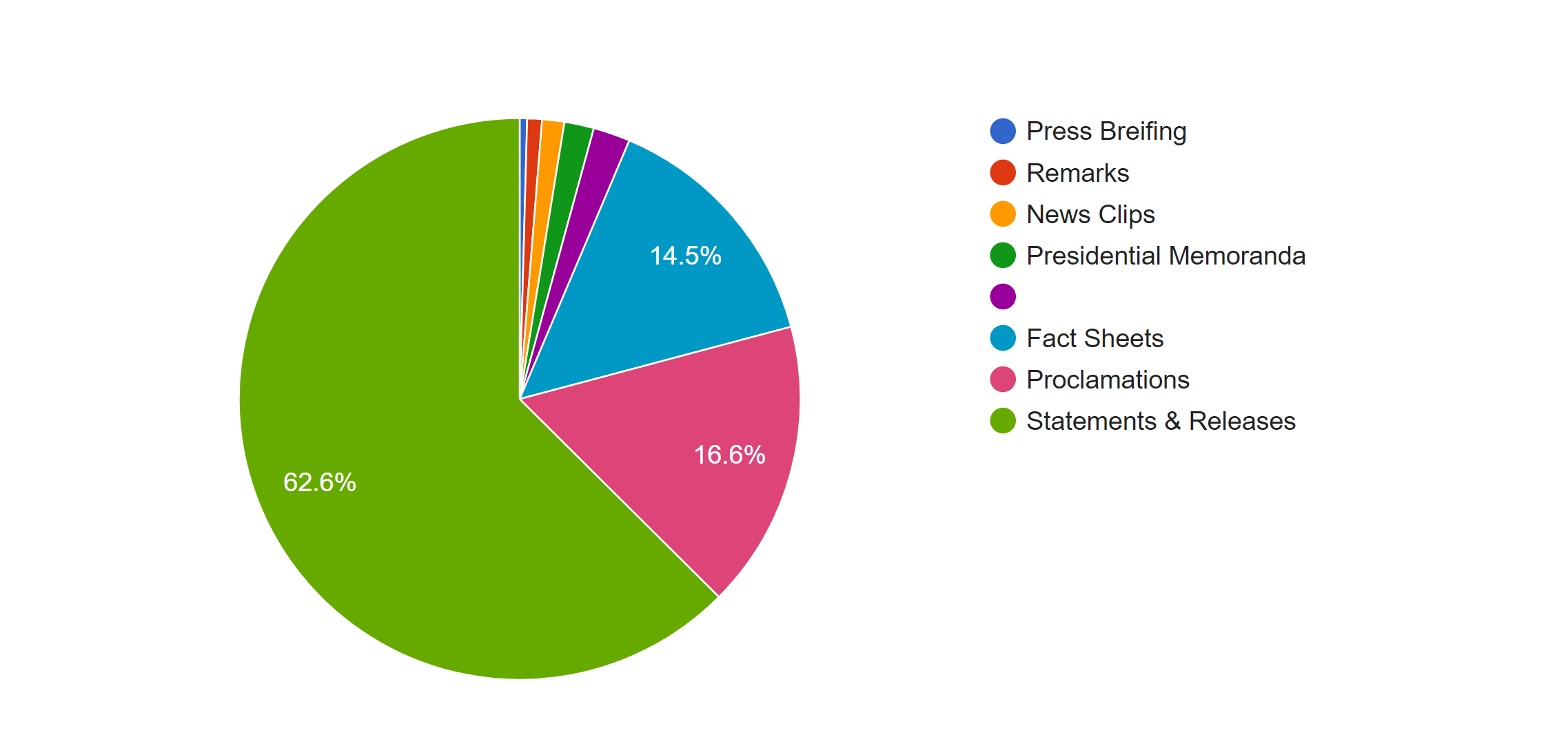
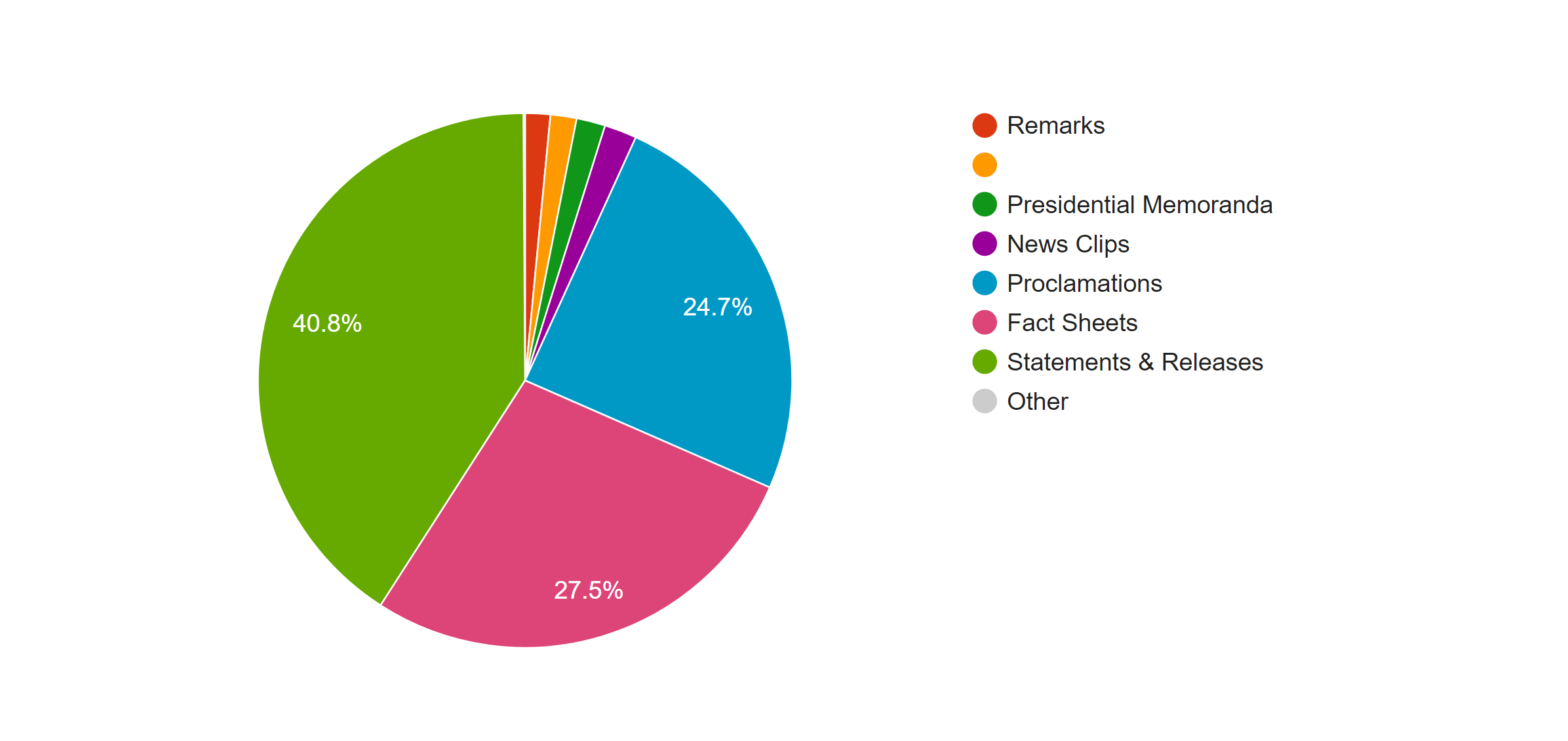
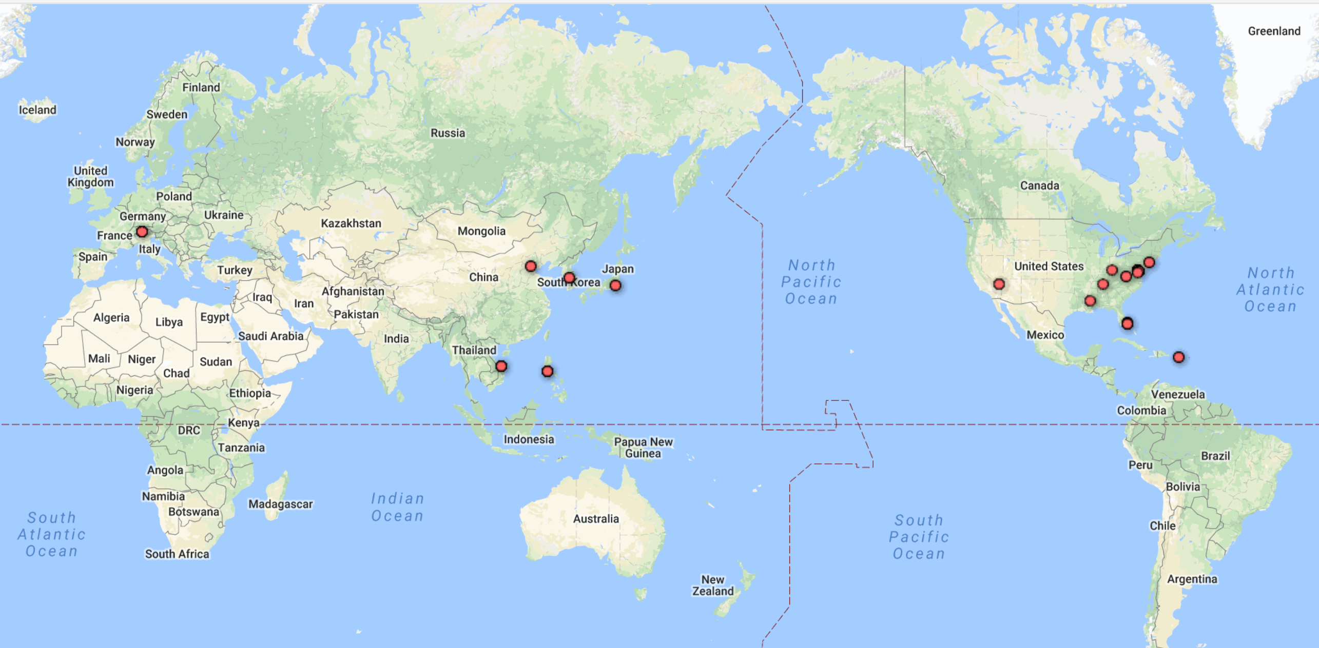
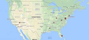
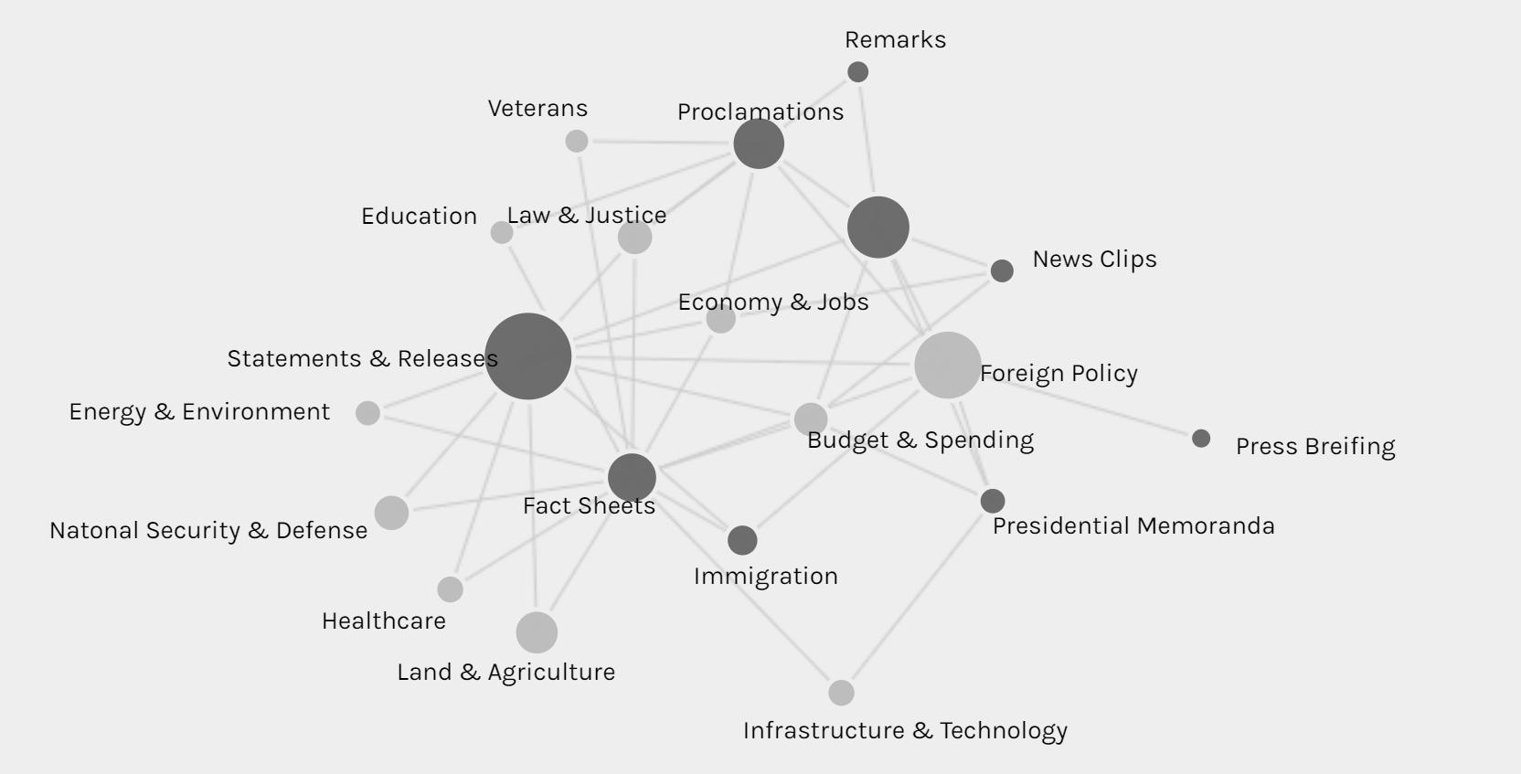
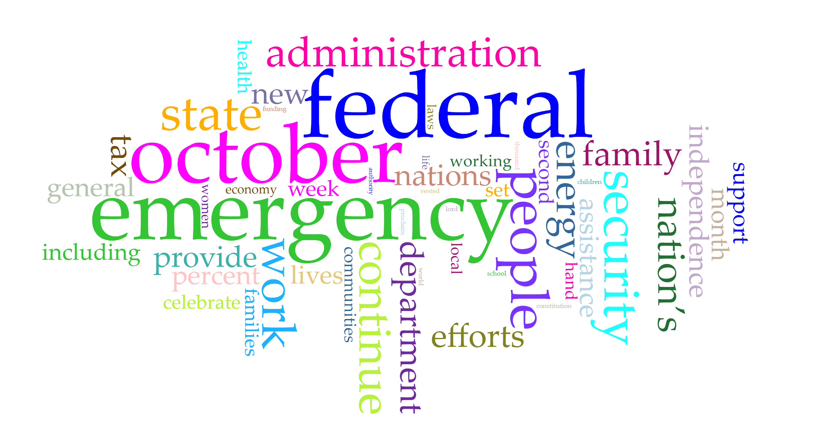
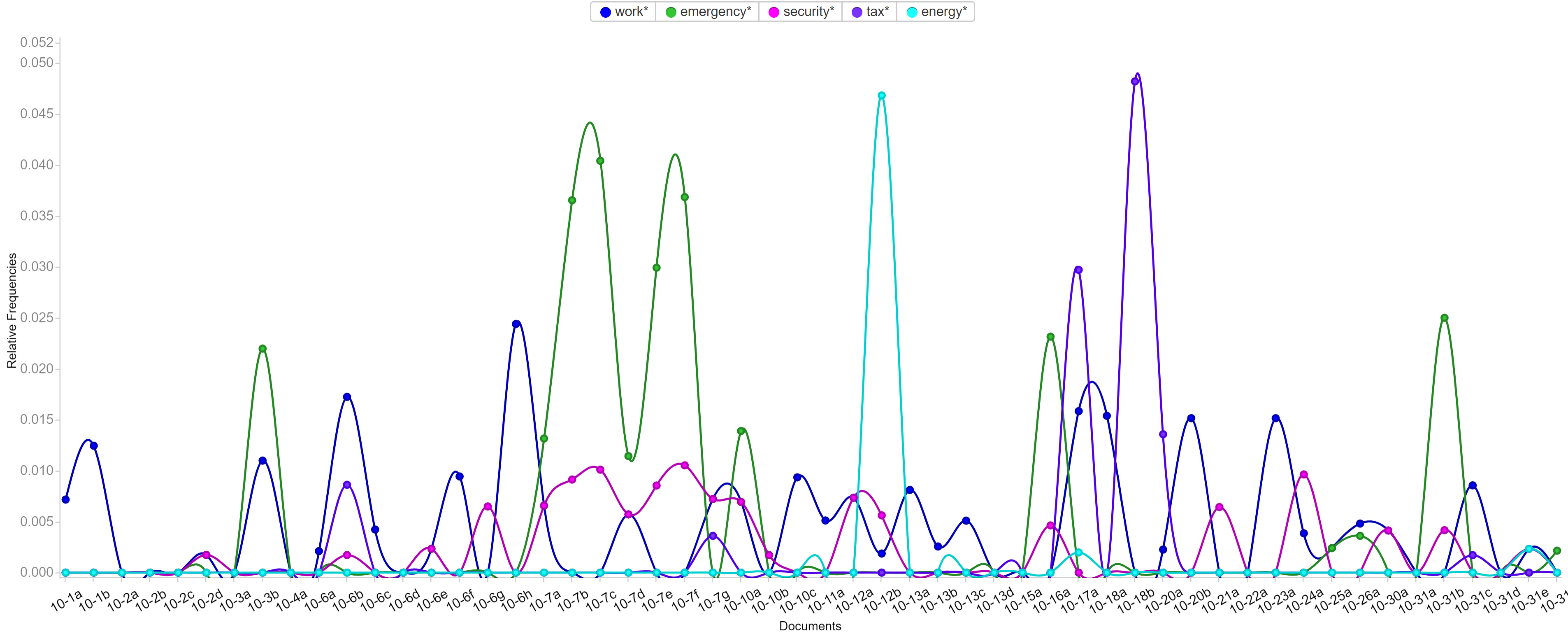
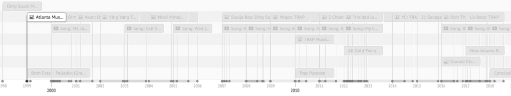
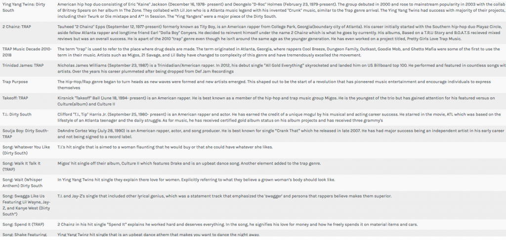
The methodology of my research is basically using python to write code for collecting raw data and extracting metadata. Then, I used Voyant and Palladio to analyze and visualize the data I collected. I used Voyant mainly for text file analysis and used Palladio for metadata analysis.

On the way to the final results, there are a lot of challenges and obstacles. Here are some problems that I encountered and finally resolved on my way.

The first step is to create my corpus. As a good base is crucial to a building, so is a good corpus to a data visualization project. The database I have will play an important role through my progress of the project. Due to my computer science and engineering major background, I decided to use coding methods to collect data from Twitter. Furthermore, since Trump is really popular on Twitter and a lot of people have concerns about him, I decided to use Trump’s tweets as my database. I spent great effort trying to collect the linguistic features and behavioral characteristics of him.

Code for collecting data for the corpus

With the reminder of Professor Faull, I noticed that metadata can also reveal a lot of information and may have unexpected positive effect when combining with raw data. Therefore, I wrote another piece of code for gathering and organizing metadata.

Code for preparing metadata

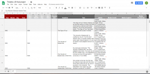
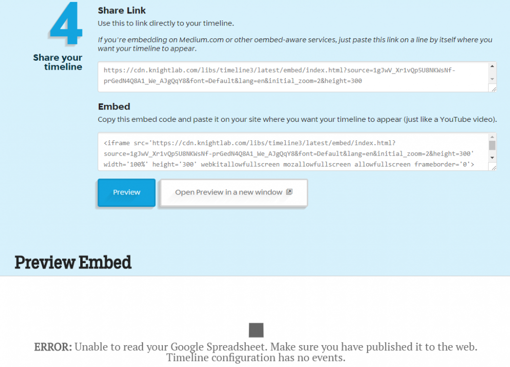
It’s not the end of the story of data collection. I used this corpus and database for assignment 3 and get some seemingly fantastic visualizations including graphs and timeline.

Palladio Timeline made from data with mistakes

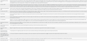
After assignment 3, Professor Faull pointed out that according to some analysis, Trump mostly posts tweets in early mornings. However, my data showed that he post tweets mainly in the night and afternoon, which lead to my attention. After careful analysis, I found that the timezone of the original tweets is UTC, which causes the problem. Therefore, I added the feature of timezone conversion to my code and finally solved the problem. Although the results still show that he post tweets mostly in the night and afternoon, I fixed the original error, thus eventually acquiring the final version of my database. If you compare the above and the below timelines, you can find various small differences. For example, on January 31st, the above timeline shows that there are 2 tweets posted while the below one shows that there is no tweet posted.

Palladio Timeline made from data without mistakes

Through this incident, I learned that it is really important to carefully progress in the process of data visualization. Reading Edward Segel and Jeffrey Heer’s article Narrative Visualization: Telling Stories with Data, I learned that as a storyteller, I am the intermediate between raw data and audience. Therefore, I should take the responsibility for interpreting data as well and correctly as I can.

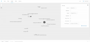
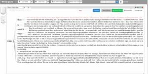
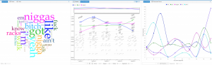
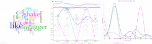
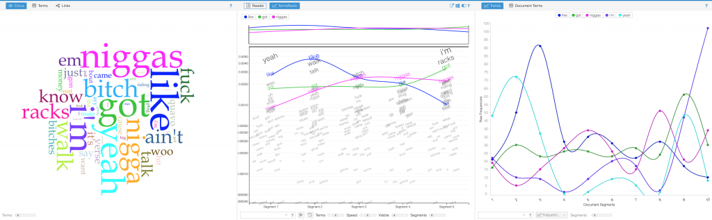
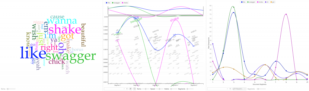
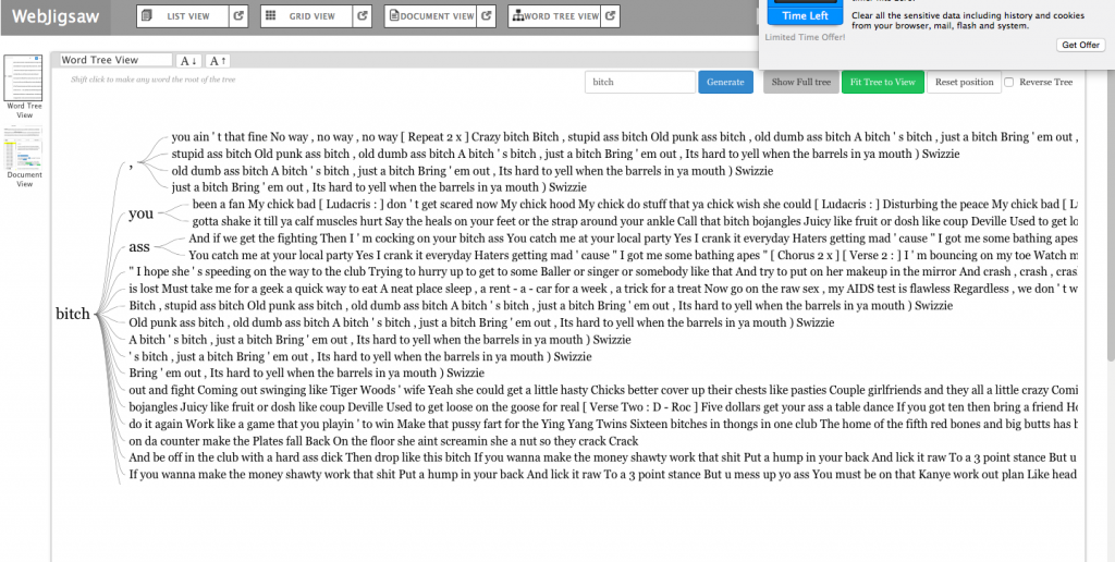
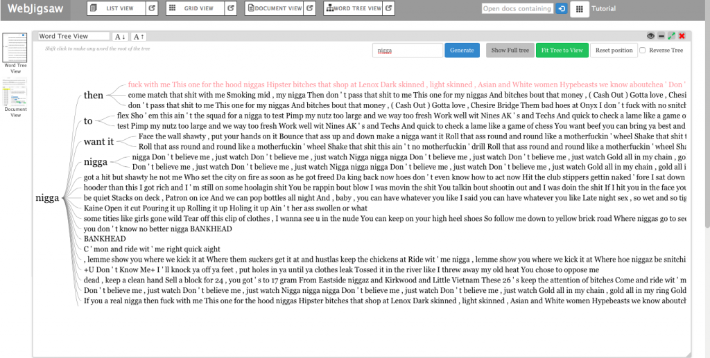
In addition to metadata visualization tools, I also used text analysis visualization tools, like Jigsaw. Jigsaw is helpful when producing word trees and context. The feature I love the most in Jigsaw is the document grid view. This feature provides multidimensional visualization with order and color. Also, since documents are ordered, it makes viewing documents in some organized sequence possible.

Document grid view of Jigsaw

However, there are some pitfalls in Jigsaw. First, the interface of the software is pretty old. Thereby, it’s hard to use Jigsaw to produce good-looking visualizations. Moreover, the functionality of Jigsaw is limited. Compared with Voyant, Jigsaw is unable for the user to choose what they want to see or what they want to ignore. Therefore, I eventually determined to use Voyant and Palladio as my visualization tools.

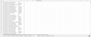
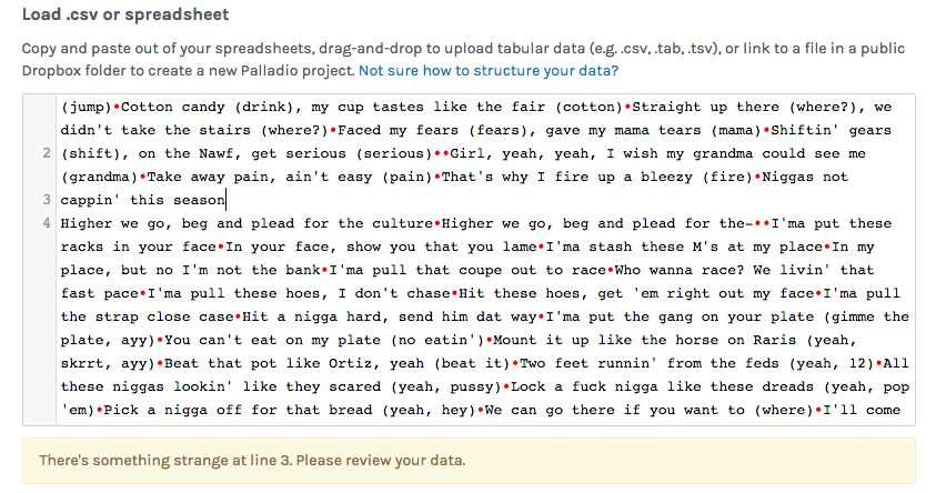
During the period of analysis, I also faced a problem that I used to use a number to name the files I collected. However, it’s hard for people to understand what these numbers mean and it’s difficult for visualization tools to order them. Therefore, I tried hard to change my code to use the date as an identifier, therefore solving the problem.

Voyant bubbleline visualization without date as identifier

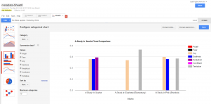
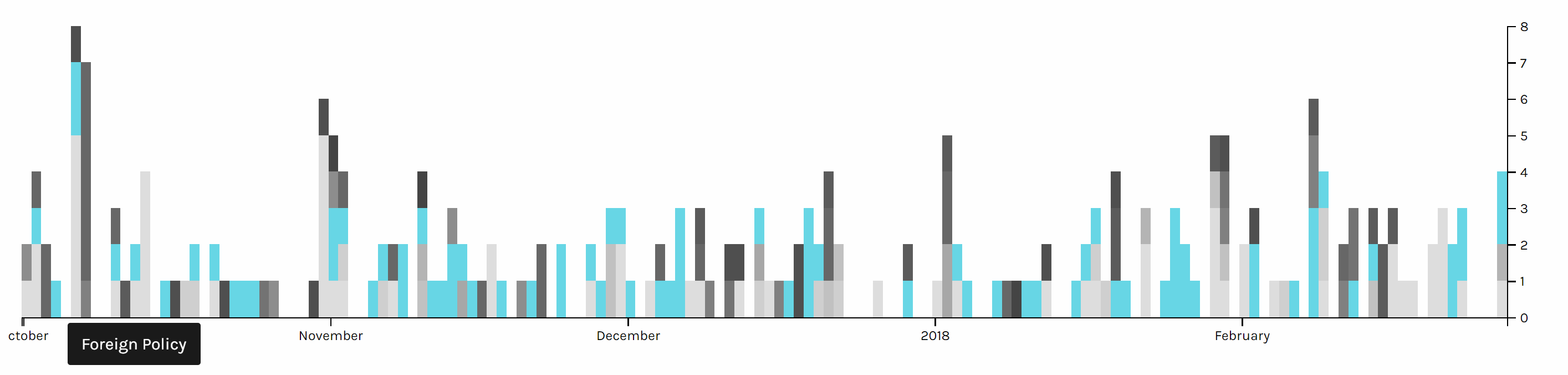
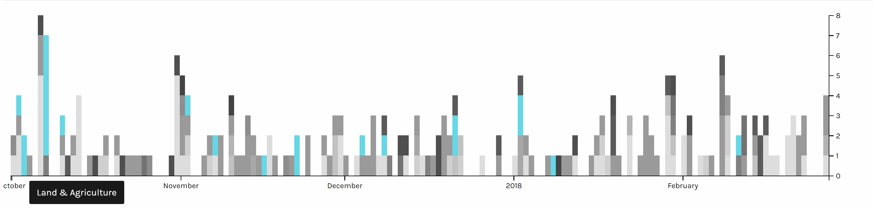
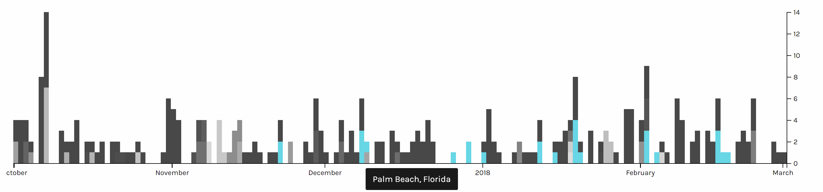
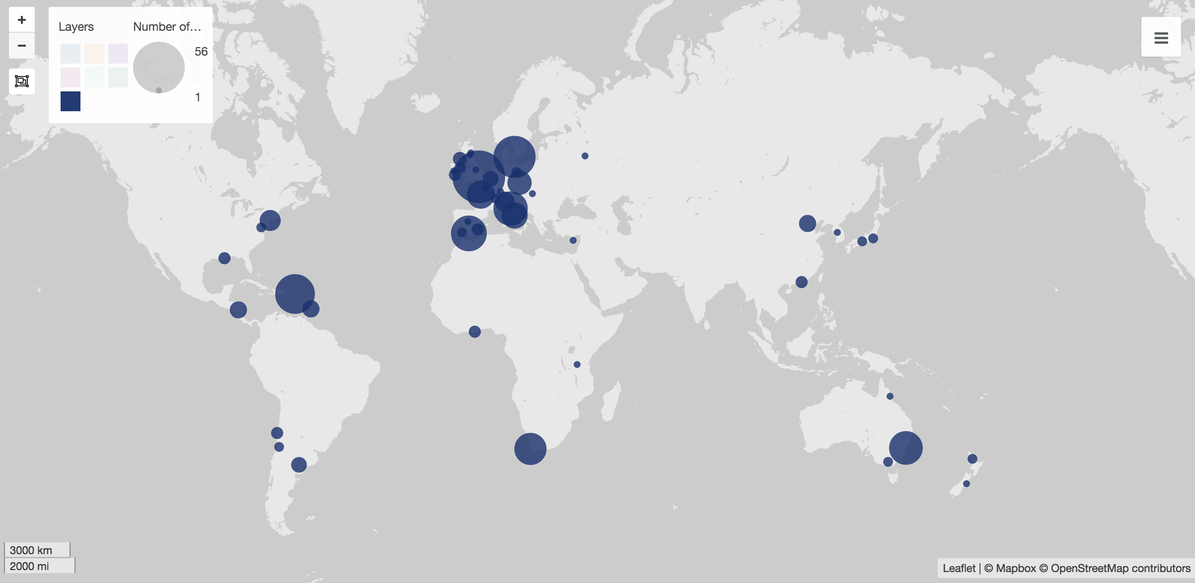
After finishing my part of the research, Haipu and I combined our work together, comparing our visualization produced by Voyant through terms, bubblelines and trends.

We met a lot of problems when combining our work. Since there may be multiple news posted one day but there is only one file for tweets per day, the organization of matching files seems to be really hard. What’s worse, when trying to use excel to combine our data, we found that data on the same line may have different dates, due to different frequencies. In order to circumvent this problem, we decided to construct two timelines separately and then compare the timelines. This solved the problem and provided us with the opportunity to analyze and compare our work effectively and efficiently.

Another problem we met was the software failure of Voyant. When we loaded our data separately to Voyant, we found that the term and trend features did not work properly. Nothing showed up at the context window when I clicked a word and the frequencies shown on the trends were really strange. According to our speculation, it was due to the limit of the number of files that Voyant can handle. Therefore, we were not able to load all of our data to Voyant. Our solution was to divide our data into pieces, specifically into months, and then compare trends of each month. This finally solved our problems.

Despite difficulties and obstacles, we finally reached our goals and fulfilled the project. I found some habits and of Trump and discovered trends in his tweets. Haipu and I together found the relationship between Trump’s tweets and the White House news, illustrating the differences and similarities. To conclude, I feel good with our project because it answers our research questions.

Categories
Final Project Uncategorized

Final Project Reflection

Final Project Reflection

Final Artifact link

Research Question

Sir Arthur Conan Doyles’ collection of works that create the original canon of Sherlock Holmes is considered some of the greatest detective fiction ever written. It’s influences can be seen in mystery stories to this day. Holmes and Watson are household names that everyone comes to know at some point. This effect is not excursively form that original canon however. Its many adaptations are just as important for keeping the stories and concepts alive. This is what as known as a stories afterlife, and can in many cases an afterlife of great magnitude, such as this one, can give rise to just as much mythos as the original. One fun fact I found while completing this project was that the infamous Deerstalker cap and Calabash pipe that Holmes was famous for were never even mentioned in the original texts, stemming for the noteworthy plays done by William Gillette.  This is just one example of how a work can be influence for neither better nor worse over time. In those adaptations however, some things were lost and gained, tropes formed and left behind all together. One hundred years of retelling can change a perception of a character dramatically. My goal of this project was to see how Holmes’s stories have changed over the years from a tone standpoint. To do this I did three things.

  • First, I used analyzed the tone of the original work and read about the portrayal of Holmes within it
  • I then would compare this to the tone of the adaptation  in Voyant
  • Lastly I would take note of the reception of the adaptation to see if people accepted this a the ‘new’ version of Sherlock Holmes


Methodology, Platforms, and Issues

After landing upon this goal, my first step was finding the adaptations that I wanted to work on. After doing quite a bit of research into plays, old tv shows, and forgotten movies, I found that getting a proper script or transcript of the production can be very difficult. After giving my computer probably more than one virus I decided to tailor my approach. I would go with the most popular Sherlock Holmes works , find their adaptations, and then use those which had public domain or easily accessible scripts or texts. I also already had all of the texts from the novels thanks to Project Gutenberg and my previous work with the Sherlock Holmes’s canon. My final approach ended up being a combination. For the meat of the project I decided to focus on the most successful novels since they have been thoroughly adapted. I also finished the slideshow with a overall view of the project

My next step was deciding on appropriate platforms for my project. I knew from the start that Voyant would be a very handy tool for as I was primarily analyzing texts. In the end Voyant would be one of my favorite aspects of my project as it was seamless to embed and looked gorgeous with no tweaking to it. The way I used Voyant was to give the reader something easily digestible upon first inspection of a work. It allows the reader to get a loose understanding and form and preconception of the adaptation or original work that they can then use to guide their thoughts when looking at the slightly more complex visualizations. This was not the main focus on my idea at first, but the way Voyant seamlessly embeds into the slideshow cannot be overstated and it adds another level of interactivity.

I also knew I wanted to do a timeline since the concept of an afterlife went hand in hand with a timeline. Luckily we had already worked a lot with Timeline JS which was the perfect platform for my project. Timeline JS is an incredibly user friendly platform that saved me a lot of time that would have otherwise been spent formatting websites. My biggest issue with timeline JS, and this is really an issue with my concept, is that a chronological layout makes sense at first, but limits my ability to control what the user sees, and that can lead to some jumbled information being reported and the visualization can lose focus.

Sentiment analysis became a problem in and of itself. Jigsaw never looked very pretty to me and when I heard other students were using IBM Watson I decided that would be my tool of choice. IBM Watson was very hard to tame in its application form, I spent hours in terminal with curl trying to get it to work, but in the end had to use the default web version unfortunately. The web version felt slightly stripped down, but was enough for me to work with. It provided scores in a range of emotions that could loosely describe the tone of a body of text. I used these scores to judge what the over all impression the work would leave on a person and used that as my basis for tone.

With that figured out, my last step was how I would present my comparisons. After looking at our previous platforms I decided that Palladio would serve me best as a flexible, simple, and user-friendly platform that accepted unformated csv files. I settled on using the graph functionality of Palladio. I pulled the graph sit created to compare the tones of an original to its adapations.

My last platform became Google Fusion Tables. My data, while interesting, was not very complex. This meant two things, I needed somthing to make data that was not quite as flashy appear like that at a cursory glance from a reader, and something that could present that data cleanly and not over complicate it. This suit google fusion tables simple charts perfectly.

In conclusion, I found this project to be an learning experience for a CS major such as myself.  This class is well outside of my comfort zone, so I’m proud of what I’ve created. I tried to not draw too many conclusions on the visualizations I provided as I want them to speak for themselves, but I fell as if they show a clear deviation in the personality of Sherlock Holmes. My original goal was simply to explore whether this deviation existed and I think I succeeded on that front. Some critiques of my own process would be to become much more intentional with my research and plan my moves for the future, as I ended up doing a lot of research and wasting a lot of time with tools that I would end up discarding. My biggest downfall was that I think I failed to convey my own opinions of the subject matter in attempting to not force them on the reader, but that could be up for debate.I also feel that my major critique of my visualization is that it lacks interactivity on an immersive level outside of clicking through a slideshow, but other than that I feel as if the project turned out excellently.


Screenshots:


Timeline JS in google sheets skeleton
Palladio in action


Palladio tables
Google Fusion tables


Metadata in google sheets
Voyant example


Bibliography:

“Canon of Sherlock Holmes.” Wikipedia, Wikimedia Foundation, 10 Apr. 2018, en.wikipedia.org/wiki/Canon_of_Sherlock_Holmes.

extensive use of this website: https://www.springfieldspringfield.co.uk/

metadata: https://docs.google.com/spreadsheets/d/1kQfdooVqIRx9hcd1z4Ot3XFDQILRTtcI6GapqkF3x0I/edit#gid=2047249578

timeline js skeleton: https://docs.google.com/spreadsheets/d/1MF4i-mdUfti8Li1FNT1O65a-WFFPa16ZUhUfkWwzVuw/edit#gid=0

voyant : http://voyant-tools.org/

palladio: http://hdlab.stanford.edu/palladio-app/#/visualization

ibm watson tone anaylzer


Categories
Final Project

FINAL PROJECT!!!!

For the final project, Bryan and I decided to focus on the music of this generation and how it’s evolved over time. Music is a key part of both of our lives. Being able to find the right song for different situations helps bring relaxation to the both of us. I really feel music is a universal language. Not only does music allow you to connect with the artist but with different people who also have the same taste in music. When I listen to music I enjoy hearing the different instruments used to make the beat from the drums to the piano. I also pay close attention to the lyrics of the artist. From listening to music I’m able to learn about different cultures and backgrounds. In particularly we decided to center our attention on the mecca of Trap music, Atlanta which Bryan and I enjoy very much. The music industry in Atlanta has always been consistently setting new music trends and producing new artist. Many upcoming artists over the years have migrated to the area because the amount of success artist is having. Over the semester it was challenging trying to come up with a solid research question. However, we decided to look at the Trap era as well as the Dirty South era of Atlanta. Both era’s respectively played an important role in the music business. We felt as time has passed the music industry has as well. As we started conducting research we saw a shift from the early 2000’s (Dirty South era) where artist mainly spoke on the absurd amount of women they had, both in a positive and negative light. However, with the emergence of an artist like Gucci Mane, T.I., Soulja Boy, and many others in Atlanta we start to see more references to drug dealing, ”the trap”, and the life struggles to reach fame. We started to realize the influence the Dirty South era had on upcoming artist today and even though they might not be rapping about the same things both decades still promoted their high priced lifestyles to their fans.

For our project, we decided to use Jigsaw, Palladio, and Voyant all visualization programs that we have used throughout the semester. For our corpus, we collected nearly 60 songs from both eras and put them into a spreadsheet. The songs collected for our visualizations at some point all reached US Billboard Top 100. By hand picking the hot tracks of each era we felt we’d get a fair/accurate representation of the different cultures in Atlanta. Our spreadsheets were then divided into columns (ex. Release date of each song, artist, producer of the song, background information on artist and song). With all the data collected in the spreadsheets, it was much easier transferring the data from one program to another. Each visualization tool used for this final project revealed its own set of problems however ultimately we worked these problems out to answer our research question.

With the text gathered we first wanted to use jigsaw to show the similarities and differences between the eras. We immediately ran into problems because the files weren’t trying to upload and kept giving us an error message. The backup plan was to use Webjigsaw however we realized we wouldn’t be able to use the many interactive tools that come with the site. Eventually, we were able to plug in our data and use the interface. We were able to use word tree which connected phrases to the words we searched using the tool. By seeing this it allowed us to see what words were being used more frequently throughout our corpus. N**** and B**** were the most commonly used in both eras. From using word tree we were able to see how in the Dirty South Era artist rapped mostly about women and how they come with the superstardom. We saw how that shifted later on in the Trap Music era as the focus changed now from glorifying women to rapping about their wealth.

Like jigsaw, we had problems using Palladio at first. When we kept trying to upload the data onto the site we kept getting an error message that something was wrong in our data. We then had to manually go through each line of text from our spreadsheet to make sure the problem was resolved which was very time-consuming. I believe by having problems and being able to work them out that was the greatest lesson we learned from this project. We gained knowledge not only from our research but first-hand experience using tools that could eventually help us later on in life. From using palladio we were able to look at each artist/group individually and able to give background information on each artist (birthdate, birthplace, and #1 debut hit singles).

With using Timeline.jgs I wasn’t comfortable using the program compared to my more efficient partner. As time past and I used the program more I soon realized how powerful of a tool it was. Being able to interact with the data as there are many tools to choose from showed me the importance of Timeline.jgs. In addition compared to the other programs and their layouts, none are able to put data in a timeline format which we also found very helpful comparing and contrasting the two eras. It was cool to see the end result of our hard work and how clear and formatted our data was. In the beginning, I remember looking at other projects for examples and I was worried at first our project wouldn’t come close I was surely wrong.

The last tool used was voyant which is a user-friendly and appealing visualization tool. Given my background with voyant it was the easiest tool to navigate and collect data for. Voyant provides many ways to interact with the data and can be viewed using different tools. This visualization compared to others resembles a dynamic visualization because it allows users to build their own conclusions from the data being presented. Using Voyant I was able to break down the data and get a better sense of what each era was rapping about in their songs.

In conclusion, I believe our final project was a success from a digital viewpoint. Not only were we able to answer our research question our visualizations are user-friendly and very informational. We both struggled at times however we picked each other and are very appreciative of being able to learn how to use these visualizations tools throughout this semester.


Categories
Final Project

Final Project Reflection

Link to final project website: http://humn270finalprojecthaipujunjie.blogs.bucknell.edu/

Link to database: https://drive.google.com/drive/folders/1rFmSEDr48kAB5f0VuYG6DrHXHAFQoPEG?usp=sharing

Trump News

It has been more than 300 days since Trump took office, and during those 300 days, the white house has been publishing many news related to him. We are familiar that Trump has been blaming new company like CNN for publishing “fake news”, so I think it will be interesting about to research about what kind of news is posted by the white house and how is the news posted by the white house related to Trump’s schedule. And because Junjie is also researching about Trump’s tweet, we can combine our result together to see the similarity and difference of both official and unofficial side of Trump. Therefore, I started to collecting news from the news section of the white house’s official website and due to the limit of time and better fitted with Junjie’s data, my data includes the news posted from October 2017 to February 2018.

Data Collection

Data collection is usually a time taking, boring and repetitive job before fancy graphs are made, but necessary and important at the same time. It is convenient to used ready-made data, but during my final project, it’s worth to spend such long time to collect data. By collecting data by myself, I know more details about each file so later I can know if the graphs made by different tools actually make sense and more importantly when weird things happened, it is easy to find out the reason of that. Just like what we have learned this semester, in Johanna Drucker’s reading, data visualization can mislead viewer, but by collecting data by myself, I could related real issues with the graphs instead of making wrong inductions.

Google Fusion

Google Fusion is an online tool which provide many basic statistical tools for me to visualize the metadata.

The first pie chart shows the distribution of news in different topics. It is obvious that Foreign Policy covers the most of area of the chart, which means it’s the issue of most news, because in the last several months, Trump visited many foreign countries and has been talking to many presidents or officials from other countries. Due to the hurricane happened during the end of 2017, land of many states were destroyed; therefore, president Trump published many relief plans to deal with the disaster. Therefore, there was also a lot of news about land and agriculture. As a famous merchant, Trump also focus a lot on the economy, so budget & spending and economy & jobs were also mentioned a lot.

This pie graphs shows the distribution of the forms of news, the left one is based on the count of the files and the right one is based on the word count. In both graphs we can see that most of news is in the form of statement and releases. However, because the white house posted news through the internet, forms of news are not limited with the common form of new paper; many news was posted in the from of fact sheets or proclamations. By comparing the percentage of those two kind of forms in two graphs, we can see an obvious increase when they are counted with the number of words; therefore, news in those two forms is longer than that in the form of statement & release.


One advantage of Google Fusion is the map function of it doesn’t require the latitude and longitude of each location by analyzing the input string of data in location column. The left graph is the world map shows the which countries Trump visited from October 2017 to February 2018 and the map corresponding well with the fact that Trump visited several Asian countries in November last year. And in the left domestic graph, we can see that Trump visited more states in the west.

Palladio

Palladio is the tool I love best, even though the amount of tools provided is very limited. 

The network graph shows the connection between the forms and issues of news, so we can see different kinds of issues might be posted in preference of different forms, like infrastructure & technology’s news is usually in fact sheets or presidential memoranda instead of the most common form of statements & release.

The multi-dimension timeline tool in Palladio is the tool I love best. It fits well with my metadata form even though the news I collected was recorded in separated files. Palladio smartly groups files together and reveal the timeline graph by including the bar chart to show the distribution at the same time.

Two graph above are screen shots I took from the same chart but highlighted different issues. We can see foreign policy has been the top issue all the time. And land & agriculture is high particularly in the beginning of October 2017, because of the hurricane during that time.

This timeline graph is produced based on the location of Trump and I highlighted when Trump is in Palm Beach, Florida, where Trump usually spends his holiday and plays golf. And it is obvious that Trump seldom visited October or November, when he might be busy with the hurricane and gunfire tragedy in Las Vegas in October and trip to Asian countries in November.

Voyant

Although both Google fusion and Palladio provide many useful tools for data visualization of my meta data, but to better understand the content of news, I also used Voyant for text analysis of my data. Voyant provide a lot of tools for text analysis and each has different advantages, but Voyant also has its limitations. The server of Voyant is very slow and there is limitation on the number of files I can upload, and when I uploaded a lot of files, Voyant starts to make serious mistakes. Fortunately, I took a look into my files, to check the word frequency, so I found this serious issue of Voyant and have to analyze data in separate months. Even though Voyant still helped me a lot in this final project to analyze the word use of news.

Voyant is very flexible that it allows users to edit the stop word list and pick the words users want to show in the trend graph. Words like emergency, security and tax have been most frequent in those five months and each months have different focused issues. By looking at frequently used words, it’s not hard to predict the top issues in each months. For example, because Trump came up with new job plan and tax cut, hurricane appeared and Las Vegas happened a gun fire tragedy, words like emergency, security, tax and job appeared most.

Conclusion

It was fun to do data visualization and I’m glad that I chose this course. During the process of my final project, I can better understand different data visualization tools and I learned that it’s more important to choose suitable tools and useful charts than just making fancy looking graphs. Gephi is a very powerful tool and I want to use it badly, but I also realize that my project focusing more on text and content instead of network, so I gave up using Gephi but tools like Google Fusion, Palladio and Voyant instead.

Categories
Final Project

Final Project

https://lak231.github.io/us-fulltime-college-students-timeuse/

Categories
Final Project

Final Project

Final Artifact –> http://humn270finalprojectbarron.blogs.bucknell.edu


Categories
Final Project

Final Project Blog

Final Artifact: Atlanta: New Wave Timeline

Over the course of the semester, we have gathered files of many songs and characteristics that represent the music and culture of Atlanta, known as the cultural capital of Hip-Hop. ATL has seen it’s decades of greatness which has left an everlasting impact on the musical world. We decided to analyze the two popular eras in Atlanta, which was the Dirty South Era and the TRAP era. There were a few purposes that resulted in us exploring these periods. As world events and different culture waves come and go, it’s normal for individuals to live differently to keep up with society. Does that mean the music will differ? Are these new rappers following in the same footsteps of their ‘elders’ or are they going in a different direction? Where one may be describing their love for a significant other, another could be describing/flaunt how much they paid for a piece of jewelry or exotic car. We both enjoy music a lot as it has helped us express ourselves through others who have the musical talent. There are times where us individuals feel a certain way, but we cannot communicate these emotions clearly. Instead, we keep these thoughts in our mind instead of releasing them. We thought to ourselves “What are these guys actually talking about in these songs?”. It’s quite interesting to see how their life stories are being told through the music. Our favorite genre is ‘trap’ which was created in Atlanta during the 2010s, as the Dirty South Era began to wear off. We wanted to compare these decades through lyrical content as trends and waves came and go. However, the main principles that are found in typical hip-hop music still prevailed. These characteristics were money, women, exotic cars, and superstardom.

The selected songs used in our corpus are popular hit singles that have all went viral and were what we consider ‘defining moments’ in the Atlanta hip-hop industry. We felt that this would give us the most accurate data whereas these lyrics have essentially progressed these movements forward. We collected 57 songs that totaled over 37,900 words in length. A dataset this large requires extensive cleaning to ensure clarity when loading the spreadsheets into platforms. We started this process in Assignment 2 and continued throughout the semester. I’ll be the first to admit that every platform has a learning curve which varies from each visualization program. We used Voyant, Jigsaw, and Palladio and we ran into the majority of our problems with Jigsaw and Palladio. Voyant has always been a powerful tool that allows a viewer to interact with the data as there are many visualization tools to choose from.

Voyant tools Cirrus, Trends, and Termsradio are used in order to show word similarities and common usage for ‘trap’ music (2010s).
Voyant tools Cirrus, Trends, and Termsradio are used in order to show word similarities and common usage for the Dirty ‘South’ era (2000s).
Jigsaw Word Tree tool which connects a word to phrases that it exists with. “b**** “m****”
Jigsaw Word Tree of phrases connected to a searched word for the Dirty South era (2000s) “n****” “bankhead” “love”

Jigsaw started off our problems with formatting to properly upload the lyrical content data. First, we tried to upload the graph in a .CSV file but it wasn’t properly converted into the proper category. That didn’t work out as it would show as ‘no files found’. However, we found the correct entity to convert our files which ended up solving the problem. After that, Jigsaw was very helpful as the Word Tree tool allowed us to search words and view the phrases that associate with the searched term. The few tools in this program prohibited us from making a variety of visualizations. In the Drucker reading, it discussed how a viewer could take away lessons from “galleries of good and bad, best and worst…they are useful for teaching and research”(Drucker, 239). With the visuals that we deemed good and bad, we both learned from them despite the physical appearance. After all, not all maps have to be flashy, but they must be meaningful. We searched n***** and b**** because those words were constantly appearing within the lyrical corpus data. Ultimately, it helped us understand lyrical phrase combinations that revealed a significant focus between the two eras. In the 2000s, rappers were including women at a high rate in their verses. This showed the persona of these artist being that they were idolizing females and the lifestyle that comes with a lot of girls. In 2010, the focus shifted more to money and groups. We concluded that musical platforms like Spotify, Apple Music, and Tidal have given the artist a more efficient tool to reach an audience. This has improved the financial gain throughout the industry which has encouraged more Atlanta rappers to launch their careers.

Using Timeline JS, we also ran into minor formatting problems with creating a proper timeline. The fourth step of sharing the google doc link wasn’t valid. However, we corrected the problem and previewed our corpus on the timeline preview. After multiple editing sessions, we created a complete project that included music summaries, videos, genre descriptions, etc. It was great to see our hard work paying off onto an interesting visual. Some may say that this isn’t important because you could see this information drawn up in a quick sketch by an individual. I don’t agree with that because visualizations “provide us with a new perspective on texts that continue to compel and surprise us by being so provocative and complex — so human.” (Clement 12) Seeing problems mapped on a timeline can help an audience understand why events occur after past experiences

Palladio: [Graph] Media Outlet Relations

As we started loading our .csv spreadsheet onto the Palladio data, we kept getting an error message saying that ‘something strange’ was occurring within the lines. We had to go through and apply spaces to properly format the corpus data. This helped as the data became viewable and we began using the visualization tools, Graph, and Table, in order to compare Artist Headline to Text Summary and link media outlet relations together. This showed a concise visual of an artist and a quick summary of them. Also, we were able to see the connections between media outlets that supplied our data. For example, Twitter, Billboard, and GQ has a social media presence in society. These sites allow a viewer to be updated with their favorite artist. These tools were very effective in our studies as we found more similarities between the decades and their content.

In conclusion, I feel that this project was very successful as it presented obstacles and we found the solutions to make our final project work. Our results solved the research question that was created in the early stages of the project.  The hip-hop industry has evolved into many different lanes that has allowed for many individuals to prosper, especially those people who were born and raised in Atlanta. Lyrical content has shifted slightly, however the two decades used many of the same words and phrases.However, the focus shifting from women to money was interesting to see as the rise of ‘trap’ music has allowed rappers to be booked for shows all across the nation. One thing for sure, times may change but the future is always imitating parts of the past. We believe it’s a great thing as both generations can enjoy the music together and express themselves like never before.


Palladio: [Table] Artist Headline to Text Summary

Struggles mentioned earlier:

Timeline JS: Fourth step of sharing the google doc link wasn’t valid
Palladio: error message saying that ‘something strange’ was occurring within the lines
Jigsaw: “Data not found, incorrect entity format”

Bibliography

“Song Lyrics & Knowledge.” Genius, genius.com/.

Carmichael, Rodney. “Culture Wars.” NPR, NPR, 15 Mar. 2017, www.npr.org/sections/therecord/2017/03/15/520133445/culture-wars-trap-innovation-atlanta-hip-hop.

Clement, Tonya. “Text Analysis, Data Mining, and Visualizations in Literary Scholarship”. book

Drucker, Johanna. “Graphic Approaches to the Digital Humanities” ch. 17. book

Jordan, Mike. “The 14 Most ‘ATL’ Songs Ever Recorded.” Thrillist, Thrillist, 4 Dec. 2015, www.thrillist.com/lifestyle/atlanta/the-14-most-atlanta-songs-ever-made.

Miller, Matt. “Dirty Decade: Rap Music and the US South, 1997–2007.” Southern Spaces, 10 June 2008, southernspaces.org/2008/dirty-decade-rap-music-and-us-south-1997%E2%80%932007.

Wilcox, Andrew. “‘The Impact of Trap Music on the Greater Atlanta Community.’” Lower Division Studies, 1 Dec. 2017, lds.gsu.edu/news/showcase/atlanta-studies/andrew-wilcox/.

Williams, Stereo. “How Atlanta Became the New Cultural Capital of America.” The Daily Beast, The Daily Beast Company, 29 Jan. 2017, www.thedailybeast.com/how-atlanta-became-the-new-cultural-capital-of-america.

Categories
Final Project

Mahoney – Final Reflection

Assignment 6 – Final Reflection

Final Artifact: https://caitlinmahoney23.wixsite.com/comabroad

Studying abroad can be a daunting task. It’s a task that many individuals set themselves up to take on in the first year here at Bucknell, but it is one that gets wiped off the agenda of many due to the work and strain that goes into it. Students in the Freeman College of Management have an especially difficult time finding places to study by needing to find courses that will transfer back as major requirements and CCC requirements. So where do students begin? They know that they want to go abroad, but they don’t know what’s been done in the past, what programs are out there, what’s popular, or even what suits their own major.

The main purpose of my visualizations is to give students a place to begin. The main questions that I analyzed through my data set and visualizations include:

  1. Where are our students studying abroad?
  2. What are the trends of our students?
  3. Who went where?

These are the questions that many have difficulty explaining because most of this data is hidden and unknown to the public. My main work and explorations went into creating a user-friendly and interactive website that can be used by all to explore the data from the Office of Global & Off-Campus Education at Bucknell in a meaningful way.

The goal was to utilize multiple types of visualizations to communicate different aspects of the data. As Drucker states, “Communicating the contents of a digital project is a knowledge design problem – since the multifaceted aspect of database structures offers different views into the materials.” (Drucker, 243) In order to offer these various views, I used Palladio, Voyant, and Google Fusion Tables.

Platforms and Tools

The webpage was created in Wix, since it is a platform that I am used to creating webpages on, and it is a very interactive and creative space, where many other tools and platforms can be embedded to tell about the study abroad narrative.

Palladio was the first tool that I decided to use based on its ability to create maps, node graphs, and timelines in a simple, yet meaningful manner.

At first, I used Palladio to create maps to show the popular spots to study abroad. These visuals are my favorite visual throughout based on their simplicity. In Wix, I created a gallery of them, which shows various sets of data, including students in the college as a whole, as well as each individual major.

The second main job done by Palladio was to create timelines. The two main timelines created were to show trends in what majors went abroad and to show trends in the locations of where students chose to study. The timelines captured trends of the students and the Wix view allowed for users to click through the various screenshots of them.

The final visual done by Palladio included the node graphs. These two graphs showed the interactions between various nodes. One shows the relationship between the semester abroad and major and the other shows the relationship between the location abroad and the major. The size of the node shows the frequency of the node.

Once integrated into the Wix website, the beautifully interactive Palladio visuals became static. However, as Sinclair nicely states, each one “aims to produce a single perspective on available information.” (Sinclair) Ultimately, each visual from Palladio assists in telling the full abroad story.

The next platform used was Voyant. I chose Voyant in order to show the popularity of locations in a different way, since some audiences may be more in tune with written out locations, as opposed to locations on a map. Voyant was used to give users a more comprehensible visual of what students were where through using the Cirrus world cloud tool. Three word clouds were created – one for continents, one for countries, and one for cities. This allows for users to play with the words that they may recognize better than a map form.

The final platform used was Google Fusion. The maps function was the perfect tool for sharing the precise location and information including name, major, class year, semester abroad, program, city, and country.  This interactive map has a full-college view, and is also available based on major. Through interactions with this map, the user is able to find areas of interest to them, see previous students who studied there, and even drop a pin to see a street view of these locations to see if they’d be comfortable in the area.

Platform and Tool Critique

My main critiques surrounding Palladio is that the platform doesn’t have an easy way to export the media and integrate it into another software. As a platform that’s in itself exploratory, once integrated into the Wix site, the Palladio visuals became static. The visualizations are no longer dynamic, which Sinclair describes, “aim to explore available information, often as part of a process that is both sequential and iterative.” (Sinclair) Rather, they are just constructs of data as capta, which have an inherent bias as Drucker explains, “Capta is constructed and not given…the initial decisions about what will be counted and how shape every subsequent feature of the visualization process.” (Druker, 244) Since the data and visuals are chosen by myself as the author, the visuals tell the story that I’m narrating, and they’re not able to be manipulated by users.

These are the critiques that ultimately led me to the inclusion of Voyant and Google Fusion visuals. Voyant embedded extremely well into the Wix webpage, however, since it’s a text-based software, for countries and cities with multiple words, it wasn’t the best tool. Google Fusion maps, on the other hand, was the tool that I had been searching for since it allowed for multiple levels of information to be shared on the map. The main critique that I have of the maps is that while they are interactive and explorative, which are keys to great visualizations, if there are multiple “pins” in the same location, then only one is seen.

Conclusion

Overall, throughout the process, the main motivation was to create a user-friendly database to explore the study abroad options for a management student interested in going abroad. Based on location, semester, or major, hopefully this database created a field of vantage points that the user could interact with. As Sinclair states in his article, “humanities scholarship is often exploratory, we have also come to believe that interactive formats are in most cases preferable to static ones, since they allow the person using the system to add and subtract elements, experiment with different forms, pursue hunches or insights, and so on.” (Sinclair) With this database, students would be able to see what’s been done before them, and explore the possibilities of creating their own adventure for their study abroad experience.

Categories
Final Project

Adams Final Project Blog

Kyle Adams

Humanities 270 – Faull

May 2, 2018

Final Blog Post: Final Project Process

            As you have heard over the course of the semester, my final project involves an investigation of responses to the 2011 Penn State Child Abuse Scandal. What I have grown particularly interested in is using my newly acquired digital humanities competencies to drill down into the factors that played a role in conditioning discourse surrounding Sandusky and Penn State University’s crimes. For the final project, I chose to expand upon some of the original work I did this semester (Assignment 2) by utilizing new analytical tools (IBM Watson Natural Language Understanding tool for sentiment calculations) and looking at novel features that impacted responses to the scandal (for example, looking at response platform by adding fifty tweets to my corpus). My ultimate goal in working with this corpus and visualizing the impact time, geography, author gender, and response platform can have on discourse was outlined well in one of our early readings this semester, “…DH scholars who have successfully used visualization in their analyses … argue for the new hermeneutic of digital visualization, the way in which their visualizations produce both new knowledge and also invite ambiguity, the traditional province of humanistic critical thinking” (Faull 2). Upon completing my final project using Palladio and the WordPress platform, I believe I have accomplished each of these goals, as my visualizations not only clearly demonstrate that author gender, time, and response platform played some role in conditioning response sentiment and message, but also open the door for humanistic inquiry focused on the social dynamics and cultural mechanisms that allowed them to do so (show that there was an impact and welcome investigation into why these specific factors played a role).

            Throughout the production process for my final project, I ran into several challenges in working with the Stanford Design + Humanities Lab’s Palladio platform. Over the course of the semester, I have found that Palladio is a fantastic tool for research like mine, as it gives individuals the power to visualize many dimensions of a corpus. In my case, this prevented me from overwhelming the interpretive capacities of audiences by attempting to visualize the multiple dimensions I was interested in on a single plain. However, the versatility of Palladio did not entirely prohibit me from suffering from a common problem identified by Elijah Meeks: “Regardless, the first step is awareness of what a tool or method is dong and how it will inflect your research. I’m concerned that humanities scholars show a willingness to defer to tools…” (Meeks 2). In my case, this problem came about when I had to reformat my metadata in order to get the narrative I was trying to visualize to “fit” the software. Initially, my metadata was structured in such a way that each element of the corpus (article or tweet) had multiple “Key Themes” assigned to it in a singular row. However, because this did not work with Palladio’s “Graph” feature (as I could only represent one theme per article/tweet, therefore leaving many subsidiary themes absent from my network), I was required to duplicate entries in my metadata to accommodate the fact that I wanted to visualize more than just one “Key Theme” per article/tweet (so I went from 105 elements to over 300). Unfortunately, my “deferring” to the tool I was using caused problems when I attempted to visualize other dimensions (for example, “Gallery” or “Map”) as my duplicate entries led to redundant material in my map visualizations and catalog of corpus elements. The only solution I was able to come up with for this problem (inability to reconcile my desire to portray multiple themes and have a logical gallery and map view) was to separate my work into two separate Palladio “artifacts.” One of these would be used to generate visualizations in the “Graph” tab (networks, timelines, and tables) and the other would be used for “Gallery” and “Map” views.

Early iteration of corpus gallery which shows redundant entries due to duplication of rows in metadata sheet

In my work with the “Map” and “Graph” features of Palladio, I encountered another problem coming in the form of automatic summation of sentiment values. As can be seen in the screenshots accompanying this blog post, node size was biased by the fact that multiple articles from the corpus came from the same location or shared common entries in other columns of my metadata. Thus, my visualizations involving node size as a reflection of sentiment were biased, and would have to be tampered with in some way. In the case of the “Map” view, the only solution I was able to come up with was to set up my visualization so that hovering over artificially large nodes (representing places like New York City) would show the sentiment values for the multiple articles that had their scores added together. In the case of sentiment summation as it related to theme or gender, I chose to go about solving this problem by incorporating a new set of simple stacked bar charts into my analysis. In doing so, I made it so that I would only have to worry about the dimensions of gender and platform as they pertained to theme (did not have to size nodes).

Early visualization showing nodes sized according to net sentiment value of constituent elements from the corpus (bias emerges due to the underrepresentation of female responders and different number of times certain themes are measured)
One “Map” visualization used in the final project that demonstrates hovering over artificially large nodes to reveal constituent sentiment values
Sample stacked bar chart representing targeted IBM sentiment values for articles in the corpus


Once I had generated all of the necessary visualizations for the development of an argument that certain factors (like gender, time, and response platform) have had an impact on responses to the Sandusky scandal, I had to develop a logical fashion for presenting my visualizations and arguments as part of a narrative. In their article on narrative visualization, Segel and Heer explain the importance of narrative to digital humanities scholars by quoting Jonathan Harris, “‘I think people have begun to forget how powerful human stories are, exchanging their sense of empathy for a fetishistic fascination with data, networks, patterns, and total information … Really, the data is just part of the story. The human stuff is the main stuff, and the data should enrich it’” (Segel and Heer 1140). With this in mind, I realized that a multi-layered WordPress site consisting of several progressive magazine-style pages would be the most appropriate way to present my data. A site of this format allowed me to sequentially paint a picture of the real people who chose to respond to the Penn State scandal. Breaking the different dimensions of analysis into different pages helped me to contain my arguments and observations as palatable narrative bits that build to a broader understanding of the story of rhetorical conditioning in responses to the Sandusky scandal.

A final challenge in working with a project of this nature is that there is no available database that truly encompasses all of the tweets and articles written in response to the Sandusky scandal. Therefore, rather than work with a pre-compiled and “objectively complete” database, I had to gather the articles and tweets that would come to make up my corpus with no assistance. This style of corpus construction (during which I considered things like geographic location of the response) facilitated what I believe is the biggest flaw in my project (although it may have been an unavoidable pitfall): the subjective inflection of my corpus. In thinking about this, I was reminded of one of Johanna Drucker’s primary critiques of digital humanities work, “All data is capta, made, constructed, and produced, never given … So the first act of creating data, especially out of humanistic documents, in which ambiguity, complexity, and contradiction abound, is an act of interpretative reduction, even violence” (Drucker 249). In the case of my project, this data being “capta” led to two weaknesses in my final product — a disproportionate amount of responses from men and an uneven geographic distribution of articles (bias towards New York City and Washington, D.C.). Throughout my work, I was unable to find a realistic solution to this problem, so I elected to mention these flaws in my work under the “Conclusions and Further Work” menu on my WordPress site.


Chart showing overall sentiment values for responses written by men (the high number of bars compared to the female visualization shows potential gender bias of corpus)
Chart showing overall sentiment values for responses written by women (the low amount of bars compared to the male visualization shows potential gender bias of corpus)


In conclusion, I believe my final product (WordPress site) was successful from a digital humanities standpoint. I hold this belief primarily because my visualizations help to generate a novel way in which to view the discourse surrounding the Sandusky scandal. In this way, my project harkens back to the assertions of Tanya Clement:”Sometimes the view facilitated by digital tools generates the same data human beings (or humanists) could generate by hand … At other times, these vantage points are remarkably different from that which has been afforded within print culture and provide us with a new perspective on texts that continue to compel and surprise us by being so provocative and complex — so human” (Clement 12). All in all, the conclusions that can be drawn from the admittedly author-driven narrative produced by my WordPress site helps to turn simple metadata into evidence of very humanistic behavioral patterns and motivation. Therefore, my final project has manifested itself as an example of the value of digital humanistic scholarship.