For this assignment, I continued my investigation of journalistic sources involving the firing of Joe Paterno at Penn State University in 2011. In addition to the university newspaper sources I analyzed for our previous assignment, I added several non-collegiate journalistic sources to my corpus (articles from The New York Times, The Chicago Tribune, The Seattle Times, The Los Angeles Times, The Denver Post, and The Dallas Morning News). In terms of metadata, I chose to classify my data into the following categories: institution, institution location, institution geolocation (lat,long), institution connection to Penn State, article author, author gender, article title, article word count, date of publication, article classification upon original publication (ex: ‘Opinions’), and a quantitative sentiment valuation for the article (taken from Jigsaw and altered by adding one to the value given in Jigsaw to put all scores in a numerical set ranging from one to two). While my metadata certainly contained values for many constituent aspects of my articles, I believe each could be visualized in an epistemological way. When it comes to sentiment and word count (my two numerical categories), each of these facets could be visualized in such a way that aids in generating arguments regarding quantity and quality of discourse surrounding Joe Paterno’s firing. In addition, these values could be paired with author gender or geolocation to determine which areas (in general, as there is still subjective interference in article selection) or genders are speaking more or less and more or less pleasantly about the event. Although publication date did not turn out being too helpful for my data visualization, a larger corpus may foster some sort of conclusions tying article publication (denoting temporal proximity to the actual firing) to geographic location, institution classification, or institution connection to Penn State. I also believe it is important to keep article title and author name present in certain visualizations, as these things can both become pertinent to discursive analysis (understand particular author bias if a name is familiar and get a sense of article tone by looking at title).
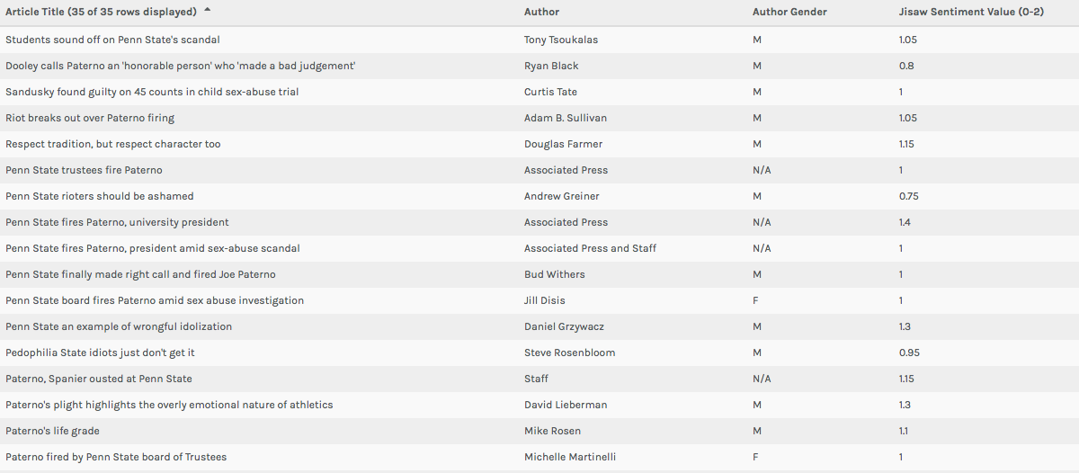
In both the Table and Gallery views in Palladio (Left: Table View, Above: Gallery View) I found the most important function of the platform to be keeping researchers from being too far divorced from the metadata and corpus in question. One of Johanna Drucker’s most poignant comments from her chapter mentions that “almost all information visualizations are reifications of mis-information” (Drucker 245). In my opinion, these two windows in Palladio prevent this from happening on some level. While they do not necessary alleviate concerns regarding data as capta (constructed and gathered by biased subjects), it does allow for those who engage with a corpus and set of metadata in the platform to see for themselves exactly where visualizations are coming from. In the Table view, this is accomplished by presenting metadata exactly as it was uploaded. The Gallery window (when linked to URL’s) not only does the same thing, but can allow (at least in my case) for researchers to return to the component articles/documents of a corpus with the click of a button. Essentially, each of these views in Palladio helps to increase familiarity with a data set/corpus for the benefit of better understanding visualizations in other views.
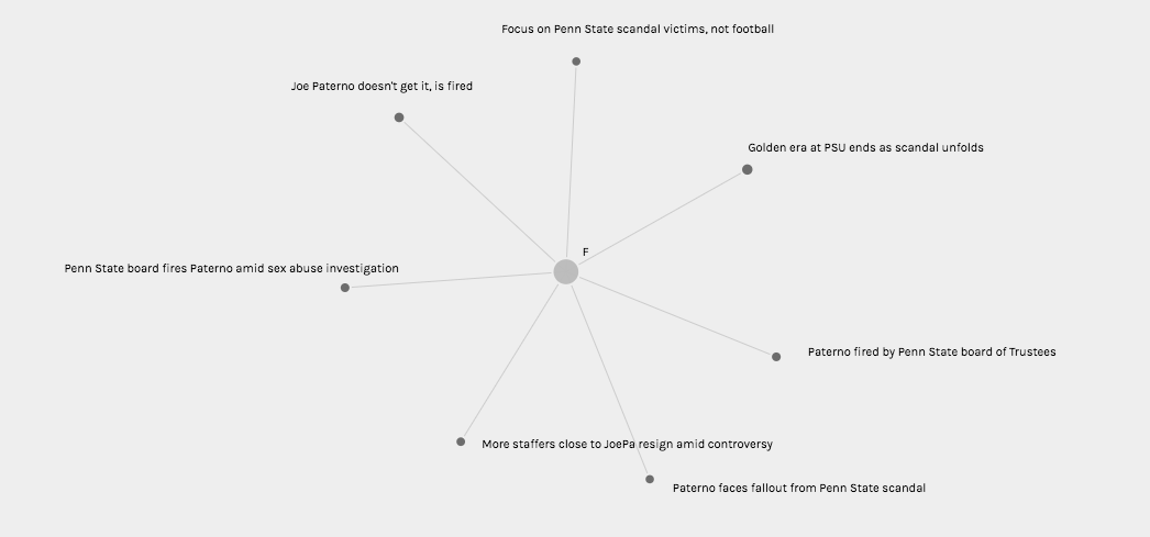
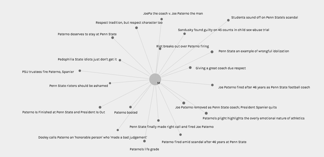
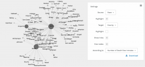
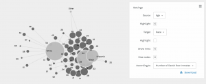
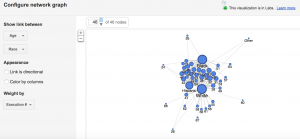
In the Graph view (Pictured Twice Above), I chose to visualize connections between author gender (M, F, and N/A in the case of collective publication) and article title with node sizing governed by Jigsaw sentiment score. While node sizes were not remarkably illustrative in an argumentative, epistemological, or hermeneutic sense, this could potentially be attributed to the small range of achievable sentiment scores keeping nodes at similar sizes. In addition, because the metadata being visualized comes from a journalistic corpus, it is understandable that wild swings in sentiment from one article to the next are not necessarily evident in the visualization (most articles must conform to a customary journalistic prosaic style). However, when node sizes are combined with the sentiment conclusions rooted in article title (as this conveys tone), one can use these visualizations to begin to discern a connection between gender and article “feel.” It appears to me that female authors, based on article title in particular, were more willing to tie the Paterno firing back to Sandusky’s sexual abuse explicitly, whereas male authors were more likely to use their platform to honor Paterno or frame the event through a less criminal lens.
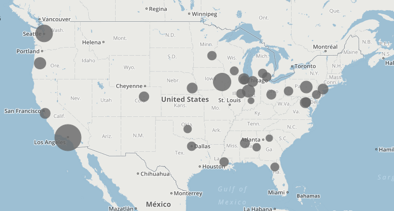
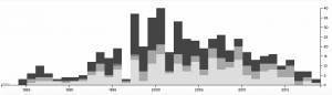
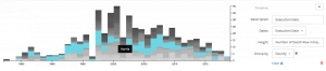
I also found the Map view (Above) to be quite interesting in terms article sentiment and publishing institution geolocation. When I began to construct this corpus, I theorized that article sentiment would become more negative as proximity to Penn State decreased. However, according to the map, it seems that some of the highest Jigsaw sentiment scores (denoting more “positive” vocabulary in the source document) were found further from State College on the map (except in the southern United States). This could have had something to do with closer, Big Ten affiliated, schools being more saddened by the symbolic loss of one of their conference’s most recognizable icons. It is also important to remember when looking at this visualization that the documents in question are journalistic, and, for that reason, may not be the most perfect texts to analyze in terms of sentiment (although some articles are opinion pieces).
All in all, I believe my visualizations presented above can be perceived as flawed in some sense, but also intellectually constructive in another. Importantly, Palladio’s provision of the Table and Gallery views is helpful for preventing researchers from being barred from a conception of the “translation” process that occurs in the visualizations in the Graph and Map windows. That being said, I believe my visualizations, at least in terms of sentiment analysis, are hindered by forces of concealment and reduction that come along with an imperfect (and hidden) Jigsaw sentiment computation (in some sense these visualizations can be seen as simple representations or mis-representations of sentiment). However, what I do believe my visualizations were successful in doing is putting on display some of the ambiguity or more nuanced aspects of my corpus. For this reason, I believe some of my visualizations would be considered successful knowledge creators to Drucker, for their “denaturalizing” effect on viewers. These visualizations are certainly novel ways of interrogating journalistic discourse surrounding Joe Paterno’s firing, and thus can help to serve as stepping stones for new understanding.
When it comes to Drucker’s discussion of spatialization creating meaning, I believe the map view can be used as a tool for knowledge creation. Due to the fact that article sentiment is tethered to proximity to the focal event, one can begin to create arguments regarding geographic location governing attitudes toward the Paterno firing in local newspapers. Article titles could also be added to these visualizations (found by hovering over a point) to help with this aforementioned pattern recognition.