Categories
Assignment 3

Assignment 3 Luke Hartman

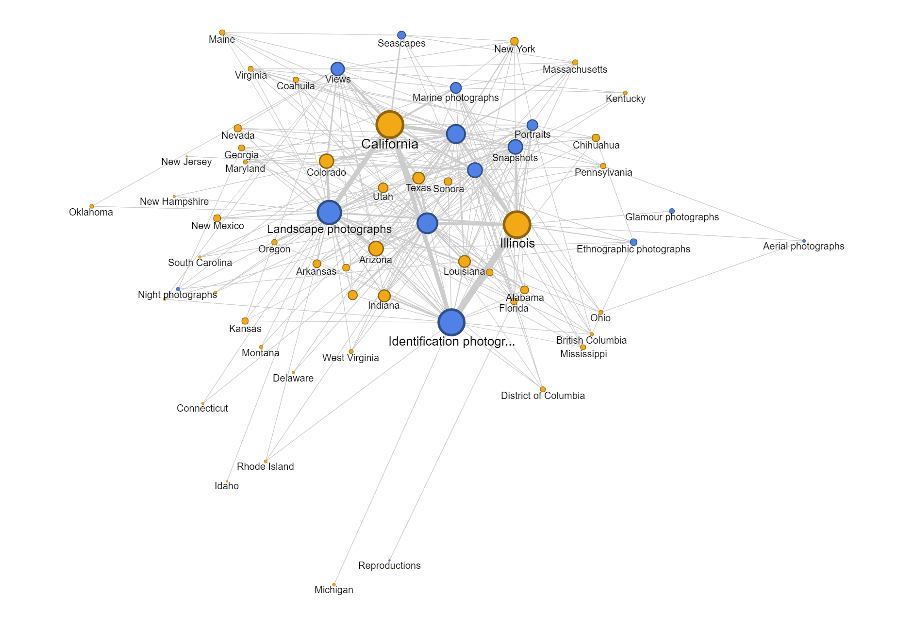
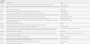
My data set is a collection of text documents (mostly speeches with a few recorded statements orations) regarding civil rights, delivered by a variety of divers authors. The authors include a Native American Chief from the 1850’s, Martin Luther King Jr. and even 2016 presidential candidate Hillary Clinton. In my data table I have included the descriptor categories:

Date

Author

Speech Topic/Context

Gender of Author

Location of Speech

Image of Author.


I felt like by using this combination of data, I could organize these texts in ways that would be meaningful for comparison and allow a reader to draw connections/ recognize similarities and differences between related topics and speeches.

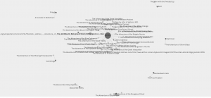
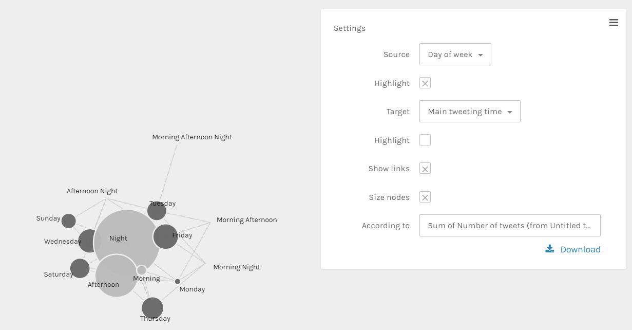
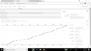
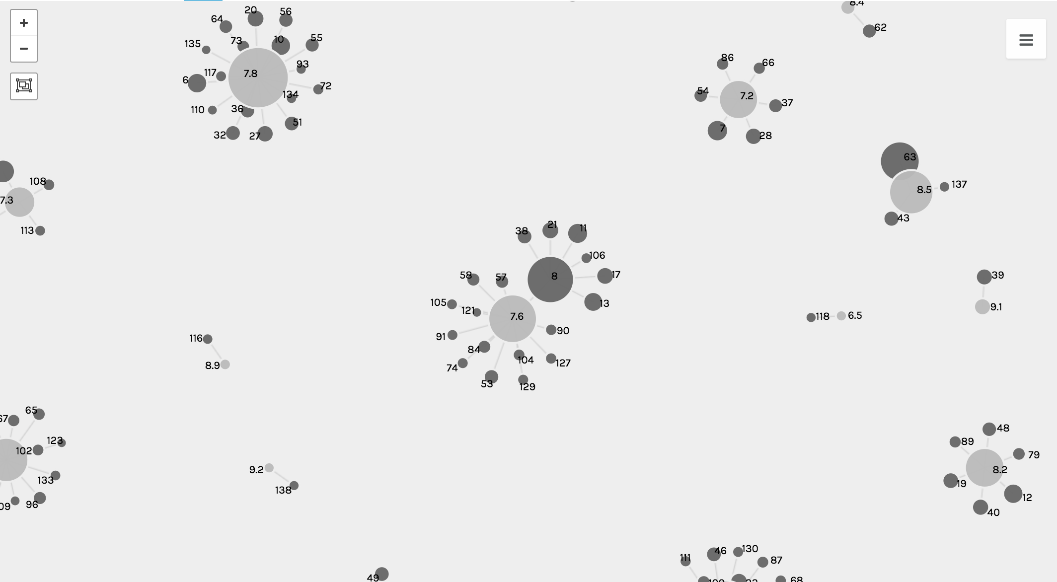
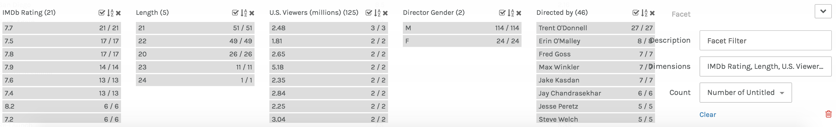
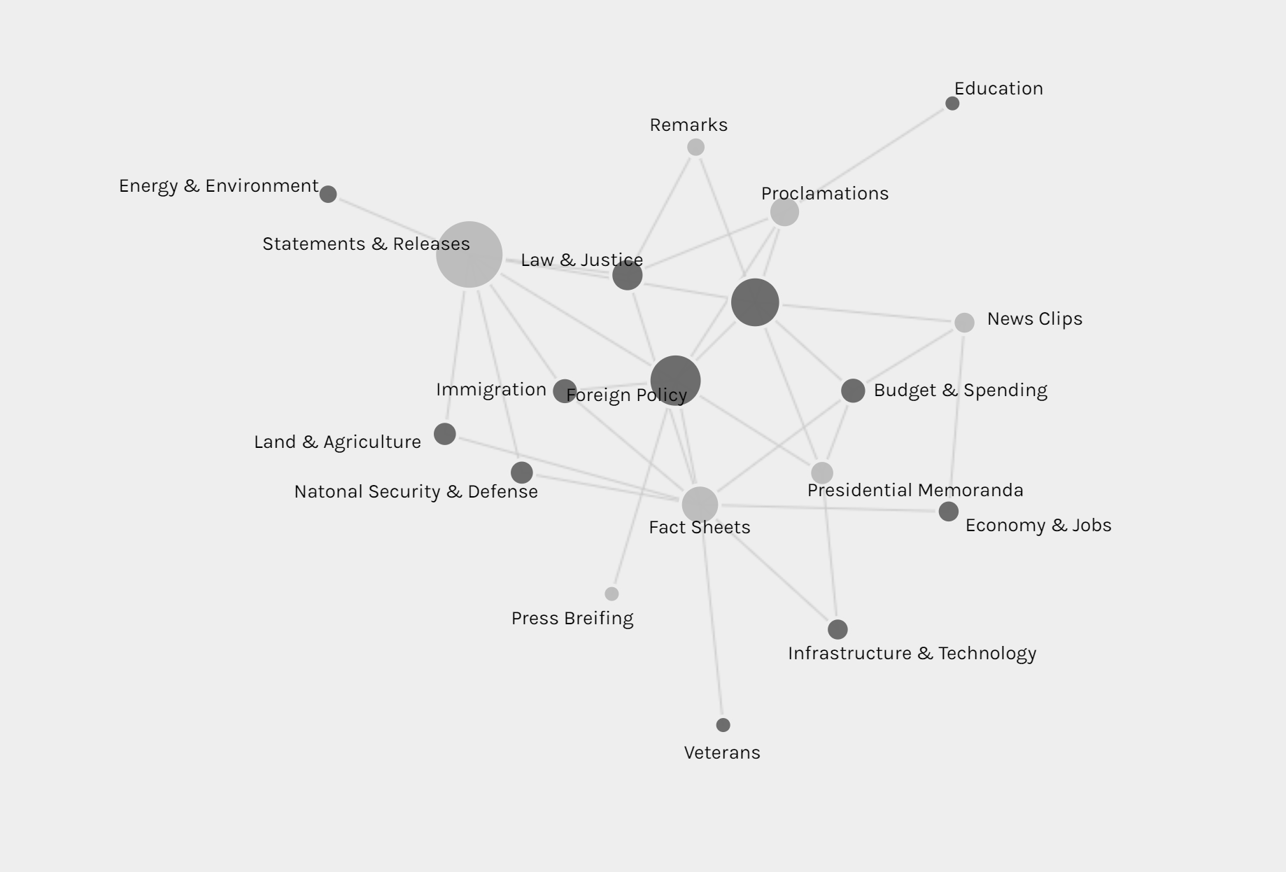
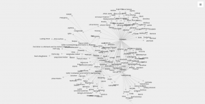
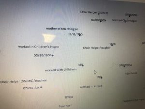
Above is a screenshot of a visualization I created on Palladio using the Graph tool. It links each speech with it’s latitude and longitude and shows which ones were given in the same location. It can also be filtered with the facet tool to show just certain speeches based on gender, topic, etc. The spatialization of this data provides a visual map for a reader with two dimensions that can be controlled to make inferences about whatever is desired to understand.

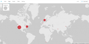
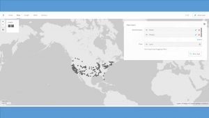
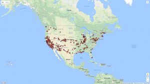
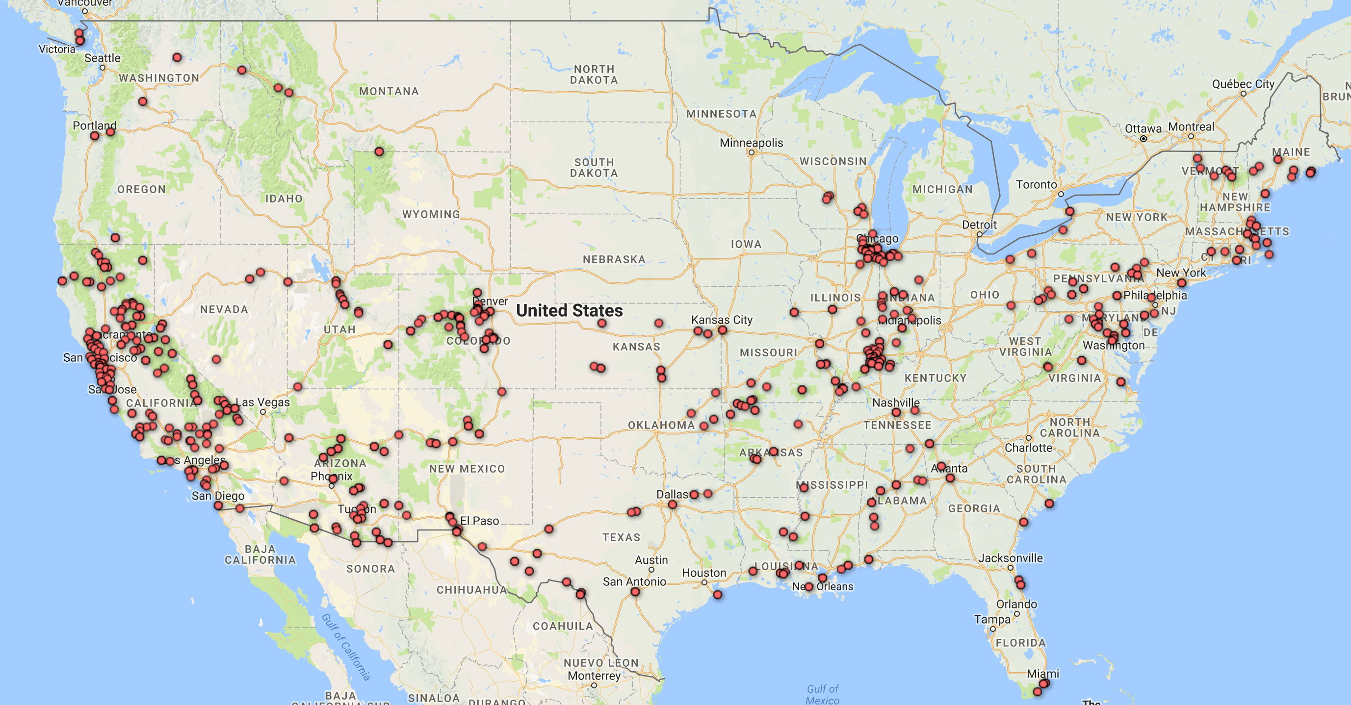
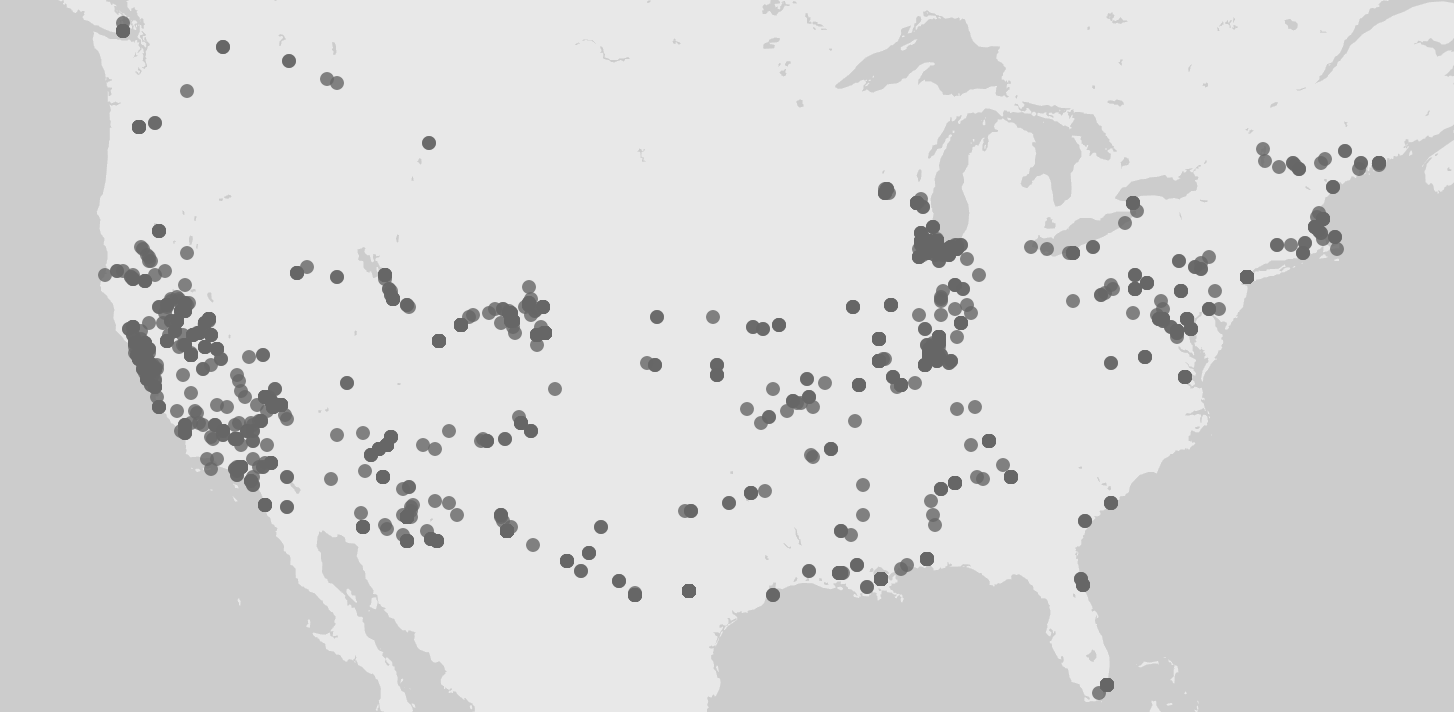
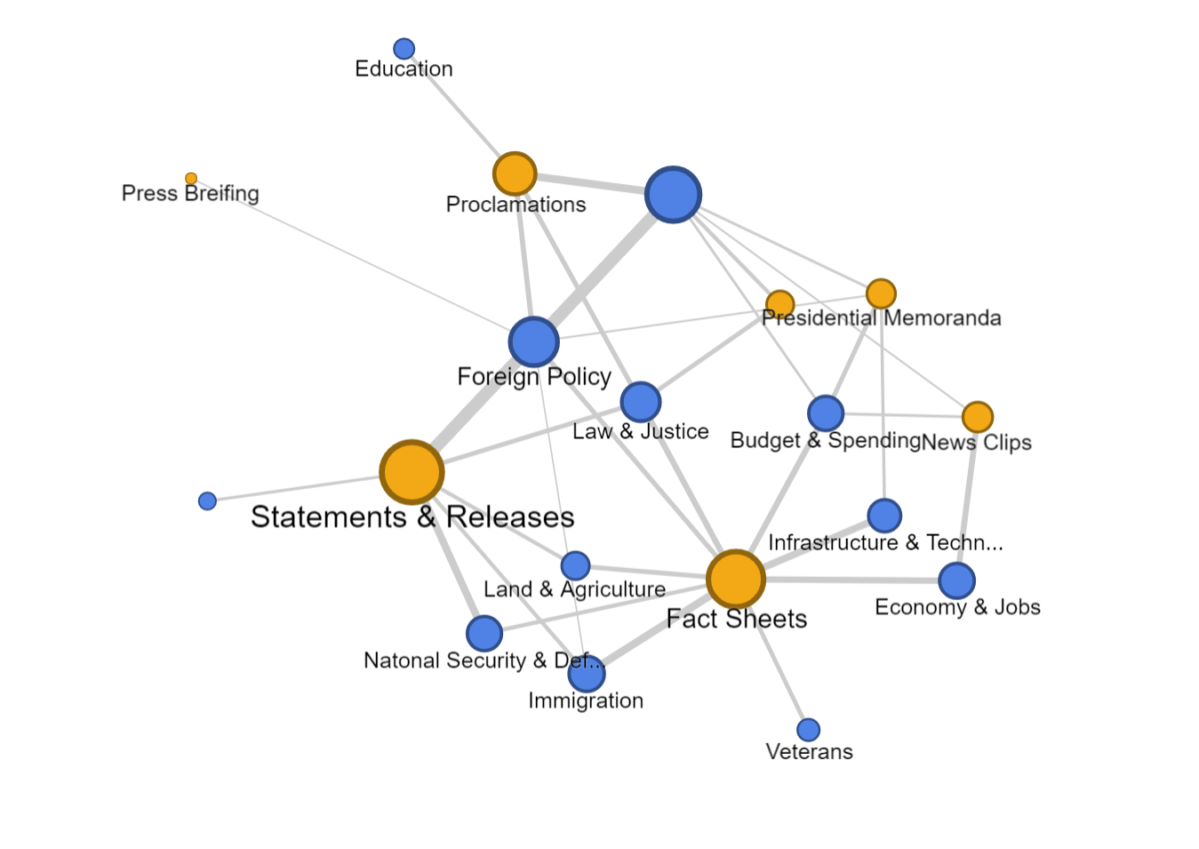
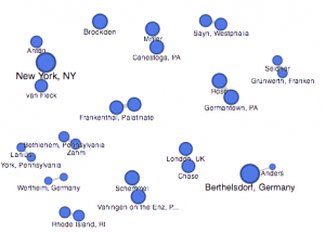
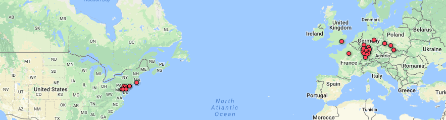
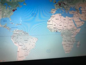
This next visualization is a mapping tool that shows the location of each speech’s delivery point on a world map. While this is a useful tool as it allows for the spatial awareness of a specific location to become perceivable for the reader, I feel it has some drawbacks as well. First off, the map is not labeled well at all, so without an extensive knowledge of geography, the map cannot stand alone well. Also, the large scaled dots are useful in the sense that they communicate volume of speeches given in a specific location, but they do not have a visible center and they span too large of areas to pinpoint the exact spot even if one did know exactly where that was on an unlabeled map. Google fusion tables has a similar feature and I feel that it does a better job although I have not completely figured out how to use it perfectly yet either.

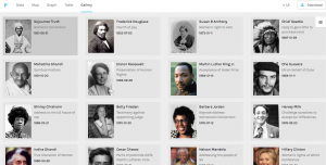
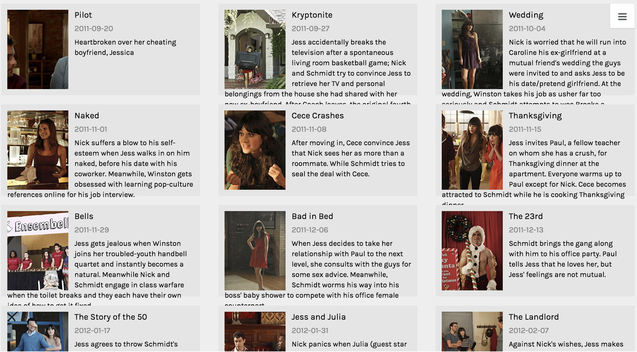
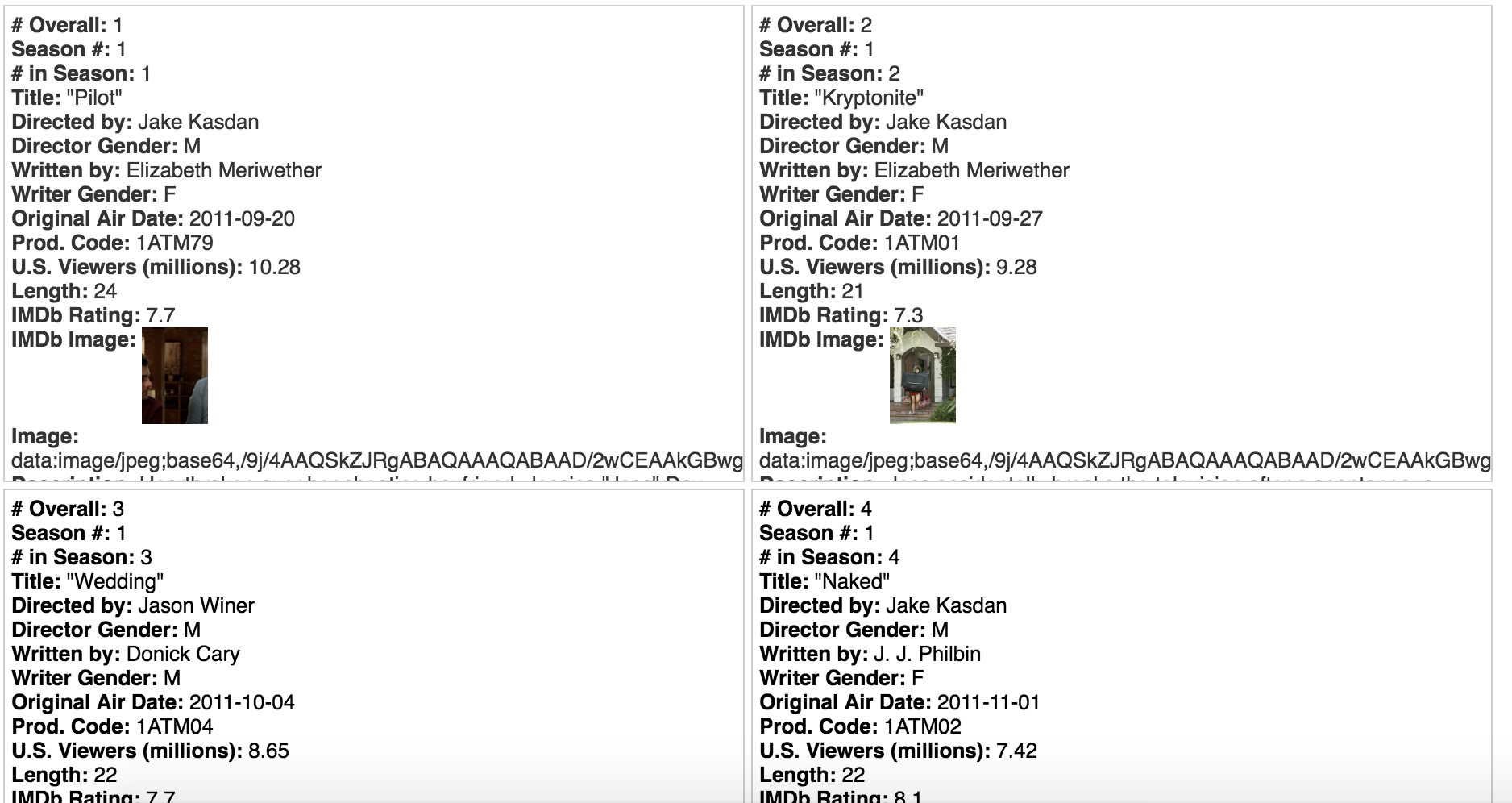
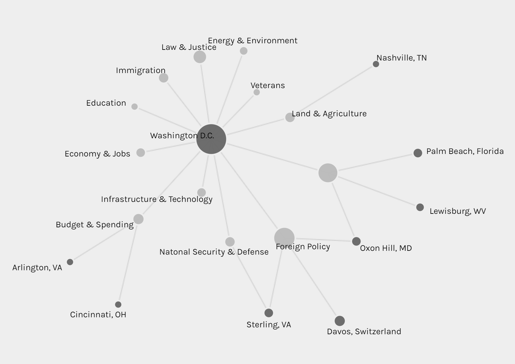
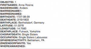
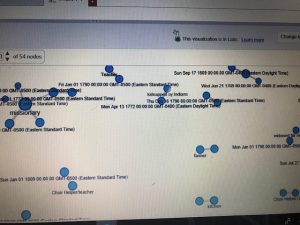
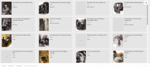
Above is my favorite of the tools I was able to use on palladio, the Gallery tool. It provides a template for a display of multiple pieces of information in a card-like format. As you can see, each card has a picture of the author of the text that it represents, along with the topic/context of their speech listed beneath their name. The cards are also organized by date (which is also listed visibly) to form a timeline of sorts within the larger visualization. Upon clicking on each card, it will also link the reader to a full text of the speech given by that author which allows for the further exploration and adds an interactive piece to the visualization to promote deeper research and understanding. I feel that there have been a vast number of times in my life when it would have been very useful to understand how to use this tool; both to sort information for my own purposes, but also for the ease of presenting it to other people.

As far as Drucker’s distinction between “knowledge generators” and “representations” I simply do not like these mutually exclusive classifications. I believe that something can be both at the same time. I think that these visualizations and this platform (palladio) embodies this idea of duality very well. Am I representing a form of data that already exists through a series of templates? Yes, and in that sense it is a representation. But by compiling this data, formatting it in accessible, user friendly ways, and then making it interactive to promote further examination and learning, I am also generating knowledge by was of access and opportunity. I find this to be very valuable and I think that it is certainly a noble pursuit.


Categories
Assignment 3

Assignment 3

For this assignment, I used the meta data of the Charles Weever Cushman collection of photographs. Looking at the platform of Palladio, I really wanted to take advantage of the map tool and try to take a look at potentially where each of these photos were taken. From this meta data, I extracted about 1000 points of information and input it into Palladio.

This was an interesting way to view where many of the pictures were taken in the United States with each dot representing an image. It was easy to understand if that was all I wanted to know. But unfortunately, just the dots alone were not very easy to understand. This view mode lacked the detail. The detail I was looking for was exactly where each photo was taken, maybe a town name or relative location. Therefore, I did not have too much to go on other than a general location. For the sake of comparison, I decided to do the CSV file in its entirety in Google Fusion Tables.

Results were immediately improved. Google Fusion Tables gave me the names of the states, their boundaries, and an easier was to select the dot of information and understand what was being represented in that specific dot. Although both tables of information showed a stronger gathering of images taken on the west coast and northeast, Google Fusion tables allowed for much more detail. Google Fusion allowed me to understand and interpret my data much more effectively. I wanted to use the timeline feature of Palladio as well, so I used that to determine when each picture was taken on Charles Weever Cushman’s journey.

This was interesting to look at because one can see when Cushman was the most active in his journey. Understanding the time of which each picture was taken could tell a researcher where a point of interest might have been at that time. This is where Drucker’s analysis on how to create new ideas from demonstrations can be seen in both the time line and map features of Palladio. Researchers looking at the trend of where and when the pictures were taken could introduce new ideas into what they were investigating, especially if both have a trend to peak interest from Cushman (taking more pictures/spending more time in that area). Palladio is a decent platform for getting this kind of data, but perhaps with a little more detailed input, such as location and state lines as seen implemented in Google Fusion Table’s, Palladio results could be a little more fulfilling to a researcher.

Categories
Assignment 3

Assignment 3

In creating my data set, I chose to look at the Fox TV show, “New Girl” and to analyze various aspects across the different episodes, including views, ratings, and descriptions of the episodes in correspondence to when the episodes were produced and the order in which they occurred in the season.

The raw data itself can be seen here. It consists of all episodes, directors, writers, genders, air dates, U.S. viewers, length, IMDb rating, images, and episode descriptions.

Due to the capacities of Palladio and Google Fusion, I decided to create visualizations of individual episodes and highlights of information with those, as well as various visualizations about the connections and correlations amongst data. In analyzing these connections, I used the season, release date, number of U.S. viewers and IMDb rating of each episode.

These aspects of each episode were chosen to as representations of each episode, therefore each visualization will have an inherent bias. As stated in Drucker’s work when discussing data in visualizations as capta, she states, “Capta is constructed and not given…the initial decisions about what will be counted and how shape every subsequent feature of the visualization process.” (244) This idea of data as capta must be considered in the graphics below, as the information and ways to present it was chosen by myself and therefore is no longer pure data.

All visualizations created both through Palladio and Google Fusion. The main goal of using these tools was to communicate the “New Girl” metadata through various graphic designs. As Drucker states, “Communicating the contents of a digital project is a knowledge design problem – since the multifaceted aspect of database structures offers different views into the materials.” (243) Because of this, multiple visualizations were created to allow for different perspectives on the data itself.

Below are various creations of visualizations done in Palladio.

This first visualization was created using the Gallery function. The main purpose of this graphic is to give the viewer a visual and quick way of reference to each episode. One lacking feature to the Gallery function is that there should be a way to include additional information to the cards, because while I believe this visual is functional, it’s not the most effective at communicating all aspects of each data point from various aspects.

The following visualizations were created using the Graph function. The first shows the number of U.S. viewers to each episode, where the size of the node reflects the number of U.S. viewers.

The second and third visualizations are the same, just with different zoom views, and these show the relationship between each episode and the IMBd rating for each episode, where the size of the node reflects the rating.

While the graph function creates detailed and intricate visualizations, from a user perspective, the visualizations are complex and difficult to read and comprehend, especially when they solely become static images.

The third and fourth visualizations are bar graphs, which when Drucker explains the history she states, ““Bar charts came relatively late into the family of graphics, invented for accounting and statistical purposes, and thus pressed into service in the eighteenth century, with only rare exceptions beforehand. They depend on underlying statistical information that has been divided into discrete values before being mapped onto a bivariate graph.” (240) Both of these were used to clearly map out the changes in trends and numerical data from the original air date of the show to the present.

The first bar graph maps out the IMBd ratings over the air dates, and the second bar graph addresses the number of U.S. viewers over the air dates. While the charts are a clear visualization and one typically beneficial to numerical data, the Palladio platform for arranging these graphs was extremely difficult and had glitches.

Lastly, in Palladio, there was the Facet Feature, which was complex and difficult to comprehend exactly how and what it was doing. That being said, it created a list-like visual, which is beneficial to users in search of quick information.

In Google Fusion, similar visualizations to those in Palladio were created. The gallery and graph functions were very similar to Palladio, but differed in terms of user interface. The visualizations are below.

In comparison to Palladio, the gallery graphic in Google Fusion is not as aesthetically pleasing, however the graphing functions and graphics were much more user friendly and of equal level to the Palladio graphs.

While these visualizations are a convenient way to present information about New Girl and how trends in U.S. viewers and ratings have changed throughout the years, it is important to recognize that with all visualizations there is bias due to data used and aesthetic decisions, and as Drucker clearly states, “all data is capta, made, constructed, and produced, never given.” (249)

Categories
Assignment 3

Assignment 3

For this assignment, I used the Cushman Collection’s dataset. This dataset contains metadata of images taken by amateur photographer and Indiana University alumnus, Charles W. Cushman. Importing this data into Palladio and Google Fusion Tables reveals some interesting aspects.

First, I tried mapping out the locations where the photos were taken. Looking at these identical maps from Palladio and Google Fusion Tables, we can infer that most of his photos were taken at Illinois and the West Coast.

Maps of locations where photographs were taken from Palladio (above) and Google Fusion Tables (below)

Adding a facet to the data in Palladio confirms our inference. Moreover, this facet also reveals that the photos from Illinois were mostly taken after 1940 and before 1952, while the photos from California were mostly taken after that period. A quick check at his biography provided by the Indiana University Archives reveals that he spent most of his life after college in Illinois and only moved to San Francisco in the 1950s. 

Timelines of number of photographs taken grouped by state.

To further confirm this conjecture, I also made a pie chart in Google Fusion Tables.

Pie chart of photos by state.

The timeline tool from Palladio also tells us that his photos were not archived until the 1940s. After that period, however, they were archived not too long after they were taken. Although Palladio did not allow me to scale the x-axes of the two timelines to match each other, the general patterns seem to support my assumption.

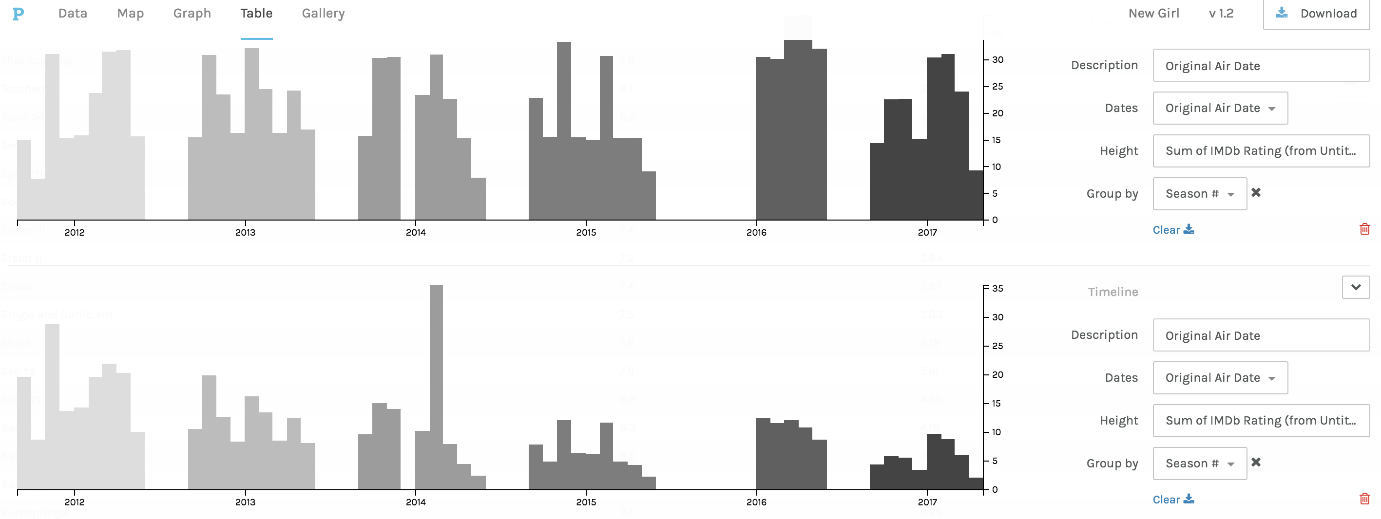
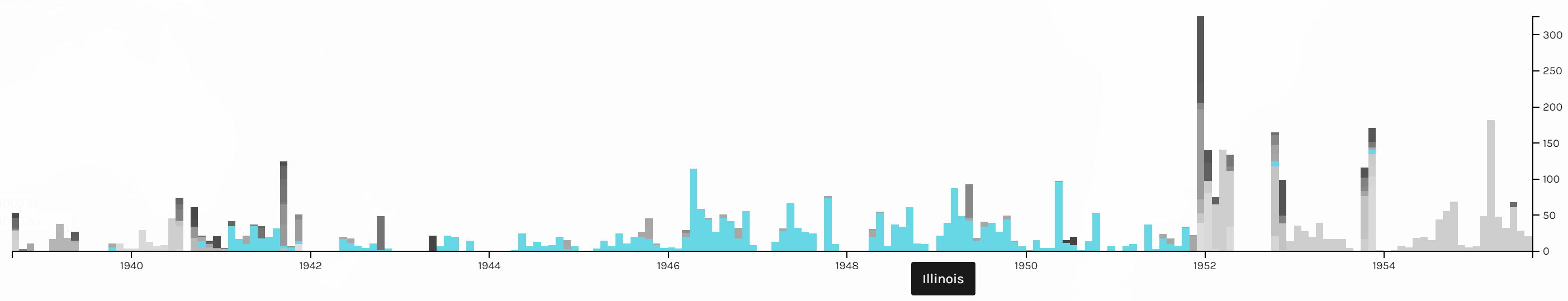
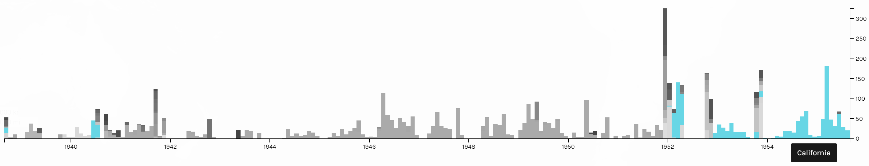
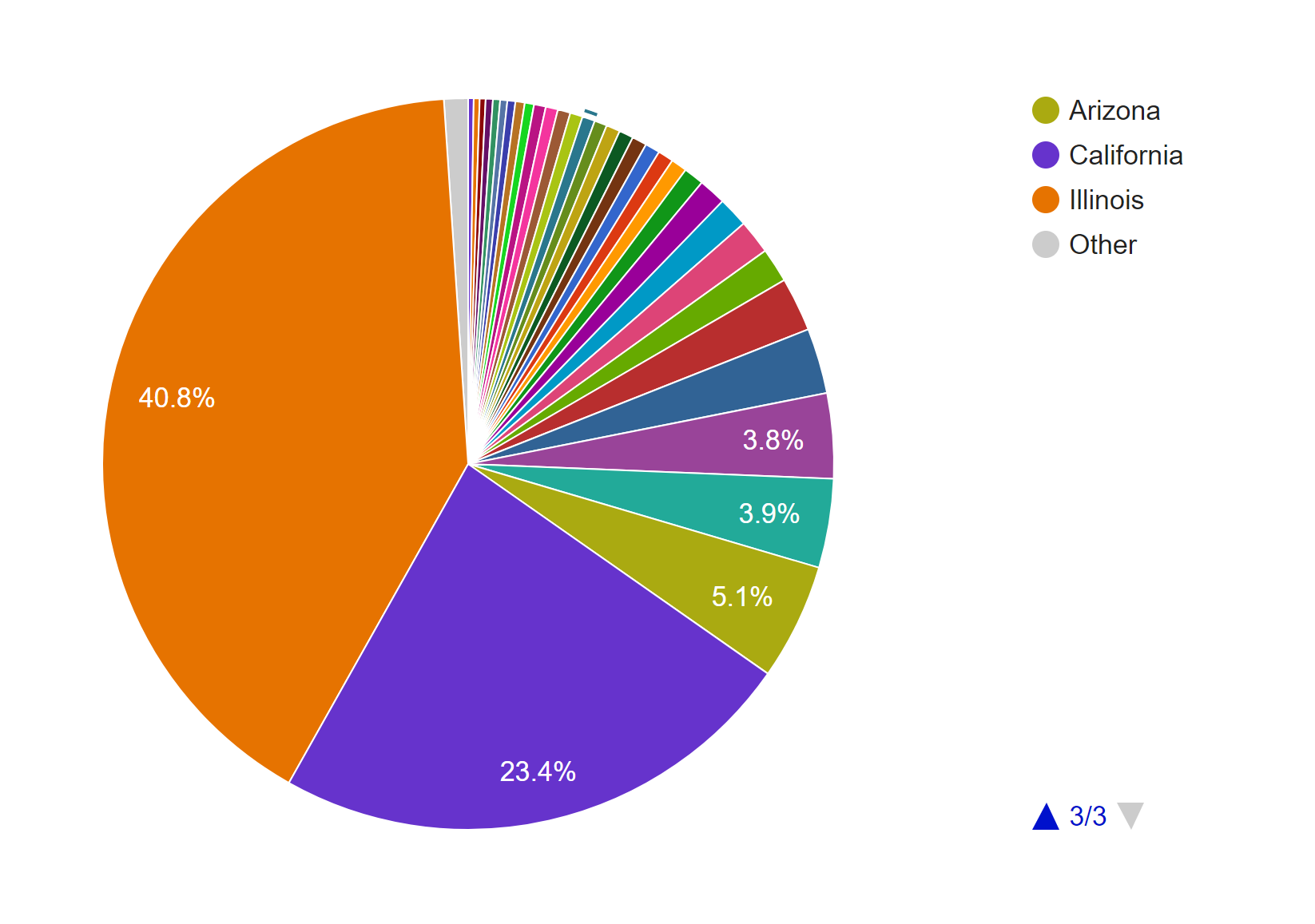
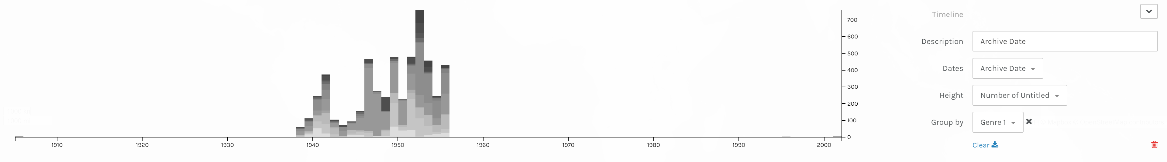
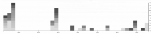
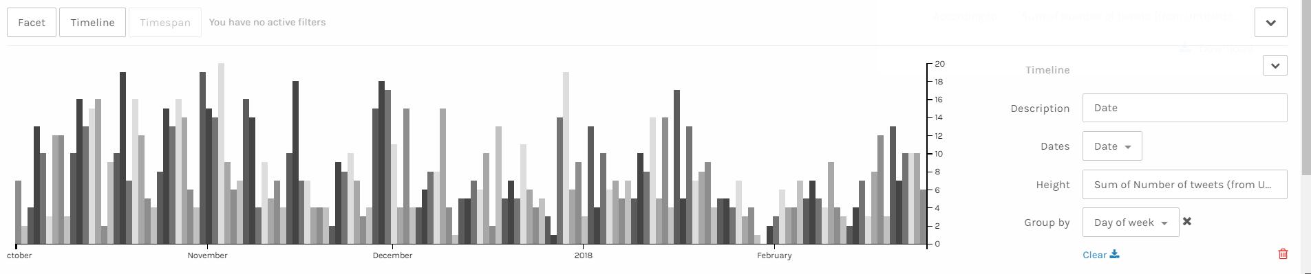
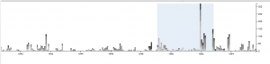
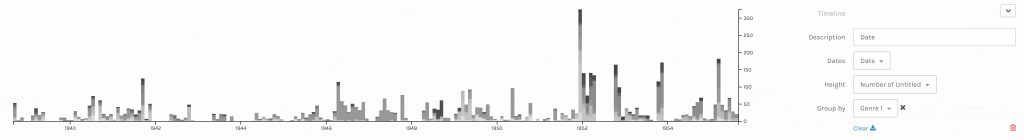
Timelines of photos by date taken (below) and date archived (above).
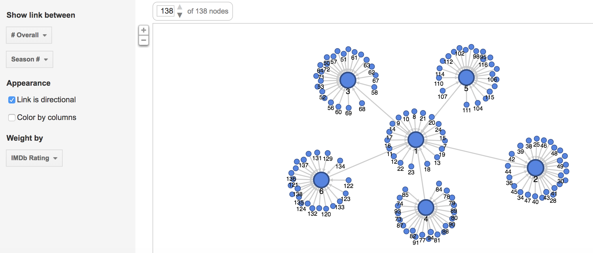
The next thing I explored in this dataset is the genre of the photos. This information is provided in two columns, Genre 1 and Genre 2, in the CSV file. Since the Genre 2 column is sparsely filled out, I only considered the data from the Genre 1 column in my visualizations.

This pie chart from Google Fusion Tables shows that Cushman’s collection consists mostly of identification, landscape, architectural, and cityscape photographs.

Pie chart of photos by genre.

The term identification photograph as used in original dataset made me think that one third of this collection was portrait photographs that you can find on driver’s licenses and passports. However, switching to the Gallery view in Palladio, I realized they are actually identification photographs of species of plants.

Gallery view in Palladio tells a different story.

Another aspect of this dataset that I wanted to look into was whether the genre of photographs changed based on the state Cushman was staying. However, neither of the tools provides the option for stacked bar charts based on location. Thus, I tried creating network graphs with the state and the genre as my parameters. Although the resulting visualizations are quite nice to look at, they do not provide any helpful information and only vaguely reconfirms the assumptions provided by the previous visualizations that I made.

They look nice but do not present anything helpful.

Since datasets, particularly this one, are usually multi-dimensional, I think that these kinds of visualizations can only present a certain aspect of the data at a time. In other words, they are partial representations rather than the whole image of the data itself. As Drucker mentioned, since these methods of visualizing information come from the natural sciences, they impose certain biases on the visualizations themselves. For example, we know from the dataset that Cushman took a lot of identification photographs. However, by counting the number of photos in each genre, we also strip these photos of it aesthetic and sentimental values. For instance, we do not know which photos were the defining moments in his photographic style or which were the ones that meant the most to him emotionally. Or just simply by categorizing the photos as identification photographs without providing the thumbnail images can give the viewers a wrong impression of the kind of photographer he was.

Nevertheless, it does not mean that these  kinds of visualization do not generate new knowledge. Nowadays, data is being generated at an unprecedented rate. Since human’s computational capacity is limited and this data is mostly digital-born, computer-generated visualizations provide an efficient way of discovering things about humanities. For example, the maps that I created infer that Cushman lived and worked in Illinois and California for most of his life, which was mentioned by the Indiana University Archives. On the other hand, by arranging his work on a timeline, we can also the period where he moved to those states.

Categories
Assignment 3

Assignment #3

News about Trump in the White House’s Official Website in 2018

I gathered all news posted on the White House’s official website, and have created a table of meta data of those news, which include file names, date, word count, category, issue and location. For now, my main focus is on the issue of those news, so that we can know what kind of issues the president has been paying attention to.

The first graph is produced by Palladio and Google Fusion, with category as source and issue as target. Intuitively, the network relationship for category and issue shouldn’t have too much significant meaning. But from the network graph below, we can interpret some information by adding the size of node as a feature. Most news is in the category of statements & releases and about foreign policy. Statements & releases connected to most kinds of issues, only education, economy & jobs and infrastructure & technology are posted by other category of articles. So we can know that dealing with different issues, the White House might use different form of articles. Compared to the graph produced by Google Fusion, I think Palladio should learn from Google fusion to change the color for different kinds of nodes. Although nodes can be highlighted, the difference of color is not significant enough. Another advantage of using Google Fusion’s network graph is that it shows the weight of relations between nodes with the thickness of lines. Palladio is also not flexible enough to control the number of nodes in the graph; in this project, the number of category is in a rather small number, so the graph is still clear for user to look at and read about details, but when there are too many nodes and users only want to learn nodes with highest weights, then the feature like limitation on the number of nodes in Google Fusion would be needed.

The second graph is also a network graph with location as source and issue as target. From this graph, we can interpret more information than the last one. Most news are posted when Trump is at Washington D.C. (most time in cabinet room, oval office or south lawn) and most issues are also in Washington D.C.. News posted outside are usually highly related with the issue happened at the date of that news. For example, the news posted on January 8th was about the rural America’s living condition and on that day, Trump visited Nashville, TN and gave remarks at the American Farm Bureau Federations Annual Convention. Another example, when Trump was attending World Economic Forum in Davos, Switzerland, news in that period is about Foreign Policy.

Those three graphs are timelines for issue, category and location. I don’t see any pattern on the category and issue of articles. And due to the timeline, we can see in the first two month of 2018 Trump didn’t spend too much time on business trip. In my project, timeline is not very helpful for users to interpret data, but I think the combination of bar graph and timeline can be a powerful tool for analyzing data like stories or events. The frequency of words or persons in time line can help users to learn about the focus of topic of an event of the clue in a story.

I also produced two pie charts for issue. Foreign policy takes the largest area and is the main focus of Trump during the beginning of this year. And we can see there is 27.5% of news is not classified with an issue by the White House. So I guess that’s what Drucker mentioned about misinformation; because when a large part of information might be omitted, ignored or untouched, the visualization of data may present imprecise data and mislead viewers. Take this pie chart for example, what if the part without being categorized is about law & justice, then in that situation, law & justice could also be a main focus of the president Trump. And that’s why although I have word count in my metadata, I choose not to use it. Because the number of words in a piece of news might represent the importance of it and it might not. Maybe it just needs more words to explain something. Similarly, what we have done in previous assignments, that we usually use the frequency of certain words to interpret data, might also be a misinformation, because maybe certain terms can be told only in a unique word, like nuclear, but terms like freedom can be also be told in liberty, essence, liberfree, or free will, then judging on the focus of topic with the frequency of words would be misleading.

Thinking more deeply, although the news posted by the White House’s official website is about foreign policy, what if many news related to other issues are not provided by the White House with news? Then the main focus of the president might not be foreign policy, and may be it is the image of the president the White House wants to present to people. Then visualization of our data will be misinformation and what Drucker tried to tell makes a lot of sense.

Therefore, I think, to prevent misinformation, we need our data to be comprehensive and multi-dimensional. Comprehensiveness can avoid omitting important parts of data, so the graph could be statistically precise; in this project, news which is not classified is a lack of comprehensiveness. Multi-dimension can avoid ignoring important perspectives or points of view to the data; in this project, we only have news from the White House’s official website, so the our data only represents the White House’s point of view on the president Trump.

Categories
Assignment 3

Assignment Three

In completing assignment 3, I decided to take a break from my Migos’ corpus and use the ‘Baptized Indians’ dataset. Mainly because I felt that the given dataset was more compatible with Palladio and Fusion tables. I inserted my original data but it didn’t offer much graphical expressions that I felt was meaningful, which is why I ultimately chose the alternative data. I extracted the data from the tables and converted them into a .csv file which I then transferred them into Palladio/Fusion tables.

The first graph (left, palladio) displays an individuals’ name in relation to their corresponding nation of origin. This tool surprised me as it showed the similarities of how all these people were in some ways connected to one another. Then, I used a similar table tool in Google Fusion (right) and it’s graphic was similar as it displays the connection between the names of the individuals to their origin location. The symbols were connected to it’s relation but it lacked a detail that showed the “close-knit” relation towards the nations. I felt that the Palladio graphic helped me gain more knowledge as the visualization added another element to the data’s information.


The first table(fusion) above provides a complete description of an indians bio followed by their life details. This supports the representation of a person and provides the viewer with a clear visualization of the basic facts of the people. The second table (palladio) wasn’t very useful in my opinion because the program restricted the creator to three linkages in the settings tab which only allowed me to show the data above rather than a full background which the fusion table provides. This may lead to a viewer misinterpreting a visualization due to a lack of information.

This palladio table allowed me show multiple layer tools into a column styled graphic which allows a viewer to view data clearly as their is no chance for misinterpretation being that these rows information is straightforward. It lays out the an individuals name and their family relation. Also, it displays their nation in which they ‘belong’ to. This visualization is interesting to me as it links the data together in a standard fashion but conveys a meaningful expression. The mapping tool(bott

om right) from the fusion table pinpoints the geographical location of the baptized indians that make up the dataset. It is plotted by their latitude, longitude coordinates which provides a pin at it’s exact location rather than a relative distance. This tools serves as a knowledge generator, discussed by Drucker, as it models the data in a form that goes beyond charted data. It allows the viewer to analyze geographical regions from a spatial aspect and draw comparisons within places as their individuals relates together.

I think that all of my visualizations above all have their own meaning which allows the viewer to analyze information further than just viewing it on a standard data table. These graphical expressions use spatial forms to influence meaning to place as well as people. In the Drucker reading, it discussed how a viewer could take away lessons from “galleries of good and bad, best and worst…they are useful for teaching and research”(239) It doesn’t matter if the graph has flaws, there is always a learning experience that you could take from an expression and use to further knowledge and gathered information.


Categories
Assignment 3

Assignment 3

For this week for Assignment 3, we were to compare and contrast Google fusion tables with the Palladio platform. For this assignment, I used the given dataset from the sample data in Palladio (Women in Memoirs). I then proceeded to upload each of the 31 women information separately from google spreadsheets to Palladio. From here I started to play around with the visualization tool to help familiarize myself with the platform. After using both visualization tools I must say Google Fusion Tables was easier to navigate and create different visualizations with.

 The first tool I used after I created the Palladio dataset was the graph(mapping) visualization. Tools like this one allow a person to see the connection these women have that you may not initially notice. For example, at first glance, I didn’t realize that most of these women died in Bethlehem, Pennsylvania. This correlation between these women is very important in looking at the data. This tool allowed me to come to the conscience that most of these women during their lifetime sailed the Atlantic to move to the United States for a better opportunity. Not only do graphs like these show trends but they can add additional importance to reports. The Google Fusion Table graph similar to Palladio, however, is much more user-friendly and eye-catching using colors. In Google Fusion Tables it takes the visualization process to the next level by even showing the day and time each woman passed away a feature Palladio doesn’t have.

The next visualization that I used on both platforms were the table tools. The information similar to google spreadsheets allowed me to see each and every one information. From their birthdate/place, death date/place, occupation, and many other aspects of their lives. This tool makes it easier to learn about each woman’s background specifically. Of course, I compared this tool in Palladio with Google Fusion Table. This time around I couldn’t really find that much of a difference between the two platforms other than the fact in Google Fusion Tables I was able to rearrange the woman’s death dates in chronological order that made it stand out.

 Unfortunately while using Palladio though I wasn’t able to access the feature of the map yet I still got a sense of how it works through Google Fusion Tables. As you can see in the picture of the United States and European countries the visualization tool allows the viewer to see where each woman originated from. I found this tool the most interesting because it shows how overtime eventually most of the women in the dataset somehow ended up locally in Bethlehem, Pennsylvania.

I believe these visualizations are representations of how the arrangement of elements carry meaning. Like I stated before humans are prone to miss things at the first time. Visualization tools like the ones above help divulge information that isn’t always given.

Categories
Assignment 3

Assignment 3

For assignment 3, I chose to go with my own data and continue observing the collection of Sherlock Holmes short stories. As said in my second assignment, the metadata is pulled from the 56 short stories written by Sir Arthur Conan Doyle. The categories I went with were title, creation date, larger collection, major location, illustrations, and recurring characters, and word count. Going into the analysis of visualizations, I didn’t have a exact goal on what to look out for. Of course there are some things you can postulate before seeing them such as the progression in writing style, but I chose to let the data speak for itself in this instance, which is why I found a lot of it. Title was chosen as a way of ID’ing the works, so that category is self-explanatory. Creation date is the date of creation of each short story. Each short story is part of a greater collection: Adventures, Memoirs, Return, The Last Bow, and Casebook,  released in that order. Each work also has a cover illustration that depicts an intense moment in the story, the url’s of which are in illustrations. Sherlock Holmes has an extensive list of characters, most of which only appear once. Aside from Holmes and Watson, there are a few returning characters that make multiple appearances, the most important of which I have in recurring characters. Major locations is a category where I have the most important location within the that story, useful for seeing if Doyle expanded Holmes’s horizons. And lastly there is word count, which I thought would be useful in analyzing the writing style of Doyle.

This first visualization is of all of the images categorized, by recurring characters, with illustrations and years provided. This view allows us to see how illustrations are affected through the years and by who is appearing. The art became much more of a selling point as the years go on. At first the roughly drawn images barely help communicate the story,  but in later years, color and detail are added to the characters, giving them life and personality. Its interesting to see how it becomes more important, especially after a climatic event like the Reichenbach Fall. We can also see that the Doyle doesn’t like to spoil the events of the coming story. When we have recurring characters, we still have the picture focused on Holmes and Watson, despite having popular characters like Moriarty in the story.

This next visualization is  of locations with respect to works. I went back and forth on using the map for this one but I felt this conveyed the messaged I wanted to  get across better. Doyle loves England, and especially London. That large dot in the middle is London, with tons and tons of stories coming off of it. The scant few surrounding it are the few other stories where main events happen

Locations and names

away from the city, such as Kent and Essex. Holmes rarely travels far from home to do most of his sleuthing, which I found rather interesting.


This last two visualizations are of the same information, but I decide to present it in two ways. I did this because I thought that it showed how much more dynamic and eye opening information can be when displayed correctly. This information depicts years and word count. There is an interesting trend going on here. As you can see Doyle wrote far less as time went on, doing most of his writing in spurts earlier to create the earlier collections. On average however, it appears that the stories are most word dense in the middle of his writing, perhaps when heavy plot elements and more complicated stories, such as the Final Problem, were being written. Nonetheless, the gradients are also pretty pleasing to look at, so I like this visualization quite a bit.


Categories
Assignment 3

Assignment 3

In the previous visualizations, I simply used 50 files of Trump’s tweets with 30 tweets in each file. This construction of corpus does not provide special meta data and thus is useless when analyzed by Palladio or Google Fusion Tables. In order to make the network visualization make more sense, I reconstructed my data set. My data set is now constructed with Trump’s tweets from 10/01/2017 to 02/25/2018, each file including all tweets posted that day. Also, I wrote code for extracting metadata from the original data set. The main parts of the metadata that I collected are date, day of week, number of tweets, time block in which Trump tweeted most in a particular day and so on. Enlightened by Professor Faull, I think although it’s not feasible to find out the relationship between tweets and events related to Trump, because I did not combine my data with Haipu, it may be interesting to figure out the living habits of Trump if I look into his usage of Twitter during different time blocks and number of tweets in different days of week.

Palladio Table for days of week, main tweeting time and number of tweets

The above visualization shows the relationship among days of week, main tweeting time blocks and number of tweets in a day. It’s obvious that Trump mainly tweets in the afternoon and night on Sundays, which means he might sleep more on Sunday mornings. Also, on Wednesday, Friday and Saturday, he usually tweets more than on Monday and Sunday.

Palladio Table for main tweeting time blocks and number of tweets in different time blocks

The above visualization shows the relationship between main tweeting time blocks and number of tweets in different time blocks. It’s evident that Trump is accustomed more to tweet in the afternoon and night, since there is no number more than 10 appearing in the “Number of tweets in the morning” column. Also, if he tends to tweet in the morning one day, he will not tweet much that day.

Palladio Graph for days of week and main tweeting time grouped by sum of number of tweets

The above visualization can better show the relationship than the table ones. The size and color dimensions definitely provides me with more information. Since the size of nodes ‘Night’, ‘Afternoon’ and ‘morning’ are really different, I can say that Trump tweets much more in the evening than in the afternoon than in the morning. Similarly, I can see that Trump tweets more on Friday, Wednesday, Thursday and Saturday than other days of week.

Palladio Timeline with height as number of tweets grouped by days of week

I think the above visualization is the best among all visualizations I made through Palladio. Since I have my corpus constructed in the order of date, I can easily make a nice looking timeline and see the trend of a period of nearly 5 months. It’s obvious that the number of tweets Trump made has a period. The number of tweets reaches the climax in the middle of week and declines after that and rises again when a new week begins. Also, it’s obvious that he tweets more in last year than in this year. Especially at the end of January and beginning of February, he tweeted much less than usual, which is strange. Some events might take place during that period and I hope after I combine my data with Haipu’s I can figure it out.

I think these visualizations are actually representations of information. A lot of information may be veiled at the first glance of data. However, after clever organization and visualization, these informative knowledge can be revealed. As discussed above, in the network visualization, the sizes and colors are dimensions that carry critical information. And I can make a guess that the distance between nodes shows how close relationship they have.

Categories
Assignment 3

Assignment 3

The data I used for the Palladio exercise is the meta-data from the Charles Weever Cushman Collection of photographs (the CSV file is taken from the sample set), located at Indiana University.  I extracted about the first 3600 records from this data set and loaded into Palladio.  The first image I created using Palladio’s map tool was a geographical representation of where the photos were taken.

This output gave a good representation of the distribution of photos in the United States, but it lacked significant detail.  I performed the same graphing exercise this time using Google Fusion for comparison reasons.  For Google Fusions I uploaded the entire CSV file.  As shown in the figure below, the Google Fusion map provides more details automatically.  This includes the state boundaries, state names, and a clearer demarcation of individual photos.  On the other hand, both tools confirm generally identical results- photos were taken across the nation with a concentration in the west coast with very little in the central north.

Using Palladio, I then created a timeline view to visualize the number of photos taken over the course of Charles Weever Cushman’s journey.

This demonstrates the most active years in Cushman’s endevour (1952).  This shows he started slowly, hit a peak in 1952, and kept up the volume somewhat until he finished (through 1956).  This simple to use tool lets researchers get a sense of the time perspective of the data they are observing.

Next I used Palladio to create a network graph, which is a useful process for mapping a system of relations, which is up to researchers to define.  Network graphs can be useful to find otherwise hidden patterns or trends in data being researched.  For example, in the Cushman photo library, I created a network graph that showed the relationships of the kind of images depicted in each photo.  For this graph, I related “genre 1” to “genre 2” categories, which produces a map of the relationships of the kind of images that simultaneously occur in each photo.  For an additional layer of information, I chose the “size” option, which depicts the frequency of connections by the size of the network node between each genre.

In terms of Palladio’s ability to demonstrate Drucker’s notion of spatialization, I think the map view will be useful in triggering different ideas to research regarding the data being analyzed and its relationship to geography.   In this example, the results are simple – the map shows the locations where photos were taken.  However, with more complex data, there could be more interesting spatialization perspectives that can be discovered.