Categories
Final Project Uncategorized

Final Project Reflection

Final Project Reflection

Final Artifact link

Research Question

Sir Arthur Conan Doyles’ collection of works that create the original canon of Sherlock Holmes is considered some of the greatest detective fiction ever written. It’s influences can be seen in mystery stories to this day. Holmes and Watson are household names that everyone comes to know at some point. This effect is not excursively form that original canon however. Its many adaptations are just as important for keeping the stories and concepts alive. This is what as known as a stories afterlife, and can in many cases an afterlife of great magnitude, such as this one, can give rise to just as much mythos as the original. One fun fact I found while completing this project was that the infamous Deerstalker cap and Calabash pipe that Holmes was famous for were never even mentioned in the original texts, stemming for the noteworthy plays done by William Gillette.  This is just one example of how a work can be influence for neither better nor worse over time. In those adaptations however, some things were lost and gained, tropes formed and left behind all together. One hundred years of retelling can change a perception of a character dramatically. My goal of this project was to see how Holmes’s stories have changed over the years from a tone standpoint. To do this I did three things.

  • First, I used analyzed the tone of the original work and read about the portrayal of Holmes within it
  • I then would compare this to the tone of the adaptation  in Voyant
  • Lastly I would take note of the reception of the adaptation to see if people accepted this a the ‘new’ version of Sherlock Holmes


Methodology, Platforms, and Issues

After landing upon this goal, my first step was finding the adaptations that I wanted to work on. After doing quite a bit of research into plays, old tv shows, and forgotten movies, I found that getting a proper script or transcript of the production can be very difficult. After giving my computer probably more than one virus I decided to tailor my approach. I would go with the most popular Sherlock Holmes works , find their adaptations, and then use those which had public domain or easily accessible scripts or texts. I also already had all of the texts from the novels thanks to Project Gutenberg and my previous work with the Sherlock Holmes’s canon. My final approach ended up being a combination. For the meat of the project I decided to focus on the most successful novels since they have been thoroughly adapted. I also finished the slideshow with a overall view of the project

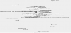
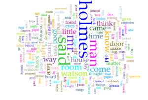
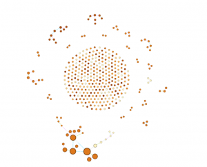
My next step was deciding on appropriate platforms for my project. I knew from the start that Voyant would be a very handy tool for as I was primarily analyzing texts. In the end Voyant would be one of my favorite aspects of my project as it was seamless to embed and looked gorgeous with no tweaking to it. The way I used Voyant was to give the reader something easily digestible upon first inspection of a work. It allows the reader to get a loose understanding and form and preconception of the adaptation or original work that they can then use to guide their thoughts when looking at the slightly more complex visualizations. This was not the main focus on my idea at first, but the way Voyant seamlessly embeds into the slideshow cannot be overstated and it adds another level of interactivity.

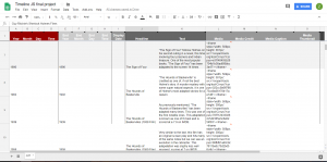
I also knew I wanted to do a timeline since the concept of an afterlife went hand in hand with a timeline. Luckily we had already worked a lot with Timeline JS which was the perfect platform for my project. Timeline JS is an incredibly user friendly platform that saved me a lot of time that would have otherwise been spent formatting websites. My biggest issue with timeline JS, and this is really an issue with my concept, is that a chronological layout makes sense at first, but limits my ability to control what the user sees, and that can lead to some jumbled information being reported and the visualization can lose focus.

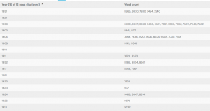
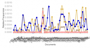
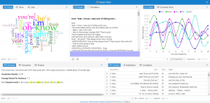
Sentiment analysis became a problem in and of itself. Jigsaw never looked very pretty to me and when I heard other students were using IBM Watson I decided that would be my tool of choice. IBM Watson was very hard to tame in its application form, I spent hours in terminal with curl trying to get it to work, but in the end had to use the default web version unfortunately. The web version felt slightly stripped down, but was enough for me to work with. It provided scores in a range of emotions that could loosely describe the tone of a body of text. I used these scores to judge what the over all impression the work would leave on a person and used that as my basis for tone.

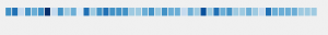
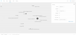
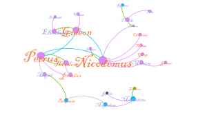
With that figured out, my last step was how I would present my comparisons. After looking at our previous platforms I decided that Palladio would serve me best as a flexible, simple, and user-friendly platform that accepted unformated csv files. I settled on using the graph functionality of Palladio. I pulled the graph sit created to compare the tones of an original to its adapations.

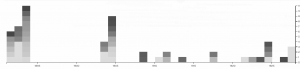
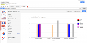
My last platform became Google Fusion Tables. My data, while interesting, was not very complex. This meant two things, I needed somthing to make data that was not quite as flashy appear like that at a cursory glance from a reader, and something that could present that data cleanly and not over complicate it. This suit google fusion tables simple charts perfectly.

In conclusion, I found this project to be an learning experience for a CS major such as myself.  This class is well outside of my comfort zone, so I’m proud of what I’ve created. I tried to not draw too many conclusions on the visualizations I provided as I want them to speak for themselves, but I fell as if they show a clear deviation in the personality of Sherlock Holmes. My original goal was simply to explore whether this deviation existed and I think I succeeded on that front. Some critiques of my own process would be to become much more intentional with my research and plan my moves for the future, as I ended up doing a lot of research and wasting a lot of time with tools that I would end up discarding. My biggest downfall was that I think I failed to convey my own opinions of the subject matter in attempting to not force them on the reader, but that could be up for debate.I also feel that my major critique of my visualization is that it lacks interactivity on an immersive level outside of clicking through a slideshow, but other than that I feel as if the project turned out excellently.


Screenshots:


Timeline JS in google sheets skeleton
Palladio in action


Palladio tables
Google Fusion tables


Metadata in google sheets
Voyant example


Bibliography:

“Canon of Sherlock Holmes.” Wikipedia, Wikimedia Foundation, 10 Apr. 2018, en.wikipedia.org/wiki/Canon_of_Sherlock_Holmes.

extensive use of this website: https://www.springfieldspringfield.co.uk/

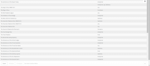
metadata: https://docs.google.com/spreadsheets/d/1kQfdooVqIRx9hcd1z4Ot3XFDQILRTtcI6GapqkF3x0I/edit#gid=2047249578

timeline js skeleton: https://docs.google.com/spreadsheets/d/1MF4i-mdUfti8Li1FNT1O65a-WFFPa16ZUhUfkWwzVuw/edit#gid=0

voyant : http://voyant-tools.org/

palladio: http://hdlab.stanford.edu/palladio-app/#/visualization

ibm watson tone anaylzer


Categories
Assignment 5

Assignment 5

Final graphic representation of small community

In this visualization, we are observing a small sub-group of Indians that appeared in my data of 75 people. To arrive to this data, this first step was tackling the use of gephi. Gephi turned out to be far easier to use than expected. With a little bit of tinkering all of the basics are readily available and fairly self explanatory. After creating roughly 80 edges for my nodes, I used the Yifan Hu layout to not only make the data more aesthetically easier to inspect, but to find anything interesting in the rather sparse amount of edges. Additionally, the data displayed multiple dimensions of the data, namely Indian nation, sex, and community connections (spousal, generational, and sibling). With all of these inputs the data still looked uninteresting, so I chose a small group of Delaware Indians to focus on. For analyzing purposes the size of the names/nodes is proportional to degree. The color of the names is sex, male and female are orange and purple respectively. The color of the nodes is the nation they are affiliated with, most important for us are the purple Delaware Indians and the blue Mahican Indians. Lastly the color of the edges is the relation of the edge, green for spousal, purple for parent to child, and blue for siblings. Some edges I’ve removed for the sake of clarity. With respect to our three calculations of modularity, degree, and eigenvectors I found them mostly inconclusive.  Degree is well represented, and so is modularity by the communities displayed, however eigenvectors failed to make the visualization any more descriptive or interesting, and as such I left them out. Our story focuses on the family trifecta of Petrus, Nicodemus, and Gideon. These three brothers all appeared within my spread of 75 in some way. I think its just fun to observe that each has gone and done their own thing in life. Although difficult to visualize, each went their own ways, represented by them each dying in different places. Nicodemus ended up in Nain, and there he had 5 children. He was married to Lucinda, shown next to him in the visualization. Nicodemus was a randy fellow, as he had the most offspring of the lot. He also appears to have been fairly successful in what he made of himself. One of his children, Zacharias pictured in the top right actually married a daughter of a Mahican. Petrus holds a similar story. He married a Theodore, which may be in a error in the data, otherwise Indians were very forward thinking. Either way Petrus had two kids, one is explicitly mentioned to be adoptive, the other may be as well. If this isn’t an error in data, perhaps they were actually homosexual. Even more impressive is that Petrus clearly made a good name for his family as well.

One of his adoptive daughters married a man who was previously Mahican and married. After his divorce he married Abigail, the daughter. Of course we’ll never know what happened, but we could even postulate that whatever Petrus had going on for himself was enough for a man to divorce his first wife, switch camps to Petrus’s, and then marry one of his daughters, all while being gay in the era. Of course none of that may be true, but exploring these what if’s is what I think visualization is about. And then there’s Gideon, who just had a good life with a wife and some kids. I think this story I found is interesting because it doesn’t show anything incredibly interesting. It simply shows a small merging of people that likely had no huge impact, but we can see this little story play out with just a couple of data points.

Size here is represented by eigenvectors and color by modularity


Categories
Assignment 4

Zeb Gordon

Professor Faull

Humn 270

3/27/18

Assignment #4

Data visualizations are far deeper than they appear. Much like a computer, the final resulting picture is the process of many tiny inputs and decisions which are all heavily involved in the power of the outcome. Most important of these decisions is the narrative of the data. Understanding that data is key to presenting it well, and many factors, from audience, to genre, to the creator itself can affect how this narrative is formed.

One important aspect of weaving a convincing and interesting narrative is understanding your target audience. Like anything made for public consumption, understanding who will be looking at this visualization is important for tailoring it to fit something relatable to them. Once you understand this who, adapting small details to make it more palatable for the viewer can drastically improve the perceived quality of the visualization. These things can be as sweeping as entire cultures. We in the West read left to right, and therefore are far more comfortable with visualizations going left to right (Segel and Heer, 2). Understanding key things as small as those can drastically change the reception of a visualization. Understanding your target audience can also affect how

According to Segel and Heer there are seven genres of visual narratives. They have created seven genres of narrative visualization: magazine style, annotated chart, partitioned poster, flow chart, comic strip, slide show, and video. Each of these styles comes with pros and cons and can be combined in ways to maximize the effectiveness of them. When choosing a genre, it is important to understand its pros and cons. Knowing them can help to accentuate your data to tell your narrative in the way that you want to be interpreted. These pros and cons fall into categories. These are also described by Segel and Heer, saying “Choosing the appropriate genre depends on a variety of factors, including the complexity of the data, the complexity of the story, the intended audience, and the intended medium.” (Segel and Heer) The final piece to the puzzle is author vs reader driven experiences. This descriptor essentially describes how focused the narrative is on leading the reader through the material.  These factors can be easily seen in the example provided by them. The “Steroids or not, the Pursuit is On” poster described by Segel and Heer is part portioned poster and part flow chart (Segel and Heer). This data, while interesting and serious to some, is not as formal as say, a business proposal. This leads the designer to more casual and static genres, such as a portioned poster. Then considering the audience, who is likely going to already understand the subject matter and will be taking a cursory glance, the designer can incorporate the visually leading aspects of a flow chart, which is a very reader driven method as it allows the reader to explore the visualization. This is opposed to the budget forecast, which is a much more business-related visualization. Here the audience wants to be led through a clean visualization that only has the goal of relaying the information. Therefore, an annotated graph is well suited for this. Annotated graphs present information well, if a touch uninspired, which is perfect for this visualization.

Visual sequence is composed by two factors. As described by Segel and Heer, these come from visual narrative tactics and narrative structure. Visual narrative tactics are the visual portion of sequence. This visual guide is composed of three parts: visual structuring, highlighting, and transition guidance (Segel and Heer, 7). Visual structuring helps the viewer to gain their bearings in the visualization and be naturally progressed through it. Lima’s fascination with trees is a great example. Trees are a natural and easy visual guide that assists the viewer through the narrative of the visualization. Highlighting needs no explanation. Its simply the changing of color to direct attention. This method is incredibly easy to see in daily life. The final piece is transition guidance. This is just moving the scene seamlessly to not confuse the viewer. In a static image this could be an arrow, or it could be an animated transition like in a power point. All of these facets are part of just the visual aspect of narrative sequence. The logical side is just as in depth. Again, Segel and Heer describe 3 forms: ordering, interactivity, and messaging. While all of these are easier for the layman to understand at first glance, they are just as important from a logical perspective. From all of these aspects we can synthesize that sequence is key to one thing, and that is keeping the viewer engaged and understanding. Visualization can often times be overwhelming, and it is the job of sequencing to lead viewers through that clutter. Additionally, we can observe the previously mentioned genres more deeply to analyze how the data the represent differs due to their narrative sequence. Segel and Heer created an incredibly useful chart that summarizes how these genres operate. To highlight these differences, using starkly different genres is best. Three genres that use very different strategies are the video, comic strip, and the annotated graph. The video genre is well known and finds its strengths in being able to show exactly what the designer wants the viewer to see at each step of the visualization. Because of that, it relies heavily on visual narrative sequencing tactics, such as well edited cuts, transitions, close ups, motion, and character direction. However, it also completely lacks interactivity, which can cause the viewer to lose interest. Comic Strips also lack this interactivity but make up for with an understood relaxed nature of the visualization, as well easy to follow visual transitions and linear narrative. However these can often contain large lie factor numbers due to the comic nature, as seen in Tufte many examples. Many times their exaggerated nature causes incidental lie factor. As said by Tufte, “Perhaps graphics that border on cartoons should be exempt from the principle” (Tufte, 73). The last example is the annotated graph. The annotated graph is a common visualization mainly used for its interactivity and ease of communication. It uses labeling and messaging well to explain the visualization and is easy to follow thanks to its linearity. This form also has the change of lie factors with poor annotations and markings however, as seen in Tufte’s example of traffic deaths (Tufte, 74).

The designer plays the role of the spyglass in the visualization. The designer allows you to see what they want you to see. Tufte describes six principles of visualization: representation of numbers, clear labeling, show data variation, use standardized units with money, the number of variables should not be more than the dimensions, and graphics must not quote data out of context(Tufte,77). Breaking any of these results in a skewing of data. With this many principles to follow, it is not easy for any impartial body to create a visualization. And simply by being human, it is impossible to be unbiased. The expert on biased visualizations is Tuft and he has many examples of lie factors that may be incidental, but none the less damage the visualization. In his example on page 70, where dollar purchasing power is compared by a graphic dollar, the areas simply don’t accurately represent the power. While the creator was attempting to be clever, he simply can’t be unbiased due to error and human bias.

In conclusion, narrative to a visualization is nearly as important as what’s being told. Its genre and presentation can even morph the data into revealing different conclusions. Understanding how these narrative devices affect the visualization can greatly improve the creation of and interpretation of visualizations and is an important thing to understand for anyone involved in the humanities.

Categories
Uncategorized

Timeline visialization


Categories
Assignment 3

Assignment 3

For assignment 3, I chose to go with my own data and continue observing the collection of Sherlock Holmes short stories. As said in my second assignment, the metadata is pulled from the 56 short stories written by Sir Arthur Conan Doyle. The categories I went with were title, creation date, larger collection, major location, illustrations, and recurring characters, and word count. Going into the analysis of visualizations, I didn’t have a exact goal on what to look out for. Of course there are some things you can postulate before seeing them such as the progression in writing style, but I chose to let the data speak for itself in this instance, which is why I found a lot of it. Title was chosen as a way of ID’ing the works, so that category is self-explanatory. Creation date is the date of creation of each short story. Each short story is part of a greater collection: Adventures, Memoirs, Return, The Last Bow, and Casebook,  released in that order. Each work also has a cover illustration that depicts an intense moment in the story, the url’s of which are in illustrations. Sherlock Holmes has an extensive list of characters, most of which only appear once. Aside from Holmes and Watson, there are a few returning characters that make multiple appearances, the most important of which I have in recurring characters. Major locations is a category where I have the most important location within the that story, useful for seeing if Doyle expanded Holmes’s horizons. And lastly there is word count, which I thought would be useful in analyzing the writing style of Doyle.

This first visualization is of all of the images categorized, by recurring characters, with illustrations and years provided. This view allows us to see how illustrations are affected through the years and by who is appearing. The art became much more of a selling point as the years go on. At first the roughly drawn images barely help communicate the story,  but in later years, color and detail are added to the characters, giving them life and personality. Its interesting to see how it becomes more important, especially after a climatic event like the Reichenbach Fall. We can also see that the Doyle doesn’t like to spoil the events of the coming story. When we have recurring characters, we still have the picture focused on Holmes and Watson, despite having popular characters like Moriarty in the story.

This next visualization is  of locations with respect to works. I went back and forth on using the map for this one but I felt this conveyed the messaged I wanted to  get across better. Doyle loves England, and especially London. That large dot in the middle is London, with tons and tons of stories coming off of it. The scant few surrounding it are the few other stories where main events happen

Locations and names

away from the city, such as Kent and Essex. Holmes rarely travels far from home to do most of his sleuthing, which I found rather interesting.


This last two visualizations are of the same information, but I decide to present it in two ways. I did this because I thought that it showed how much more dynamic and eye opening information can be when displayed correctly. This information depicts years and word count. There is an interesting trend going on here. As you can see Doyle wrote far less as time went on, doing most of his writing in spurts earlier to create the earlier collections. On average however, it appears that the stories are most word dense in the middle of his writing, perhaps when heavy plot elements and more complicated stories, such as the Final Problem, were being written. Nonetheless, the gradients are also pretty pleasing to look at, so I like this visualization quite a bit.


Categories
Assignment 2

Assignment 2

I chose to analyze the original Sherlock Holmes short stories by Conan Doyle. The idea came from our analysis of the London map in class the week before this assignment. I’ve omitted the novels in an attempt to keep the corpus even throughout. I feel the short stories were an excellent choice of corpus for this assignment, namely for Jigsaw. Doyle released the adventures in collections, making them fit for classification throughout the years, furthermore they each have roughly ten entries which is perfect for Jigsaw. In this way it was very easy to decide which texts I should use, as they could all be used fairly easily. Additionally the short stories are close to 10 pages, which makes Jigsaw far more useful. All of these factors helped in choosing Sherlock Holmes for a corpus. I’ve chosen to analyze Doyle’s writing style as the stories got older, and if he tried to tailor his style to meet demand as time went on.

Collecting the corpus was fairly simple. Being such an old series of works, they were all available free online. I found plain text versions of each work and copied them all into their respective categories. From there I went to Jigsaw.


My first visualization is of the words relating to the works over time. As you can see here, this visualization is representative of time and length of the works individually. The lighter the color the shorter the work and time runs left to right. As you can see length appears to be lessening as time goes on. We can interpret this as assuming maybe his works were too long for the average consumer. Seeing that, maybe he adjusted the length to maximize the audience. Or maybe he got better at writing and could convey more with less writing. That is what we can take away from this.


Our second example jumps to voyant. This visualization shows the frequency of dark subject matter showing up within the texts. These terms include murder, death, and killed among other terms. As you can see the frequency of these terms tends to jump around with spikes throughout. One could interpret it to see there is greater grouping in the middle of this writing. The documents are grouped by work and the groups go from left to right in terms of time.

My final visualization is a simple overall word frequency of the Sherlock Holmes short stories. While it doesn’t entirely line up with my original plan, I felt that it was interesting how static and representative of the time that this was written in. Holmes blows all the other terms out of the water, despite the books having a wide cast of recurring characters. The short stories never fail to have Holmes being the center of the show with the side cast of characters merely filling out the world, and Doyle never moves from that philosophy throughout.


These two tools are extremely powerful and can generate amazing visualizations. I feel that voyant can create very good visualizations that can be dynamic and are interesting for the viewer, however its power lies in accessibility. The ease that one can create visualizations with is incredible. Jigsaw on the other hand has an incredible skill ceiling. With enough skill one could make visualizations that blow voyant out of the water. However, it is much more difficult to even get jigsaw off the ground. As such, voyant was a joy to work with, while jigsaw was very difficult.


I feel Clement’s quote is very much reinforced by what I’ve done here. Certain opinions or conclusions that could be drawn from this data could not really be seen from a simple reading. Jigsaw and Voyant allow for a incredibly deep analysis from seemingly infinite angles. That overlap that creates a ‘multidimensional’ lens is why I find these tools so powerful. Different visualizations could show vastly different things, and even within one you could come to a myriad of conclusions.

Categories
Assignment 1

Assignment 1

First example
Second Example

For my two selections , I tried to choose two that showed the different ways visualizations can be effective. The first visualization is very clean and easily legible. Its value is in being easily comprehensible and conveying that information efficiently. While its unfortunately not in English, you can see just from its neutral presentation how it will give very precise information for the reader to digest, while using imagery to assist the reading. The visualization depicts connections between contemporary works of fiction and non fiction. The nodes are works and the edges are concepts the connect them. This is a very intuitive design that sells its ideas very cleanly. It draws attention where needed and is visually pleasing. There aren’t too many dimensions going on as well, adding to its simplicity and ease of use. The second visualization is the opposite. Where as the first example was very literal, this one conveys the abstract. This visualization attempts to reveal the overlap in our deeply connected modern world. The creator took participants data and connected it abstractly with others.  The result is messy and indefinite. A hundred people could have a hundred different interpretations. No key is given to decipher what this any color or strength of light means. All is up to the reader to decide. I think these two showcase two of the many ways data visualization can be used. The first comes from an almost empirical background. The connections are cleanly drawn and  are easy to follow. The creator is clearly trying to suggest relationships between the works and has a clear message to share. The second is a free form experiment in art, showing our deep connections to strangers in a modern world, and allows for infinite interpretation while being extremely pleasing to look at. These don’t differ in the fact that they’re both very static in presentation, which makes the reader less able to interact with it as a whole.


This example I feel straddles the two schools of thought. This can be difficult because doing either method poorly can result in a lackluster visualization. I feel this one works excellently however. Just to start, its incredibly clean to look at. One can easily understand the gist of each area of the visualization, but it has detail for when closer inspection is needed. Furthermore, the ability to change the person being observed adds dimensions to the data. This is a great humanist visualization because it gives the detail needed to quickly understand the information, but also leaves that data up for varied and strong conclusions.

third example
Categories
practice

Homework 1