Categories
Final Project

FINAL PROJECT!!!!

For the final project, Bryan and I decided to focus on the music of this generation and how it’s evolved over time. Music is a key part of both of our lives. Being able to find the right song for different situations helps bring relaxation to the both of us. I really feel music is a universal language. Not only does music allow you to connect with the artist but with different people who also have the same taste in music. When I listen to music I enjoy hearing the different instruments used to make the beat from the drums to the piano. I also pay close attention to the lyrics of the artist. From listening to music I’m able to learn about different cultures and backgrounds. In particularly we decided to center our attention on the mecca of Trap music, Atlanta which Bryan and I enjoy very much. The music industry in Atlanta has always been consistently setting new music trends and producing new artist. Many upcoming artists over the years have migrated to the area because the amount of success artist is having. Over the semester it was challenging trying to come up with a solid research question. However, we decided to look at the Trap era as well as the Dirty South era of Atlanta. Both era’s respectively played an important role in the music business. We felt as time has passed the music industry has as well. As we started conducting research we saw a shift from the early 2000’s (Dirty South era) where artist mainly spoke on the absurd amount of women they had, both in a positive and negative light. However, with the emergence of an artist like Gucci Mane, T.I., Soulja Boy, and many others in Atlanta we start to see more references to drug dealing, ”the trap”, and the life struggles to reach fame. We started to realize the influence the Dirty South era had on upcoming artist today and even though they might not be rapping about the same things both decades still promoted their high priced lifestyles to their fans.

For our project, we decided to use Jigsaw, Palladio, and Voyant all visualization programs that we have used throughout the semester. For our corpus, we collected nearly 60 songs from both eras and put them into a spreadsheet. The songs collected for our visualizations at some point all reached US Billboard Top 100. By hand picking the hot tracks of each era we felt we’d get a fair/accurate representation of the different cultures in Atlanta. Our spreadsheets were then divided into columns (ex. Release date of each song, artist, producer of the song, background information on artist and song). With all the data collected in the spreadsheets, it was much easier transferring the data from one program to another. Each visualization tool used for this final project revealed its own set of problems however ultimately we worked these problems out to answer our research question.

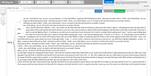
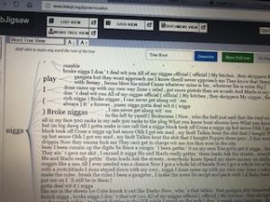
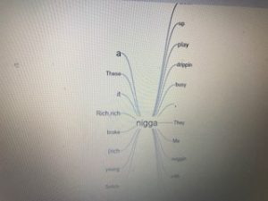
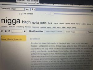
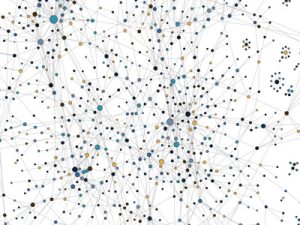
With the text gathered we first wanted to use jigsaw to show the similarities and differences between the eras. We immediately ran into problems because the files weren’t trying to upload and kept giving us an error message. The backup plan was to use Webjigsaw however we realized we wouldn’t be able to use the many interactive tools that come with the site. Eventually, we were able to plug in our data and use the interface. We were able to use word tree which connected phrases to the words we searched using the tool. By seeing this it allowed us to see what words were being used more frequently throughout our corpus. N**** and B**** were the most commonly used in both eras. From using word tree we were able to see how in the Dirty South Era artist rapped mostly about women and how they come with the superstardom. We saw how that shifted later on in the Trap Music era as the focus changed now from glorifying women to rapping about their wealth.

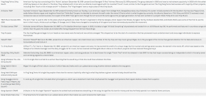
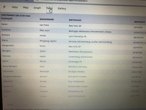
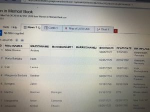
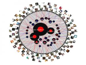
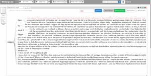
Like jigsaw, we had problems using Palladio at first. When we kept trying to upload the data onto the site we kept getting an error message that something was wrong in our data. We then had to manually go through each line of text from our spreadsheet to make sure the problem was resolved which was very time-consuming. I believe by having problems and being able to work them out that was the greatest lesson we learned from this project. We gained knowledge not only from our research but first-hand experience using tools that could eventually help us later on in life. From using palladio we were able to look at each artist/group individually and able to give background information on each artist (birthdate, birthplace, and #1 debut hit singles).

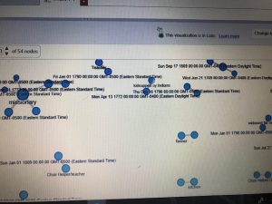
With using Timeline.jgs I wasn’t comfortable using the program compared to my more efficient partner. As time past and I used the program more I soon realized how powerful of a tool it was. Being able to interact with the data as there are many tools to choose from showed me the importance of Timeline.jgs. In addition compared to the other programs and their layouts, none are able to put data in a timeline format which we also found very helpful comparing and contrasting the two eras. It was cool to see the end result of our hard work and how clear and formatted our data was. In the beginning, I remember looking at other projects for examples and I was worried at first our project wouldn’t come close I was surely wrong.

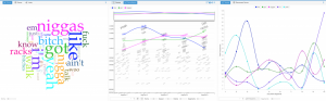
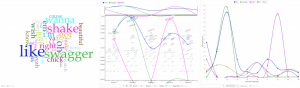
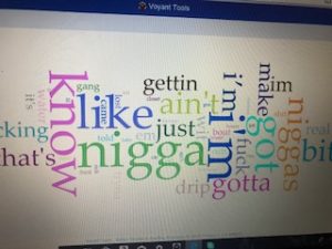
The last tool used was voyant which is a user-friendly and appealing visualization tool. Given my background with voyant it was the easiest tool to navigate and collect data for. Voyant provides many ways to interact with the data and can be viewed using different tools. This visualization compared to others resembles a dynamic visualization because it allows users to build their own conclusions from the data being presented. Using Voyant I was able to break down the data and get a better sense of what each era was rapping about in their songs.

In conclusion, I believe our final project was a success from a digital viewpoint. Not only were we able to answer our research question our visualizations are user-friendly and very informational. We both struggled at times however we picked each other and are very appreciative of being able to learn how to use these visualizations tools throughout this semester.


Categories
Assignment 5

Assignment #5 (Omar G. & Bryan M.)

For this particular assignment, Bryan and I analyzed the data from the Baptized Indians Database. We were able to do so by using Gephi visualizations. Using Gephi help reveal patterns and also allowed us to explore and manipulate the data to point out trends of the baptism relationships between Native Americans during the time. We first started by making edges for the people we were assigned to with the ID 175-225. For our visualization, we ended up with 97 nodes and 86 edges. Each node specifically represents a Native American who fell under our category while the edges show the numerous interconnections made between the natives. When we first saw this visualization below we were confused to say the less about what Gephi was trying to show us due to a couple connections that weren’t found on the spreadsheet thus making it hard to follow along initially. You can only see some connections however its hard to follow along because of the lines crossing one another. We then proceeded to play around with Gephi in order to get a better understanding of the data.

[gview file=”http://humn2702018.blogs.bucknell.edu/files/2018/04/raw-version-1.pdf”]

We first started my adding color (modularity) to our visualization to help further break down the data given. By adding color to the graph Gephi allows the viewer to see what group each person is linked with. By doing this it gives a viewer an easier graph to look at compared to the visualization we started out with each node being the same color. You are now able to see the different communities within this visualization.

[gview file=”http://humn2702018.blogs.bucknell.edu/files/2018/04/modularity.pdf”]

We decided to break it down even more and looking at the different connections between each of the communities. In this visualization to highlight the interaction between each person(node), we decided to adjust the size of the nodes according to their class and rank. Furthermore one can imply by looking at this visualization to see how Christianity was spread back then which was usually through marriage which explains the connection between the different color nodes.

[gview file=”http://humn2702018.blogs.bucknell.edu/files/2018/04/indiansmarinekf.pdf”]

The last feature we decided to use was a visualization showing their names and the various relationships between each baptized person. This visualization shows how each person is either related somehow or come in contact with each other. The color of each node depends on their activeness within their community and spread of Christianity. I find this visualization more meaningful than the others because it shows the overlap of the communities and how they networked back then as well it shows you the more important people in the groups.

[gview file=”http://humn2702018.blogs.bucknell.edu/files/2018/04/noverlap.pdf”]

In conclusion, Bryan and I believe Gephi is a helpful visualization site but it can be very difficult at operating sometimes. Overall we both struggled with learning how to use Gephi but are very appreciative of being able to learn how to use another visualization site. However, as time passed Bryan became more comfortable in using the site compared to me. Compared to other tools we’ve used before Gephi isn’t the most user-friendly and because of this, it can be tough at pulling and analyzing the data with this visualization tool. We quickly realized though as we added more features to our data the more knowledge we were able to gain. We like that you could play around with some tools from the site however we both said we wish it could be more interactive like voyant or jigsaw which both had an ultimate amount of resources to play with and extract data from.

Categories
Uncategorized

Timeline Visualzation

Categories
Assignment 3

Assignment 3

For this week for Assignment 3, we were to compare and contrast Google fusion tables with the Palladio platform. For this assignment, I used the given dataset from the sample data in Palladio (Women in Memoirs). I then proceeded to upload each of the 31 women information separately from google spreadsheets to Palladio. From here I started to play around with the visualization tool to help familiarize myself with the platform. After using both visualization tools I must say Google Fusion Tables was easier to navigate and create different visualizations with.

 The first tool I used after I created the Palladio dataset was the graph(mapping) visualization. Tools like this one allow a person to see the connection these women have that you may not initially notice. For example, at first glance, I didn’t realize that most of these women died in Bethlehem, Pennsylvania. This correlation between these women is very important in looking at the data. This tool allowed me to come to the conscience that most of these women during their lifetime sailed the Atlantic to move to the United States for a better opportunity. Not only do graphs like these show trends but they can add additional importance to reports. The Google Fusion Table graph similar to Palladio, however, is much more user-friendly and eye-catching using colors. In Google Fusion Tables it takes the visualization process to the next level by even showing the day and time each woman passed away a feature Palladio doesn’t have.

The next visualization that I used on both platforms were the table tools. The information similar to google spreadsheets allowed me to see each and every one information. From their birthdate/place, death date/place, occupation, and many other aspects of their lives. This tool makes it easier to learn about each woman’s background specifically. Of course, I compared this tool in Palladio with Google Fusion Table. This time around I couldn’t really find that much of a difference between the two platforms other than the fact in Google Fusion Tables I was able to rearrange the woman’s death dates in chronological order that made it stand out.

 Unfortunately while using Palladio though I wasn’t able to access the feature of the map yet I still got a sense of how it works through Google Fusion Tables. As you can see in the picture of the United States and European countries the visualization tool allows the viewer to see where each woman originated from. I found this tool the most interesting because it shows how overtime eventually most of the women in the dataset somehow ended up locally in Bethlehem, Pennsylvania.

I believe these visualizations are representations of how the arrangement of elements carry meaning. Like I stated before humans are prone to miss things at the first time. Visualization tools like the ones above help divulge information that isn’t always given.

Categories
Assignment 2

Assignment #2

For my corpus, since I’m interested in music, I’ve decided to focus my research on the lyrics of some of the artist I like to listen to. I grew an interest in music because I find it as a way to express oneself. I’ve realized this is a very broad topic so instead, I choose songs that have some type of correlation, rap. I then went on to Genius and copy and pasted my top 10 songs and put them in a single word document. With the text, I gathered I hope to find similarities between these songs whether it’s the deeper message the artist is portraying, commonly used words, or to analyze and see if their flows are the same. At first, I was going to censor the explicit words from these songs however I felt that was taking away from the authenticity of these raps. I want the viewers of my corpus to get a sense of what artist are rapping about today whether it’s money, drugs, women, etc.

Unfortunately trying to download jigsaw to my computer has been a mess this past couple of weeks. My system since trying to download the program has not been right since. So for the assignment write up, I’m currently using WebJigsaw. I realize not using the original jigsaw I’m not able to see the many interactive visualizations however it still provides me with the word tree, list, and document grid views.

Nonetheless, from interacting with these two visualizations I’ve realized they are quite similar. However rather than just being user-friendly and more appealing like Voyant, Jigsaw takes it a step further by using visualizations that show connections between entities across the document collection.

Both tools have a word tree visualization, however, spits out different information when searching for the same root term. The term ”ni**a” was used both in voyant and jigsaw to show an example of this. On the one hand, when using voyant to search for a term you are able to click on the term your searching and it will allow the viewer to explore the root term and the different phrases its used in throughout the corpus. On the other hand, when a person is using jigsaw’s wordtree the viewer is able to search for a term and it will turn show you the entire phrase that follows the word your searching for as well as highlight/bold words that are used more frequently throughout your corpus.

Furthermore, both tools have similar visualizations that enable the viewer to see the top frequent words being used in the document. This tool is used to quickly draw the attention of the viewers to show them what is in the document. With voyant, this tool is called cirrus which uses a method where the most commonly used words are positioned in the middle emphasized with larger text and the less frequently used words are on the outside hovering around. In a jigsaw, this tool is called the document view which has all the traits that cirrus has but you can take it a step further by analyzing the similarity of your documents against the others being visualized in addition you can request that the document execute a sentiment analysis.

By constructing my corpus and viewing it through both visualization tools: voyant and jigsaw I believe it gave me a different perspective. This, in turn, agrees with what Tanya Clements harped on when she talked about multi-viewpoints. Even though I wasn’t able to use the original jigsaw format I got the sense of how powerful of a tool the program really was through WebJigsaw. What drew my attention from using both visualizations were how interactive they both were in using my corpus. Using both visualizations I was able to catch things that the human eye might not. I was able to break down the information and get a better sense of the lyrics of my favorite songs.

Categories
Assignment 1

Assignment 1

The first visualization I choose is called “Twitter Lyrics” which is a rating system which uses Twitter to track the number of times a song is being quoted this is done to help understand the impact songs have on people’s lives. I found this visualization interesting because I can personally relate to this visualization. I love listening to music especially rap. A lot of my tweets from Twitter are inspired by the lyrics I hear from the music I come across. I love the fact that I can find always find a song/quote and connect it with how I’m feeling that day. I use the quotes from these songs to uplift myself as well as for motivation. Twitter Lyrics provides many ways to interact with the data and be viewed from different perspectives. I believe the visualization enable an artist to see how their listeners are interacting with their music. This visualization resembles a dynamic visualization because viewers are able to build their own conclusions from the data presented without it being misleading in any way.

The next visualization is “The Seattle Band Map” which is also categorized under music. This visualization unlike Twitter Lyrics documents the bands from the northwest region of the United States. The visualization shows how they have connected whether it be personal relationships or working together on songs. The creators of this visualization believe Seattle is a prominent area for music so to keep the area relevant they came up decided to create this lineage. This visualization drew my attention because I was fascinated how the creators made the visualization very informational. I find this visualization unlike Twitter Lyrics to be very more hands-on and interactive. This visualization, in particular, exemplifies a dynamic visualization as well because it’s very detailed and it doesn’t try to persuade the viewer any type of way other than showing you the social network of these bands. Yes, the visualization provides multiple ways of interacting with the data allowing it be viewed from different perspectives. Lastly, I believe this visualization leads to new and emergent ways of understanding the material because even though the visualization looks complexes it’s rather simple and helpful if you want to learn more about these bands.

After looking at a couple of software’s I decided I enjoyed a program known as Selfiecity. This is mainly due to the huge impact social media has on everyday human life. This software “investigates the style of self-portraits” in places like Bangkok, Berlin, Moscow, New York, and Sao Paulo. The primary focus of the software is visualization. Throughout Selfiecity the creators use different graphs to show the data taken from their research. The ultimate goal of the software is to see if there are differences in the selfies being taken in different places across the world. The website is very interactive allowing the viewers to play around and explore with the website enabling them to see thousands of selfies and the correlation the selfies have from the same places.


Categories
Uncategorized

Two Visualizations