Categories
Assignment 5

Assignment 5

Gephi visualization representing relations between Moravian missionaries in the mid Atlantic states in the 18th century

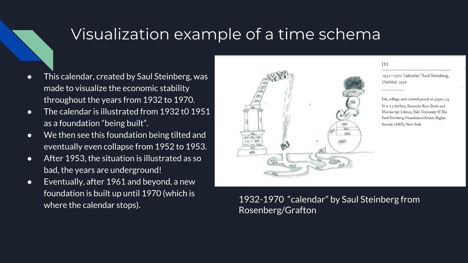
Gephi is a data visualization tool that allows the user to input data and manipulate it in numerous ways. It has the capability to visualize different relationships within the data across multiple dimensions as well. Steve and I were taking a look at 49 different Moravian missionaries who had been baptized in the 18th century. Using the Moravians from ID number 126 to 175, we broke down their data into ID number, name, relations to others within the data set, and the nation they belonged to. After putting the information into Gephi, we started testing with the different options that Gephi had to offer to visualize our data with focuses on statistical calculations such as modularity, degree, and betweenness (or Eigenvector value). These were essential to the project since we were looking at a very tight knit community of people. Paranyushking writes about how all of this information can be allowed to “speak in its multiplicity”, where it tells the story through the information given (Paranyushkin 2011).

It was difficult to figure out the different aspects of Gephi without playing with the options first. To begin with, we had to build up our data. Connecting each Moravian within the table to their relative was the first step. After building undirected links between all 49 Moravians, we were able to begin visualizing the data. What we initially got was a very “bare bone” visualization of our information. It was after that that we started playing with the different options

Gephi “bare bone” visualization

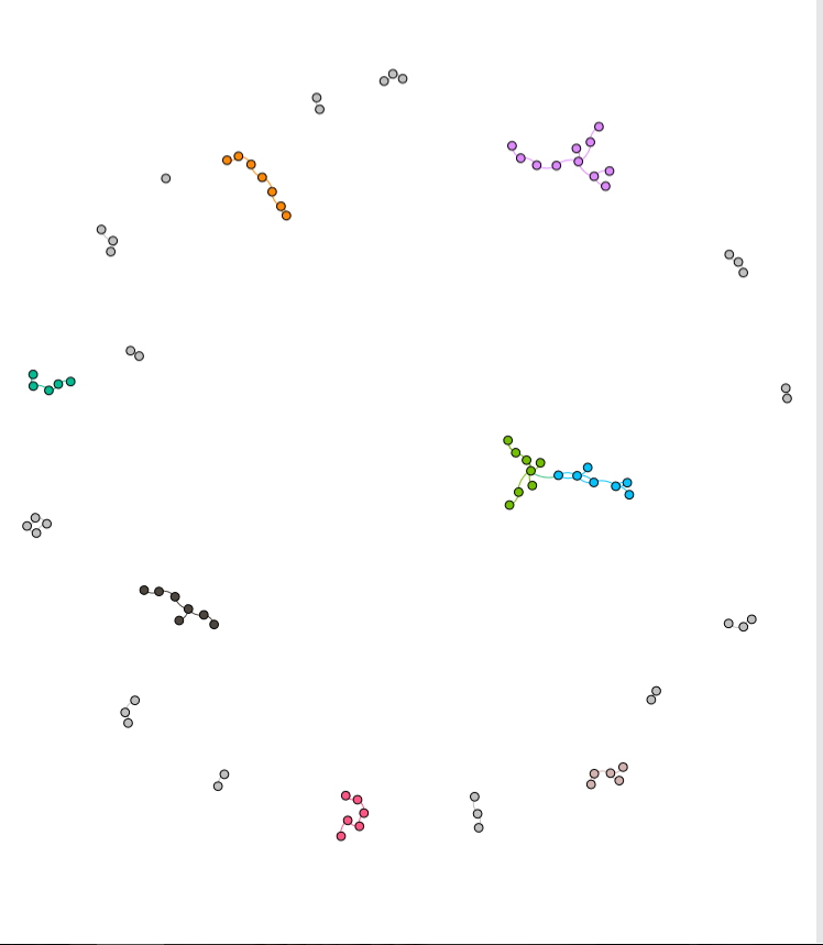
What Steve and I decided to investigate next was adding in a different dimension of information to be visualized. We began to look at the Native American nation they represented.

Gephi visualization with a focus on nation within a family

With this visualization, I was able to start answering the question of how important it was for Christianity to be spread among family’s of Native Americans. By making the nation visible with the partition option, we got to emphasize the importance of how a family may have been baptized together with potentially the same baptizer rather than individually. The edges between each family’s relation also represent the top three nations in the data. These were the Wampanog (41.6%), Delaware (31.5%), and Mahican (21.2%), which made up a majority of the nations represented. This proves that family played a large portion in the spread of Christianity for the Native Americans.

Gephi representation of group mingling

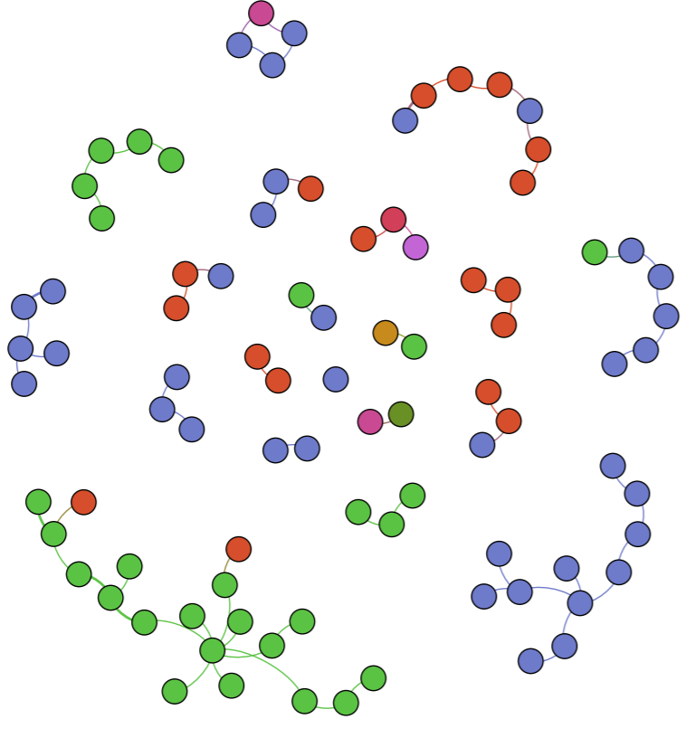
Keeping the visual representation of the nations with the color schemes, we saw that some families had intermingling of other families. This showed that despite what nation you came from, something such as Christianity could still be spread from family to family, and nation to nation. This would then lead to more baptized natives, and more influential families that spread the idea of Christianity through their relationships with other families.

After playing with the different connections, we decide to look at the statistical concepts of modularity, degree, and betweenness or Eigenvector. To isolate each concept, we changed the way the visualization looked with a focus on each.

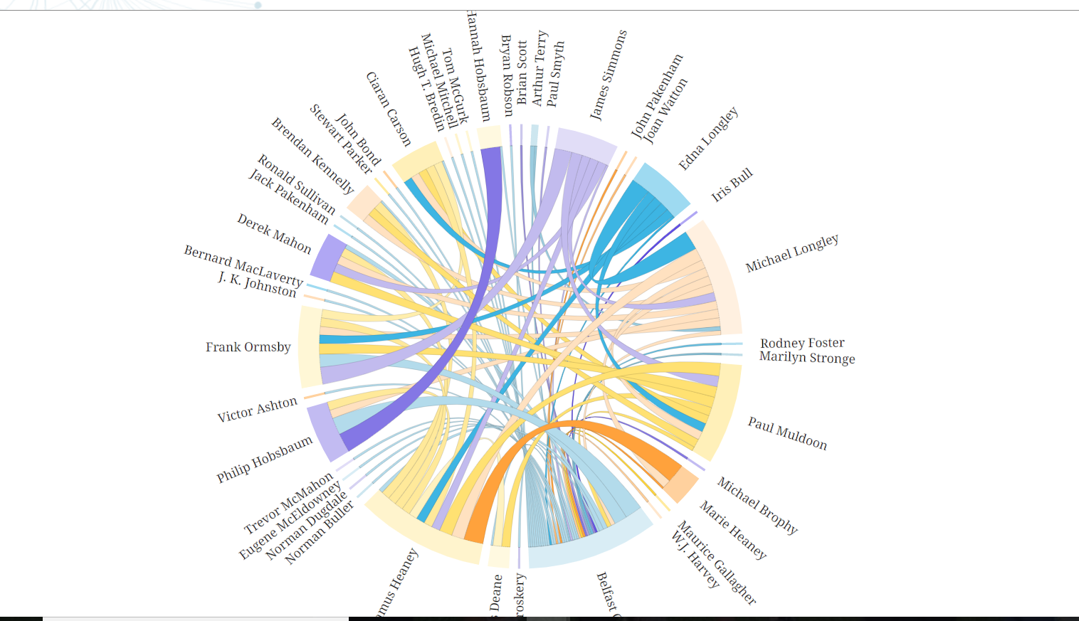
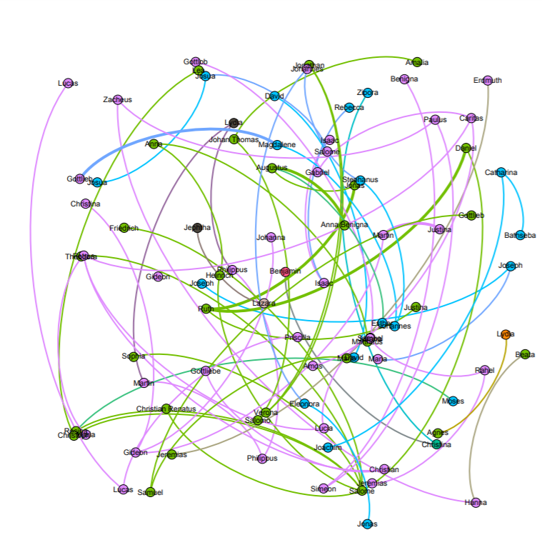
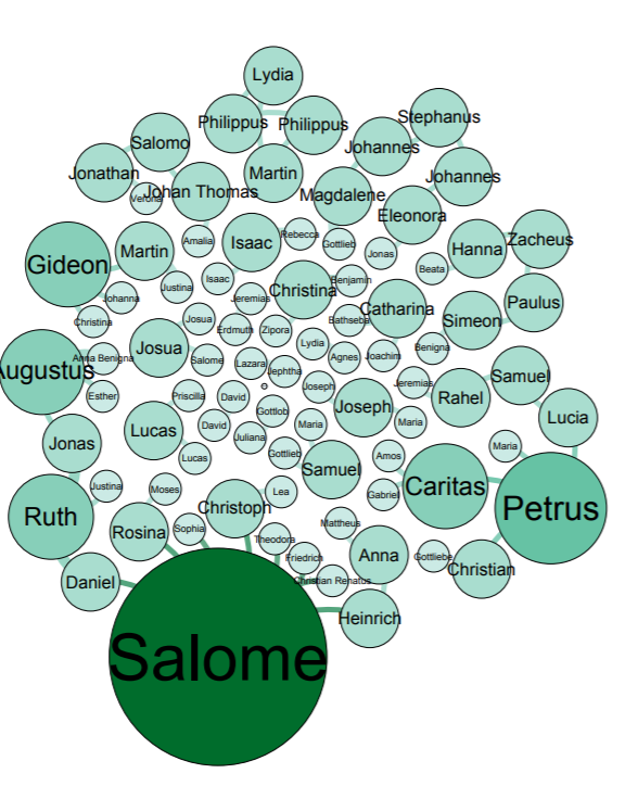
Salome appears as the biggest name, which means that Salome had the most connections with other family members. We used the average degree report to determine how often the natives were related to one another and came up with a value of 1.57. What this means is that our families were closely related, but not very large. With this information and information we have gather from the previous visualizations, we can determine that a majority of the Native Americans in the entire data set were more than likely small families.

Visualization of Degree
Visualization of Modularity

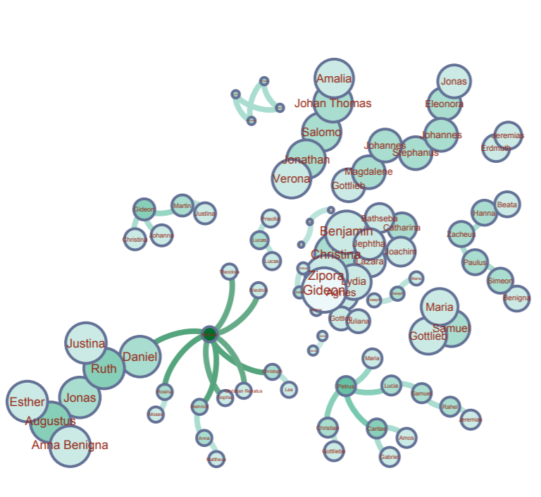
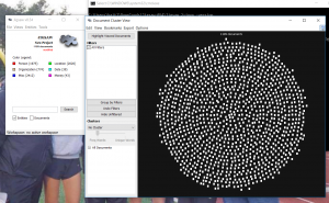
Modularity represents the community structure within a network. Modularity will focus on the nodes and edges in the visualization. Since we have 89 nodes and 70 edges, we used the Force Atlas visualization. After adjusting the “nodes” tab to show their ranking as a degree, we had to set a much larger range so that the nodes appeared much bigger than usual since many of the families were already so small. Paranyushkin talks about how modularity that is measured greater than 0.4 proves that a partition produced by the algorithm can show a distinct relationship within the data. In order to prove his point, we ran the modularity report in Gephi and measured a .9. This proves Paranyushkin’s theory that there are direct links in the modularity that are much stronger than the average links in the entire data set (Paranyushkin 2011).

Visualization of Betweenness

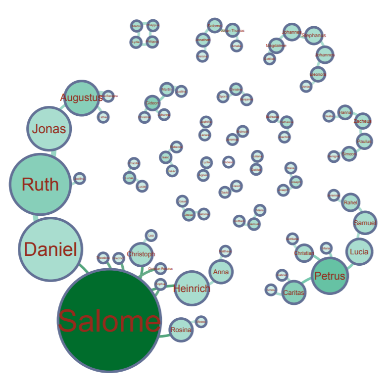
Finally, betweenness is represented as how often a node appears on the shortest path between two nodes in a network. The higher the betweennes value, the more important the node is based off of its presence in the network. Under the “Network Diameter” option in Gephi. It showed that we had a diameter of 8. With Gephi’s resizing tool, we could make the node bigger based on its connections. Salome had the largest betweenness value at 127.

There was definitely a learning curve when it came to using Gephi. Steve and I both had different problems at different times when it came to visualizing our data. More times than not, I would find that the program itself would lose portions of its functions, like my random inability to use the drag tool, or Steve completely losing the Layout widget entirely. But despite its random glitches and dropping our work before we’ve saved, Gephi is a very powerful tool to use when visualizing information in multiple dimensions. When you begin with the first visualization, it becomes almost like a waterfall effect. Each visualization reveals and builds onto a different dimension that can be investigated.


Works Cited

Paranyushkin, Dmitry.  “Identifying the Pathways for Meaning Circulation using Text Network”


Categories
Uncategorized

Katie and Steve Presentation

[gview file=”http://humn2702018.blogs.bucknell.edu/files/2018/03/presentation-for-32F62F18.pptx”]


Categories
Assignment 3

Assignment 3

For this assignment, I used the meta data of the Charles Weever Cushman collection of photographs. Looking at the platform of Palladio, I really wanted to take advantage of the map tool and try to take a look at potentially where each of these photos were taken. From this meta data, I extracted about 1000 points of information and input it into Palladio.

This was an interesting way to view where many of the pictures were taken in the United States with each dot representing an image. It was easy to understand if that was all I wanted to know. But unfortunately, just the dots alone were not very easy to understand. This view mode lacked the detail. The detail I was looking for was exactly where each photo was taken, maybe a town name or relative location. Therefore, I did not have too much to go on other than a general location. For the sake of comparison, I decided to do the CSV file in its entirety in Google Fusion Tables.

Results were immediately improved. Google Fusion Tables gave me the names of the states, their boundaries, and an easier was to select the dot of information and understand what was being represented in that specific dot. Although both tables of information showed a stronger gathering of images taken on the west coast and northeast, Google Fusion tables allowed for much more detail. Google Fusion allowed me to understand and interpret my data much more effectively. I wanted to use the timeline feature of Palladio as well, so I used that to determine when each picture was taken on Charles Weever Cushman’s journey.

This was interesting to look at because one can see when Cushman was the most active in his journey. Understanding the time of which each picture was taken could tell a researcher where a point of interest might have been at that time. This is where Drucker’s analysis on how to create new ideas from demonstrations can be seen in both the time line and map features of Palladio. Researchers looking at the trend of where and when the pictures were taken could introduce new ideas into what they were investigating, especially if both have a trend to peak interest from Cushman (taking more pictures/spending more time in that area). Palladio is a decent platform for getting this kind of data, but perhaps with a little more detailed input, such as location and state lines as seen implemented in Google Fusion Table’s, Palladio results could be a little more fulfilling to a researcher.

Categories
Assignment 2

Assignment 2

For the construction of Steve and I’s corpus, we have decided to take a look at three different religious texts. The Christian Bible, Muslim Quran, and the Hindu Vedas. Looking at these three different texts could show us a simple way of understanding what each book is trying to convey. We also wanted to make different visualizations to represent common ideas and differences between each text. We understand that there could be different interpretations to each book and what they try to convey, so we are going to use textual analysis to take the narrative out of the story and essentially getting the words themselves to convey the message. But using an interactive way of data visualization will allow us to better interpret similarities and differences between the three texts.

For the two images depicted, I took the first two chapters from the Quran and ran them through Voyant. Then I took the Bible and ran it through Jigsaw. These were my results.

In Voyant, I looked at the first two chapters of the Quran. Looking in the Cirrus, I can already see that “Allah’ is the most frequent word used (253 times). It makes sense for Allah to be seen most often in the Quran. Another interesting aspect to look at is the scatter plot of the most common word usage. Allah continues to rise in how often it is used, followed by “people”, “said”, and “lord”.

In Jigsaw, it was a little tricky to get to work, but I took a look at the Bible’s first and second testament. The issues that I seem to come across often are quite simply that the program does not exactly work. Whether it is because of my computer being a PC or perhaps the documents I am running through it, the same issue keeps appearing. This issue being selecting certain visualizing tools and having nothing load through. But through seeing the platform work on other’s laptops, I am able to justify that Jigsaw is much more usable when looking at word trends and its “word tree” option. I managed to get the wordtree option to work, which was interesting to look at words that are commonly used in succession of another.

Due to previous experiences with both platforms, I have formed a preference with Voyant. Jigsaw is difficult to use when documents exceed a few thousand words, making it almost impossible to use in certain circumstances without having to breakdown and chunk your texts. Voyant allows for simple input and simple output. What I mean is that the platform is easy to input your data to be analyzed with simple options. Once Voyant runs through your documents, it gives you plenty of options to visualize your data in interactive ways. At one point, Voyant even showed us that pronoun usage in some novels was much more of a prevalent concept to follow than what we were initially investigating. It turned out that male and female authors were more likely to use male characters than female characters. That was for a previous corpus we formed using science fiction novels.  Jigsaw can interpret data in ways that are much more thorough, though. When using something like Wordtree, Jigsaw is excellent at looking at different word trends.

When looking at the results of texts run through data visualization tools, you are viewing them in their most realistic and authentic state. The narrative is removed from the document, leaving it as a simplified collection of words. What this does is completely remove any sense of bias that could be present in the work. Tanya Clement’s claim that the use of  visualization platforms “… is a virtual reality that keeps us mindful of the processes we use to produce it, but the experience of this encompassing vantage point allows for a feeling of justice or authenticity that is based on plausible complexities, not simplified and immutable truths.”

Categories
Assignment 1

Assignment 1

What made me choose these two visualizations from VisualComplexity.com was their difference in color usage, word flow, and way of organizing data. Despite discussing two entirely different topics, one is much more interesting to look at than the other. I believe the second image exemplifies a more dynamic visualization whereas the first displays a more static visualization. The first example is a rather plain way of viewing different bridges in a certain area. The area in discussion was two large islands in the middle of a river. These two islands were connected to each other and the river bank by seven bridges. A game that became popular was for citizens to find a way of crossing all seven bridges without repeating. So using mathematical formula, a mathematician determined that it was not possible. Therefore, the second graph is the next best alternative to an otherwise impossible task.

The second graph colorfully explains different beers that are tailored to how someone may like them. Using numbers and factors, each lines connects to another beer that is similar to one that the person may prefer. Running through these numbers and factors, the graph will find the next best beers for the person to try. The only downside to this graph would be the sheer amount of options, making some options hard to read and connections between them difficult to follow. The line thickness also seems to make for some confusing interpretations.

Using the Belfast Group Poetry diagram from the DH Sample Book, I believe it is a better combination of information being presented and the way it is being presented than the previous two samples I chose. Not only is it interactive to see the bond between each person, but it is also clear to understand. Granted, there is still quite a lot of information being represented, it is done so in a way that allows the user to highlight a specific persons name in conjunction to someone else’s name. Looking at information in this way could reveal bonds with people or things that were not previously known based on ideas such as writing style, genre, year published, themes, and many other styles.

Categories
Uncategorized

Two Bad Visualizations