https://lak231.github.io/us-fulltime-college-students-timeuse/
Categories
Hi.
In this assignment, I created and analyzed network graphs by using the records of the Moravian missionaries in the mid-Atlantic states in the 18th century. After briefly looking at the data, there were a few questions that I wanted to explore:
To be able to input the data into Gephi, I first ran a script using the original spreadsheet to generate an edge table, resulting in a database with 377 nodes and 490 undirected edges. Although my method is faster than manually extracting the data, due to my lack of text analysis knowledge, marriage, etc. relationships are all represented by the same kind of edge in my data (I feel like Drucker would not like this at all). This might hinder my further study of the data. However, for the questions that I proposed, I do not think it greatly influenced my interpretations.
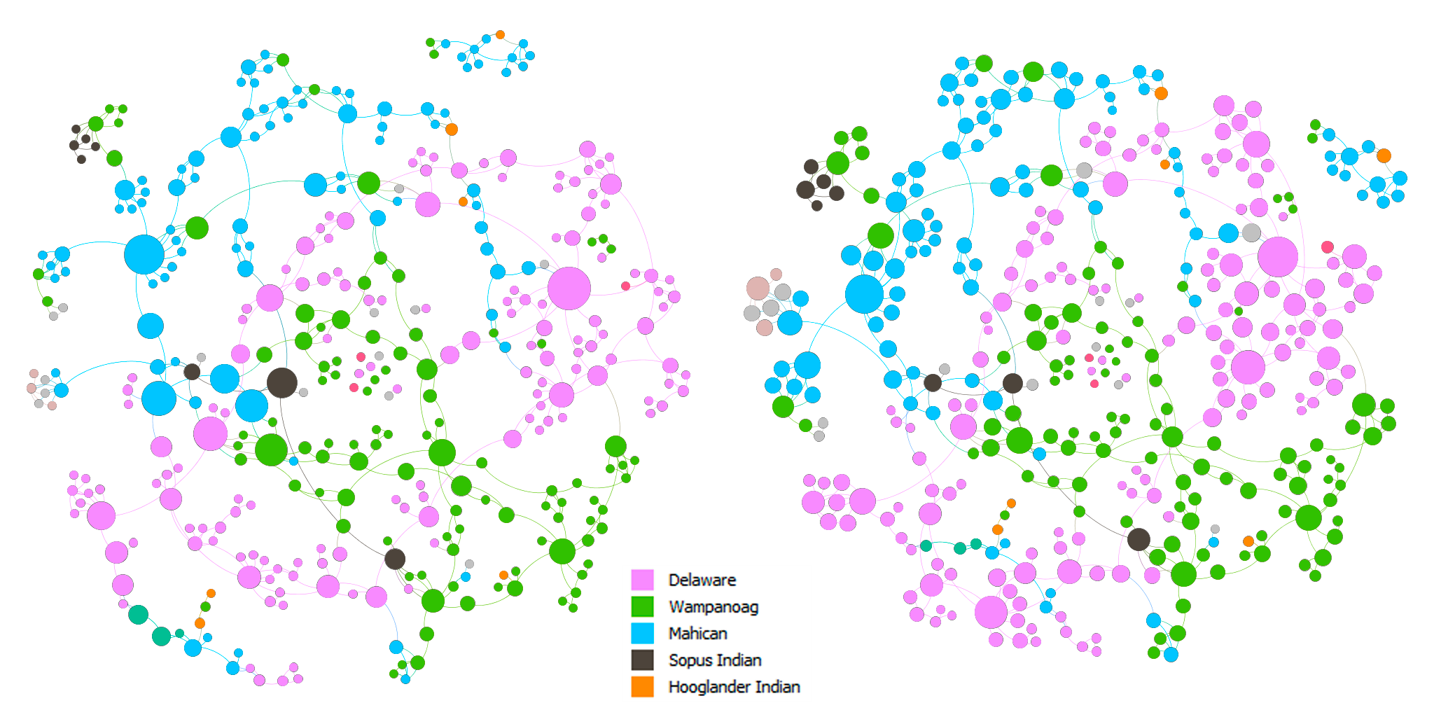
Above are the force-directed (Force Atlas layout) representations of the network. The nodes in both of the graphs are colored by nation. The nodes are sized by betweenness centrality in the left graph and by eigenvector centrality in the right graph. In both of the graphs, we can see that there are clusters of colors, which indicates that proximity did play a role in the spread of Christianity. In addition, there are also connections between clusters of different colors. This can imply that either Christianity expanded through marriage or those people married because they shared the same faith, which in turn, solidified the position of Christianity in the community.
I made two slightly different graphs because I think that one can be in the shortest paths of many connections and be somewhat insignificant at the same time, which can be seen in the change in size of some nodes between the two graphs. On the other hand, one can be influential in a large community, but that community is only in the periphery of a larger community, which might result in a low betweenness score. Hence, to find the most important people in the network, I used the graph on the left and filtered out nodes with eigenvector centrality < 0.5. The result is shown in the graph below.
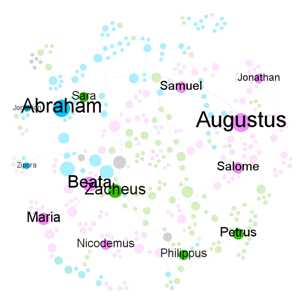
I think that the baptists were somehow also aware of the importance of these people. I created two more graphs using the Circle Pack Layout with the first hierarchy being the nations and the second hierarchy being the baptists. The nodes in both of the graphs are sized by eigenvector centrality. In the left graph, the nodes are colored by the nations and by the baptists in the right graph.
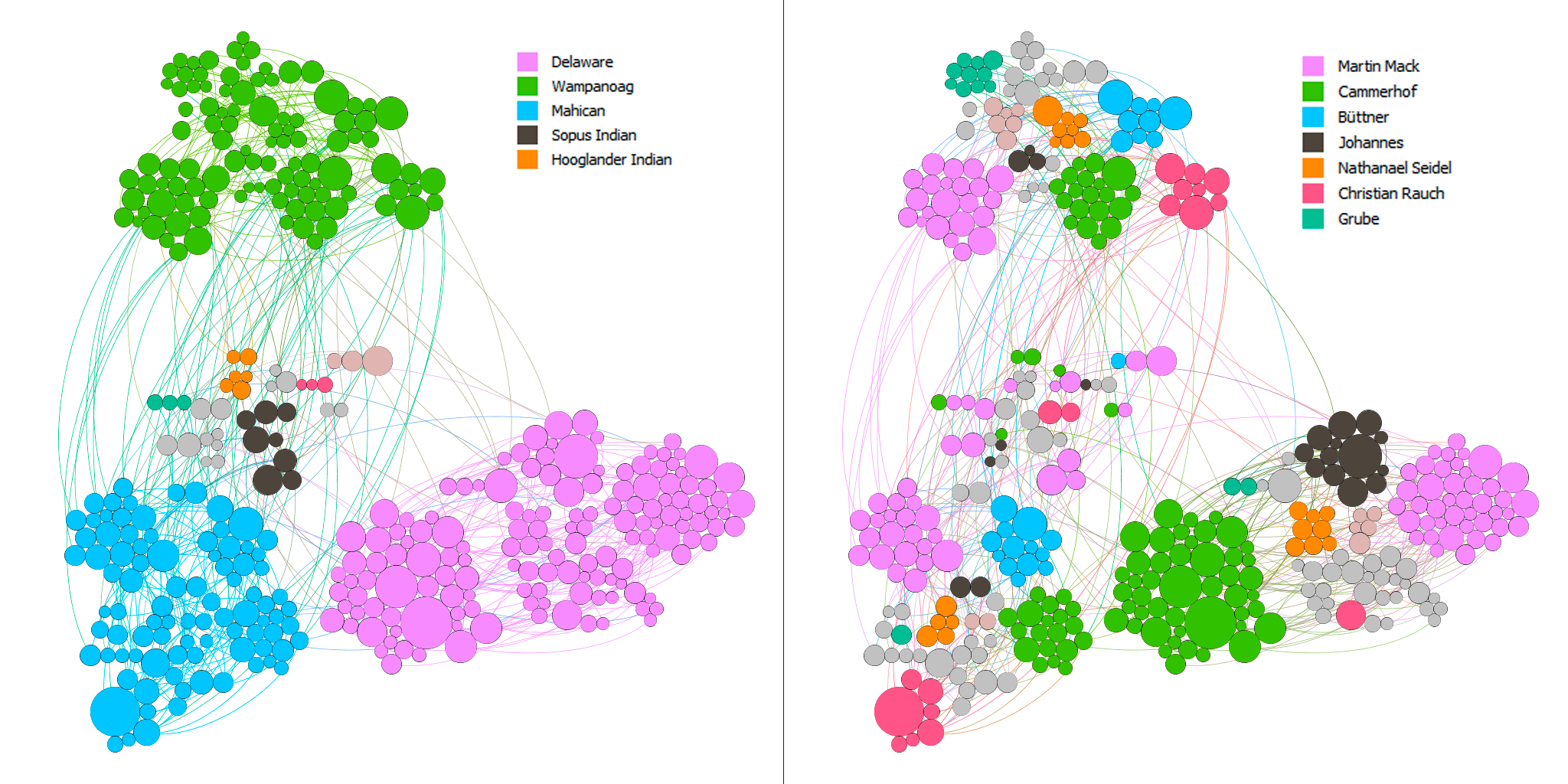
Most of the baptists seem to have focused on maximizing the number of regions they went to. In addition, they baptized the people with high eigenvector centrality in each nation. Although this is not rigorous, I arbitrarily checked the dates for some of the big nodes and the nodes surrounding them and found out that the bigger ones tend to be the ones that got baptized earlier. Thus, there seems to be a pattern among these baptists to baptize the most important people in as many regions as possible.
Overall, I think that Gephi is an amazingly versatile visualization tool with a quite usable interface. However, there are also some aspects of Gephi that I found limiting. For example, I was not able to embed a timescale in my visualizations, which is one of the four principles of network visualization mentioned in the 3rd chapter of Lima’s book. Nor was I able to easily put the nodes in a map layout as I could in Palladio.
While making these network graphs, I was also aware that they are not a representation of the data but rather a story that I wanted to tell about the data (again, Drucker would disagree with my method). I proposed questions about the data that I sought to answer. In other words, I chose to omit aspects of the data that I did not care about. I do not think that data visualizations can ever be subjective, even the act of collecting and organizing data contains biases in itself. However, as computer scientist Bret Victor said, “[a]n active reader doesn’t passively sponge up information, but uses the author’s argument as a springboard for critical thought and deep understanding.”
https://www.bls.gov/tus/charts/students.htm
https://fathom.info/fortune500/
https://flowingdata.com/2015/12/15/a-day-in-the-life-of-americans/
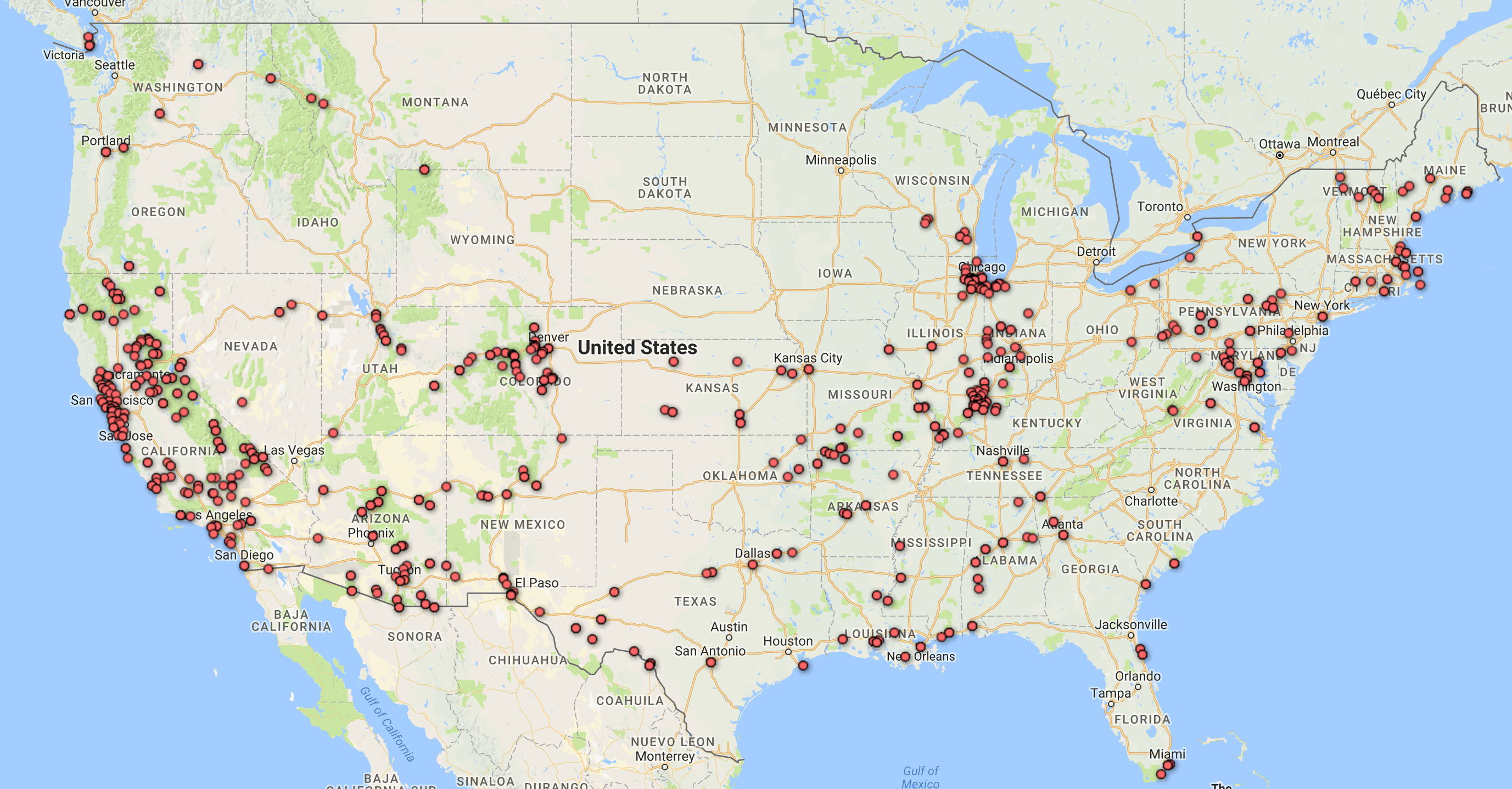
For this assignment, I used the Cushman Collection’s dataset. This dataset contains metadata of images taken by amateur photographer and Indiana University alumnus, Charles W. Cushman. Importing this data into Palladio and Google Fusion Tables reveals some interesting aspects.
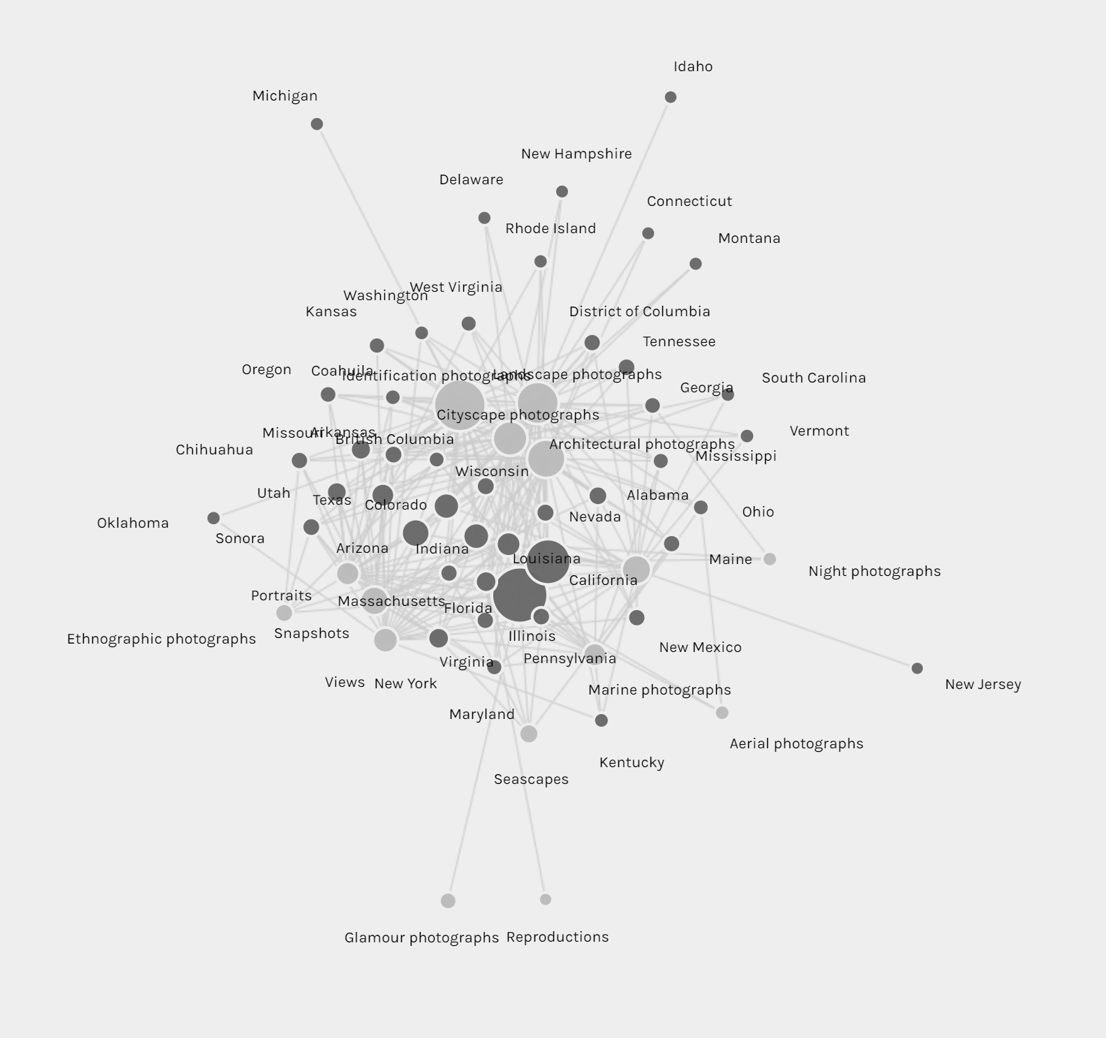
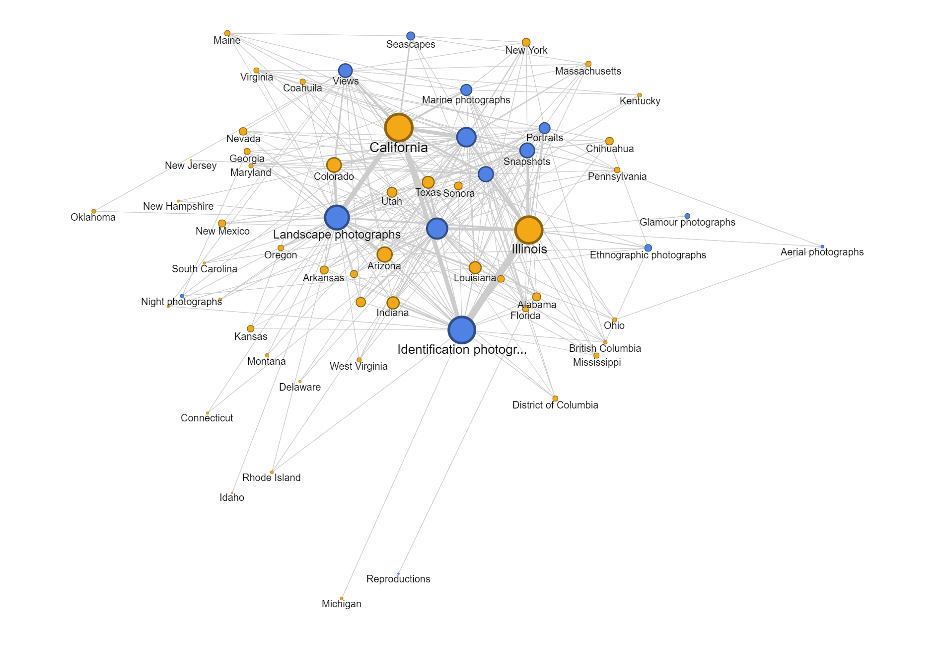
First, I tried mapping out the locations where the photos were taken. Looking at these identical maps from Palladio and Google Fusion Tables, we can infer that most of his photos were taken at Illinois and the West Coast.
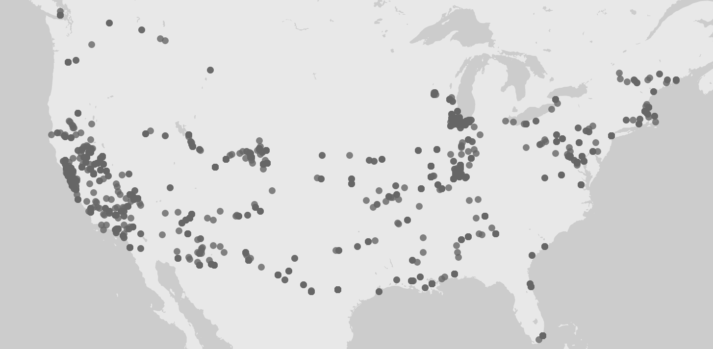
Adding a facet to the data in Palladio confirms our inference. Moreover, this facet also reveals that the photos from Illinois were mostly taken after 1940 and before 1952, while the photos from California were mostly taken after that period. A quick check at his biography provided by the Indiana University Archives reveals that he spent most of his life after college in Illinois and only moved to San Francisco in the 1950s. 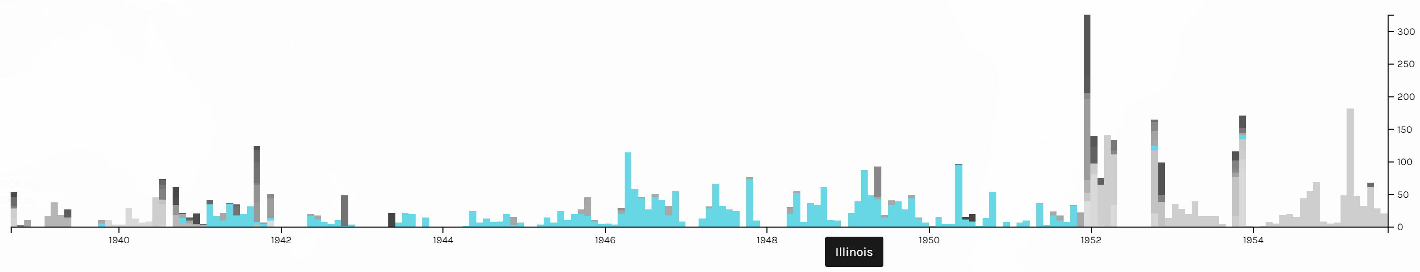
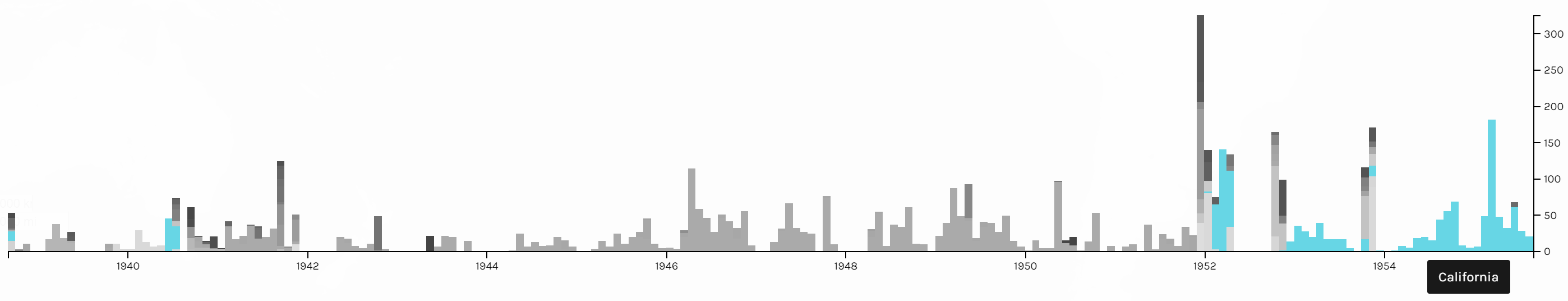
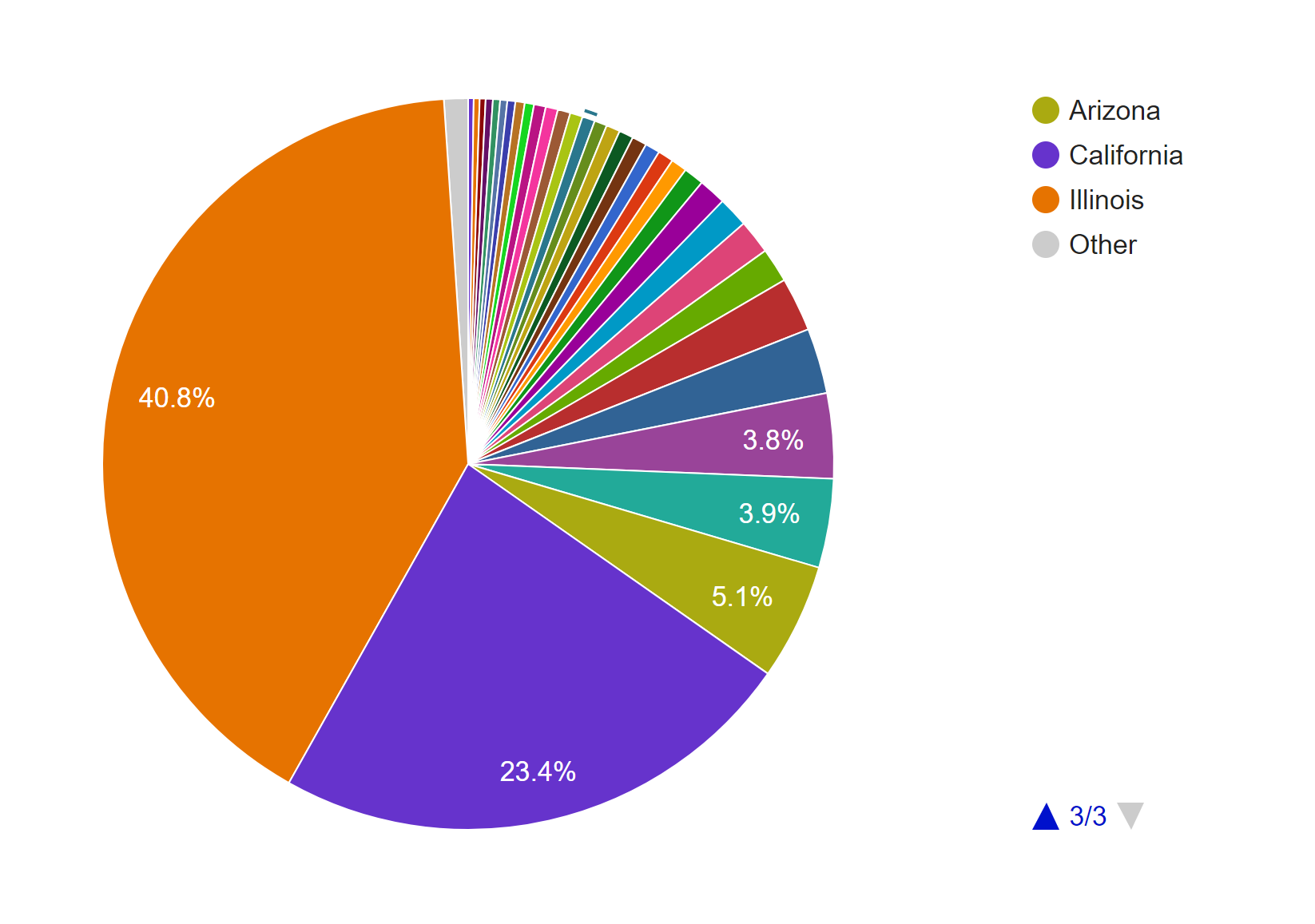
To further confirm this conjecture, I also made a pie chart in Google Fusion Tables.
The timeline tool from Palladio also tells us that his photos were not archived until the 1940s. After that period, however, they were archived not too long after they were taken. Although Palladio did not allow me to scale the x-axes of the two timelines to match each other, the general patterns seem to support my assumption.
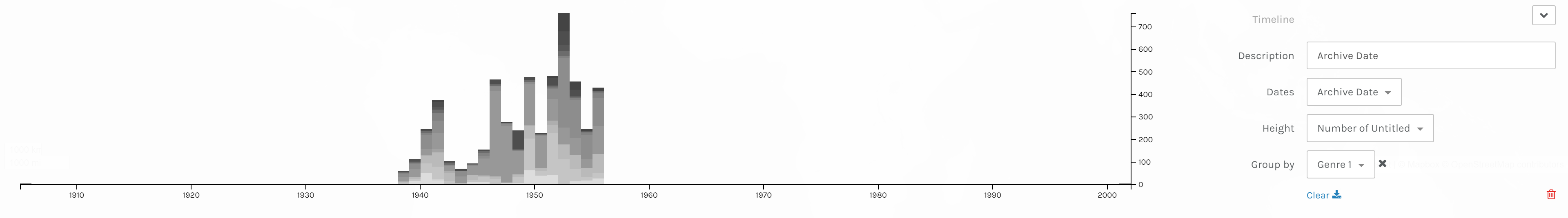
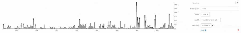 Timelines of photos by date taken (below) and date archived (above).
The next thing I explored in this dataset is the genre of the photos. This information is provided in two columns, Genre 1 and Genre 2, in the CSV file. Since the Genre 2 column is sparsely filled out, I only considered the data from the Genre 1 column in my visualizations.
This pie chart from Google Fusion Tables shows that Cushman’s collection consists mostly of identification, landscape, architectural, and cityscape photographs.
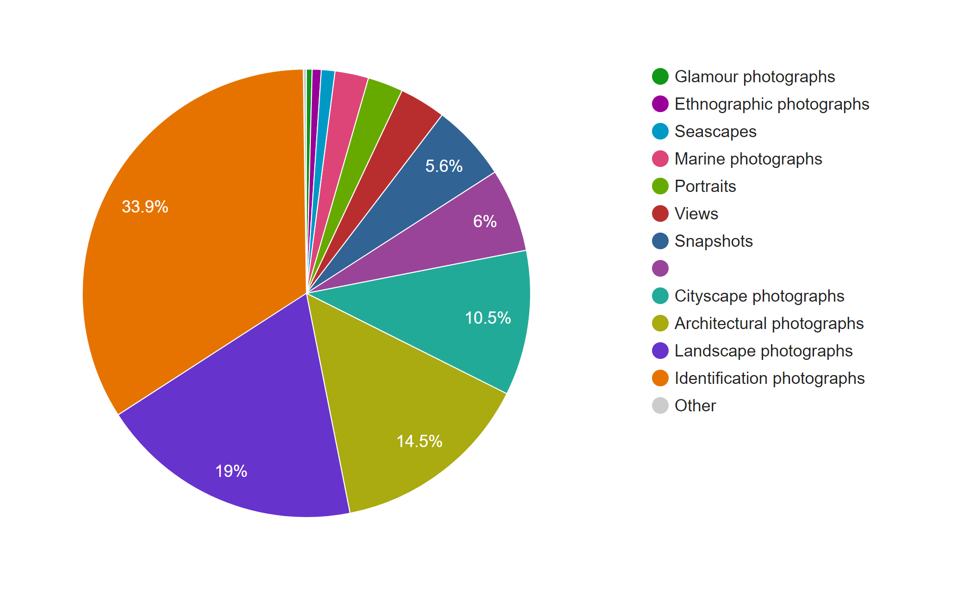
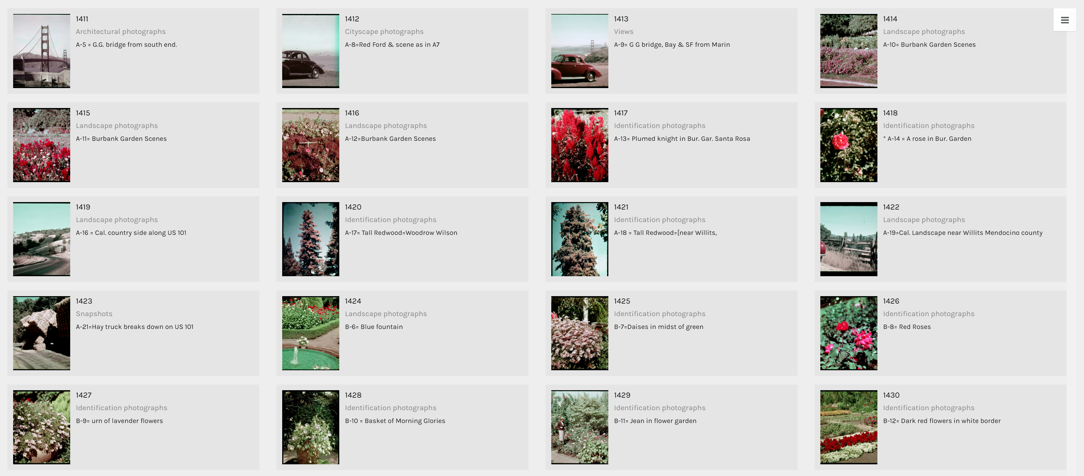
The term identification photograph as used in original dataset made me think that one third of this collection was portrait photographs that you can find on driver’s licenses and passports. However, switching to the Gallery view in Palladio, I realized they are actually identification photographs of species of plants.
Another aspect of this dataset that I wanted to look into was whether the genre of photographs changed based on the state Cushman was staying. However, neither of the tools provides the option for stacked bar charts based on location. Thus, I tried creating network graphs with the state and the genre as my parameters. Although the resulting visualizations are quite nice to look at, they do not provide any helpful information and only vaguely reconfirms the assumptions provided by the previous visualizations that I made.
Since datasets, particularly this one, are usually multi-dimensional, I think that these kinds of visualizations can only present a certain aspect of the data at a time. In other words, they are partial representations rather than the whole image of the data itself. As Drucker mentioned, since these methods of visualizing information come from the natural sciences, they impose certain biases on the visualizations themselves. For example, we know from the dataset that Cushman took a lot of identification photographs. However, by counting the number of photos in each genre, we also strip these photos of it aesthetic and sentimental values. For instance, we do not know which photos were the defining moments in his photographic style or which were the ones that meant the most to him emotionally. Or just simply by categorizing the photos as identification photographs without providing the thumbnail images can give the viewers a wrong impression of the kind of photographer he was.
Nevertheless, it does not mean that these kinds of visualization do not generate new knowledge. Nowadays, data is being generated at an unprecedented rate. Since human’s computational capacity is limited and this data is mostly digital-born, computer-generated visualizations provide an efficient way of discovering things about humanities. For example, the maps that I created infer that Cushman lived and worked in Illinois and California for most of his life, which was mentioned by the Indiana University Archives. On the other hand, by arranging his work on a timeline, we can also the period where he moved to those states.
For this assignment, I chose the Harry Potter series because I wanted to get a different view at the novels I like so much and hoped to find something interesting. So, I googled the .txt version of the books and saved each of them as a separate .txt file.
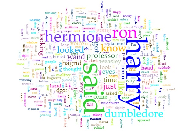
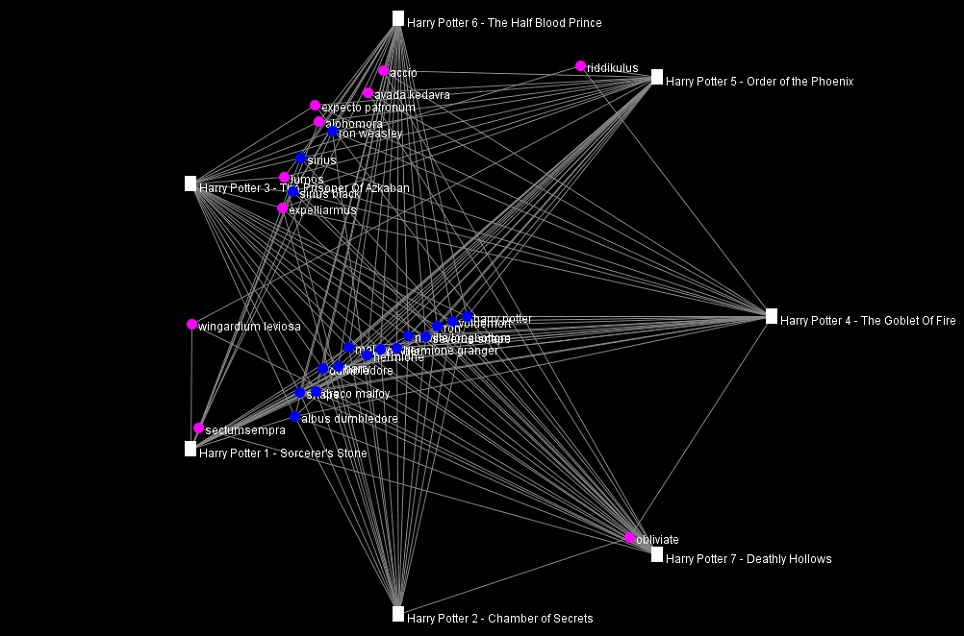
First, I loaded the books in Voyant. After trying many tools provided by the application, I found the Cirrus, Bubblelines, and Correlations tools to be the most fascinating.
Obviously, as the titles of the books suggested, since the series is about Harry Potter, the most prominent word in the Cirrus visualization is “Harry.” Predictably, the second, third, and fourth used words are “Ron”, “Hermione”, and “Dumbledore” respectively, all of whom are Harry’s best friends. In addition, since the story is told from a third person perspective, the word “said” is also repeated many times. Even though I am quite against using word clouds as statistical analysis tools because of the lie factor, word clouds such as this one can provide viewers with an overview of the main theme of a text.
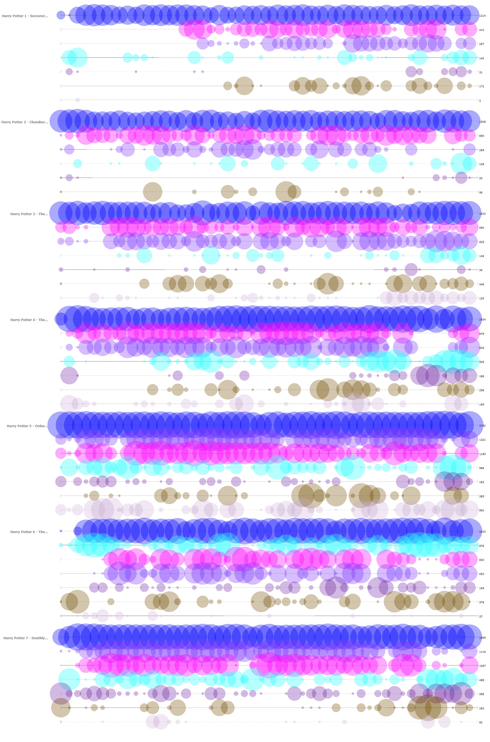
The next tool that I found insightful from Voyant is the Bubblelines tool. I used the name of the characters that appeared in the word cloud and a few more that I thought were important as keywords. The result, more or less, summarizes the plot of the series, as one can infer from the visualization the change in importance, disappearance, etc. of the characters.
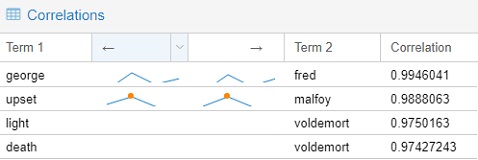
The final tools that I chose to include from Voyant is the Correlations tool. Although I think the tool might not be as visually impressive as the Bubblelines tool, it was quite entertaining to use. For example, I found that “Malfoy” was highly correlated with “upset”, “Voldemort” with “death”, “Fred” with “George.” Even though correlation is not equivalent to causation, I think this tool still can be very useful for finding trends if the users know what they are looking for.
Importing the .txt files into Jigsaw was more troublesome than importing those into Voyant since the way the books were formatted was not recommended by the author of Jigsaw. I took quite a while to import one out of the seven books at first, so I had to modify the commands to give the program more memory to run with. I imported the books in using the Illinois-NER entity identification, but the result was a quite messy. Thus, I ended up creating my own lists of characters and some spells for exploring purpose. The tools that I found the most helpful were Document view and the Word Tree.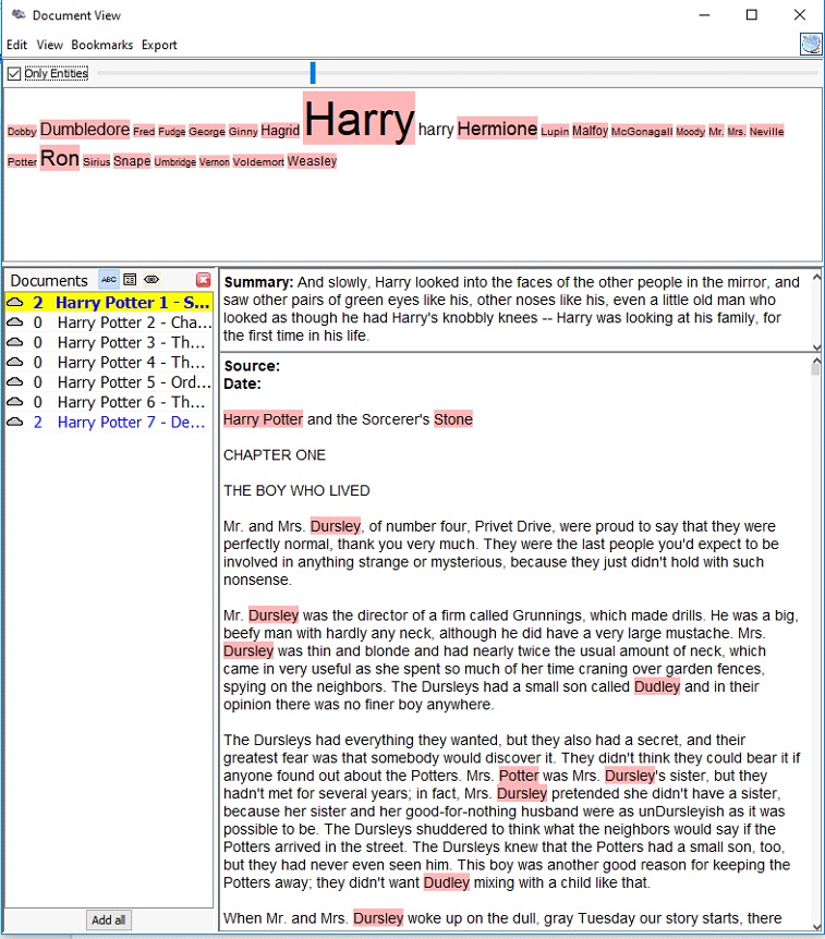
The Document view, similar to the Cirrus tool in Voyant, provides users with the most frequently used words in a document. However, instead of creating a word cloud, the Document view presents the words in a line with varying font sizes to reflect the frequency and in context. It also attempts to give a summary of the text by picking out a sentence from the text itself, which is quite fascinating in my opinion.
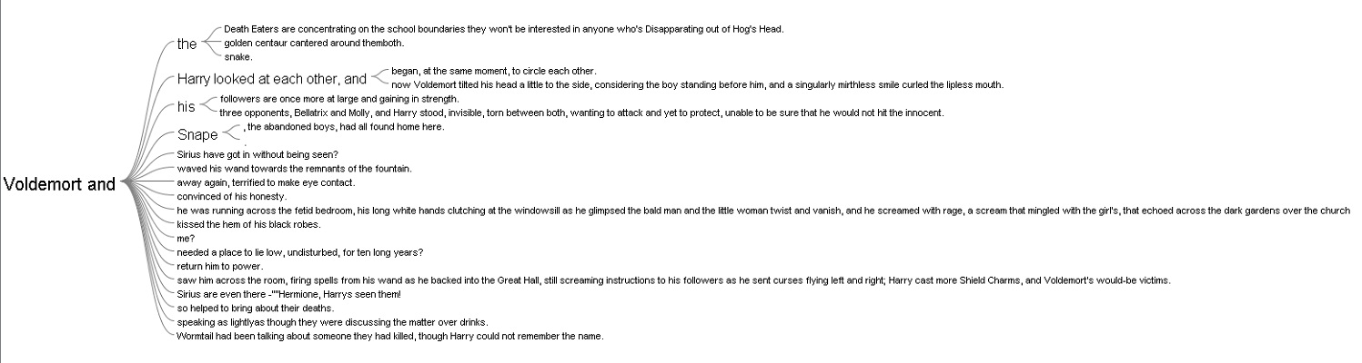
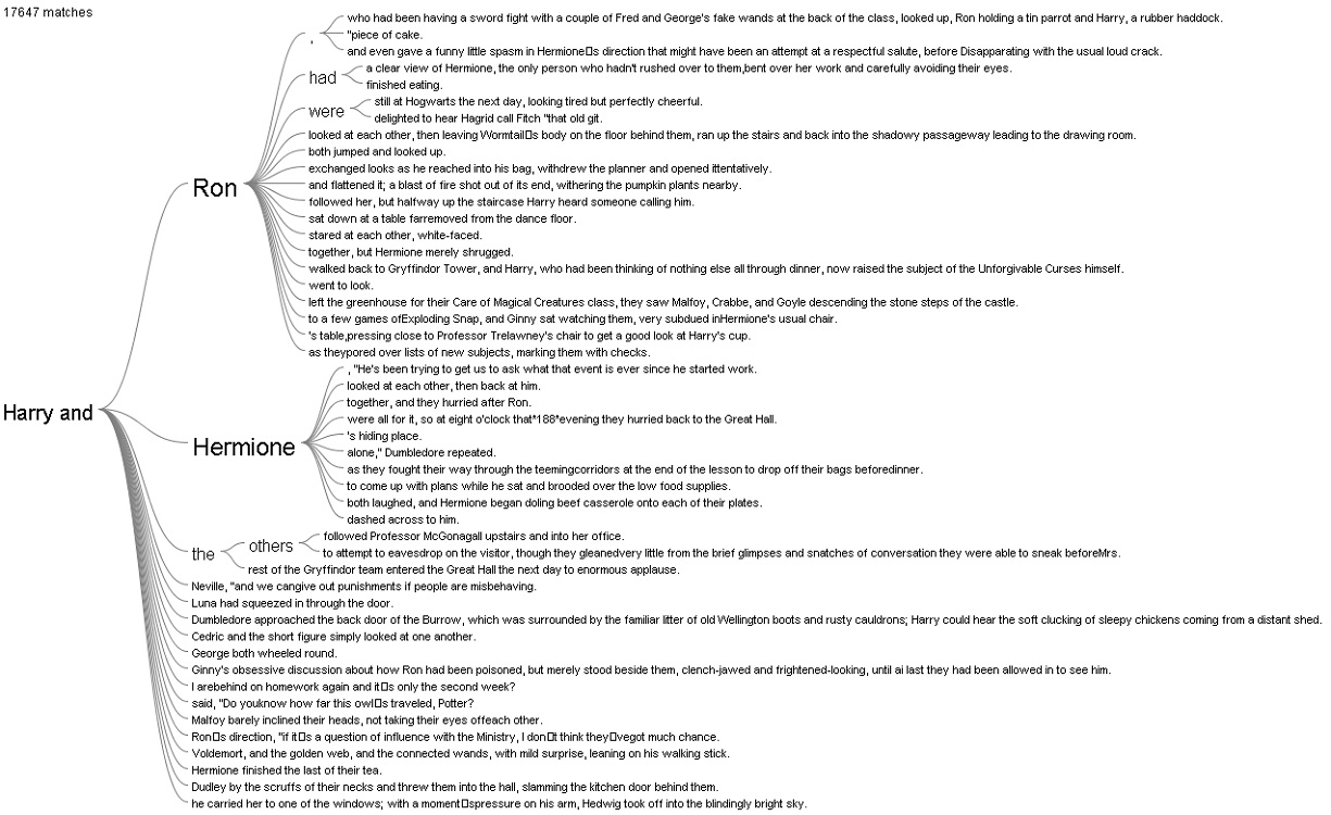
The Word Tree provided me with an interesting interpretation. I looked up the words “Harry” and “Voldemort” and clicked on the “and” branch for both of them. For “Harry and”, the most frequently paired terms are “Ron” and “Hermione,” while for “Voldemort and,” there was not a particular name standing out, which reflects that Harry always had his best friends to support him and Voldemort was always alone.
I also tried out the other views in Jigsaw, but they did not provide anything helpful with the entities I defined.
Overall, I prefer Voyant to Jigsaw because of its performance and usability. The tools in Voyant are very powerful and easy to use since they have tooltips explaining what each tool does. In additional, the visualizations that these tools produced are visually pleasing and smoothly interactive. In addition, I think the Summary and the Context tools in Voyant do better job at summarizing the text compared to the Document view in Jigsaw. However, I do like the idea of importing text with defined entities in Jigsaw since the program is all about visualizing relations. Voyant can also do similar things with links, but it requires the users to know what they want to look for beforehand.
The process of making my own visualizations in Voyant and Jigsaw has verified Tanya Clement’s observation. Modern day computers are not at a complex state where they can comprehend and interpret humanities works. However, what they can do is to provide the computational power to present humanist data efficiently and uniquely compared to humans iteratively reading through printed media. These representations of data by computers, on other hand, do not necessarily provide a fixed view on the data itself, but rather observations that are both objective and subjective.
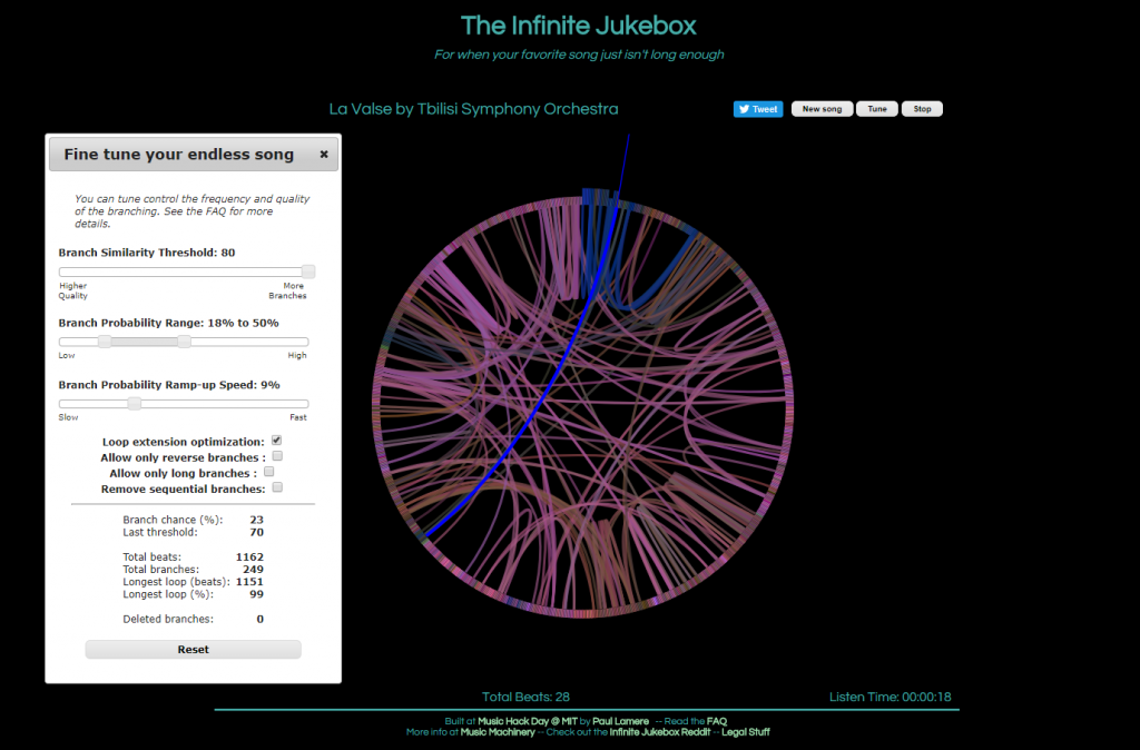
The first visualization, called The Infinite Jukebox, caught my attention as I listen to and practice music regularly, and have taken music theory classes here at Bucknell. First of all, the visualization is quite pleasing to look at. Second, the idea of listening to different versions of a song you like in an infinite loop is really cool, in my opinion, though it can be tiring at some point. Finally, and most importantly, this visualization is a great tool for reading music. Of course, one can look at the sheet of the song or simply just listen to it. However, music is, I think, quite linear, which makes it challenging to see the overall structure of a piece of music. On the Infinite Jukebox, however, one can see where musical ideas repeat by looking at the amount of connections. It would be really fascinating if the visualization allowed more than one song at a time, which could be used for analyzing similarities or influences between musicians (or for producing some awesome mashups).
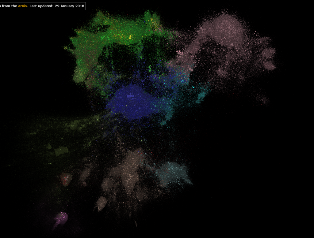
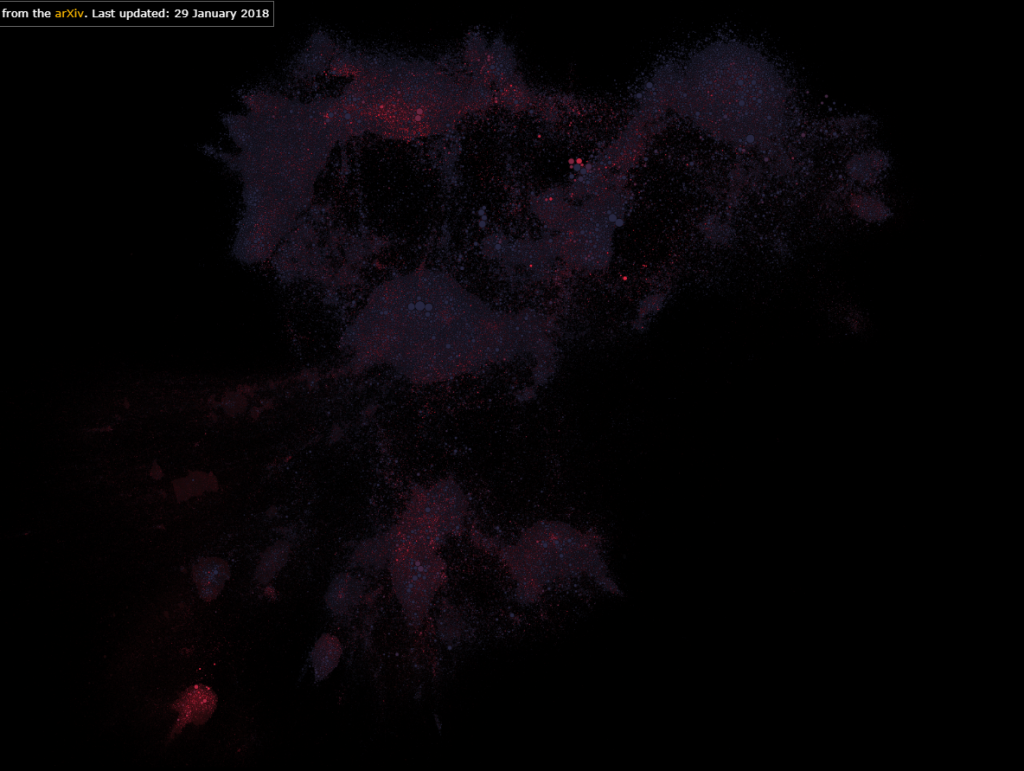
The second visualization that I found interesting was Paperspace. Firstly, it shows which fields in STEM are most researched. Secondly, it also shows research in one field interacts with those in another field. Finally, it also allows users to color the map by the age of the papers, which can reveal the current trend or topics of interest in STEM. In addition, one can tell, by interacting with this visualization, if a research topic is really “out there”.
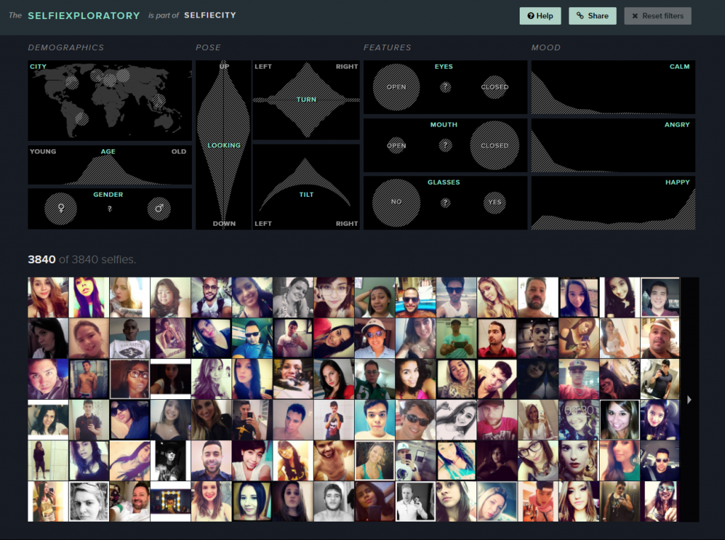
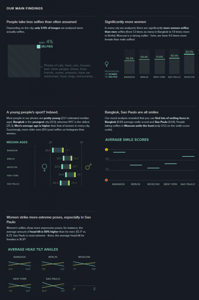
For the visualization from the DH Sample Book, I chose Selfiecity. First of all, the design of the website is clean and modern. Second, in addition to the researchers’ own findings, which I think are very interesting and comprehensive, they also provide a section called “Selfiexploratory” for users to interact with their data (images). The filters in the “Selfiexploratory” section are very responsive and well-designed. They represent the variables they are changing with visual mapping and, at the same time, show how the quantitative data change directly on the sliders themselves.
These visualizations definitely exemplify Sinclair’s observation on the difference between static and interactive visualizations. Instead of providing immutable perspectives on the data, the visualizations mentioned above all allow users to adjust the parameters and come to their own conclusions. For example, the Infinite Jukebox lets the users adjust the probability and the threshold that a song might switch to a different section. The Paperspace visualization allows users to change how the papers are categorized and also updates its database frequently. Selfiecity provides users with probably the same tools that the researchers used to get their results.