Categories
Final Project

Final Project Reflection

Link to final project website: http://humn270finalprojecthaipujunjie.blogs.bucknell.edu/

Link to database: https://drive.google.com/drive/folders/1rFmSEDr48kAB5f0VuYG6DrHXHAFQoPEG?usp=sharing

Trump News

It has been more than 300 days since Trump took office, and during those 300 days, the white house has been publishing many news related to him. We are familiar that Trump has been blaming new company like CNN for publishing “fake news”, so I think it will be interesting about to research about what kind of news is posted by the white house and how is the news posted by the white house related to Trump’s schedule. And because Junjie is also researching about Trump’s tweet, we can combine our result together to see the similarity and difference of both official and unofficial side of Trump. Therefore, I started to collecting news from the news section of the white house’s official website and due to the limit of time and better fitted with Junjie’s data, my data includes the news posted from October 2017 to February 2018.

Data Collection

Data collection is usually a time taking, boring and repetitive job before fancy graphs are made, but necessary and important at the same time. It is convenient to used ready-made data, but during my final project, it’s worth to spend such long time to collect data. By collecting data by myself, I know more details about each file so later I can know if the graphs made by different tools actually make sense and more importantly when weird things happened, it is easy to find out the reason of that. Just like what we have learned this semester, in Johanna Drucker’s reading, data visualization can mislead viewer, but by collecting data by myself, I could related real issues with the graphs instead of making wrong inductions.

Google Fusion

Google Fusion is an online tool which provide many basic statistical tools for me to visualize the metadata.

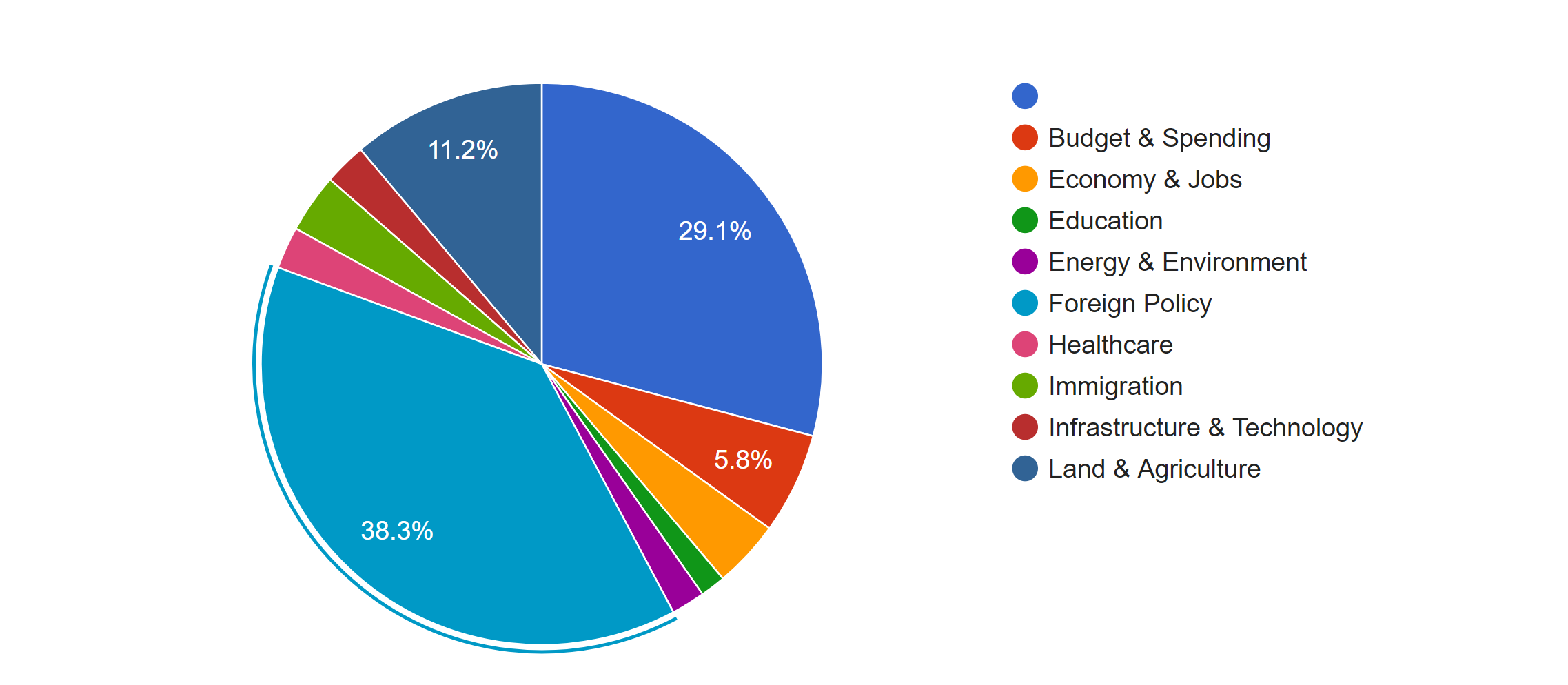
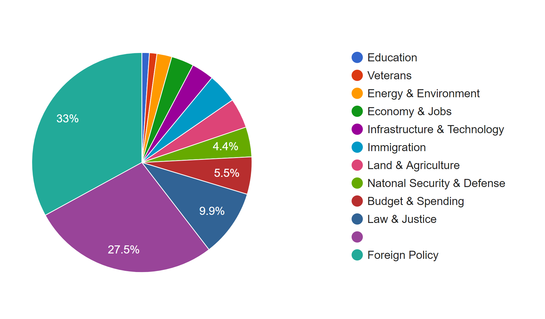
The first pie chart shows the distribution of news in different topics. It is obvious that Foreign Policy covers the most of area of the chart, which means it’s the issue of most news, because in the last several months, Trump visited many foreign countries and has been talking to many presidents or officials from other countries. Due to the hurricane happened during the end of 2017, land of many states were destroyed; therefore, president Trump published many relief plans to deal with the disaster. Therefore, there was also a lot of news about land and agriculture. As a famous merchant, Trump also focus a lot on the economy, so budget & spending and economy & jobs were also mentioned a lot.

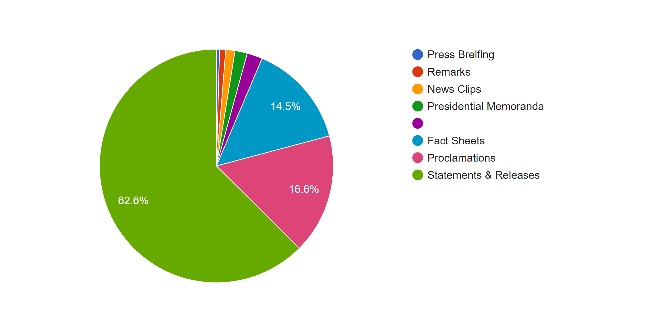
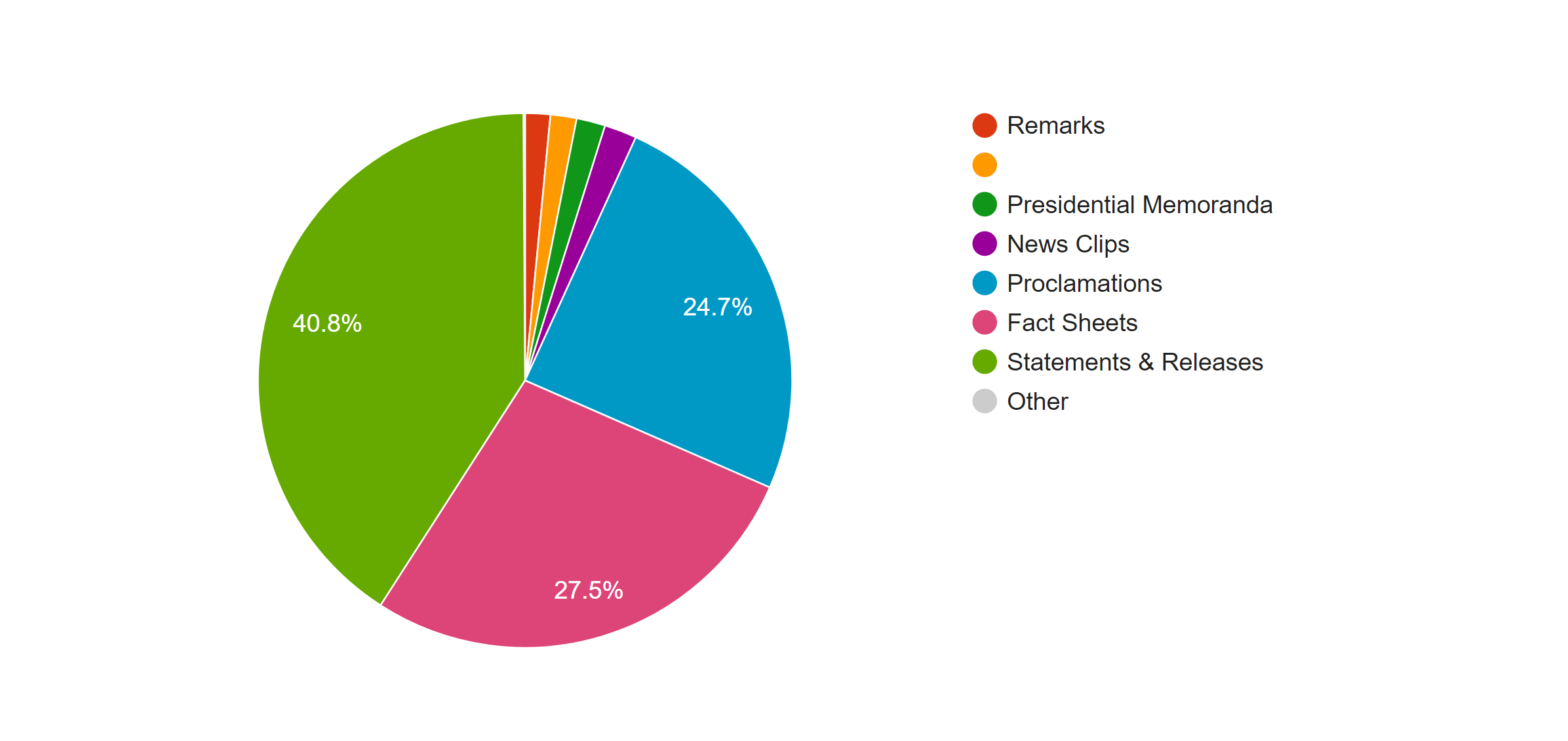
This pie graphs shows the distribution of the forms of news, the left one is based on the count of the files and the right one is based on the word count. In both graphs we can see that most of news is in the form of statement and releases. However, because the white house posted news through the internet, forms of news are not limited with the common form of new paper; many news was posted in the from of fact sheets or proclamations. By comparing the percentage of those two kind of forms in two graphs, we can see an obvious increase when they are counted with the number of words; therefore, news in those two forms is longer than that in the form of statement & release.


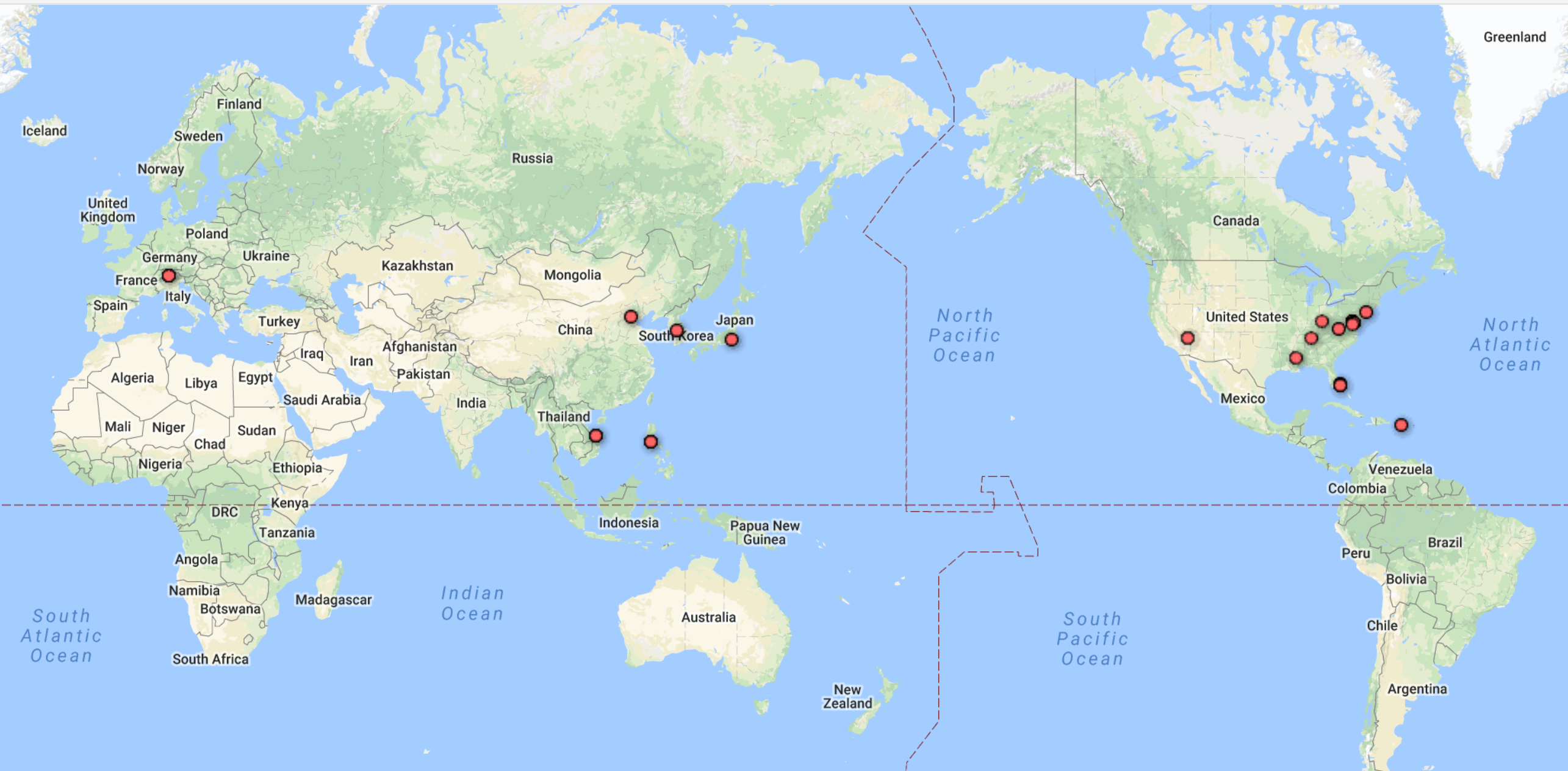
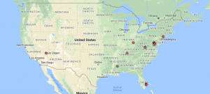
One advantage of Google Fusion is the map function of it doesn’t require the latitude and longitude of each location by analyzing the input string of data in location column. The left graph is the world map shows the which countries Trump visited from October 2017 to February 2018 and the map corresponding well with the fact that Trump visited several Asian countries in November last year. And in the left domestic graph, we can see that Trump visited more states in the west.
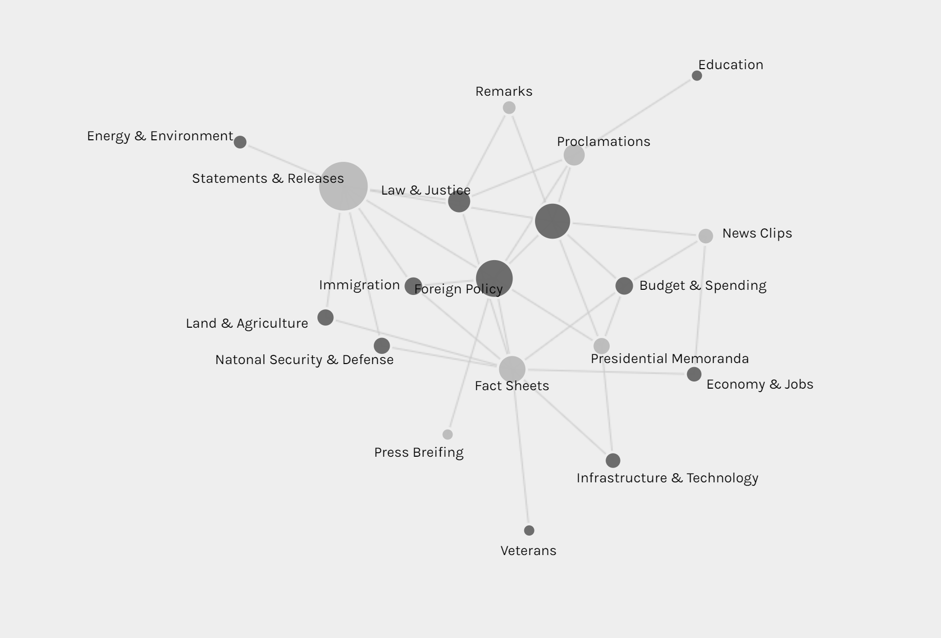
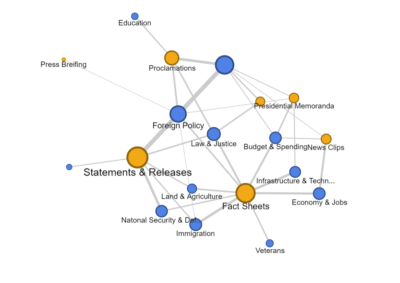
Palladio

Palladio is the tool I love best, even though the amount of tools provided is very limited. 

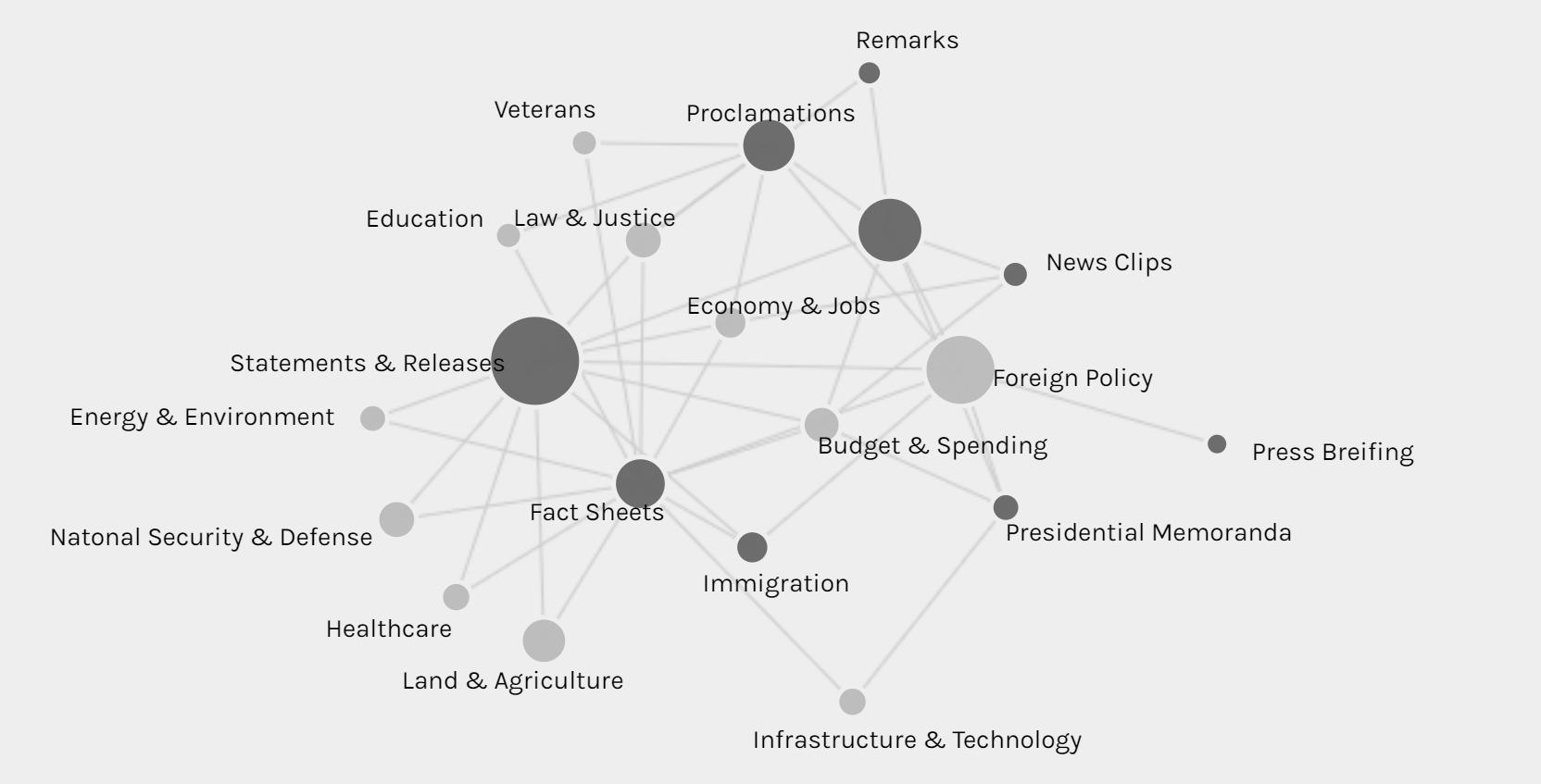
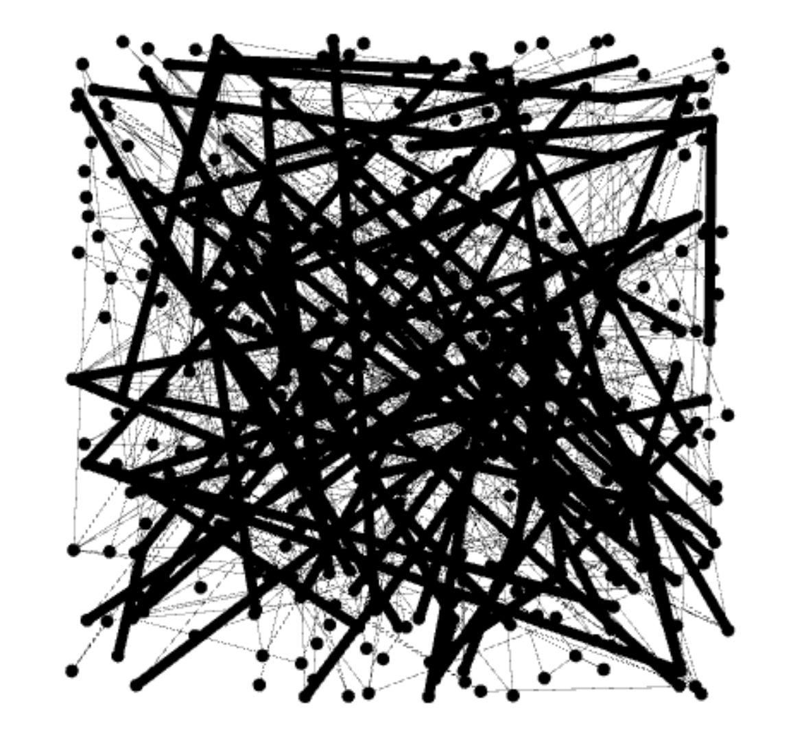
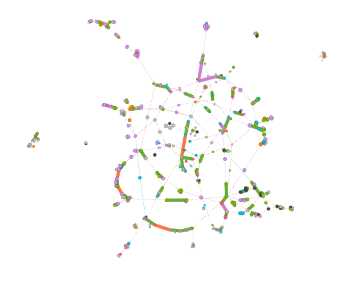
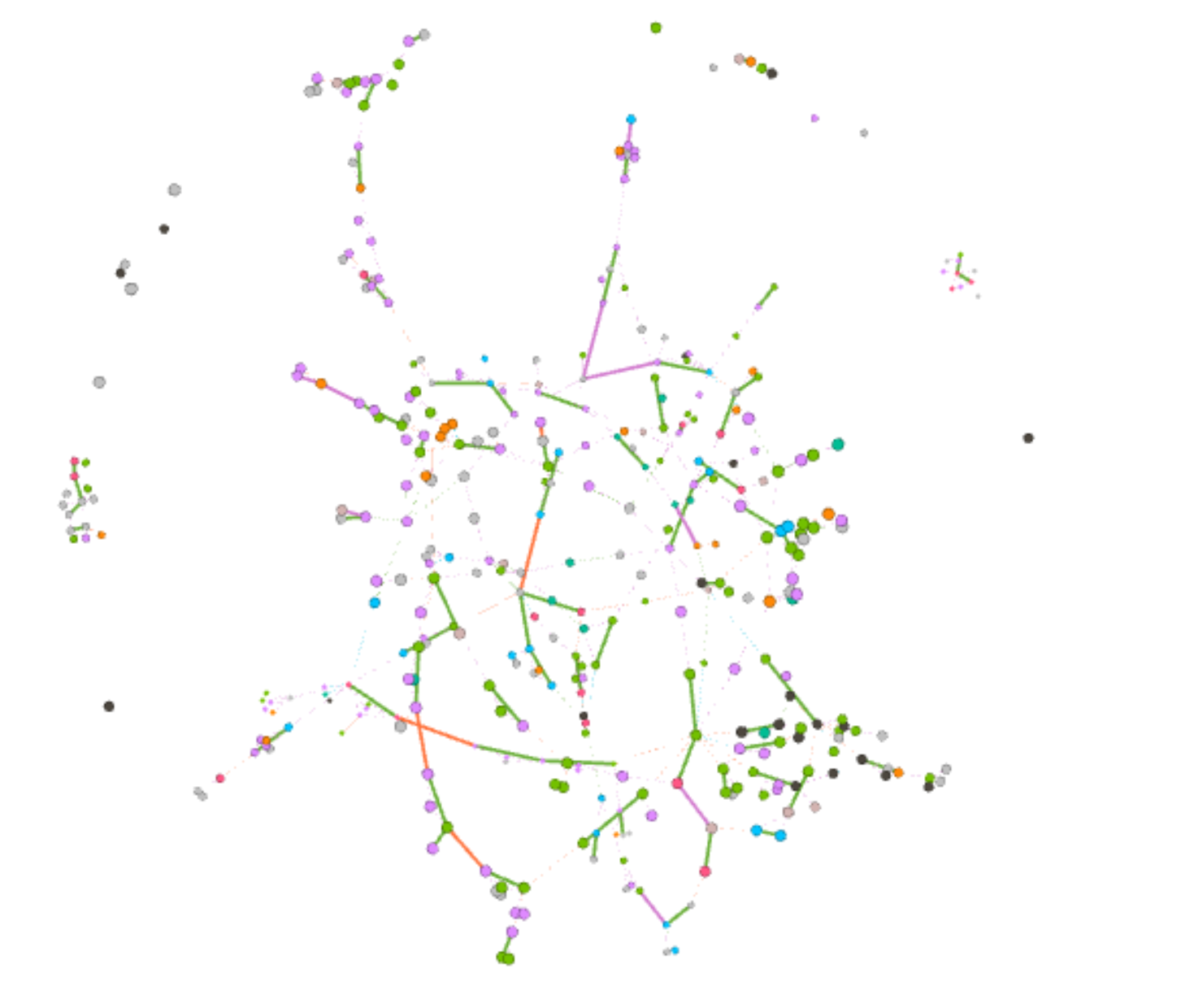
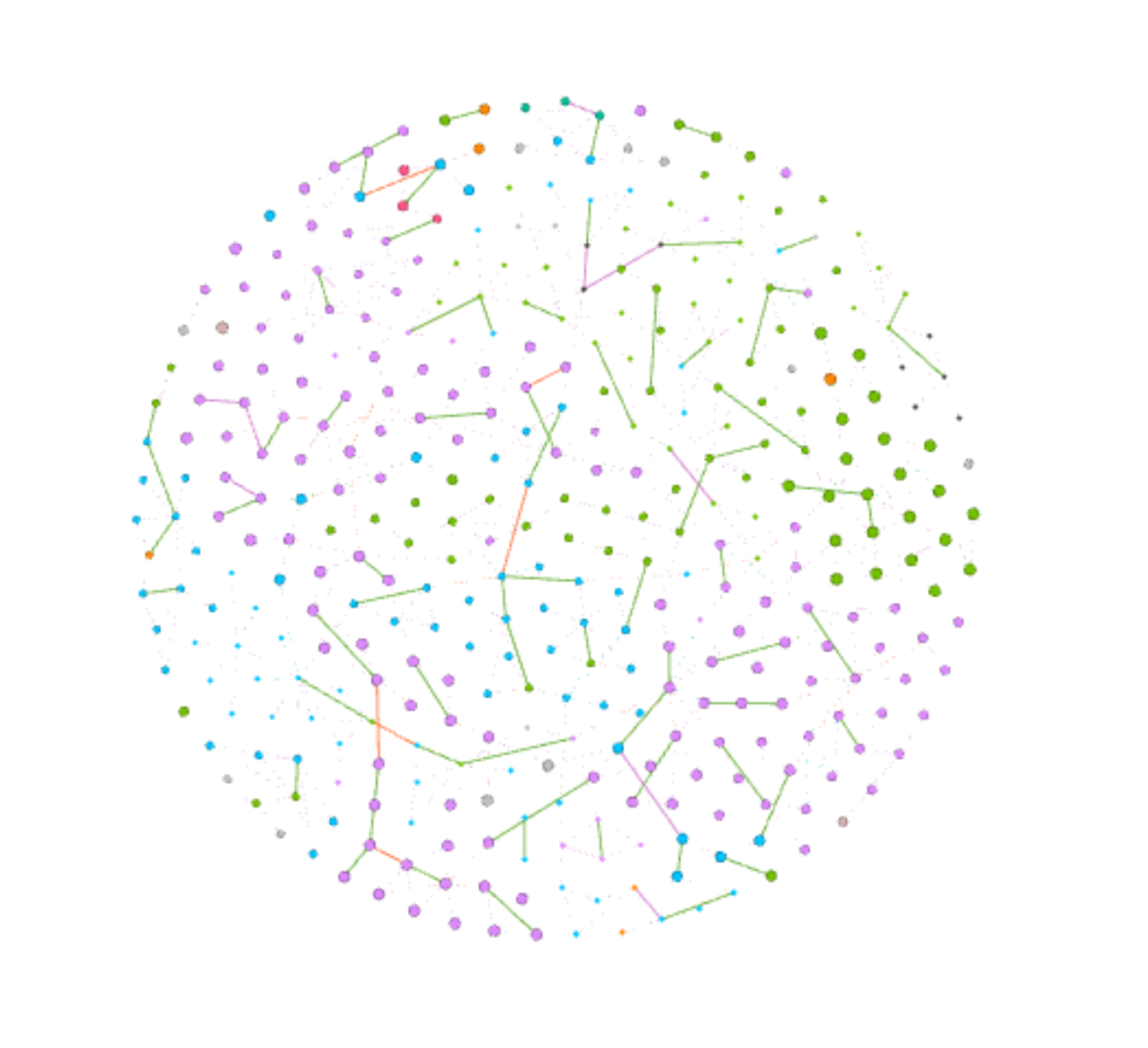
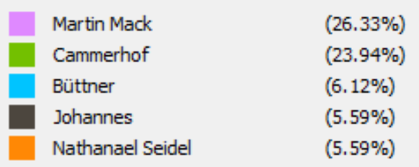
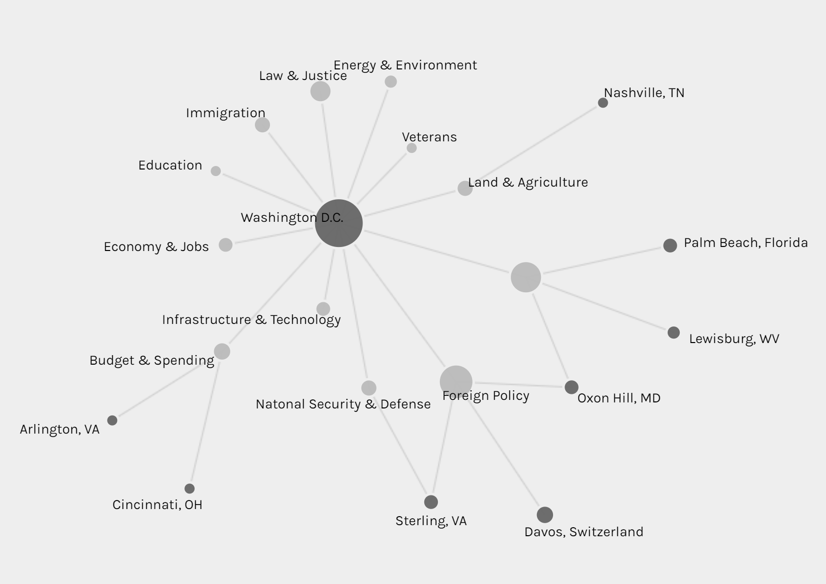
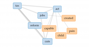
The network graph shows the connection between the forms and issues of news, so we can see different kinds of issues might be posted in preference of different forms, like infrastructure & technology’s news is usually in fact sheets or presidential memoranda instead of the most common form of statements & release.

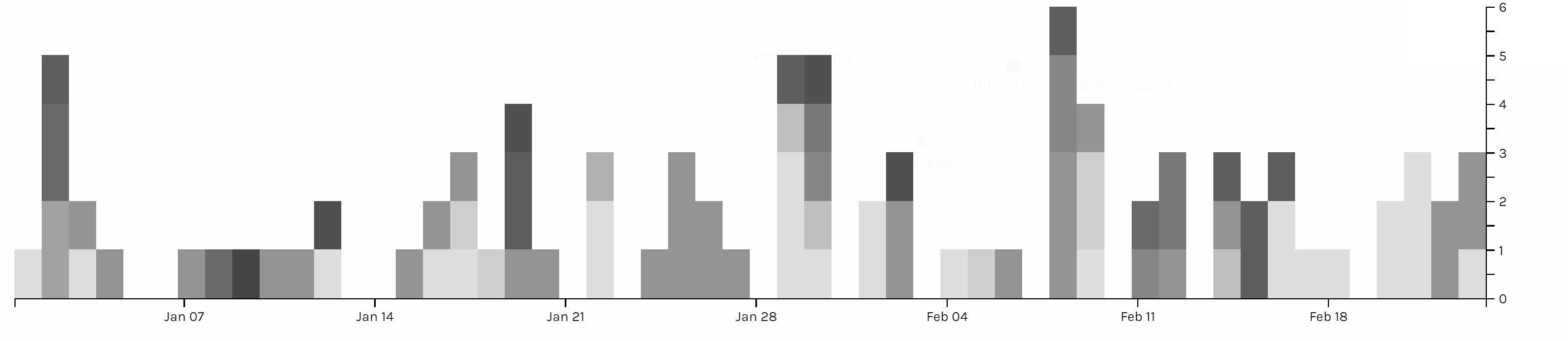
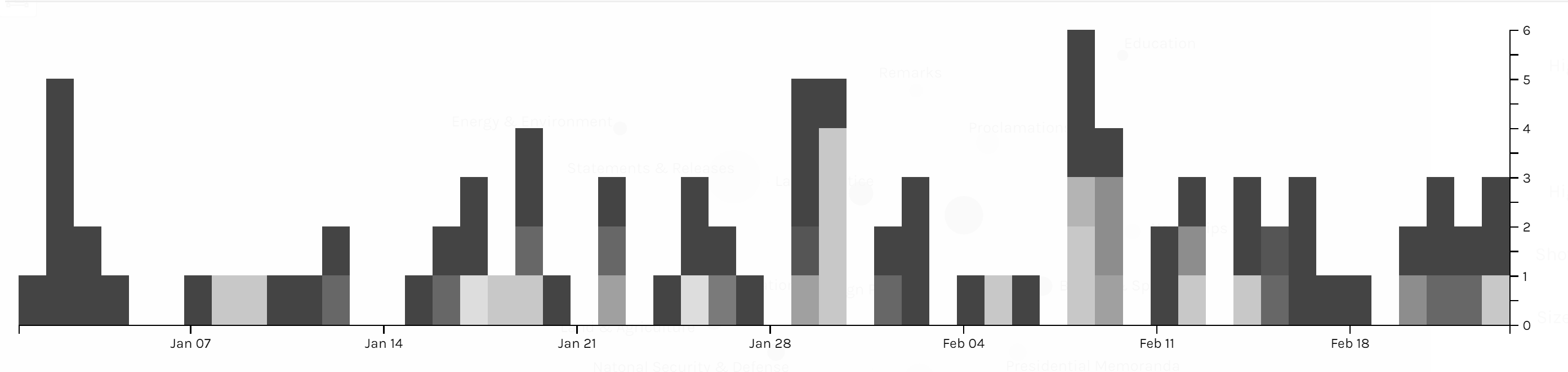
The multi-dimension timeline tool in Palladio is the tool I love best. It fits well with my metadata form even though the news I collected was recorded in separated files. Palladio smartly groups files together and reveal the timeline graph by including the bar chart to show the distribution at the same time.

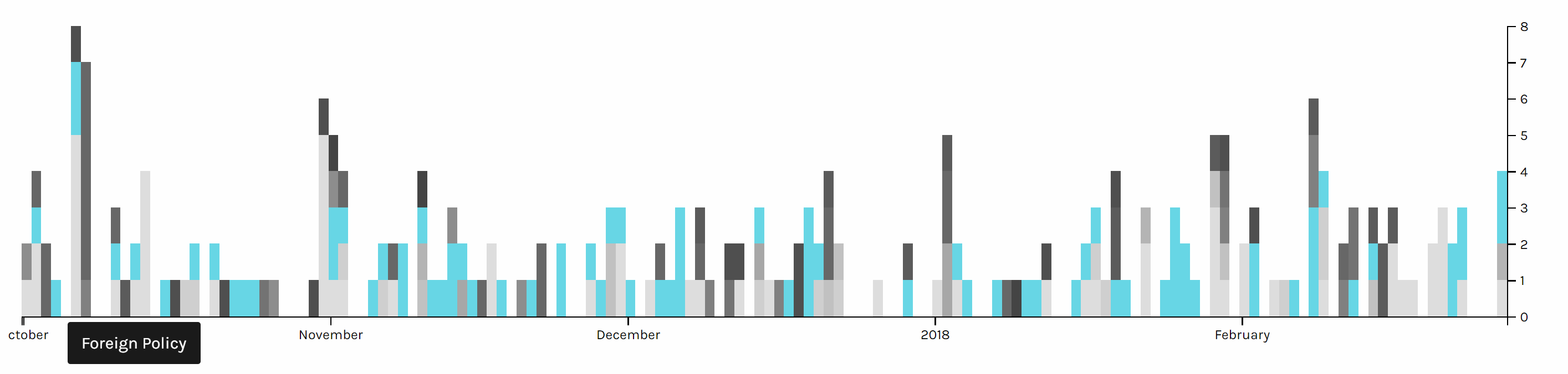
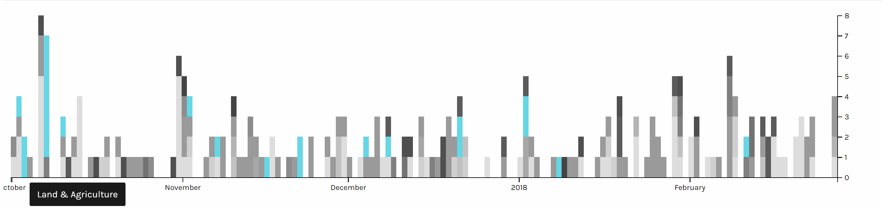
Two graph above are screen shots I took from the same chart but highlighted different issues. We can see foreign policy has been the top issue all the time. And land & agriculture is high particularly in the beginning of October 2017, because of the hurricane during that time.

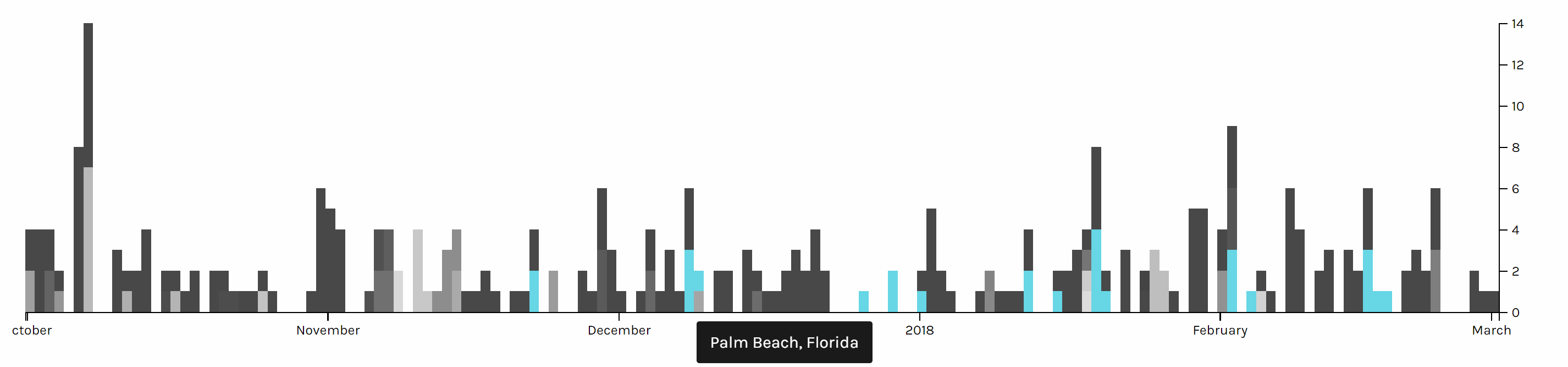
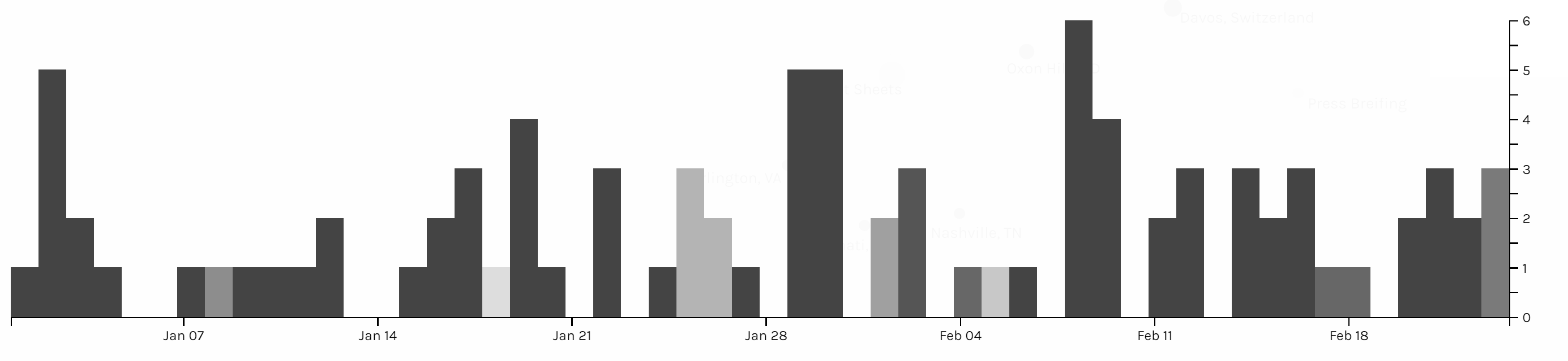
This timeline graph is produced based on the location of Trump and I highlighted when Trump is in Palm Beach, Florida, where Trump usually spends his holiday and plays golf. And it is obvious that Trump seldom visited October or November, when he might be busy with the hurricane and gunfire tragedy in Las Vegas in October and trip to Asian countries in November.

Voyant

Although both Google fusion and Palladio provide many useful tools for data visualization of my meta data, but to better understand the content of news, I also used Voyant for text analysis of my data. Voyant provide a lot of tools for text analysis and each has different advantages, but Voyant also has its limitations. The server of Voyant is very slow and there is limitation on the number of files I can upload, and when I uploaded a lot of files, Voyant starts to make serious mistakes. Fortunately, I took a look into my files, to check the word frequency, so I found this serious issue of Voyant and have to analyze data in separate months. Even though Voyant still helped me a lot in this final project to analyze the word use of news.

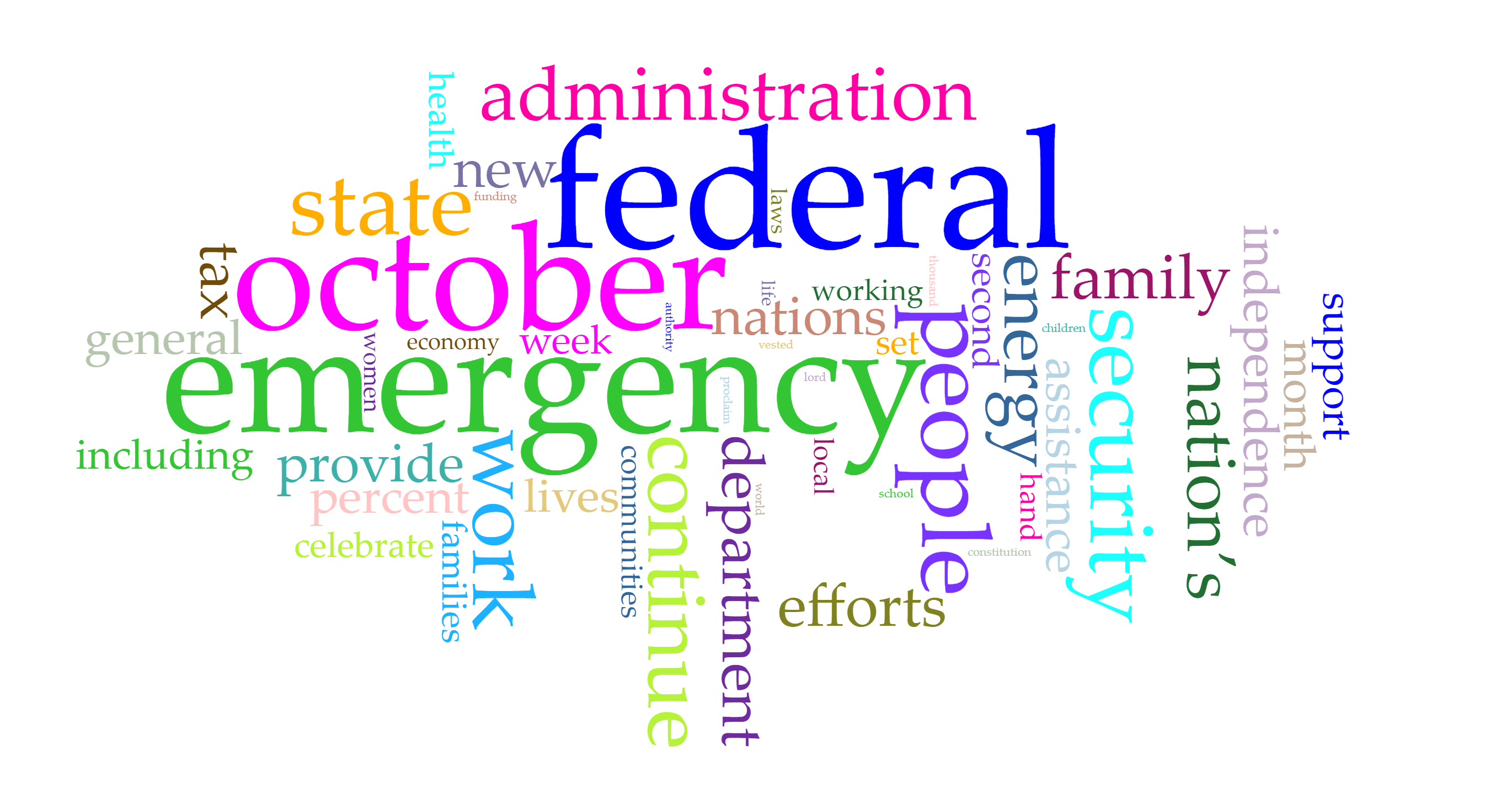
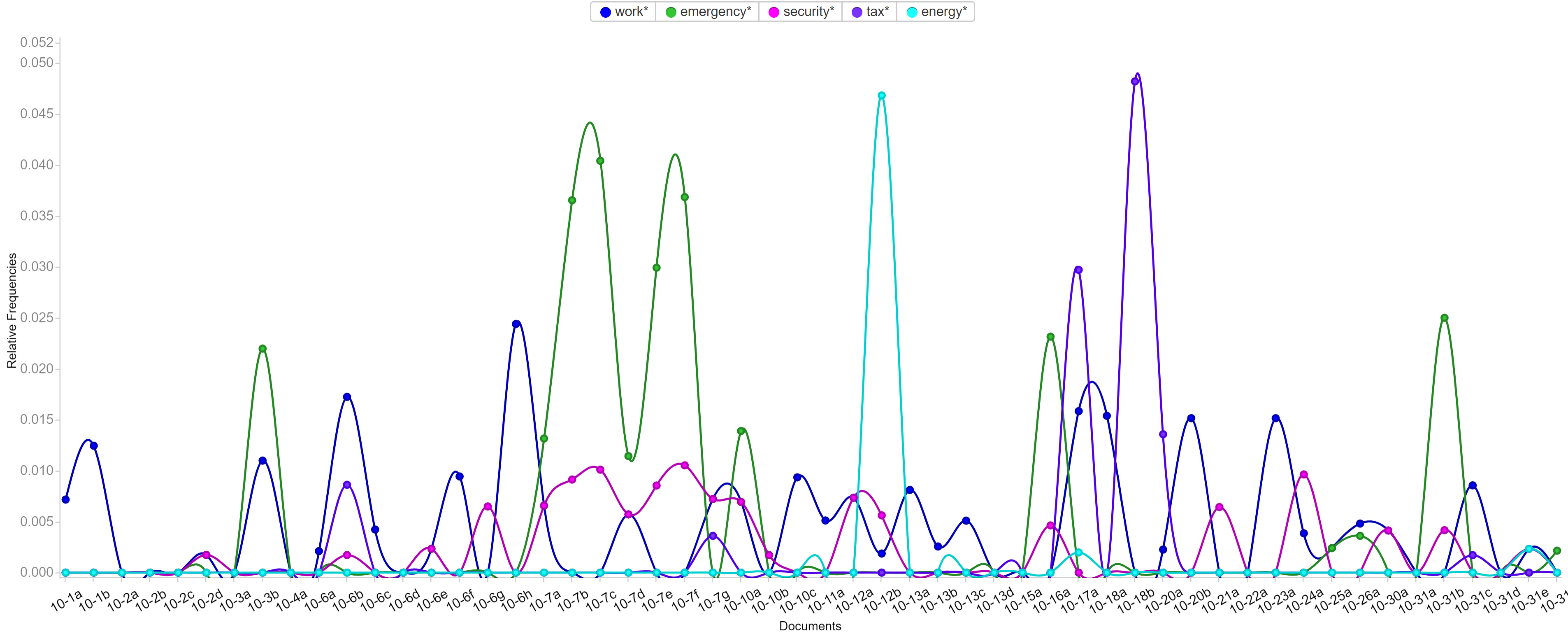
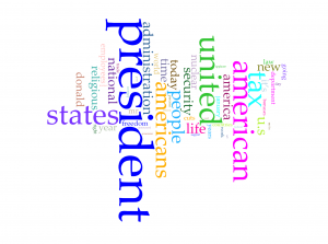
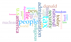
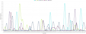
Voyant is very flexible that it allows users to edit the stop word list and pick the words users want to show in the trend graph. Words like emergency, security and tax have been most frequent in those five months and each months have different focused issues. By looking at frequently used words, it’s not hard to predict the top issues in each months. For example, because Trump came up with new job plan and tax cut, hurricane appeared and Las Vegas happened a gun fire tragedy, words like emergency, security, tax and job appeared most.

Conclusion

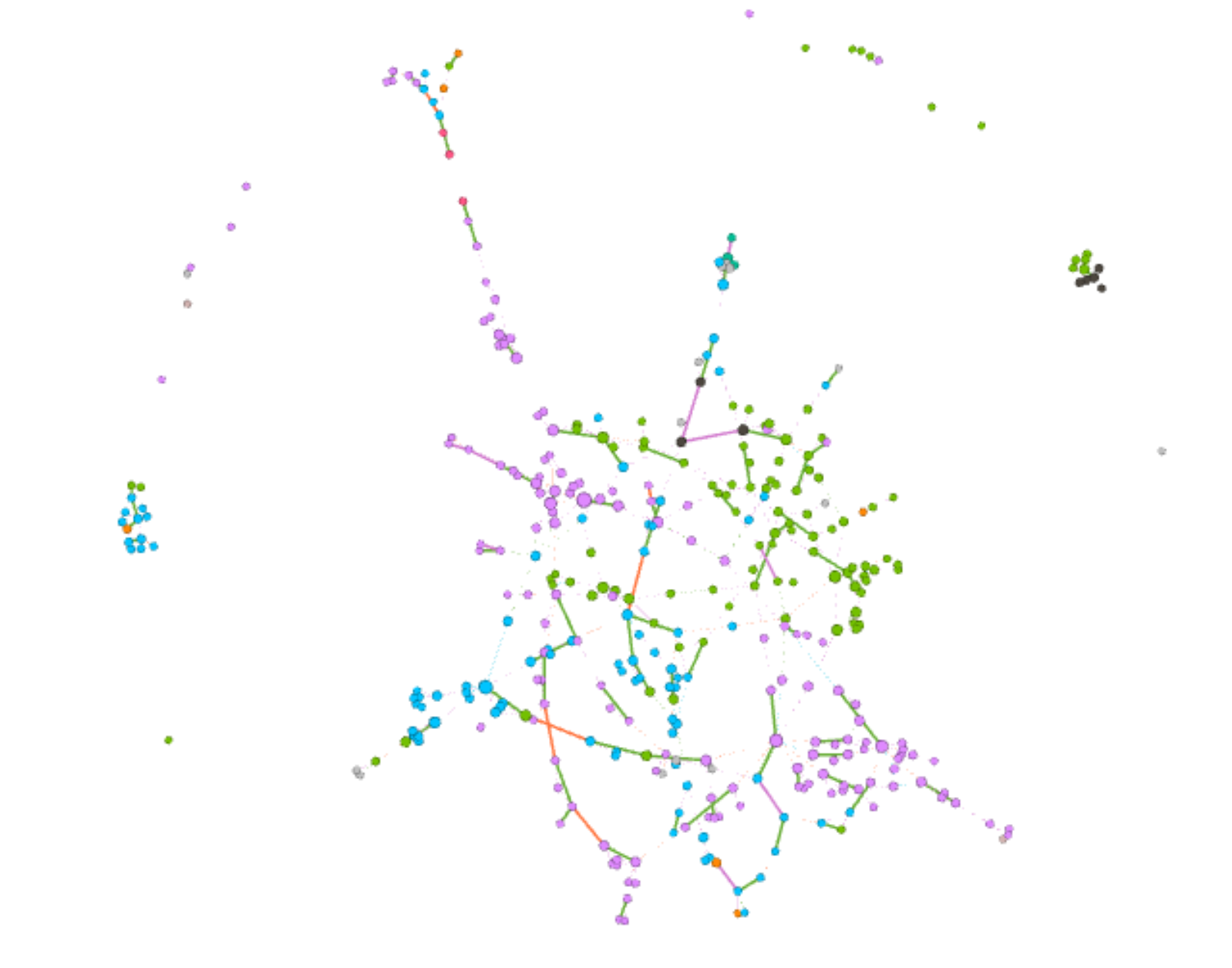
It was fun to do data visualization and I’m glad that I chose this course. During the process of my final project, I can better understand different data visualization tools and I learned that it’s more important to choose suitable tools and useful charts than just making fancy looking graphs. Gephi is a very powerful tool and I want to use it badly, but I also realize that my project focusing more on text and content instead of network, so I gave up using Gephi but tools like Google Fusion, Palladio and Voyant instead.

Categories
Assignment 5

Assignment #5

Gephi is a really powerful data visualizing tool with comprehensive features, supporting calculations, formatting, filtering and etc. It also provide user abundant choice on layout and coloring with multiple ways of classification on nodes and edges. So in this assignment, I tried many combinations of layouts, ranking of nodes and partitioning to see how different dimensions are combined to show more information about baptism of native American.

After I go through what kinds of information provided in each columns of the provided csv file, I want to see how is family members related in baptism. However the all family relationship are not recorded with usable format and the file is sorted by timeline, which makes it hard to inspect the relationships of family members. Therefore, I attempted to involve all family relationships in edges. I classified edges with four kinds: parent-child, couple, sibling and relatives.

First image here is the default layout after I import the csv files of nodes and edges. The import of data in Gephi is very flexible and it allows user to do editions to the data tables and export the data. My original Gephi project went wrong and all data is lost, but thankfully I export my edges table right after I completed it. Each nodes represent a person and edge represent there is family relationship between two people. The data is consisted of over 300 nodes and over 500 edges, so it looks very messy at first, so we can hardly get any useful information from the graph right now.

Then I partition the nodes with by whom each person are baptized and use Force Atlas and Yifan Hu layout to the graph by sizing nodes with degree of them. From the graph we can see that the layout forms of both Force AtlasYifan Hu put closer related nodes together and each group of nodes are usually in the same same color, which makes perfect sense that relatives are more possible to be baptized by the same person. Then I use Fruchterman Reingold layout to have better view of relationships of all people.

When I partitioned the nodes with nation in Yifan Hu layout, Gephi provides me an interesting graph. We can see that most people are from three nations: Delaware, Wanpanoag and Mahican. The top right corner is mainly consisted of green, top left and bottom right are mainly consisted of purple and left bottom corner is consisted of blue. The obvious separation between three nations is actually very reasonable; it is intuitive that family members are usually in the same nations. But if look closer to the boundaries of each sub parts, we can see that the density of edges is significantly lower that the partition of each nation. So compared the Yifan Hu graph above we can assume that the difference between nations contributes more to the grouping of nodes than by whom each person is baptized.

Although the graph looks cleaner, it still provides limited information of the data. One advantage of Gephi is that users can use different partitioning and layouts to make comparisons. Therefore, I tried several different partitionings and had insights into one small group of nodes. Nodes are partitioned with baptized by whom, Eigenvector centrality, modularity and nations. We can see that family members share a lot commons in baptism. In the graphs I listed below, we can see that this group of nodes is mainly consisted by two sub networks, which are connected by “Esther” in the middle. And we can see that those two sub networks are partitioned with different colors in both Eigenvector and nations partitioning, so Gephi works great on separating nodes and family members are usually highly related in baptism.

I also apply ranking of degree on nodes, and I took insight into four nodes with highest degree. Interestingly, those four node have different features: Augustus has two wives connected by two thick green edges, who are Ana Benigna and Esther; Salome has a lot of siblings; Nicodemus has a lot of children; Abraham has a larger family tree. Although those four have different structure of family network, all of them show that family has big influence on the spread of Christianity.

Because I manually typed in all edges for the graph, I found many interesting features in the data, which are not revealed in Gephi due to the lack of consideration on time. Because people are sorted by the date of baptism, people who were baptized earlier are usually parents. However, there are special cases that parents were baptized later. Moreover, there are also a lot couples that one of them may be baptized after marriage (obvious for those who have second wives) and many kids are baptized in their young age. Therefore, we can assume that family relationship contributes a lot in the spread of Christianity.

I also found some weird problems when I was using Gephi. Apart from the failure of loading my previous object, the percentage calculated in partitioning of edge also seems wrong. The proportion of each kind of edge is right, but the sum of them is only 1%.

Above all, compared to all data visualization tool we have been learning this semester, Gephi is the most powerful one, which provide comprehensive tools, flexible manipulation on data and more aesthetically pleasing features. After this assignment, I have learned many useful skills of Gephi, but I found there are still many features I haven’t used, so I hope I can learn and use more powerful tools and features in Gephi in future data visualization projects.

Categories
Uncategorized

Timeline Visualization

Categories
Assignment 3

Assignment #3

News about Trump in the White House’s Official Website in 2018

I gathered all news posted on the White House’s official website, and have created a table of meta data of those news, which include file names, date, word count, category, issue and location. For now, my main focus is on the issue of those news, so that we can know what kind of issues the president has been paying attention to.

The first graph is produced by Palladio and Google Fusion, with category as source and issue as target. Intuitively, the network relationship for category and issue shouldn’t have too much significant meaning. But from the network graph below, we can interpret some information by adding the size of node as a feature. Most news is in the category of statements & releases and about foreign policy. Statements & releases connected to most kinds of issues, only education, economy & jobs and infrastructure & technology are posted by other category of articles. So we can know that dealing with different issues, the White House might use different form of articles. Compared to the graph produced by Google Fusion, I think Palladio should learn from Google fusion to change the color for different kinds of nodes. Although nodes can be highlighted, the difference of color is not significant enough. Another advantage of using Google Fusion’s network graph is that it shows the weight of relations between nodes with the thickness of lines. Palladio is also not flexible enough to control the number of nodes in the graph; in this project, the number of category is in a rather small number, so the graph is still clear for user to look at and read about details, but when there are too many nodes and users only want to learn nodes with highest weights, then the feature like limitation on the number of nodes in Google Fusion would be needed.

The second graph is also a network graph with location as source and issue as target. From this graph, we can interpret more information than the last one. Most news are posted when Trump is at Washington D.C. (most time in cabinet room, oval office or south lawn) and most issues are also in Washington D.C.. News posted outside are usually highly related with the issue happened at the date of that news. For example, the news posted on January 8th was about the rural America’s living condition and on that day, Trump visited Nashville, TN and gave remarks at the American Farm Bureau Federations Annual Convention. Another example, when Trump was attending World Economic Forum in Davos, Switzerland, news in that period is about Foreign Policy.

Those three graphs are timelines for issue, category and location. I don’t see any pattern on the category and issue of articles. And due to the timeline, we can see in the first two month of 2018 Trump didn’t spend too much time on business trip. In my project, timeline is not very helpful for users to interpret data, but I think the combination of bar graph and timeline can be a powerful tool for analyzing data like stories or events. The frequency of words or persons in time line can help users to learn about the focus of topic of an event of the clue in a story.

I also produced two pie charts for issue. Foreign policy takes the largest area and is the main focus of Trump during the beginning of this year. And we can see there is 27.5% of news is not classified with an issue by the White House. So I guess that’s what Drucker mentioned about misinformation; because when a large part of information might be omitted, ignored or untouched, the visualization of data may present imprecise data and mislead viewers. Take this pie chart for example, what if the part without being categorized is about law & justice, then in that situation, law & justice could also be a main focus of the president Trump. And that’s why although I have word count in my metadata, I choose not to use it. Because the number of words in a piece of news might represent the importance of it and it might not. Maybe it just needs more words to explain something. Similarly, what we have done in previous assignments, that we usually use the frequency of certain words to interpret data, might also be a misinformation, because maybe certain terms can be told only in a unique word, like nuclear, but terms like freedom can be also be told in liberty, essence, liberfree, or free will, then judging on the focus of topic with the frequency of words would be misleading.

Thinking more deeply, although the news posted by the White House’s official website is about foreign policy, what if many news related to other issues are not provided by the White House with news? Then the main focus of the president might not be foreign policy, and may be it is the image of the president the White House wants to present to people. Then visualization of our data will be misinformation and what Drucker tried to tell makes a lot of sense.

Therefore, I think, to prevent misinformation, we need our data to be comprehensive and multi-dimensional. Comprehensiveness can avoid omitting important parts of data, so the graph could be statistically precise; in this project, news which is not classified is a lack of comprehensiveness. Multi-dimension can avoid ignoring important perspectives or points of view to the data; in this project, we only have news from the White House’s official website, so the our data only represents the White House’s point of view on the president Trump.

Categories
Assignment 2

Assignment #2

Corpus Introduction

My corpus is consisted of news related to president Trump posted on the official website of the White House. The files are named with the date of the news and include presidents’ readout, statements, memoranda and etc. Because I only focus on news related to president Trump, I filter out those posts from January 12th to February 11th.

Voyant Visualization


Word clouds above are produced with Cirrus tool in Voyant. To have better visualization about words with high frequency, I filter out words like “trump” and “trump’s” in the first word cloud and “president”, “american”, “americans”, “united” and “states”. From the rest of words in the cloud,  we can have a direct view of what topic are focused by president Trump in last month. Tax, nuclear, religious and security have been four popular topics. Although word cloud is an aesthetic tool for data visualization, but it is hard to know exact frequency of each words. Viewers can learn from the graph that “president” appears much more than other words, but they can barely judge that how much more frequent is the word “president” more than for example “people”. So I also took a look at trend graph.

Because files of corpus are named after the date of the news, we can take the advantage that the trend graph’s horizontal axis is also the time line of last month. So we can derived more information than I expected from trend graph:

  1. The word “nuclear” and “security” is highly related.
  2. Topics of tax, religious and “nuclear” are excluded with each other in each news, because news posted from the White House website is usually concise to cover only one aspect of a topic.
  3.  I searched hot news last month and results match with this trend graph very well.

In my opinion, trend graph can perform better on larger data set, which can show better shift from one topic to another. If I can apply all speeches of all American presidents, I guess the trend graph can provide a clear view of focusing topics of each president.

From popular topics, I use links to have more insight into word “tax”. The four most related words are “jobs”, “act”, “reform” and “cuts”.  So we can speculate from the links that the government might want to cut tax and have tax policies related to jobs. But obviously, links don’t perform well enough to show how are those words highly related.

Jigsaw Visualization

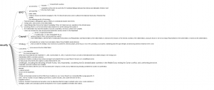
(Sorry about high resolution of my computer, so the font size is extremely small)
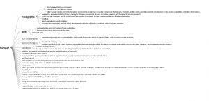
Although Jigsaw is a really old software, but I prefer word trees produced by it than Voyant. Because I apply corpus into Voyant first, I directly search four most frequent words in word tree of Jigsaw. Word tree in Jigsaw can perform much better than link in providing text information but showing phrases and even sentences. Word tree is a kind of visualization combines word cloud and link together. The size of connected word is proportional to the frequency and the lines represent the links between word. However, word tree provides more information and function than both word cloud and link. Users can specify the starting word to have more insight into certain topics of text and lines in word tree are directional from the specified word to words connected after it. But word tree also has the disadvantage that the sentence takes too much space in the graph and might be incomplete because they are limited to initiate from the specified word.

Comparison

Both platforms provide users with multiple ways of data visualization. Because Voyant is newer, it runs much faster to analyze texts, and due to the limitation of memory used by Jigsaw, the text size imported into Jigsaw is very limited. Voyant also provides more kinds of visualizations which Jigsaw doesn’t have, but the word tree in Jigsaw definitely performs better than that in Voyant. So I guess Voyant is much better for analyzing text from multiple aspects with diverse graphs and Jigsaw is better for deeper insight into content of text.

Summary

In the process of applying the same corpus into different platforms and diverse data visualization tools provide users with deeper insight and more dimensions into the data set. As Tanya Clement said, the use of visualization form can provide multidimensional viewpoints. My trend graph can provide more information in the time sequence; dragging words in Voyant’s link can have better visualization about complex connections; the meta information with multiple dimensions in word tree can lead to better speculation of contents based on graphs. Besides merely providing superficial and statistical information of contents, the process of data visualization can also lead user to deeper understanding of the focus, clue or even metaphor of the context.

Categories
Assignment 1

Assignment #1

1. Invisible Residents

http://www.nytimes.com/interactive/2012/06/19/science/0619-microbiome.html?_r=0

This is a chart from the project called The Human Microbiome Project, which spent two years surveying and classifying the bacteria and microbes at different sites on 242 healthy people. This radial network chart aims to reveal the complexity inside the combinations of microbes living in or on the human body.

The first impression of this graph to me is complex, but After I read through the details of this graph, I was impressed with how this radial network chart manages to embed so much information. Although it is a 2-dimension graph, the circle is actually consisted of three related parts to show many dimensions of information. The inner one is a circle-like family tree of the microbes in the human body; the middle rings shows how much each microbes is found in each site of human body; the peripheral shows the significance of the abundance of each microbes on its most common site. The inner tree graph has classified different kinds of microbes and bacteria, as mentioned in Lima’s chapter 2 (page 62), tree diagram has been popular for its advantage of classification in hierarchy diagram. Therefore, this graph efficiently makes use of the increase the radius to show the information from classification to more detailed numerical charts. It is worth to mention that instead of simply present the graph, this chart uses black border to emphasize significant or extreme values with laconic explanations.

As a static visualization graph, it shows great relationships between each kind of microbes and clear comparisons on the abundance of them. It is regrettable that the this chart don’t provide any interaction for users; I think it would be much better if users can access more details about each branch of data on the graph by a link.

2. Zeus’s Affairs

https://www.fastcodesign.com/1671501/infographic-mapping-every-affair-zeus-ever-had

The topic of this chart is very funny and the result is also amazing; it covers a large part of Greek gods. It shows every relationship Zeus ever had and many of them are with sisters, daughters and aunts.

Usually, relationships of lovers and offspring is presented in a standard top-down family tree, but in Zeus’s case, as the creators says, it would be impossible to represent all the unions between Zeus and other women, with their offspring, without repeating most of the names more than twice. Intuitively, it is a tree graph, but the “center” Zeus is a line instead of an element in graph. It is really interesting that instead of putting Zeus at the center of the circle, the god of gods is represented as a thick black line with his sexual partners on the inside and their offspring on the outside.

This graph of relationships is very interactive. Instead of gathering data only from the popular Homer’s Epic, it covers all texts of Homer, Ovid and many other historians of antiquity, each represented as a different color of line in the graph. Views can click on the color to see only ones delineated by certain historians (The link of the original project is not valid even after I tried after searching).

3.Belfast Group Poetry

http://belfastgroup.digitalscholarship.emory.edu/network/chord/

This is a chord diagram to show the network of relationships among Belfast Group’s members. As an alternate visualization of the original network graph, this diagram is easier for viewers to see the connections and the strength of them.

The strength of each connection between two individuals is represented by the thickness of the line, and the color of the line is based on the stronger or more frequent source of the connection. Compare to the original graph,  this chord diagram reveals more information in each connection and makes the whole network more visible by using different colors and thickness of lines.

This chord diagram is also very interactive; viewers can click on a certain person to see exclude the connection unrelated to him or her, and on the right hand side of the graph, a links of this person’s profile is provided. Sinclair (section Interactive Glyphs) also mentioned that the interactive tools here provide users with deeper insight into many details of the graph. The example provided by Sinclair is also about letters between a group of people; interactive tools provide users with better scope of possible patterns.

Summary

It is obvious that I have intentionally chosen three radial graphs so that I can make some comparisons. All those three graphs aim to show a relationship of network, and it is an advantage of radial graphs, because when elements are highly related, circle provides the better arrangement of elements and lines in visualization. Lima’s chapter 2 (page 62) also mentioned about the popularity of classification with tree method. Although Folksonomy uses bottom-up and DDC uses top-down method, both of them use hierarchy architecture (tree graph). Even though, it is still better to provide the functionality of extracting certain part of the network, especially when the graph is complex and highly connected. All those three graphs have their own good features like multi-dimensions or interactions.

Categories
practice

Two posts from viz.wtf

(1)

(2)