Categories
Final Project

Mahoney – Final Reflection

Assignment 6 – Final Reflection

Final Artifact: https://caitlinmahoney23.wixsite.com/comabroad

Studying abroad can be a daunting task. It’s a task that many individuals set themselves up to take on in the first year here at Bucknell, but it is one that gets wiped off the agenda of many due to the work and strain that goes into it. Students in the Freeman College of Management have an especially difficult time finding places to study by needing to find courses that will transfer back as major requirements and CCC requirements. So where do students begin? They know that they want to go abroad, but they don’t know what’s been done in the past, what programs are out there, what’s popular, or even what suits their own major.

The main purpose of my visualizations is to give students a place to begin. The main questions that I analyzed through my data set and visualizations include:

  1. Where are our students studying abroad?
  2. What are the trends of our students?
  3. Who went where?

These are the questions that many have difficulty explaining because most of this data is hidden and unknown to the public. My main work and explorations went into creating a user-friendly and interactive website that can be used by all to explore the data from the Office of Global & Off-Campus Education at Bucknell in a meaningful way.

The goal was to utilize multiple types of visualizations to communicate different aspects of the data. As Drucker states, “Communicating the contents of a digital project is a knowledge design problem – since the multifaceted aspect of database structures offers different views into the materials.” (Drucker, 243) In order to offer these various views, I used Palladio, Voyant, and Google Fusion Tables.

Platforms and Tools

The webpage was created in Wix, since it is a platform that I am used to creating webpages on, and it is a very interactive and creative space, where many other tools and platforms can be embedded to tell about the study abroad narrative.

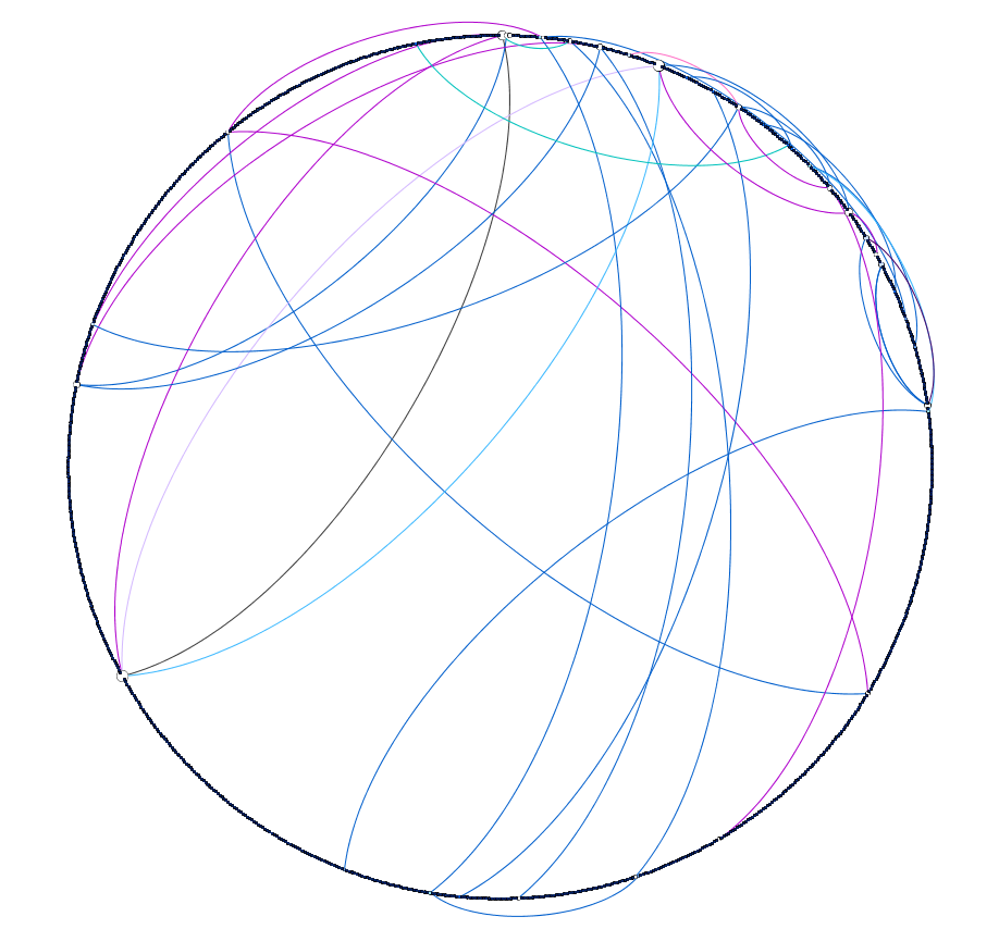
Palladio was the first tool that I decided to use based on its ability to create maps, node graphs, and timelines in a simple, yet meaningful manner.

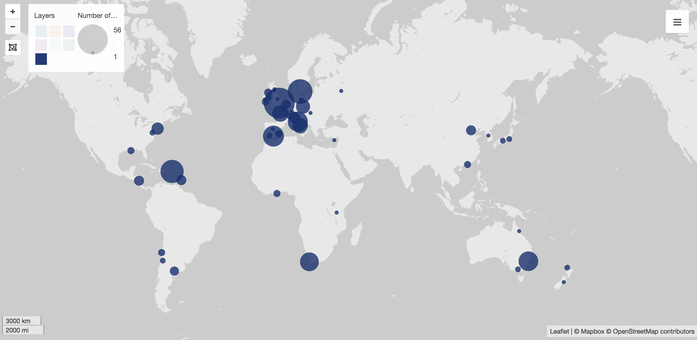
At first, I used Palladio to create maps to show the popular spots to study abroad. These visuals are my favorite visual throughout based on their simplicity. In Wix, I created a gallery of them, which shows various sets of data, including students in the college as a whole, as well as each individual major.

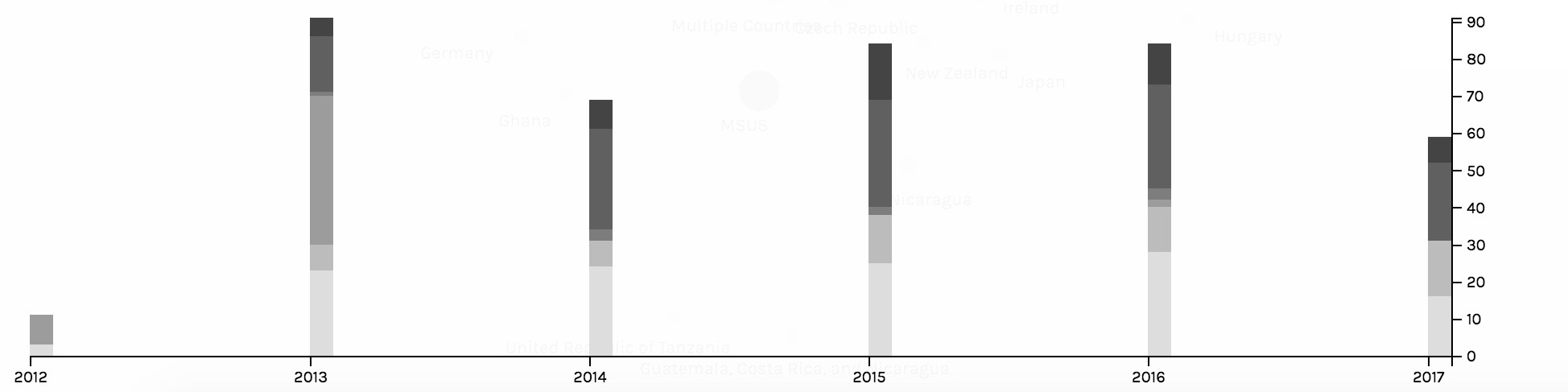
The second main job done by Palladio was to create timelines. The two main timelines created were to show trends in what majors went abroad and to show trends in the locations of where students chose to study. The timelines captured trends of the students and the Wix view allowed for users to click through the various screenshots of them.

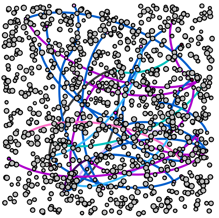
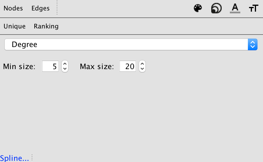
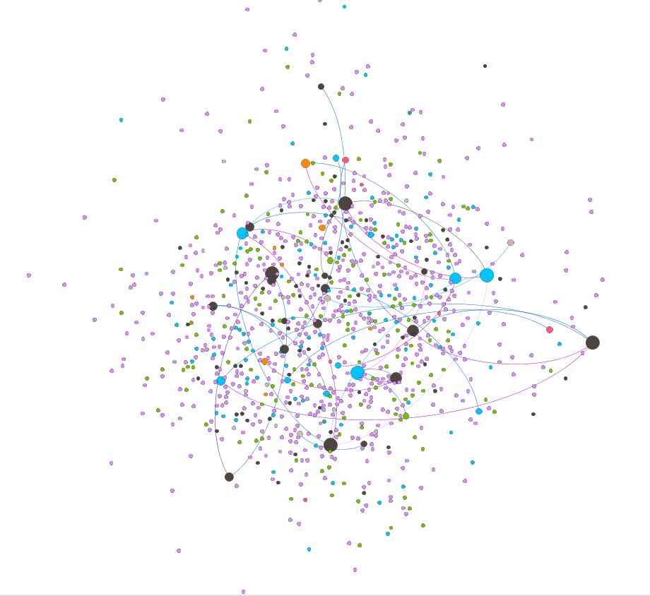
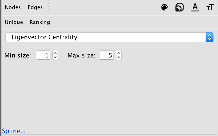
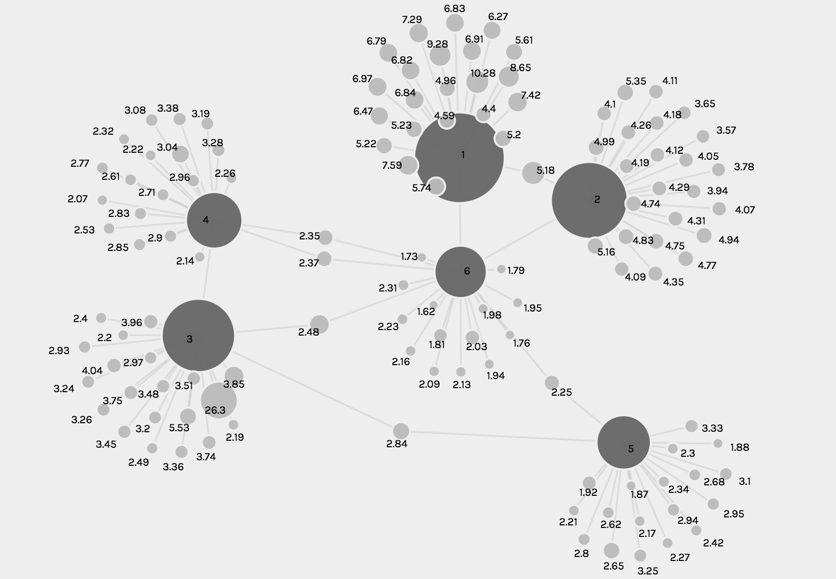
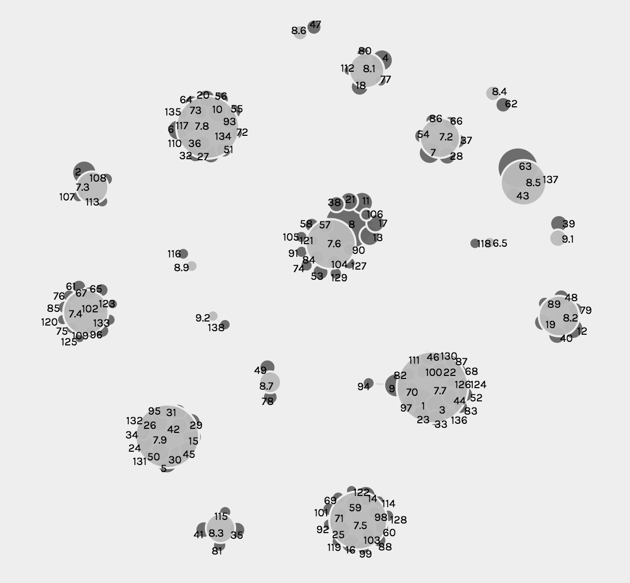
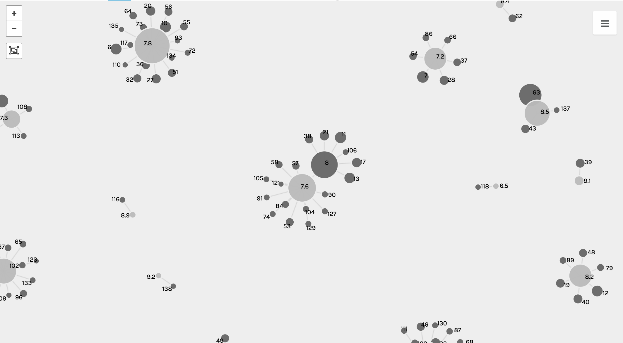
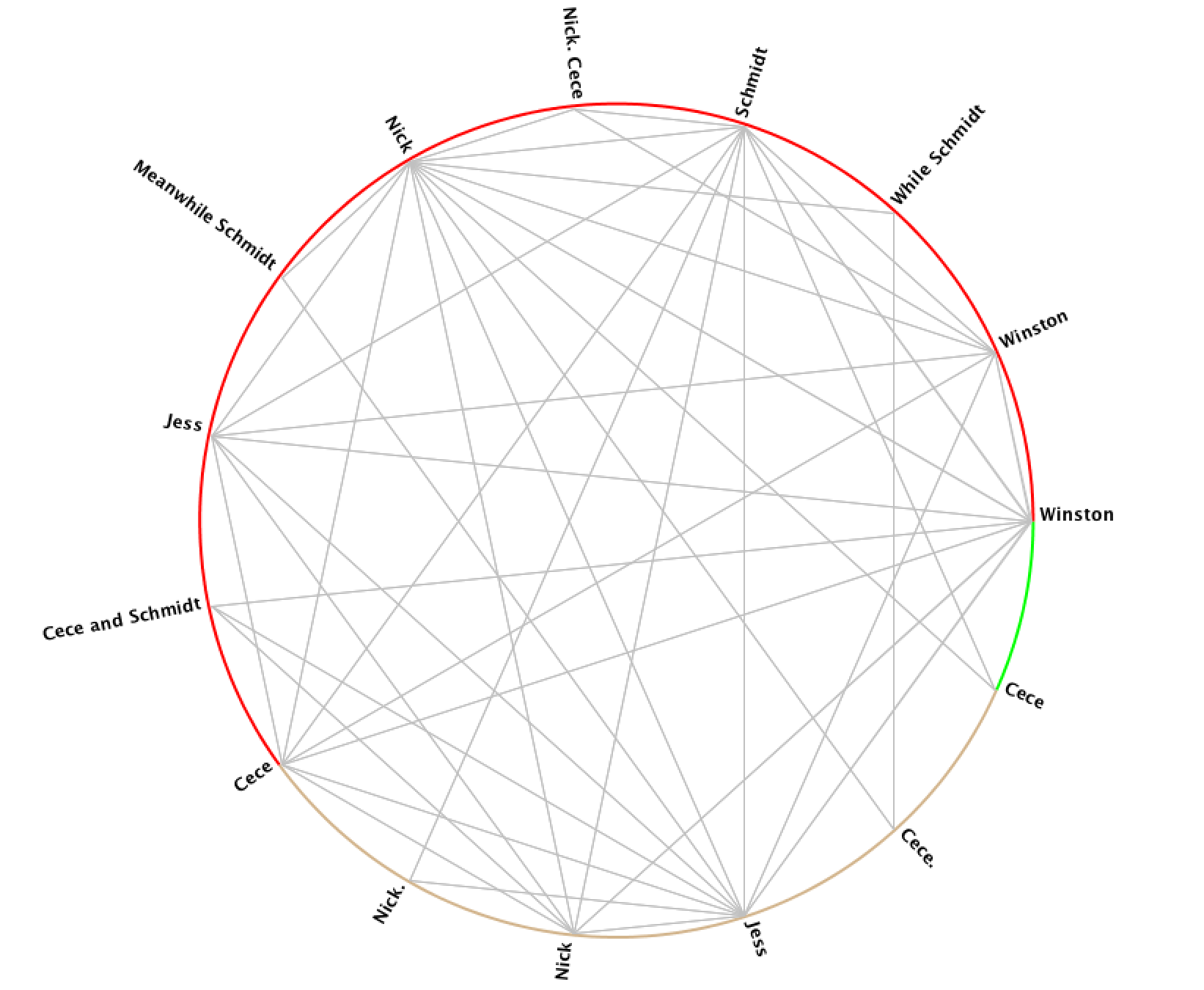
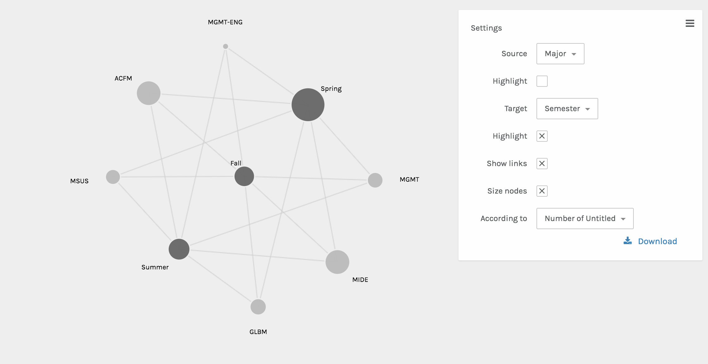
The final visual done by Palladio included the node graphs. These two graphs showed the interactions between various nodes. One shows the relationship between the semester abroad and major and the other shows the relationship between the location abroad and the major. The size of the node shows the frequency of the node.

Once integrated into the Wix website, the beautifully interactive Palladio visuals became static. However, as Sinclair nicely states, each one “aims to produce a single perspective on available information.” (Sinclair) Ultimately, each visual from Palladio assists in telling the full abroad story.

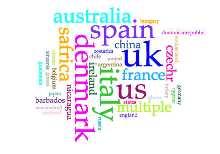
The next platform used was Voyant. I chose Voyant in order to show the popularity of locations in a different way, since some audiences may be more in tune with written out locations, as opposed to locations on a map. Voyant was used to give users a more comprehensible visual of what students were where through using the Cirrus world cloud tool. Three word clouds were created – one for continents, one for countries, and one for cities. This allows for users to play with the words that they may recognize better than a map form.

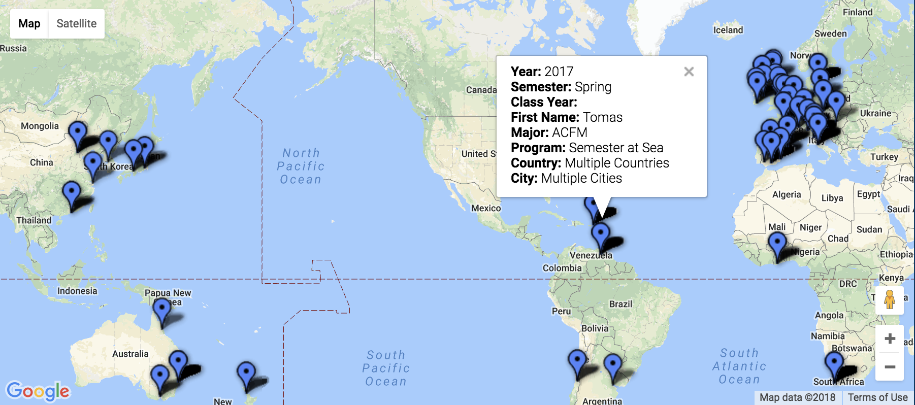
The final platform used was Google Fusion. The maps function was the perfect tool for sharing the precise location and information including name, major, class year, semester abroad, program, city, and country.  This interactive map has a full-college view, and is also available based on major. Through interactions with this map, the user is able to find areas of interest to them, see previous students who studied there, and even drop a pin to see a street view of these locations to see if they’d be comfortable in the area.

Platform and Tool Critique

My main critiques surrounding Palladio is that the platform doesn’t have an easy way to export the media and integrate it into another software. As a platform that’s in itself exploratory, once integrated into the Wix site, the Palladio visuals became static. The visualizations are no longer dynamic, which Sinclair describes, “aim to explore available information, often as part of a process that is both sequential and iterative.” (Sinclair) Rather, they are just constructs of data as capta, which have an inherent bias as Drucker explains, “Capta is constructed and not given…the initial decisions about what will be counted and how shape every subsequent feature of the visualization process.” (Druker, 244) Since the data and visuals are chosen by myself as the author, the visuals tell the story that I’m narrating, and they’re not able to be manipulated by users.

These are the critiques that ultimately led me to the inclusion of Voyant and Google Fusion visuals. Voyant embedded extremely well into the Wix webpage, however, since it’s a text-based software, for countries and cities with multiple words, it wasn’t the best tool. Google Fusion maps, on the other hand, was the tool that I had been searching for since it allowed for multiple levels of information to be shared on the map. The main critique that I have of the maps is that while they are interactive and explorative, which are keys to great visualizations, if there are multiple “pins” in the same location, then only one is seen.

Conclusion

Overall, throughout the process, the main motivation was to create a user-friendly database to explore the study abroad options for a management student interested in going abroad. Based on location, semester, or major, hopefully this database created a field of vantage points that the user could interact with. As Sinclair states in his article, “humanities scholarship is often exploratory, we have also come to believe that interactive formats are in most cases preferable to static ones, since they allow the person using the system to add and subtract elements, experiment with different forms, pursue hunches or insights, and so on.” (Sinclair) With this database, students would be able to see what’s been done before them, and explore the possibilities of creating their own adventure for their study abroad experience.

Categories
Assignment 5

Assignment 5

Through using Gephi, the baptismal relationships between Native American Indians will be analyzed. From the initial dataset of 375 nodes, I closely analyzed the first 25 nodes, which each represented a unique Native American.

The main goal of these visualizations is to further understand the complex relationships between the various elements. As Isabelle Meirelles discusses in Design for Information, “Node-link representations use symbolic elements to stand for nodes and lines to represent the connections between them” (55). Using Gephi, a structure of nodes and link connections were created.

The given dataset was a Native America multidimensional, baptismal database. In the Gephi database, each element or person is represented by a node, and I connected the nodes with edges based on the relationships with one another. These edges in Gephi specifically represented husband, wife, brother, son, stepdaughter, widow, or null.

With these edges consistent throughout the visualizations, the three different dimensions that I examined closely were modularity, degree, and Eigenvector.


Modularity –

The first step of creating a visualization based on modularity was to color the nodes based on modularity class. To further emphasize differences in class, the node size was also adjusted based on rank.


The attribute of color distinguishes different modularity classes from one another. With the colors, the reader is able to see the main clusters and different groups that the Native Americans were in. Since not all the edges were created for the full data set, many nodes are left gray in the visualization, which represents them being disconnected from the rest of the data set.

Without many groupings showing up with the red through gray modularity color scale for the nodes, the most striking part of the visualization are the edges between the nodes, which show various relationships between the baptized Indians, or adjacent nodes.


Degree –

For the degree visualization, the nodes are colored based on the nation of the baptized Indian, and are sized based on the degree. This graphic visualizes the story of how nation and relationships between nodes are related.

Each node is colored based on nation.

The size of each node is based on the degree of the element.

With these ways to partition and rank the data, below is the visualization created.

From this, the reader can interpret how baptized Indians are related to one another based on node size (strength of degree), node color (nation), and edge color (relationship between nodes).


Eigenvector –

For the Eigenvector visualization, the nodes are colored based Eigenvector statistical calculation. This graphic visualizes the relationship between Eigenvector values and the relationships with adjacent nodes.

Each node is colored based on Eigenvector calculation.

Each node is sized based on the Eigenvector statistical analysis as well.

With the visualization, the Eigenvector calculation takes into account the degrees of adjacent nodes.

Overall, this visualization is difficult to read, and would be a stronger visualization if there were more connections within the numerous data points. There is an unproportional amount of nodes to number of edges, and overall the set doesn’t create the most meaningful visual.

This is my main disagreement with visualizations in the Gephi platform. The platform is not user-friendly, and is extremely difficult to work with as an author. As an author, the statistical analysis logic and creation is complicated, resulting in extremely complex visualizations that are potentially too sophisticated for readers to completely understand.

In addition to that, unless the visualizations are exported with the Sigma.js extension, the visualizations are static and are not interactive. This results in even more difficulty in analyzing the data further as a visual form.

As the reader can see from these visualizations, it’s very difficult to interpret much from this small a dataset. As Meirelles discusses, “most problems faced by node-link representations are caused by the occlusion of nodes and link crossings, which obliterates the structure it is supposed to reveal” (56). Since there were many gaps in this data set, the full narrative could not be visualized. Overall, the visuals are telling in the connections between the various baptized Indians, and the colorful edges tell a story about the connections. However, without the full extent of the connections between all nodes, the visualizations are not capable of telling the full story that the Moravian missionaries were trying to capture through their records.

Categories
Uncategorized

Time Schema Examples

“Diagram of the Causes of Mortality in the Army in the East” (Florence Nightingale, 1858).

“Conspectus of the History of Political Parties” (1880).

“Last Clock” (Jussi Angesleva and Ross Cooper, 2002)

Categories
Assignment 3

Assignment 3

In creating my data set, I chose to look at the Fox TV show, “New Girl” and to analyze various aspects across the different episodes, including views, ratings, and descriptions of the episodes in correspondence to when the episodes were produced and the order in which they occurred in the season.

The raw data itself can be seen here. It consists of all episodes, directors, writers, genders, air dates, U.S. viewers, length, IMDb rating, images, and episode descriptions.

Due to the capacities of Palladio and Google Fusion, I decided to create visualizations of individual episodes and highlights of information with those, as well as various visualizations about the connections and correlations amongst data. In analyzing these connections, I used the season, release date, number of U.S. viewers and IMDb rating of each episode.

These aspects of each episode were chosen to as representations of each episode, therefore each visualization will have an inherent bias. As stated in Drucker’s work when discussing data in visualizations as capta, she states, “Capta is constructed and not given…the initial decisions about what will be counted and how shape every subsequent feature of the visualization process.” (244) This idea of data as capta must be considered in the graphics below, as the information and ways to present it was chosen by myself and therefore is no longer pure data.

All visualizations created both through Palladio and Google Fusion. The main goal of using these tools was to communicate the “New Girl” metadata through various graphic designs. As Drucker states, “Communicating the contents of a digital project is a knowledge design problem – since the multifaceted aspect of database structures offers different views into the materials.” (243) Because of this, multiple visualizations were created to allow for different perspectives on the data itself.

Below are various creations of visualizations done in Palladio.

This first visualization was created using the Gallery function. The main purpose of this graphic is to give the viewer a visual and quick way of reference to each episode. One lacking feature to the Gallery function is that there should be a way to include additional information to the cards, because while I believe this visual is functional, it’s not the most effective at communicating all aspects of each data point from various aspects.

The following visualizations were created using the Graph function. The first shows the number of U.S. viewers to each episode, where the size of the node reflects the number of U.S. viewers.

The second and third visualizations are the same, just with different zoom views, and these show the relationship between each episode and the IMBd rating for each episode, where the size of the node reflects the rating.

While the graph function creates detailed and intricate visualizations, from a user perspective, the visualizations are complex and difficult to read and comprehend, especially when they solely become static images.

The third and fourth visualizations are bar graphs, which when Drucker explains the history she states, ““Bar charts came relatively late into the family of graphics, invented for accounting and statistical purposes, and thus pressed into service in the eighteenth century, with only rare exceptions beforehand. They depend on underlying statistical information that has been divided into discrete values before being mapped onto a bivariate graph.” (240) Both of these were used to clearly map out the changes in trends and numerical data from the original air date of the show to the present.

The first bar graph maps out the IMBd ratings over the air dates, and the second bar graph addresses the number of U.S. viewers over the air dates. While the charts are a clear visualization and one typically beneficial to numerical data, the Palladio platform for arranging these graphs was extremely difficult and had glitches.

Lastly, in Palladio, there was the Facet Feature, which was complex and difficult to comprehend exactly how and what it was doing. That being said, it created a list-like visual, which is beneficial to users in search of quick information.

In Google Fusion, similar visualizations to those in Palladio were created. The gallery and graph functions were very similar to Palladio, but differed in terms of user interface. The visualizations are below.

In comparison to Palladio, the gallery graphic in Google Fusion is not as aesthetically pleasing, however the graphing functions and graphics were much more user friendly and of equal level to the Palladio graphs.

While these visualizations are a convenient way to present information about New Girl and how trends in U.S. viewers and ratings have changed throughout the years, it is important to recognize that with all visualizations there is bias due to data used and aesthetic decisions, and as Drucker clearly states, “all data is capta, made, constructed, and produced, never given.” (249)

Categories
Assignment 2

Assignment 2

After doing a similar analysis project in my IP course, “Approaches to Digital Humanities,” I decided to create data visualizations to analyze at the scripts, descriptions, and character relationships of the Fox TV show, New Girl.

In creating my corpus, I was really interested in a few things. The first was character names and descriptions. I looked at how often they appeared, and how often they were related to others. I was looking to analyze the relationship between the roommates throughout the show, along with their different relationship histories. Specifically, my main objective was to see whether or not it was possible to predict the ending of Season 6, where Jess and Nick end up together.

Below are the Voyant visualizations:


In analyzing the character frequencies and relationships, I found Voyant extremely useful. The Cirrus tool was interesting to use. Immediately, I found that the most frequent words are the main characters of the show, including Jess, Nick, Schmidt, Winston, Cece, and Coach. Through the Bubblelines, I was able to see the overlap and frequencies over time of when these individual characters were mentioned throughout the seasons. And then lastly for Voyant, I used the Links, which was a good visual of the various connections between key terms, and it supports the strong link between Jess and Nick in the texts.

The Voyant tools, including Cirrus, Bubblelines, and Links tools, were extremely helpful in analyzing the text across the different seasons in showing trends and connections throughout.  One tool that I believed would have worked in my favor is the Phasing tool. I struggled with this tool many times, and tried to get it to behave properly, however it wasn’t very user friendly and resulted in poorer results that what I had expected. One tool that I would have loved, that would have been slightly more advanced would be a stronger linking tool. I would have loved to see how words were more intertwined with one another than just the Links tool was capable of showing. Lastly, it would be useful for the Voyant Tools to interpret different versions of words or understand synonyms when analyzing how frequent similar themes or messages appeared.

Below are the Jigsaw Visualizations:

In using Jigsaw, I utilized the Word Tree and Circle Graph tools to look at the various connections between the characters. From the Word Tree, it is clear that “Jess and Nick” is a reoccurring phrase, and it nicely shows how Nick is mentioned in sentences that relate to Jess. One further investigation that would be interesting to follow up on this would be to see what words and phrases are before the term “Jess.” In addition to the Word Tree, the Circle Graph creates a pleasing web of connections between the various characters. However, it’s unclear exactly how and why the character names are divided the way they are between the different “groupings” on Jigsaw. Another flaw is that the visualization doesn’t portray the strength of the connection between characters, which I would have loved to see.

Overall the process of analyzing the data was an enjoyable one, but I would be interested to look deeper into the written scripts themselves, rather than just the summaries that were short and necessary for Jigsaw.

In comparing the two platforms, Voyant was more useful in terms of making sense of and creating the visualizations. Jigsaw was not nearly as user-friendly, and the graphics weren’t of the same caliper as Voyant. That being said, with other data, Jigsaw could be more beneficial if there were more layers and details about the time, place, and location of the data.

Overall, the process of creating the corpus and visualizations has been an amusing experience. As Tanya Clement discussed, the creation of these visualizations gave new insight, and a “vantage point” that allowed me to see the text from a different angle. Additionally, with the text simplified down to significant words and connections, the visualizations allowed for “a feeling of justice of authenticity that is based on plausible complexities, not just simple immutable truths.”

Categories
Assignment 1

Assignment 1

Visual Complexity.com Examples:

“Universe of Emotions” – http://www.visualcomplexity.com/vc/project_details.cfm?id=926&index=44&domain=Semantic%20Networks

“Blooming Numbers” – http://www.visualcomplexity.com/vc/project_details.cfm?id=391&index=57&domain=Knowledge%20Networks

The “Universe of Emotions” and “Blooming Numbers” visualizations are extremely visually appealing to me. They are both extremely neat and colorful, as well as clean and simple. In the screenshots alone, the static visualizations are beautiful.

The “Universe of Emotions” visualization maps together the 307 emotions, showing the different groupings and relationships between the different emotions. The map was created to help people visualize and understand emotional health in order to improve learning and management of emotions.

The map truly speaks to me because emotions are intangible to begin with, yet with this visualization, the different levels and feelings and mental shifts can be simple to follow. The visualization itself is static, which is as Sinclair describes in his article, “aims to produce a single perspective on available information.” Although there aren’t various ways to view the data, which could definitely add depth and different perspectives of the content. However, since the data began as intangible material, the visualization helped to create a very tangible understanding of emotions.

The “Blooming Numbers” visualization, as the author explains, maps out how “people from different cultural backgrounds have distinct opinions about numbers.” To do this, the flowers represent different numbers, with the size being in correspondence to the number of people who chose that number. The colors range from orange to black, where orange corresponds with people favoring that number and black, the opposite. The petals around the flowers represent the people affected by the number.

The dynamic visualizations, which Sinclair describes, “aim to explore available information, often as part of a process that is both sequential and iterative.” The “Blooming Numbers” allows users to interact with the data through clicks, which allows users to explore the information further. When a petal is clicked, the petal links to two other petals from the same person, with additional information about the person. Overall, I think that it presents data in a very different and interesting way, however, I would love to see a simpler way to compare the different preferences across cultures, which seems to have been lost in the beauty of the visualization.


DH Sample Book Example:

“SelfieCity” – http://selfiecity.net/selfiexploratory/

The “SelfieCity” visualization is easily one of my favorite visualizations. For starters, it’s such an interesting idea and concept. The visualization is extremely dynamic and focused on being user friendly, which allows the user to interact and become more familiar with the data. With being able to play with the data and make different connections, the visualization is extremely interactive.

As Sinclair states in his article, “humanities scholarship is often exploratory, we have also come to believe that interactive formats are in most cases preferable to static ones, since they allow the person using the system to add and subtract elements, experiment with different forms, pursue hunches or insights, and so on.” Through further exploring the data, the “Selfiexploratory” can be used to explore demographics, pose, features, and more.

Overall, the dynamic visualizations are super fun and interactive, but the end Findings are fascinating, and overall, SelfieCity does a fantastic job at showing data, analyzing it, and presenting it in user-friendly ways.

Categories
practice

Two Visualizations