Final Artifact –> http://humn270finalprojectbarron.blogs.bucknell.edu
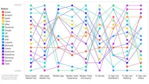
For this assignment, in order to portray the baptism information from the Moravian missionaries in the 18th century, I decided to create a visualization using Gephi that focuses on the gender of those that were baptised and how many connections they had to the others in the dataset. My visualization is featured below:
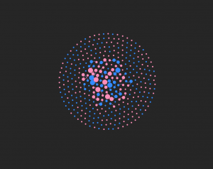
My visualization has 376 nodes and 70 edges. I used all of the nodes in the dataset, but I only created edges for the 50 people that I was assigned. Although I think the visualization presents the data that I included in a very useful way, seeing all the edgeless nodes surrounding the center shows how big the dataset was and how the edges that I included are just a portion of the people that were baptised. However, by only using these 50 nodes, it allowed me to visualize specific individuals more clearly.
I represented the data primarily through the color of the nodes and edges and also through the node size. The color of the nodes are either pink or blue, pink representing females and blue representing males. The edge color is pink if the connection is between two females, blue if the connection is between two males, or purple if the connection is between a male and a female. I found the gender aspect of this data to be very intriguing because I wanted to see if well connected individuals were typically male or female and what that could mean for the data as a whole. The size of the nodes represents the degree and how many connections a specific person has. The more connections, the bigger the node. The nodes on the outside are all equally small because I did not enter their edges into the data laboratory. All the edges that I added are visible in the center of the visualization.
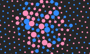
So, what does this data show? This data shows that Elizabeth, Beata, Zipora, Christiana, and Esther are the females with the most connections and Petrus, Benjamin, Nathanael, and Thomas are the males with the most connections. There are 5 very well connected females and only 4 well connected males present in this visualization. Of the 50 people that I created edges for in the dataset, 31 were female and 19 were male. This is evident with the higher number of pink nodes that you can see in the center of the graphic. This tells me that the females overall had more connections than the males. This made me curious as to what the roles of the women are in these communities and how women are viewed by both the missionaries and by the males in the dataset. The women seem to play a very important role, given how many of them are so well connected to others. Also, most of the nodes that were the largest, meaning the nodes that represented the people with the most connections, tended to be related to the other people who also had the highest number of connections. For example, Zipora’s father is Petrus, her son is Nathanael, and her husband is Benjamin. All four of these names had some of the highest number of connections of the 50 people I included. This made me wonder about the roles of specific families and if some families were more active in the community or if they played specific roles in their community that were considered to be very important to others.
Figuring out how to create this visualization in Gephi was very challenging at times, but once all the data was in, it was very fun to play around with the many different layouts, statistics, and partitions that changed the look and meaning of the nodes and links, just as we’ve read about in our Meirelles readings. However, I wish Gephi allowed for more interaction and more features on the viewer’s end because I think this dataset would be very interesting to explore further. I also would like to see more dynamic visualizations because with such intriguing stories, being able to captivate the viewer would be easier with more freedom and creativity in the design. Just as we explored through the Segel and Heer reading, I think it would contribute more to telling the story of these people that were baptized rather than just showing them as colorful nodes. For example, seeing a time feature in the visualization would be another aspect that could offer insight into their stories. However, with that being said, I think Gephi is the most interesting platform we’ve worked with so far and I really enjoyed the challenge. I was able to explore this data thoroughly and I felt like I had a lot of possible directions to go in when doing so.
“Linear Chronology, Exhibiting the Revenues, Expenditure, Debt, Price of Stocks & Bread, from 1770 to 1824” by William Playfair

The different color lines are different categorical variables of the data such as the revenues, expenditure, debt, price, etc. Historical events in time are shown on the horizontal axis. It shows how they changed over time from 1770 to 1824. I thought this would be really interesting because it shows a lot of categorical data on one timeline and it shows the connection between them all during any given moment in time. This would be useful for my data of the Death Row Inmates because I have so much metadata about them, such as where they are from, what race they are, what they said, what they did, their age, their education level, and their gender. Seeing all of this information over a period of time and seeing how it has changed since 1982 would be very interesting to analyze. In the platforms we’ve used, like Palladio, I haven’t been able to look at all of these in one space or one timeline. This would give me insight into how the types of prisoners that we see on Death Row have evolved over time.
This visualization was interesting and very well organized. I figured it would be interesting to categorize the crimes committed by the prisoners sentenced to Death Row or even the racial breakdown. I think it would be beneficial to look at this over time, from 1982 until now because it could show how the crimes have changed over time.
The dataset I used for this assignment was the same dataset I used for Voyant and Jigsaw. I am using the metadata from the Death Row inmates’ last words corpus. I had a lot of metadata from the website that I thought would be very interesting to investigate further. Although the last words themselves were extremely interesting to analyze, I was also very intrigued by other aspects of the data, such as the age, race, and county of the Death Row inmates. These three aspects of the dataset caught my attention because I figured that I would be able to paint a better picture of the inmates by looking at these other aspects in addition to their last words. It allowed me to see the breakdown of the inmates. I also decided on these three aspects because I figured if there were any underlying biases of which prisoners were sentenced to death, it would be evident in there race, age, or what kind of area they come from (such as a low socioeconomic county).
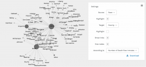
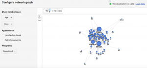
The screenshot above shows the racial breakdown of each county in Texas that at least one of the Death Row inmates was from. I found it interesting to organize it in this way because the counties in the middle that connect to each race node are more diverse in that they have people of more than one background. It is reasonable for me to assume that the counties on the outside of each of the three race nodes and that are not connected to more than one race are the counties that are more segregated. I found it interesting that the counties on the outside of the “White” node had significantly more counties without any other race or any type of diversity in comparison to the counties outside the “Black” node or the counties outside the “Hispanic” node.
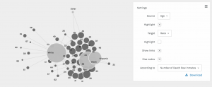
This screenshot shows the breakdown of each race by age. The most interesting part about this visualization is that the white prisoners tended to be much older than the black and hispanic prisoners. The white prisoners had the greatest spread of age in comparison to the other races represented.
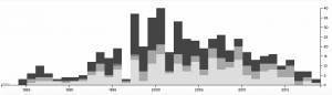
In this screenshot, I used the timeline function paired with the race of the prisoners. This shows how the racial breakdown of the prisoners on Death Row changed over time. From 1998 to 2006, it seems like the majority of prisoners executed were black and there were much more executions going on during those years. However, as we get closer and closer to present day, the number of prisoners executed drops significantly and the prisoners seem to be a little more diverse. I figured that the reason the number of executions dropped is because of the legal issues and heated debates that arose regarding capital punishment.
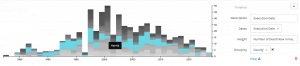
I also did another timeline visualization, but this time I paired it with the county the prisoners were from. This gave me insight into what some of these counties were like and how they might have changed over time. I figured that the counties that the most prisoners originated from are potentially the counties that are more dangerous or may have lower socio-economic status and higher crime rates. Harris county seemed to have the most prisoners and up until recently, it seemed to be very popular. Today it seems to be a little less represented.
This screenshot is from Google Fusion and it shows age and race. I wanted to see how the Google Fusion visualization would compare with that of Palladio. I felt that it looks similar to the Palladio visualization and it tells me the same thing about the data, which is that the white prisoners seemed to be much older whereas the other races seemed to be much younger. The white prisoners had a wider age range than any other race represented.
For this assignment, I decided to look at the last words of all death row inmates in Texas from 1982 to now. Although I knew working with this corpus would be depressing, being able to analyze their last words was extremely interesting and it gave me valuable insight into their experiences on death row. Creating my corpus was extremely tedious because the website where I acquired all the information was separated into over 548 links. I tried to use web scraping tools, but was not able to figure out how to arrange the data in a way that would upload to Jigsaw so I decided to put all the information into separate TextEdit files myself. This took me a long time to do, but it all worked out in the end!
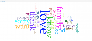
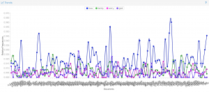
First, I analyzed the corpus through Voyant. This was very interesting to look at because the Cirrus tool allowed me to see the most commonly used words. I noticed that they are all positive words that focus on relationships of some sort, whether that relationship is with family, a friend, or a religion. I found it strange that many of the prisoners said thank you in their last words given their situation (I noticed this as I was reading through the last words during the construction of my corpus as well). The Trends tool allowed me to visualize the patterns of the last words more easily. The relative frequency for words like “family” and “love” were much higher than repentant words such as “sorry”. Looking at the trends led me to believe that the prisoners focused more on reaffirming their love one last time rather than focusing on what they did in the past that led to that moment. I think this shows that many of the prisoners significantly change as they await their death to the point where they are almost completely different people when their execution date comes along.
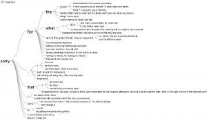
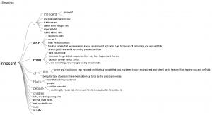
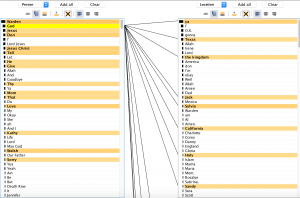
Next, I used Jigsaw. I really liked the Word Tree view and the List view. I tested out several different words in the Word Tree view and was able to better understand the context and the meaning intended by the different prisoners. I thought it would be interesting to look at the word “innocent” because it was not very common. If prisoners were using their final moment to state their innocence, I concluded it was because they were either innocent or they were lying and therefore have not come to terms with their crimes like so many of the others had. I also used the List view, which was interesting because it showed the connections between the entities as well as the frequencies. This tool really highlighted the prisoners’ acknowledgment of various faiths and their hope for an afterlife. This helped me better understand the context and the relationship between the words they chose. I liked that this view was interactive and allowed you to look at the information in a variety of ways.
I had very different experiences working with these two different platforms. I thought Voyant was very easy to use. I like that Voyant has a lot of different tools that you can choose from, however there were several that I felt were not useful because they were visually incomprehensible or because they just didn’t provide a valuable organization of the data. I think there are still several very valuable tools and I enjoyed reading through the information breakdown below the visualizations as well. I like Jigsaw because of how different each of the 10 tools are. I think they are extremely valuable in looking at the data from new perspectives and seeing connections you would otherwise miss. There are views similar to Voyant’s tools, but there are also several that are very unique, complex, and interactive. I felt like I had more control.
Finally, creating this corpus and viewing it through Voyant and Jigsaw has affirmed Clement’s observation of this “multidimensional viewpoint”. I was very surprised at how the many different ways I visualized the data shaped my interpretation of the inmates’ last words. Throughout the process, I drew conclusions that I did not come to when I initially read their last words. I was able to better grasp that these data analytics methods make the information more objective and allow you to see the information in its rawest form, but that seeing it in its rawest form created even more complex connections.
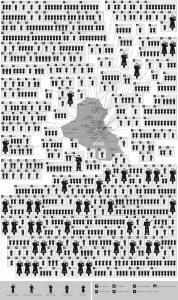
This busy visualization called “Mapping 31 Days in Iraq” depicts over 800 wartime deaths in January of 2006. I chose this because I felt it was a powerful visualization with emotional sentiment. This visualization is very dependent on its spatial organization. First, the image is separated by spatial regions that stem from the map located in the middle of the visualization. These regions are connected by touching subdivisions of boxes. Secondly, arranging the regions by icons that are moving from left to right and then down signifies the passing of time. Third, the icons represent a variety of victims that help the viewer distinguish who was killed and how they were killed. This is a static visualization because there are no interactive features and limited perspectives. The information is being summarized and is mostly meant to be used as a emotional visual to depict the fatalities of war.
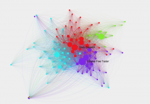
This network shows connections among 19th century newspapers, as well as which texts went viral and why. The circles or nodes represent the newspapers of that time. The lines represent their circulation. The larger the nodes and the thicker the lines means the more viral it was. The colors symbolize communities of closely-tied newspapers. The overall visualization is interactive because you can extract new information from it by clicking and exploring the relationships between the different newspapers, locations, and texts. Clicking on the nodes gives you more information about its connections and the node itself. I chose this because I found it visually appealing and wanted to explore what it represented.
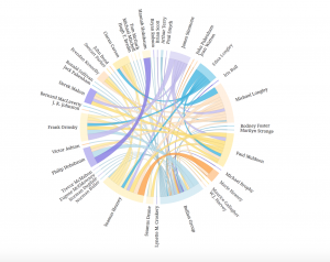
This chord diagram is very aesthetically pleasing. I really like the circular model and the organization of the words because it is very legible. When I explored it more, I realized the circular shape allows the reader to easily follow the chords as they go across in all directions. The thickness and colors are also important to exploring the connections. This is interactive because you can click on connections and names to learn more about them and you can view the groupsheets associated with their names. The lines also fade and highlight when you click. It is not just a summary of information, but a network of people and relationships that can be explored.