Categories
Final Project

Final Project Blog

Final Artifact: Atlanta: New Wave Timeline

Over the course of the semester, we have gathered files of many songs and characteristics that represent the music and culture of Atlanta, known as the cultural capital of Hip-Hop. ATL has seen it’s decades of greatness which has left an everlasting impact on the musical world. We decided to analyze the two popular eras in Atlanta, which was the Dirty South Era and the TRAP era. There were a few purposes that resulted in us exploring these periods. As world events and different culture waves come and go, it’s normal for individuals to live differently to keep up with society. Does that mean the music will differ? Are these new rappers following in the same footsteps of their ‘elders’ or are they going in a different direction? Where one may be describing their love for a significant other, another could be describing/flaunt how much they paid for a piece of jewelry or exotic car. We both enjoy music a lot as it has helped us express ourselves through others who have the musical talent. There are times where us individuals feel a certain way, but we cannot communicate these emotions clearly. Instead, we keep these thoughts in our mind instead of releasing them. We thought to ourselves “What are these guys actually talking about in these songs?”. It’s quite interesting to see how their life stories are being told through the music. Our favorite genre is ‘trap’ which was created in Atlanta during the 2010s, as the Dirty South Era began to wear off. We wanted to compare these decades through lyrical content as trends and waves came and go. However, the main principles that are found in typical hip-hop music still prevailed. These characteristics were money, women, exotic cars, and superstardom.

The selected songs used in our corpus are popular hit singles that have all went viral and were what we consider ‘defining moments’ in the Atlanta hip-hop industry. We felt that this would give us the most accurate data whereas these lyrics have essentially progressed these movements forward. We collected 57 songs that totaled over 37,900 words in length. A dataset this large requires extensive cleaning to ensure clarity when loading the spreadsheets into platforms. We started this process in Assignment 2 and continued throughout the semester. I’ll be the first to admit that every platform has a learning curve which varies from each visualization program. We used Voyant, Jigsaw, and Palladio and we ran into the majority of our problems with Jigsaw and Palladio. Voyant has always been a powerful tool that allows a viewer to interact with the data as there are many visualization tools to choose from.

Voyant tools Cirrus, Trends, and Termsradio are used in order to show word similarities and common usage for ‘trap’ music (2010s).
Voyant tools Cirrus, Trends, and Termsradio are used in order to show word similarities and common usage for the Dirty ‘South’ era (2000s).
Jigsaw Word Tree tool which connects a word to phrases that it exists with. “b**** “m****”
Jigsaw Word Tree of phrases connected to a searched word for the Dirty South era (2000s) “n****” “bankhead” “love”

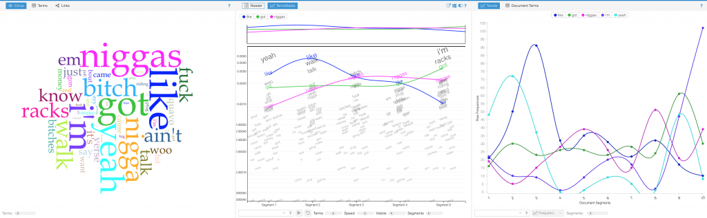
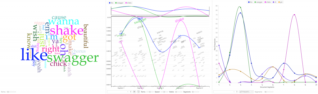
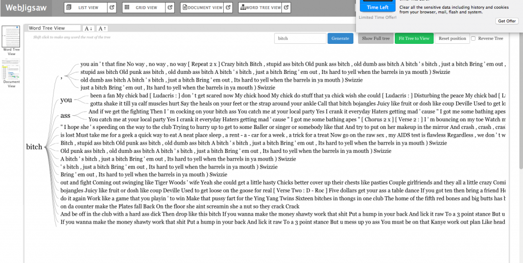
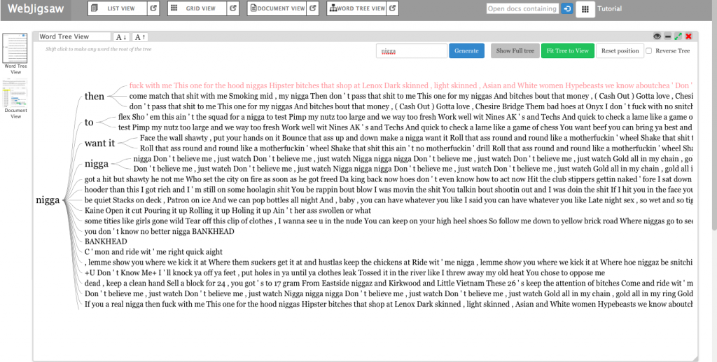
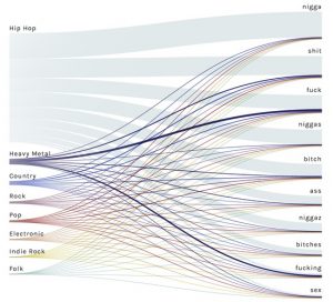
Jigsaw started off our problems with formatting to properly upload the lyrical content data. First, we tried to upload the graph in a .CSV file but it wasn’t properly converted into the proper category. That didn’t work out as it would show as ‘no files found’. However, we found the correct entity to convert our files which ended up solving the problem. After that, Jigsaw was very helpful as the Word Tree tool allowed us to search words and view the phrases that associate with the searched term. The few tools in this program prohibited us from making a variety of visualizations. In the Drucker reading, it discussed how a viewer could take away lessons from “galleries of good and bad, best and worst…they are useful for teaching and research”(Drucker, 239). With the visuals that we deemed good and bad, we both learned from them despite the physical appearance. After all, not all maps have to be flashy, but they must be meaningful. We searched n***** and b**** because those words were constantly appearing within the lyrical corpus data. Ultimately, it helped us understand lyrical phrase combinations that revealed a significant focus between the two eras. In the 2000s, rappers were including women at a high rate in their verses. This showed the persona of these artist being that they were idolizing females and the lifestyle that comes with a lot of girls. In 2010, the focus shifted more to money and groups. We concluded that musical platforms like Spotify, Apple Music, and Tidal have given the artist a more efficient tool to reach an audience. This has improved the financial gain throughout the industry which has encouraged more Atlanta rappers to launch their careers.

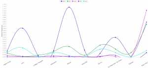
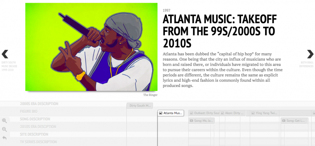
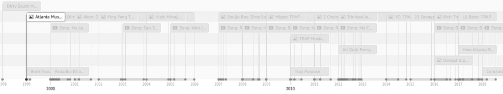
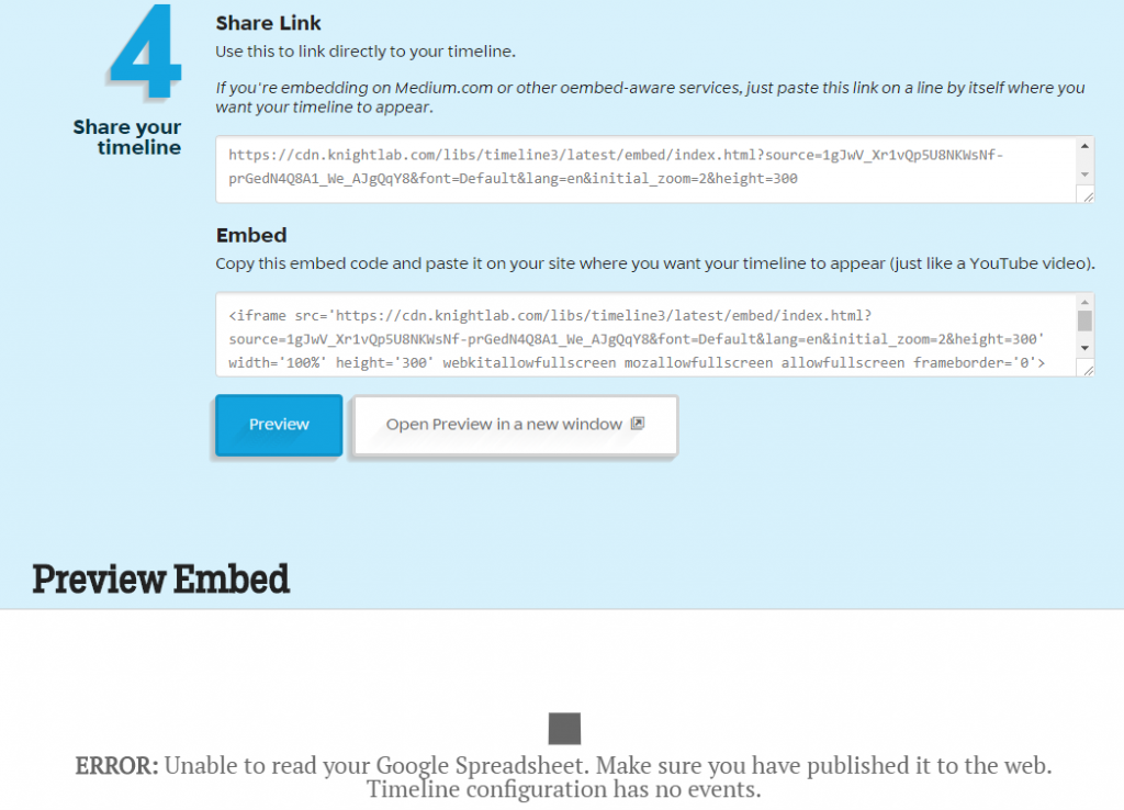
Using Timeline JS, we also ran into minor formatting problems with creating a proper timeline. The fourth step of sharing the google doc link wasn’t valid. However, we corrected the problem and previewed our corpus on the timeline preview. After multiple editing sessions, we created a complete project that included music summaries, videos, genre descriptions, etc. It was great to see our hard work paying off onto an interesting visual. Some may say that this isn’t important because you could see this information drawn up in a quick sketch by an individual. I don’t agree with that because visualizations “provide us with a new perspective on texts that continue to compel and surprise us by being so provocative and complex — so human.” (Clement 12) Seeing problems mapped on a timeline can help an audience understand why events occur after past experiences

Palladio: [Graph] Media Outlet Relations

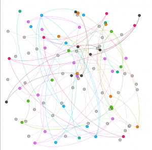
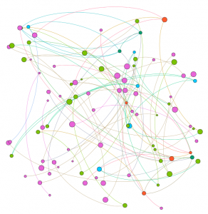
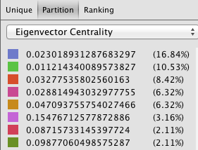
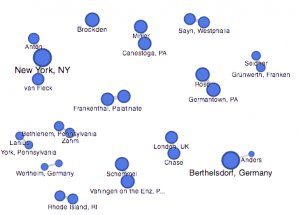
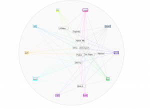
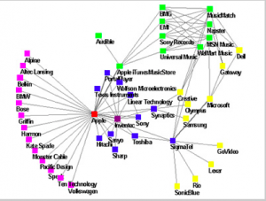
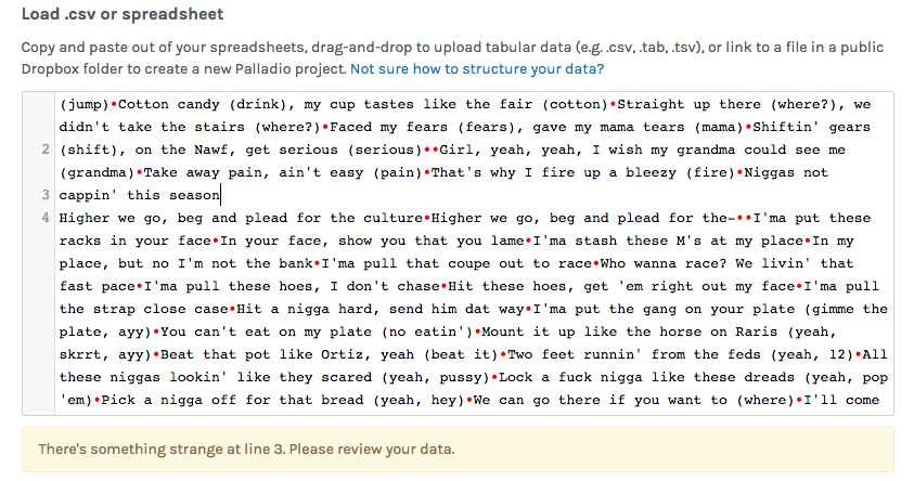
As we started loading our .csv spreadsheet onto the Palladio data, we kept getting an error message saying that ‘something strange’ was occurring within the lines. We had to go through and apply spaces to properly format the corpus data. This helped as the data became viewable and we began using the visualization tools, Graph, and Table, in order to compare Artist Headline to Text Summary and link media outlet relations together. This showed a concise visual of an artist and a quick summary of them. Also, we were able to see the connections between media outlets that supplied our data. For example, Twitter, Billboard, and GQ has a social media presence in society. These sites allow a viewer to be updated with their favorite artist. These tools were very effective in our studies as we found more similarities between the decades and their content.

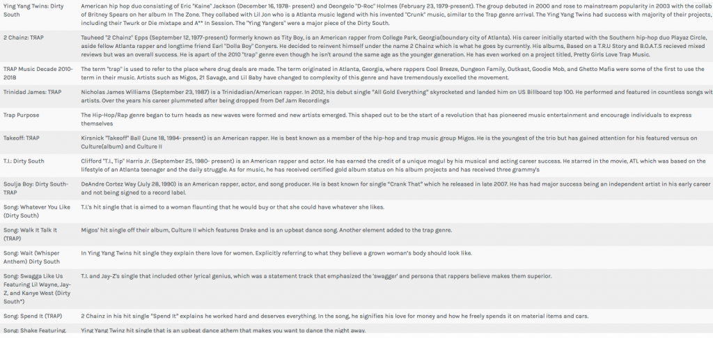
In conclusion, I feel that this project was very successful as it presented obstacles and we found the solutions to make our final project work. Our results solved the research question that was created in the early stages of the project.  The hip-hop industry has evolved into many different lanes that has allowed for many individuals to prosper, especially those people who were born and raised in Atlanta. Lyrical content has shifted slightly, however the two decades used many of the same words and phrases.However, the focus shifting from women to money was interesting to see as the rise of ‘trap’ music has allowed rappers to be booked for shows all across the nation. One thing for sure, times may change but the future is always imitating parts of the past. We believe it’s a great thing as both generations can enjoy the music together and express themselves like never before.


Palladio: [Table] Artist Headline to Text Summary

Struggles mentioned earlier:

Timeline JS: Fourth step of sharing the google doc link wasn’t valid
Palladio: error message saying that ‘something strange’ was occurring within the lines
Jigsaw: “Data not found, incorrect entity format”

Bibliography

“Song Lyrics & Knowledge.” Genius, genius.com/.

Carmichael, Rodney. “Culture Wars.” NPR, NPR, 15 Mar. 2017, www.npr.org/sections/therecord/2017/03/15/520133445/culture-wars-trap-innovation-atlanta-hip-hop.

Clement, Tonya. “Text Analysis, Data Mining, and Visualizations in Literary Scholarship”. book

Drucker, Johanna. “Graphic Approaches to the Digital Humanities” ch. 17. book

Jordan, Mike. “The 14 Most ‘ATL’ Songs Ever Recorded.” Thrillist, Thrillist, 4 Dec. 2015, www.thrillist.com/lifestyle/atlanta/the-14-most-atlanta-songs-ever-made.

Miller, Matt. “Dirty Decade: Rap Music and the US South, 1997–2007.” Southern Spaces, 10 June 2008, southernspaces.org/2008/dirty-decade-rap-music-and-us-south-1997%E2%80%932007.

Wilcox, Andrew. “‘The Impact of Trap Music on the Greater Atlanta Community.’” Lower Division Studies, 1 Dec. 2017, lds.gsu.edu/news/showcase/atlanta-studies/andrew-wilcox/.

Williams, Stereo. “How Atlanta Became the New Cultural Capital of America.” The Daily Beast, The Daily Beast Company, 29 Jan. 2017, www.thedailybeast.com/how-atlanta-became-the-new-cultural-capital-of-america.

Categories
Uncategorized

Assignment #5

Our group worked within the Baptized Indians database, which was confined to sections ID 175-225. We then compiled this data into the Gephi program to create visualizations to interpret the information. This platform was difficult at first but it became helpful with establishing connections. Using the data laboratory, we created 86 edges and 97 nodes which exemplified the relationship connections of our sample group. I must admit, we ran into a bit of trouble when we were creating the edges as the metadata had some error within the connections. We scanned all numbered individuals to locate spouses, children, etc. however, there were some connections that were impossible which we could not create that edge to be connected in our visualization.

original raw dataset

At first, when we viewed our data in Overview, it didn’t seem very meaningful without any labels or information. However, once we started to experiment more within the tools, we began to make progress. The first appearance change was made by selecting “modularity”. This added color to the dots which showed us the comm

modularity appearance

on relationships. This gives the viewer a clearer understanding with the connections and relationship between communities. This visualization was a minor change that made a significant difference in data recognition. Next, we decided to switch the size of the nodes according to class and rank to further support the similarities. This implies that Christianity began to expand and spread throughout society. The main component was marriage and the interesting connection was seen through certai

node size enhancement

n nodes that connected twice to certain colors(blue and orange). In the data, there were individuals who had endured two marriages, being that they were divorced at one point. After playing around with the program, we explored the degree and eigenvector centrality which the data results changed but the appearance wasn’t altered much. Eventually, we came across noverlap which had labels and showed a different connection which


we were more accustomed to when viewing data information. The visualization shows their names and the various relationships between each baptized person. This indicates how each person is related or how they come in contact during some point of their lives. The color of the node revolves around an individuals relations with a certain number of people. We tended to gravitate towards this style more because it was clearer to understand and mapped out the community overlap that symbolizes the more important groups of people. Using this visualization along with the edge labels would help a person understand the relationships created and the relations between communities that have been created through marriage or the birth of a child. Overall, I’d say that Gephi was very helpful to our assignment. It allowed us to visualize a group of people in a creative way that brought many of them together. It’s always warming to create graphic expressions that tell a story without much text that we are accustomed to. It took us a while to understand the concepts and tools with using Gephi. There were some networks that didn’t run properly but we never gave up in trying. Also, the collected data translated into color coded was beyond helpful to distinguish certain levels and communities. Compared to the other platforms we used in the past, I would say that this was the most challenging and wasn’t very beginner friendly. Because of this, we didn’t uncover all the results that we hoped for but that’s fine because we learn a lot about ourselves and the power of visualizing. It was fun to play around and run test that generated different information, however jigsaw and voyant was easier to operate in which we could create visual masterpieces. However, it like we learned, it doesn’t always have to be cool or an attractive graph, as long as it is meaningful and could be interpreted by an audience.

Categories
Uncategorized

Timeline Visualization

Creating a similar graph

“How Different Groups Spend Their Day”

Employed

Everyone

People 65 and over

Hip-Hop Content

Categories
Assignment 3

Assignment Three

In completing assignment 3, I decided to take a break from my Migos’ corpus and use the ‘Baptized Indians’ dataset. Mainly because I felt that the given dataset was more compatible with Palladio and Fusion tables. I inserted my original data but it didn’t offer much graphical expressions that I felt was meaningful, which is why I ultimately chose the alternative data. I extracted the data from the tables and converted them into a .csv file which I then transferred them into Palladio/Fusion tables.

The first graph (left, palladio) displays an individuals’ name in relation to their corresponding nation of origin. This tool surprised me as it showed the similarities of how all these people were in some ways connected to one another. Then, I used a similar table tool in Google Fusion (right) and it’s graphic was similar as it displays the connection between the names of the individuals to their origin location. The symbols were connected to it’s relation but it lacked a detail that showed the “close-knit” relation towards the nations. I felt that the Palladio graphic helped me gain more knowledge as the visualization added another element to the data’s information.


The first table(fusion) above provides a complete description of an indians bio followed by their life details. This supports the representation of a person and provides the viewer with a clear visualization of the basic facts of the people. The second table (palladio) wasn’t very useful in my opinion because the program restricted the creator to three linkages in the settings tab which only allowed me to show the data above rather than a full background which the fusion table provides. This may lead to a viewer misinterpreting a visualization due to a lack of information.

This palladio table allowed me show multiple layer tools into a column styled graphic which allows a viewer to view data clearly as their is no chance for misinterpretation being that these rows information is straightforward. It lays out the an individuals name and their family relation. Also, it displays their nation in which they ‘belong’ to. This visualization is interesting to me as it links the data together in a standard fashion but conveys a meaningful expression. The mapping tool(bott

om right) from the fusion table pinpoints the geographical location of the baptized indians that make up the dataset. It is plotted by their latitude, longitude coordinates which provides a pin at it’s exact location rather than a relative distance. This tools serves as a knowledge generator, discussed by Drucker, as it models the data in a form that goes beyond charted data. It allows the viewer to analyze geographical regions from a spatial aspect and draw comparisons within places as their individuals relates together.

I think that all of my visualizations above all have their own meaning which allows the viewer to analyze information further than just viewing it on a standard data table. These graphical expressions use spatial forms to influence meaning to place as well as people. In the Drucker reading, it discussed how a viewer could take away lessons from “galleries of good and bad, best and worst…they are useful for teaching and research”(239) It doesn’t matter if the graph has flaws, there is always a learning experience that you could take from an expression and use to further knowledge and gathered information.


Categories
Assignment 2

Assignment #2

Through the past decades, hip-hop and rap music has evolved into many styles as new groups have formed and changed the culture. Being that music has a major impact on my daily life, I decided to create a song corpus from my favorite tunes/artists. One goal that I want to accomplish is to gain a better understanding of the content that these songs entail. I will be using the albums Culture 2, Young Rich N****, and Too Hard. The corpus artists’ (Migos: Quavo, Offset, Takeoff), Post Malone, Baby, Two Chainz, and Drake) originated all across Atlanta, Toronto, and Syracuse, NY. With New York and Atlanta being popular musical city hotbeds, I felt that this would give a provide an interesting comparison while deciphering the similarities that these artists have while expressing their lives through words. The lyrics include a few explicit words which give my corpus a realistic feeling which reveals the true identity of this genre. My overall corpus construction worked well with both tools as it discovered word frequencies as well as comparisons regarding the main words and phrases. I have used Voyant many times throughout my time at Bucknell and it has been outstanding, to say the least. It allows a viewer to gain a better understanding of the text in a variety of ways and methods. Since there are many options to choose from, the creator isn’t limited to a standard format which helps a corpus true meaning to be shared with the intended audience. I chose Mandala and Trends which connected the words together between songs and highlighted the connection of the song-to-word. Mandala has a clean and basic appearance that vibrantly lights up when you move the cursor across the song title. Trends was a bit different as it displayed the frequency in which the words were being used. This showed revealed the artist’s favorite rhyme scheme or lyrical pattern. 


Mandala (Voyant)

After using both platforms to visualize and analyze the corpus, I can see that they both have many similarities between the two, however, they are very much different at the same time. Using the Word Tree file in Jigsaw, I highlighted “money” as the keyword which is a common topic of discussion regarding the dream rap artist lifestyle. Voyant showed me the similar linked words to money within a song. Jigsaw actually connected phrases and linkage which created an extensive amount of data. It showed an artists lifestyle, his goals and what his future plans would be with the money, also about the violence surrounding their life in order to generate and maintain this currency. It’s also as if it goes deeper than the surface of a lyrical pad and actually tells a story of its own in a unique way. This connects an audience to an artist life which they can then relate it towards their own personal life. By using Jigsaw, it’s possible to reveal similarities that you’ve never known about an artist. For instance, in the Migos’ project Young Rich N*****, this was the early stage in their careers where it was understandable that they showed immaturity in their raps as they related money back to strip clubs and drugs. However, their Culture 2 album showed that money related to conducting businesses, establishing great credit, and creating lives for their family members. Both platforms effectively conveyed forms of a relationship between artist and style/slang. Mandala revealed that the terms ‘yea’ and ‘woo’ where the most found terms which are interesting because, at the end of many verses, the artists use those words as ad-libs to transition into the next verse or stanza. This contributes to the melodic vibe that’s created when making this kind of music.

Trends (Voyant)

Ultimately, this corpus construction and visualizations has further supported Tanya Clement’s observation’s as I was able to create “multidimensional viewpoint” by using the tools. Instead of being stuck in one category, these platforms have allowed the viewer to analyze an artist beyond the lyrics while actually using the content given in their songs. It’s very ironic that these songs have come to life while never actually having the livelihood, to begin with. It now jumps off of the paper and into our minds where we can now view information from all different angles. Also, using these tools strips the narrative or delivery from data and only shows textual word. Both platforms invite the viewer to analyze and interpret data in a creative way which wouldn’t be possible by just an ordinary viewing.


Word Tree (Jigsaw)


Categories
Assignment 1

Assignment 1

I chose this visualization mainly because it created an interesting visual of company connections that exists together in the market with products such as designer clothing, candy, and soft drinks. Although they are similar in the webbing design, there purpose differs as the first visualization has a more complex understanding. It shows ‘who owns what’ throughout various corporations across the world. This graph is a good example of dynamic visualization as it is effectively follows it’s purpose without misleading the viewer to another conclusion. The only downside that I can see from the first graph is that the world map in the background has no purpose. The graph doesn’t represent any company’s geographic locationwhich the average viewer would assume when they see a map.

The second visualization is very simple and lacks vibrance as it appears very dull. However, this plain style illustrates an effective way of showing the branch offs connected to Apple. It also shows the evolution of Apple’s iPod “ecosystem” of music and sounds that have become a household name throughout society. Almost all of my electronics have came from Apple and I love their products which made this interesting for me to view. The visualization is clear and concise which i enjoyed, being that I could understand it’s purpose easily. 

SelfieCity has always been one of my favorite visualizations due to it’s creative datasets that represent social networks most popular photo style. The software can take a simple self-portrait from popular cities such as New York, Moscow, Berlin, etc. and compile data to recognize trends and similarities within the people in those cities. You can use the site in a variety of ways as its viewer interactive system can be molded into a customized research. Overall, it’s a great tool to see how people are operating throughout daily life while also recognizing tendencies and trends. These visualizations help understand the websites purpose for creating a unique way of analyzing images.

Categories
Uncategorized

Data Visualizations