Luke Hartman– Assignment 5
The purpose of this assignment was to become capable of using Gephi through an analysis of the Baptized Indians Database. I created a worksheet in Gephi and input the 376 names of Indians as nodes, and then created edges (82 in total) for the names of Indians with ID numbers 225-274. The edges represent connections between Indians within the database with the edge source as the ID (225-274), and the target as the other related person. As is evidenced by the 82 total edges, some of the 50 Indians had multiple connections and thus multiple source-target edges created for their singular ID.
I also distinguished inter-generational relationships by using directed vs. undirected edges. For example, if the source was the son, and the target a mother or father, the edge was directed to show a generational gap. If the source-target relationship showed brothers, sisters, spouses, etc., it would be undirected.
When I initially put the information into Gephi, I was lost to say the least. Below is a screenshot of what the default visualization showed.
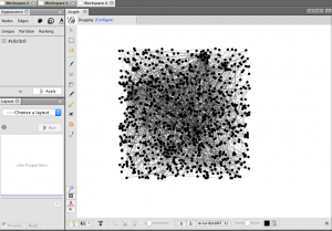
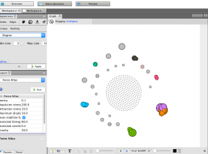
As one can see, it is very jumbled and does not show anything discernible at this stage. The next step I took was to run the modularity program that showed nodes grouped by communities allowing me to identify niches within the larger group. I then ran a program called Force Atlas that moved the communities to the outside edges of the data set in the visualization and I set the size of the node to correspond to “degree” which is a measure of how many people a specific person or entity has interacted with other members of the community. The color of the node also distinguishes related communities and relative proximity within the graph shows overlap in groups. This produced a very interesting visualization shown below.
While recognizing that this graphic had value in it’s principle structure, I struggled a bit with how to discern more meaningful comprehension from it because of the overlapping nodes and the lack of visible edge connections. In light of this, I increased the distance factor in between all the nodes in the graph for easier viewing, and then colored them based on closeness centrality, which is a measure of how close one node (or member of a community) is to all the other nodes in the network (or all the other members of the community in this case). Below is the result, followed by a zoom on one specific section of the graph.
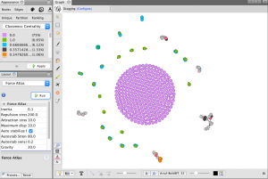
(Bottom Right of graph is zoomed in on)
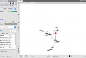
This zoomed in view has many of the desired qualities of a visualization I hoped to create when I began this project. First, the node size is visibly larger corresponding to the total amount of connection each person has in the network. The color of the nodes correspond to values between 0-1 listed in the chart in the top left of the first picture shown above and they display closeness centrality of each node. Next, each edge is shown as a thin line connecting nodes, and the directed edges have arrows at the end which represents a generational difference. This is extremely informative as it allows the viewer to see the three brothers at the center of the community and then discern the relationships of all the other people in the network just from the graphic. If edges were created for all 376 nodes, this would be a great way to visualize many complex and interwoven connections within the larger set of data.
Overall the ability to use Gephi is something I certainly value. I definitely struggled with it and got frustrated at times but I learned a lot and when I finally made some progress it wasn’t difficult to see the value in the tools the platform offers. I feel much more equipped to tussle with complex and layered data given my knowledge and experience with this assignment and program, who knows what it will be useful for in my life and work going forward.