For this assignment, in order to portray the baptism information from the Moravian missionaries in the 18th century, I decided to create a visualization using Gephi that focuses on the gender of those that were baptised and how many connections they had to the others in the dataset. My visualization is featured below:
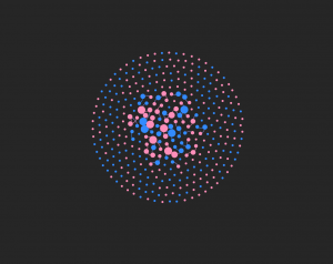
My visualization has 376 nodes and 70 edges. I used all of the nodes in the dataset, but I only created edges for the 50 people that I was assigned. Although I think the visualization presents the data that I included in a very useful way, seeing all the edgeless nodes surrounding the center shows how big the dataset was and how the edges that I included are just a portion of the people that were baptised. However, by only using these 50 nodes, it allowed me to visualize specific individuals more clearly.
I represented the data primarily through the color of the nodes and edges and also through the node size. The color of the nodes are either pink or blue, pink representing females and blue representing males. The edge color is pink if the connection is between two females, blue if the connection is between two males, or purple if the connection is between a male and a female. I found the gender aspect of this data to be very intriguing because I wanted to see if well connected individuals were typically male or female and what that could mean for the data as a whole. The size of the nodes represents the degree and how many connections a specific person has. The more connections, the bigger the node. The nodes on the outside are all equally small because I did not enter their edges into the data laboratory. All the edges that I added are visible in the center of the visualization.
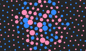
So, what does this data show? This data shows that Elizabeth, Beata, Zipora, Christiana, and Esther are the females with the most connections and Petrus, Benjamin, Nathanael, and Thomas are the males with the most connections. There are 5 very well connected females and only 4 well connected males present in this visualization. Of the 50 people that I created edges for in the dataset, 31 were female and 19 were male. This is evident with the higher number of pink nodes that you can see in the center of the graphic. This tells me that the females overall had more connections than the males. This made me curious as to what the roles of the women are in these communities and how women are viewed by both the missionaries and by the males in the dataset. The women seem to play a very important role, given how many of them are so well connected to others. Also, most of the nodes that were the largest, meaning the nodes that represented the people with the most connections, tended to be related to the other people who also had the highest number of connections. For example, Zipora’s father is Petrus, her son is Nathanael, and her husband is Benjamin. All four of these names had some of the highest number of connections of the 50 people I included. This made me wonder about the roles of specific families and if some families were more active in the community or if they played specific roles in their community that were considered to be very important to others.
Figuring out how to create this visualization in Gephi was very challenging at times, but once all the data was in, it was very fun to play around with the many different layouts, statistics, and partitions that changed the look and meaning of the nodes and links, just as we’ve read about in our Meirelles readings. However, I wish Gephi allowed for more interaction and more features on the viewer’s end because I think this dataset would be very interesting to explore further. I also would like to see more dynamic visualizations because with such intriguing stories, being able to captivate the viewer would be easier with more freedom and creativity in the design. Just as we explored through the Segel and Heer reading, I think it would contribute more to telling the story of these people that were baptized rather than just showing them as colorful nodes. For example, seeing a time feature in the visualization would be another aspect that could offer insight into their stories. However, with that being said, I think Gephi is the most interesting platform we’ve worked with so far and I really enjoyed the challenge. I was able to explore this data thoroughly and I felt like I had a lot of possible directions to go in when doing so.