The goal of this assignment is try to understand the data in the Baptized Indians database using Gephi visualizations. I made edges for people with ID 276-325, so all my visualizations have 375 nodes and 75 edges. Below is the default layout of my data sheets when I finished entering the 75 edges to the database.
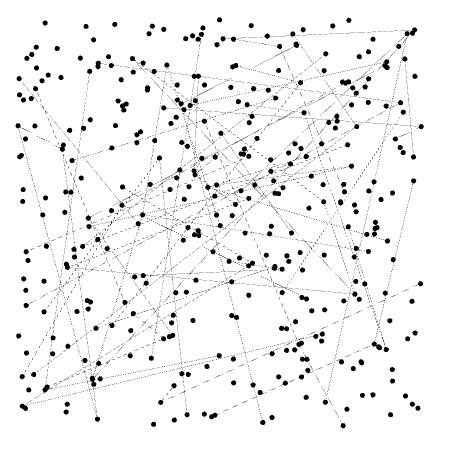
In this visualization, I can only see some edges between nodes, most of which are thin and two of them are strong. Nearly nothing more can be shown by this graph. From this point, I begin to add features to this visualization.
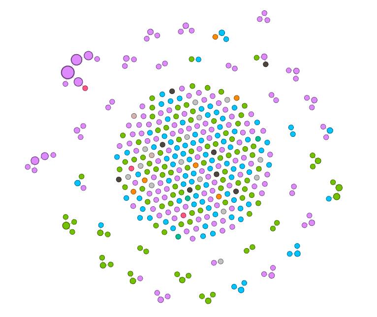
First, I add modularity as a color attribute to this graph. This attribute shows people in different groups, connected with edges I add before. Now, I can see different small communities inside this large group of people in different colors. Moreover,these gray nodes are people that are not connected with others. In other words, they may have relationships with others, but since I only added edges for nodes with ID 276-325, their relationships are not shown in this visualization.
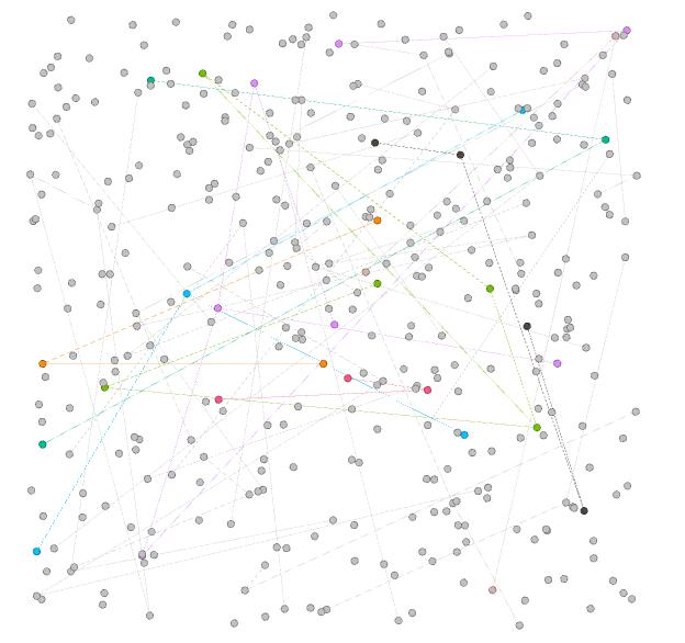
In order to view the inner relationship more clearly, I use Force Atlas as the layout. In this visualization, I can easily distinguish different small communities, in which nodes form a connected tree. I can see that the purple group at the top left corner contains most number of nodes, thus learning that Magdalene, represented as the center node in that group, has played an important role in that community.
Furthermore, I use the ranking feature and select degree as the ranking attribute and generate this visualization, in which nodes with deeper colors have higher degree. In this visualization, I can obviously see that the center nodes of the left group and the top left group have greatest influence on the relationship, since their degree are the highest. Also, I can figure out that the middle part of the visualization are the nodes that are not connected.
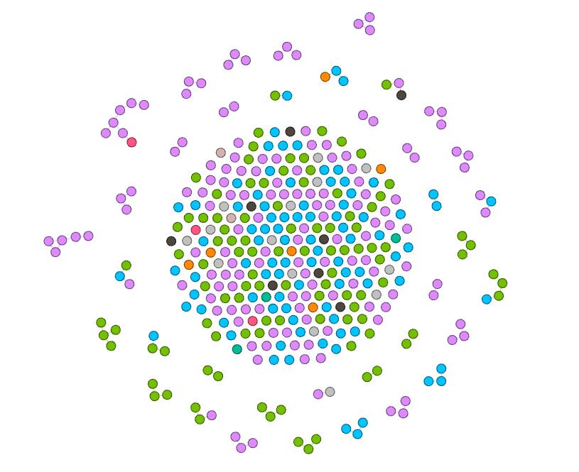
Next, I try the nation feature. This attribute seems to be really meaningful, since it is evident that in most communities, people are in the same nations. Therefore, it shows that the native nation is a really important element to the spread of Christianity.
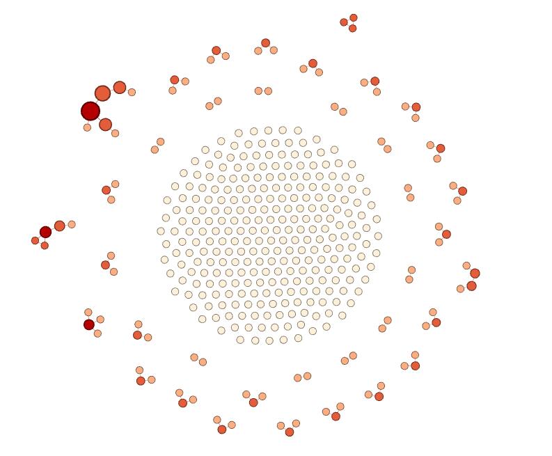
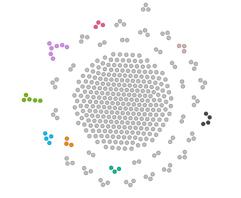
Since I’m not satisfied with two-dimension visualization, I add size as a new dimension. In the above visualization, I visualize degree with color ranking and betweenness with size. The result is really attracting. I can see that nodes with more degree have more betweenness and there are a high-degree class and a low-degree class in most communities. Therefore, I can learn that during the spread of Christianity, active individuals are significant, since they can lead to wider spread. And I can speculate that if more edges are added, the spread will become hierarchical, with some most significant people with highest degree and highest betweenness.
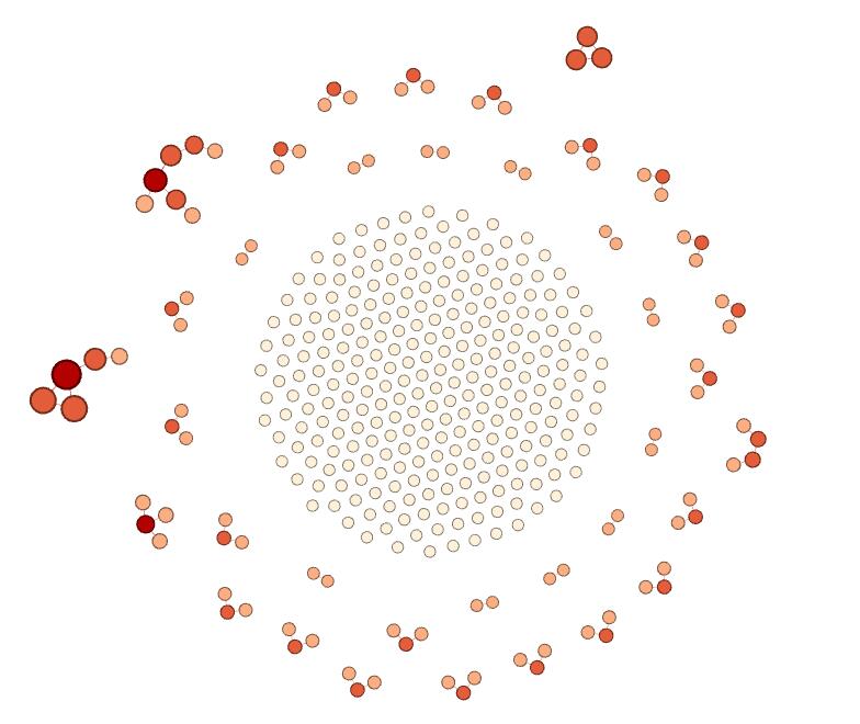
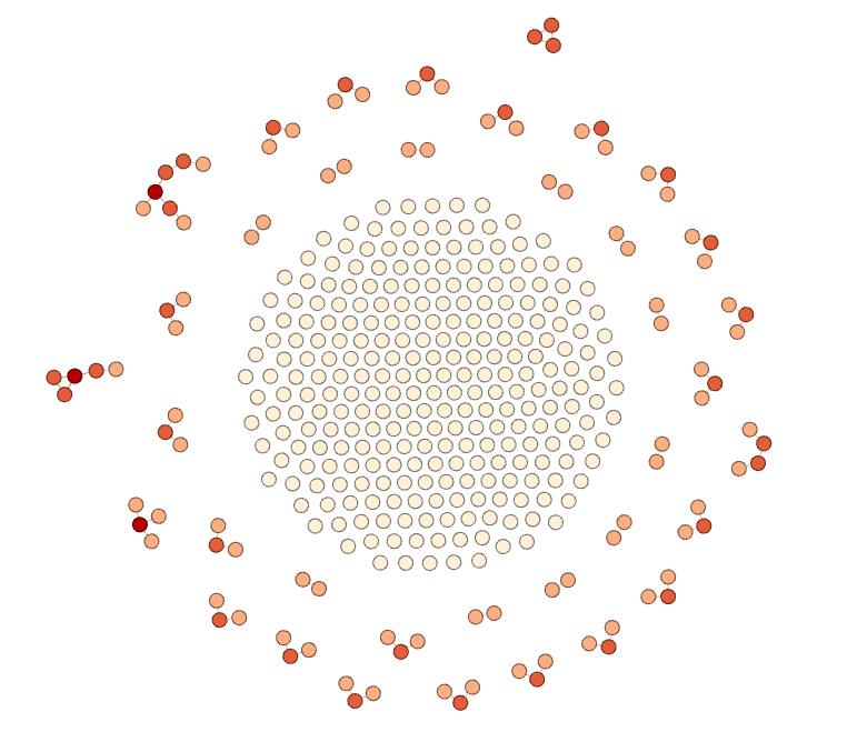
In the above graph, I replace betweenness with eigenvector value. There are only a few differences between this visualization and the former one. First, I notice that nodes in the left group become larger. Second, nodes in the top right corner become larger. I think it is because eigenvector value takes into account the degree of their adjacent nodes, while betweenness only depends on the degree of nodes themselves. Therefore, the result I can get from this visualization is the same as the above one.
Finally, since betweenness can show degree in some way, I replace degree with nation as the attribute visualized by color. This graph itself can now show a lot of information. First, I learned that nation is an important attribute of the spread of Christianity. In same nations, the spread may be easier. However, in some situation, spread across nations can happen. It is because that the edges here represent some kind of family relations and it is more probable for people in the same nation to get married with each other. Therefore, I can claim that family relations is also a key element in the spread of Christianity. Second, I observe that the purple nation have the most people who are involved in this database, green and blue coming next. Therefore, I can speculate that Christianity is more popular in these nations than in black or orange nations. Third, this visualization shows that the purple nation tends to have more tightly connected communities, since some groups have large betweenness compared with others. Furthermore, I can identify that the largest node, which is the center node of the group in the top left corner, is the most influential people in this visualization, since this node has the greatest betweenness.
I’m surprised that simple actions on Gephi can reveal so much information in the database. And the beautiful graphs are really fascinating. As described by Edward Segel and Jeffrey Heer, “Crafting successful ‘data stories’ requires a diverse set of skills.” I think using Gephi is such a good skill to learn.