“Linear Chronology, Exhibiting the Revenues, Expenditure, Debt, Price of Stocks & Bread, from 1770 to 1824” by William Playfair

The different color lines are different categorical variables of the data such as the revenues, expenditure, debt, price, etc. Historical events in time are shown on the horizontal axis. It shows how they changed over time from 1770 to 1824. I thought this would be really interesting because it shows a lot of categorical data on one timeline and it shows the connection between them all during any given moment in time. This would be useful for my data of the Death Row Inmates because I have so much metadata about them, such as where they are from, what race they are, what they said, what they did, their age, their education level, and their gender. Seeing all of this information over a period of time and seeing how it has changed since 1982 would be very interesting to analyze. In the platforms we’ve used, like Palladio, I haven’t been able to look at all of these in one space or one timeline. This would give me insight into how the types of prisoners that we see on Death Row have evolved over time.
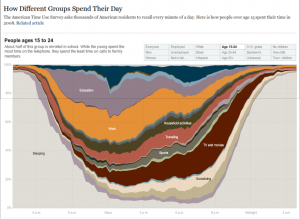
This visualization was interesting and very well organized. I figured it would be interesting to categorize the crimes committed by the prisoners sentenced to Death Row or even the racial breakdown. I think it would be beneficial to look at this over time, from 1982 until now because it could show how the crimes have changed over time.