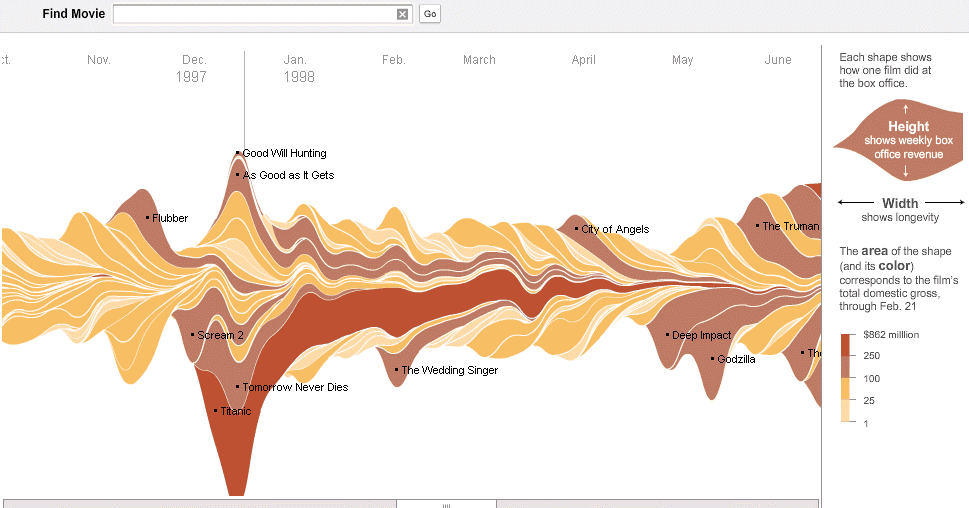
I chose this stacked flow visualization regarding ticket sales because I think it would be rather illustrative in the context of my data. I believe I could select one or more journalistic publications and collect information regarding the volume of articles written about Penn State over the course of several months, beginning in November 2011. In order to separate out layers as shown above, I could potentially differentiate articles by subject (ex: Sandusky, Paterno, football program, university, etc.) and see how volume ebbs and flows over time. I believe this visualization would help to depict the nuance of the narrative of scandal I am looking to depict. For example, I believe certain subjects will have their volume increase at certain points, showing turning points in the scandal (ex: Paterno’s volume will likely increase around the time of his death or the publication of the Freeh report).
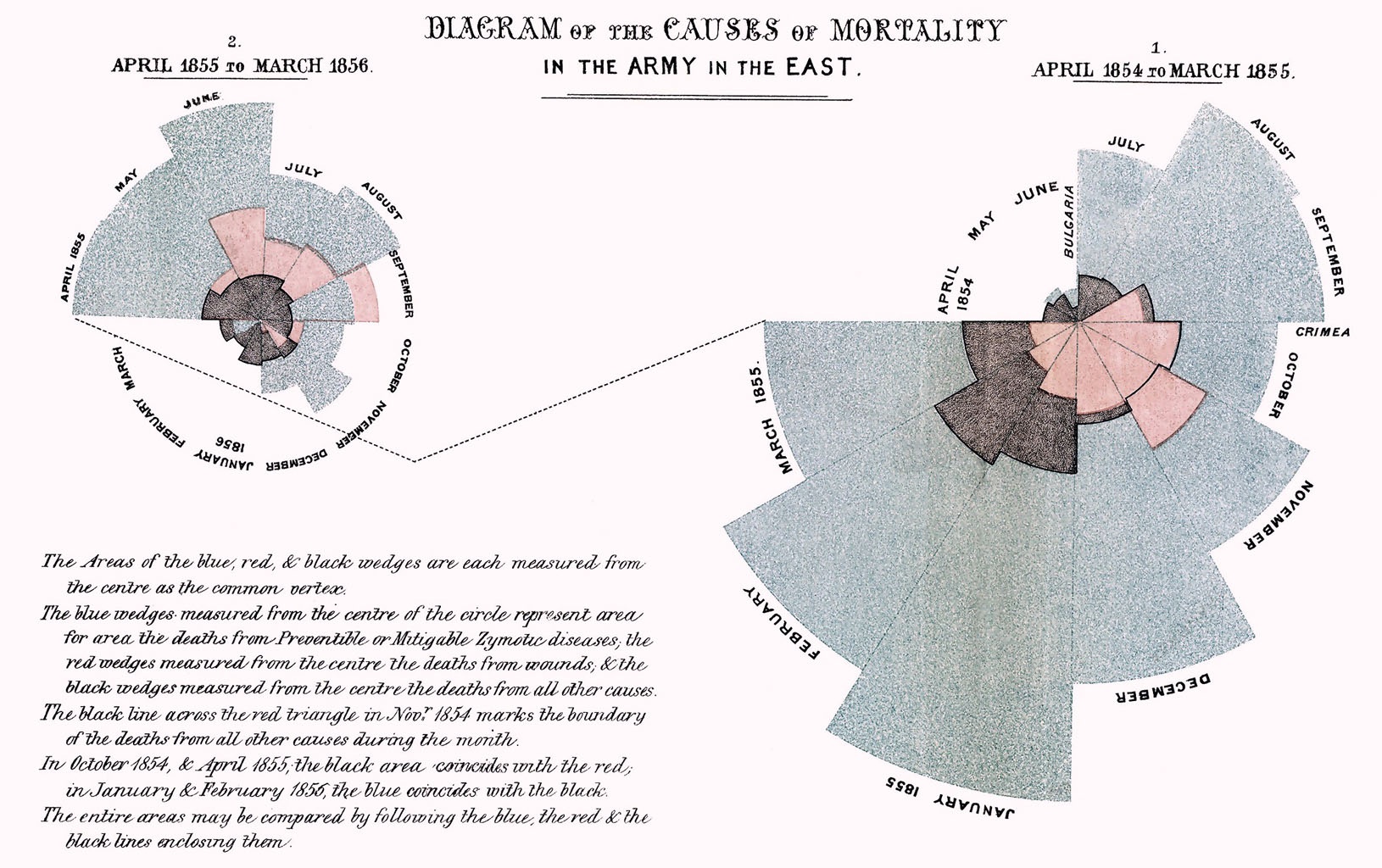
Florence Nightingale’s radial diagram could also be useful in visualizing the time dimension of my data (article publication date) as the pedals can expand to show volume, but also be broken up into actors, similarly to the layers of a stream graph. In addition, the circular layout of the visualization implies a repetitive aspect that would be interesting to incorporate should I choose to compile volume data for more than a particular year.