For this assignment, I used the meta data of the Charles Weever Cushman collection of photographs. Looking at the platform of Palladio, I really wanted to take advantage of the map tool and try to take a look at potentially where each of these photos were taken. From this meta data, I extracted about 1000 points of information and input it into Palladio.
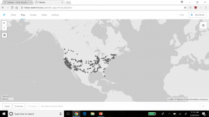
This was an interesting way to view where many of the pictures were taken in the United States with each dot representing an image. It was easy to understand if that was all I wanted to know. But unfortunately, just the dots alone were not very easy to understand. This view mode lacked the detail. The detail I was looking for was exactly where each photo was taken, maybe a town name or relative location. Therefore, I did not have too much to go on other than a general location. For the sake of comparison, I decided to do the CSV file in its entirety in Google Fusion Tables.
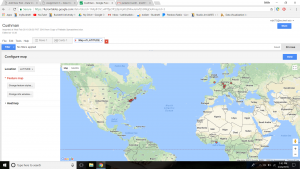
Results were immediately improved. Google Fusion Tables gave me the names of the states, their boundaries, and an easier was to select the dot of information and understand what was being represented in that specific dot. Although both tables of information showed a stronger gathering of images taken on the west coast and northeast, Google Fusion tables allowed for much more detail. Google Fusion allowed me to understand and interpret my data much more effectively. I wanted to use the timeline feature of Palladio as well, so I used that to determine when each picture was taken on Charles Weever Cushman’s journey.
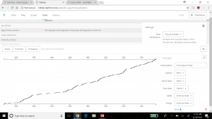
This was interesting to look at because one can see when Cushman was the most active in his journey. Understanding the time of which each picture was taken could tell a researcher where a point of interest might have been at that time. This is where Drucker’s analysis on how to create new ideas from demonstrations can be seen in both the time line and map features of Palladio. Researchers looking at the trend of where and when the pictures were taken could introduce new ideas into what they were investigating, especially if both have a trend to peak interest from Cushman (taking more pictures/spending more time in that area). Palladio is a decent platform for getting this kind of data, but perhaps with a little more detailed input, such as location and state lines as seen implemented in Google Fusion Table’s, Palladio results could be a little more fulfilling to a researcher.