For this week for Assignment 3, we were to compare and contrast Google fusion tables with the Palladio platform. For this assignment, I used the given dataset from the sample data in Palladio (Women in Memoirs). I then proceeded to upload each of the 31 women information separately from google spreadsheets to Palladio. From here I started to play around with the visualization tool to help familiarize myself with the platform. After using both visualization tools I must say Google Fusion Tables was easier to navigate and create different visualizations with.
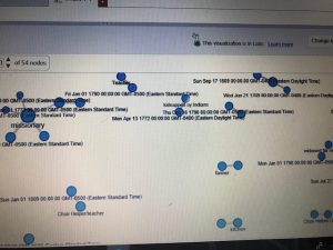
The first tool I used after I created the Palladio dataset was the graph(mapping) visualization. Tools like this one allow a person to see the connection these women have that you may not initially notice. For example, at first glance, I didn’t realize that most of these women died in Bethlehem, Pennsylvania. This correlation between these women is very important in looking at the data. This tool allowed me to come to the conscience that most of these women during their lifetime sailed the Atlantic to move to the United States for a better opportunity. Not only do graphs like these show trends but they can add additional importance to reports. The Google Fusion Table graph similar to Palladio, however, is much more user-friendly and eye-catching using colors. In Google Fusion Tables it takes the visualization process to the next level by even showing the day and time each woman passed away a feature Palladio doesn’t have.
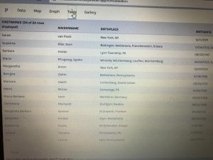
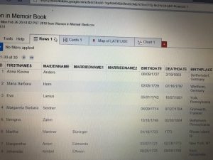
The next visualization that I used on both platforms were the table tools. The information similar to google spreadsheets allowed me to see each and every one information. From their birthdate/place, death date/place, occupation, and many other aspects of their lives. This tool makes it easier to learn about each woman’s background specifically. Of course, I compared this tool in Palladio with Google Fusion Table. This time around I couldn’t really find that much of a difference between the two platforms other than the fact in Google Fusion Tables I was able to rearrange the woman’s death dates in chronological order that made it stand out.
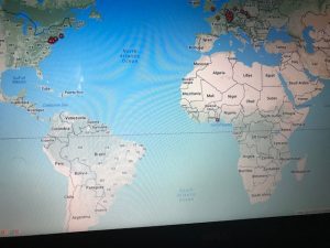
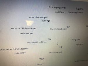
Unfortunately while using Palladio though I wasn’t able to access the feature of the map yet I still got a sense of how it works through Google Fusion Tables. As you can see in the picture of the United States and European countries the visualization tool allows the viewer to see where each woman originated from. I found this tool the most interesting because it shows how overtime eventually most of the women in the dataset somehow ended up locally in Bethlehem, Pennsylvania.
I believe these visualizations are representations of how the arrangement of elements carry meaning. Like I stated before humans are prone to miss things at the first time. Visualization tools like the ones above help divulge information that isn’t always given.