News about Trump in the White House’s Official Website in 2018
I gathered all news posted on the White House’s official website, and have created a table of meta data of those news, which include file names, date, word count, category, issue and location. For now, my main focus is on the issue of those news, so that we can know what kind of issues the president has been paying attention to.
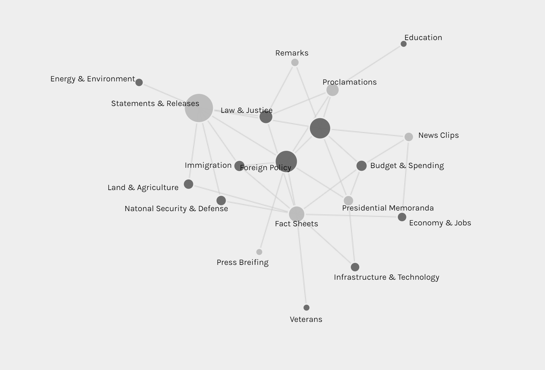
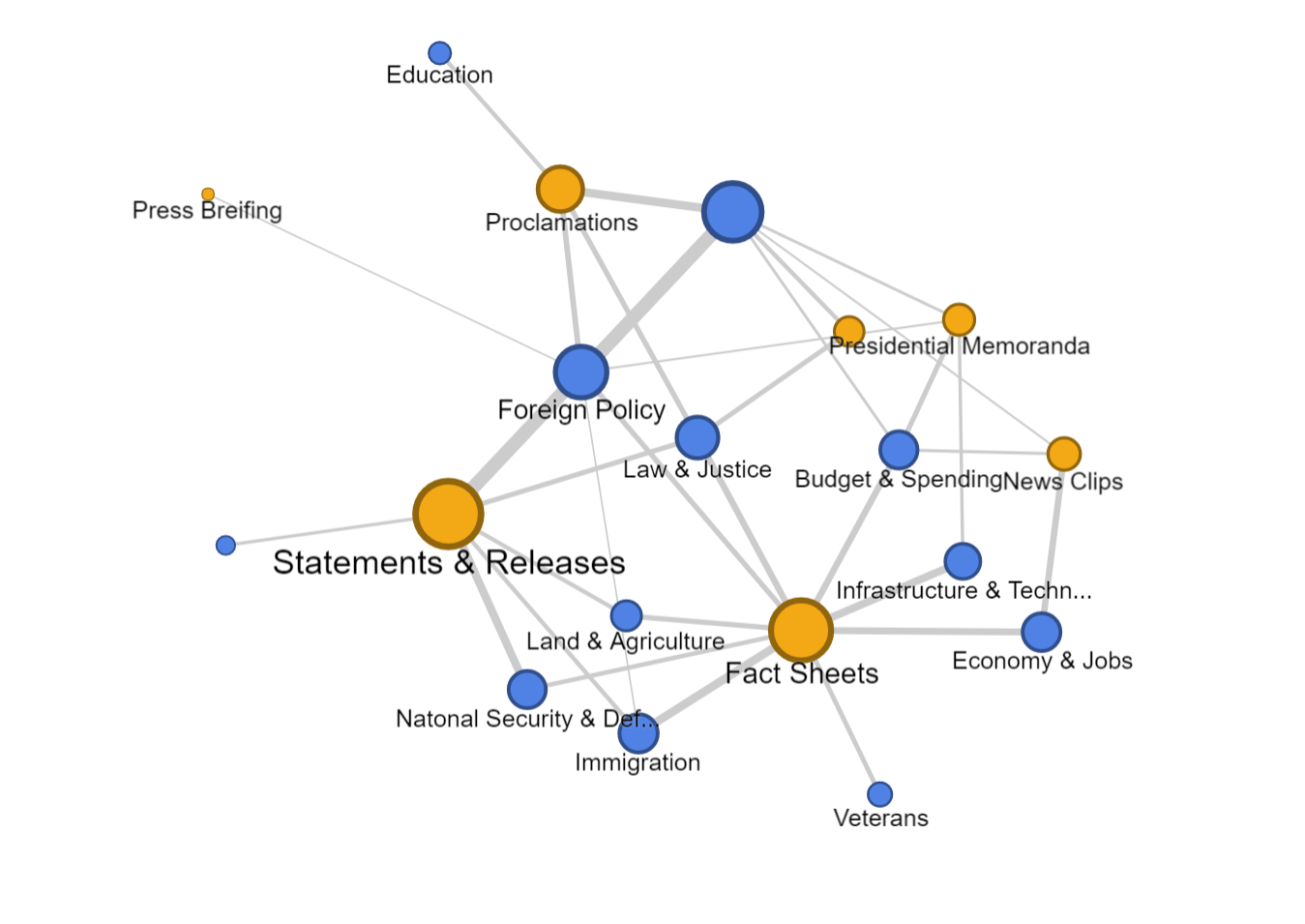
The first graph is produced by Palladio and Google Fusion, with category as source and issue as target. Intuitively, the network relationship for category and issue shouldn’t have too much significant meaning. But from the network graph below, we can interpret some information by adding the size of node as a feature. Most news is in the category of statements & releases and about foreign policy. Statements & releases connected to most kinds of issues, only education, economy & jobs and infrastructure & technology are posted by other category of articles. So we can know that dealing with different issues, the White House might use different form of articles. Compared to the graph produced by Google Fusion, I think Palladio should learn from Google fusion to change the color for different kinds of nodes. Although nodes can be highlighted, the difference of color is not significant enough. Another advantage of using Google Fusion’s network graph is that it shows the weight of relations between nodes with the thickness of lines. Palladio is also not flexible enough to control the number of nodes in the graph; in this project, the number of category is in a rather small number, so the graph is still clear for user to look at and read about details, but when there are too many nodes and users only want to learn nodes with highest weights, then the feature like limitation on the number of nodes in Google Fusion would be needed.
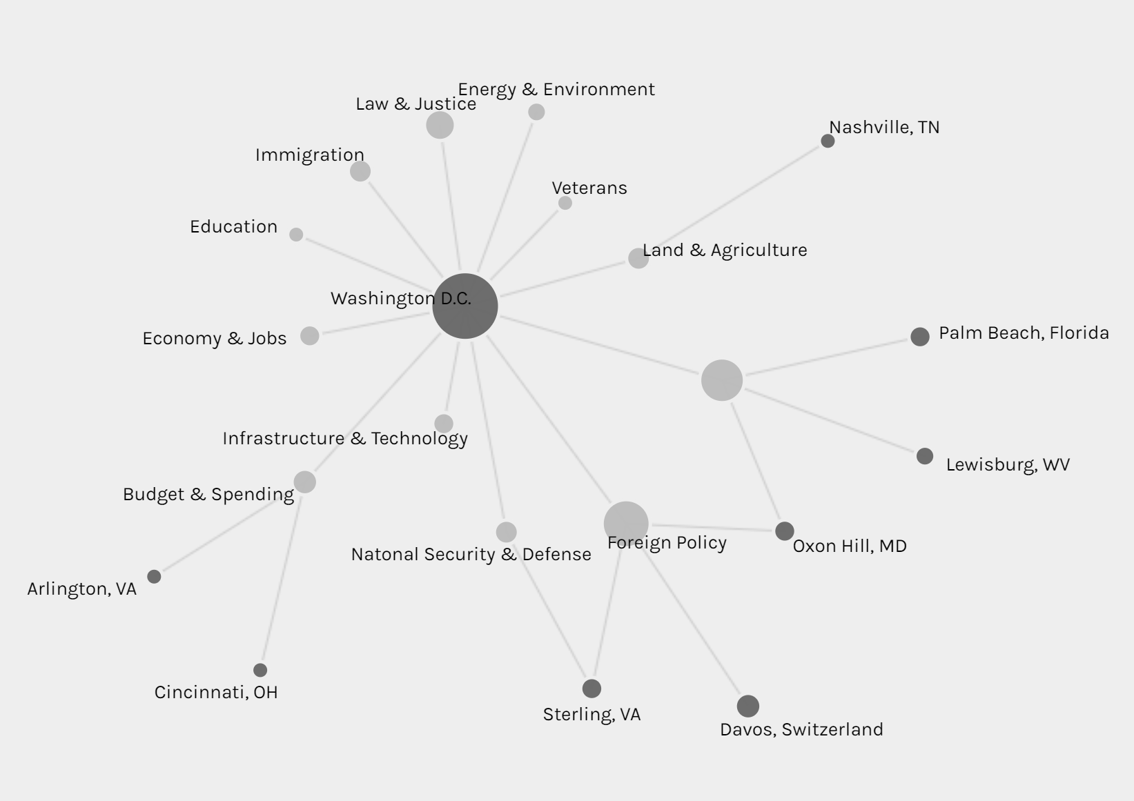
The second graph is also a network graph with location as source and issue as target. From this graph, we can interpret more information than the last one. Most news are posted when Trump is at Washington D.C. (most time in cabinet room, oval office or south lawn) and most issues are also in Washington D.C.. News posted outside are usually highly related with the issue happened at the date of that news. For example, the news posted on January 8th was about the rural America’s living condition and on that day, Trump visited Nashville, TN and gave remarks at the American Farm Bureau Federations Annual Convention. Another example, when Trump was attending World Economic Forum in Davos, Switzerland, news in that period is about Foreign Policy.
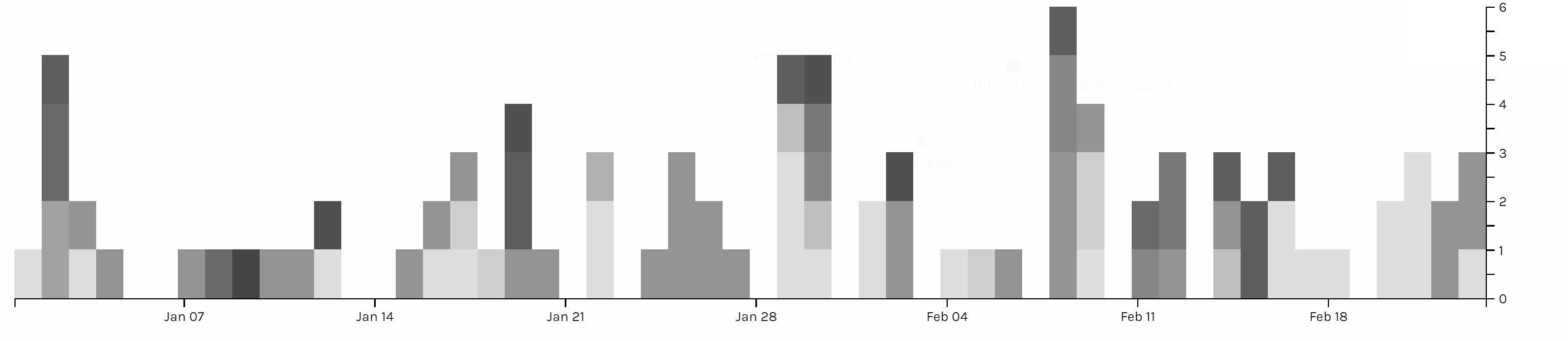
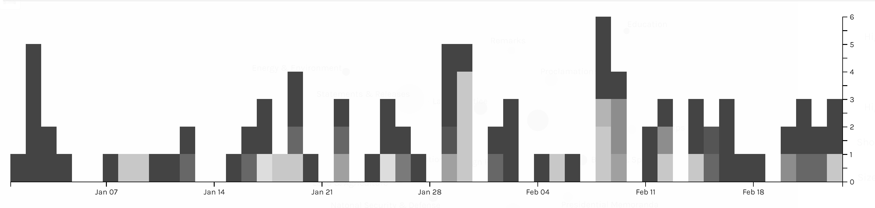
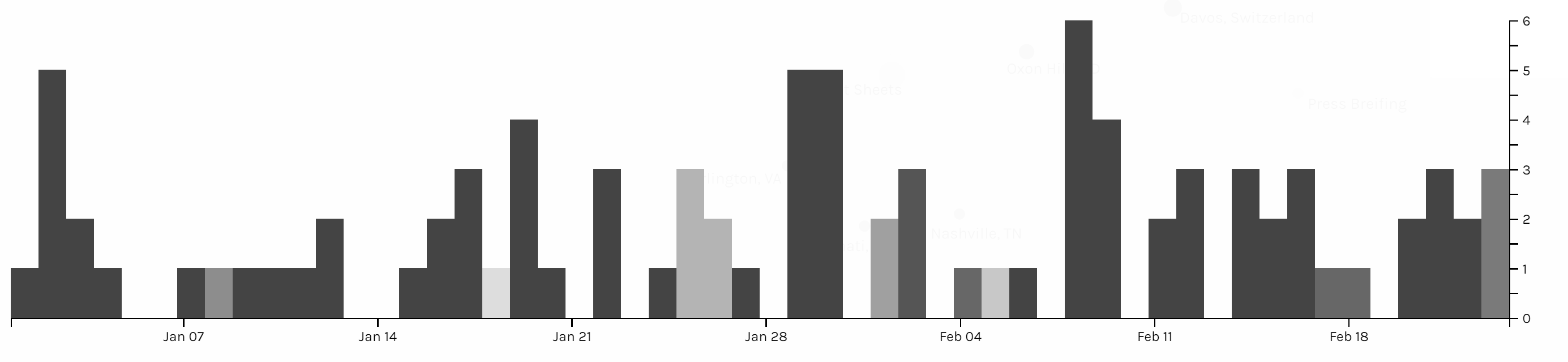
Those three graphs are timelines for issue, category and location. I don’t see any pattern on the category and issue of articles. And due to the timeline, we can see in the first two month of 2018 Trump didn’t spend too much time on business trip. In my project, timeline is not very helpful for users to interpret data, but I think the combination of bar graph and timeline can be a powerful tool for analyzing data like stories or events. The frequency of words or persons in time line can help users to learn about the focus of topic of an event of the clue in a story.
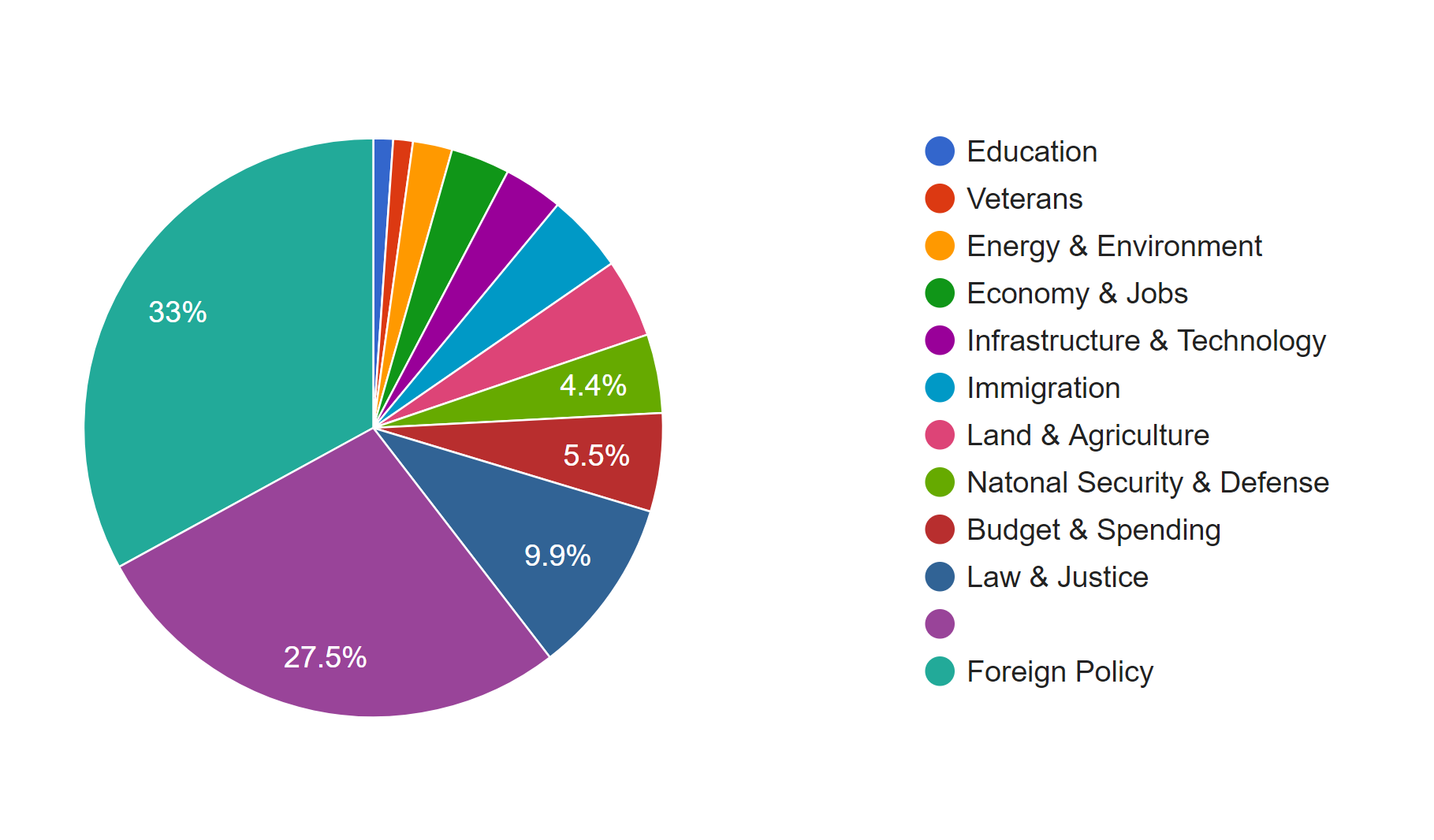
I also produced two pie charts for issue. Foreign policy takes the largest area and is the main focus of Trump during the beginning of this year. And we can see there is 27.5% of news is not classified with an issue by the White House. So I guess that’s what Drucker mentioned about misinformation; because when a large part of information might be omitted, ignored or untouched, the visualization of data may present imprecise data and mislead viewers. Take this pie chart for example, what if the part without being categorized is about law & justice, then in that situation, law & justice could also be a main focus of the president Trump. And that’s why although I have word count in my metadata, I choose not to use it. Because the number of words in a piece of news might represent the importance of it and it might not. Maybe it just needs more words to explain something. Similarly, what we have done in previous assignments, that we usually use the frequency of certain words to interpret data, might also be a misinformation, because maybe certain terms can be told only in a unique word, like nuclear, but terms like freedom can be also be told in liberty, essence, liberfree, or free will, then judging on the focus of topic with the frequency of words would be misleading.
Thinking more deeply, although the news posted by the White House’s official website is about foreign policy, what if many news related to other issues are not provided by the White House with news? Then the main focus of the president might not be foreign policy, and may be it is the image of the president the White House wants to present to people. Then visualization of our data will be misinformation and what Drucker tried to tell makes a lot of sense.
Therefore, I think, to prevent misinformation, we need our data to be comprehensive and multi-dimensional. Comprehensiveness can avoid omitting important parts of data, so the graph could be statistically precise; in this project, news which is not classified is a lack of comprehensiveness. Multi-dimension can avoid ignoring important perspectives or points of view to the data; in this project, we only have news from the White House’s official website, so the our data only represents the White House’s point of view on the president Trump.