For assignment 3, I chose to go with my own data and continue observing the collection of Sherlock Holmes short stories. As said in my second assignment, the metadata is pulled from the 56 short stories written by Sir Arthur Conan Doyle. The categories I went with were title, creation date, larger collection, major location, illustrations, and recurring characters, and word count. Going into the analysis of visualizations, I didn’t have a exact goal on what to look out for. Of course there are some things you can postulate before seeing them such as the progression in writing style, but I chose to let the data speak for itself in this instance, which is why I found a lot of it. Title was chosen as a way of ID’ing the works, so that category is self-explanatory. Creation date is the date of creation of each short story. Each short story is part of a greater collection: Adventures, Memoirs, Return, The Last Bow, and Casebook, released in that order. Each work also has a cover illustration that depicts an intense moment in the story, the url’s of which are in illustrations. Sherlock Holmes has an extensive list of characters, most of which only appear once. Aside from Holmes and Watson, there are a few returning characters that make multiple appearances, the most important of which I have in recurring characters. Major locations is a category where I have the most important location within the that story, useful for seeing if Doyle expanded Holmes’s horizons. And lastly there is word count, which I thought would be useful in analyzing the writing sty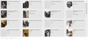 le of Doyle.
This first visualization is of all of the images categorized, by recurring characters, with illustrations and years provided. This view allows us to see how illustrations are affected through the years and by who is appearing. The art became much more of a selling point as the years go on. At first the roughly drawn images barely help communicate the story, but in later years, color and detail are added to the characters, giving them life and personality. Its interesting to see how it becomes more important, especially after a climatic event like the Reichenbach Fall. We can also see that the Doyle doesn’t like to spoil the events of the coming story. When we have recurring characters, we still have the picture focused on Holmes and Watson, despite having popular characters like Moriarty in the story.
This next visualization is of locations with respect to works. I went back and forth on using the map for this one but I felt this conveyed the messaged I wanted to get across better. Doyle loves England, and especially London. That large dot in the middle is London, with tons and tons of stories coming off of it. The scant few surrounding it are the few other stories where main events happen
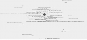
away from the city, such as Kent and Essex. Holmes rarely travels far from home to do most of his sleuthing, which I found rather interesting.
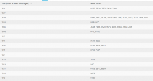
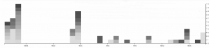
This last two visualizations are of the same information, but I decide to present it in two ways. I did this because I thought that it showed how much more dynamic and eye opening information can be when displayed correctly. This information depicts years and word count. There is an interesting trend going on here. As you can see Doyle wrote far less as time went on, doing most of his writing in spurts earlier to create the earlier collections. On average however, it appears that the stories are most word dense in the middle of his writing, perhaps when heavy plot elements and more complicated stories, such as the Final Problem, were being written. Nonetheless, the gradients are also pretty pleasing to look at, so I like this visualization quite a bit.