Corpus Introduction
My corpus is consisted of news related to president Trump posted on the official website of the White House. The files are named with the date of the news and include presidents’ readout, statements, memoranda and etc. Because I only focus on news related to president Trump, I filter out those posts from January 12th to February 11th.
Voyant Visualization
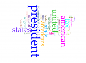
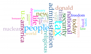
Word clouds above are produced with Cirrus tool in Voyant. To have better visualization about words with high frequency, I filter out words like “trump” and “trump’s” in the first word cloud and “president”, “american”, “americans”, “united” and “states”. From the rest of words in the cloud, we can have a direct view of what topic are focused by president Trump in last month. Tax, nuclear, religious and security have been four popular topics. Although word cloud is an aesthetic tool for data visualization, but it is hard to know exact frequency of each words. Viewers can learn from the graph that “president” appears much more than other words, but they can barely judge that how much more frequent is the word “president” more than for example “people”. So I also took a look at trend graph.
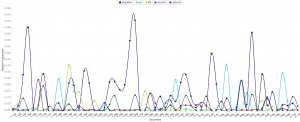
Because files of corpus are named after the date of the news, we can take the advantage that the trend graph’s horizontal axis is also the time line of last month. So we can derived more information than I expected from trend graph:
- The word “nuclear” and “security” is highly related.
- Topics of tax, religious and “nuclear” are excluded with each other in each news, because news posted from the White House website is usually concise to cover only one aspect of a topic.
- I searched hot news last month and results match with this trend graph very well.
In my opinion, trend graph can perform better on larger data set, which can show better shift from one topic to another. If I can apply all speeches of all American presidents, I guess the trend graph can provide a clear view of focusing topics of each president.
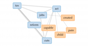
From popular topics, I use links to have more insight into word “tax”. The four most related words are “jobs”, “act”, “reform” and “cuts”. So we can speculate from the links that the government might want to cut tax and have tax policies related to jobs. But obviously, links don’t perform well enough to show how are those words highly related.
Jigsaw Visualization
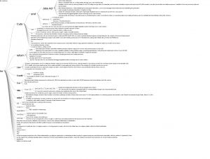 (Sorry about high resolution of my computer, so the font size is extremely small)
Although Jigsaw is a really old software, but I prefer word trees produced by it than Voyant. Because I apply corpus into Voyant first, I directly search four most frequent words in word tree of Jigsaw. Word tree in Jigsaw can perform much better than link in providing text information but showing phrases and even sentences. Word tree is a kind of visualization combines word cloud and link together. The size of connected word is proportional to the frequency and the lines represent the links between word. However, word tree provides more information and function than both word cloud and link. Users can specify the starting word to have more insight into certain topics of text and lines in word tree are directional from the specified word to words connected after it. But word tree also has the disadvantage that the sentence takes too much space in the graph and might be incomplete because they are limited to initiate from the specified word.
Comparison
Both platforms provide users with multiple ways of data visualization. Because Voyant is newer, it runs much faster to analyze texts, and due to the limitation of memory used by Jigsaw, the text size imported into Jigsaw is very limited. Voyant also provides more kinds of visualizations which Jigsaw doesn’t have, but the word tree in Jigsaw definitely performs better than that in Voyant. So I guess Voyant is much better for analyzing text from multiple aspects with diverse graphs and Jigsaw is better for deeper insight into content of text.
Summary
In the process of applying the same corpus into different platforms and diverse data visualization tools provide users with deeper insight and more dimensions into the data set. As Tanya Clement said, the use of visualization form can provide multidimensional viewpoints. My trend graph can provide more information in the time sequence; dragging words in Voyant’s link can have better visualization about complex connections; the meta information with multiple dimensions in word tree can lead to better speculation of contents based on graphs. Besides merely providing superficial and statistical information of contents, the process of data visualization can also lead user to deeper understanding of the focus, clue or even metaphor of the context.