For the construction of my corpus, since I am doing a research related to twitter feeds, I’m familiar with tweet collecting procedure and I fully understand that there is much information that can be extracted from twitter feeds. Therefore, I determined that my corpus should focus on President Trump’s public twitter feeds. I downloaded his tweets through Twitter API and I have 50 files in total, each file containing 30 tweets. With this corpus, I can anticipate interesting findings like Trump’s main focus in the past months. Also, with my computing experience, I successfully scrapped off some useless and meaningless content from the original corpus such as urls.
Since these two platforms possess a number of functionalities, I chose some of the most important ones and made snapshots. Also, in order to compare these two platforms, I selected some similar and some different visualization tools.
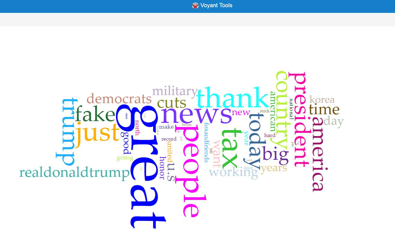
These two visualizations are created using two similar tools, which produce views of frequently used word in documents with different advantages and disadvantages. Obviously, the visualization produced by Voyant is much more beautiful, with the difference of frequencies shown more evidently. However, Jigsaw is superior to Voyant in the way that it shows these words with their contexts, which may provide more information to users.
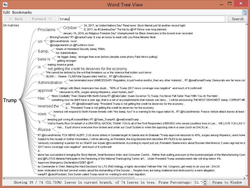
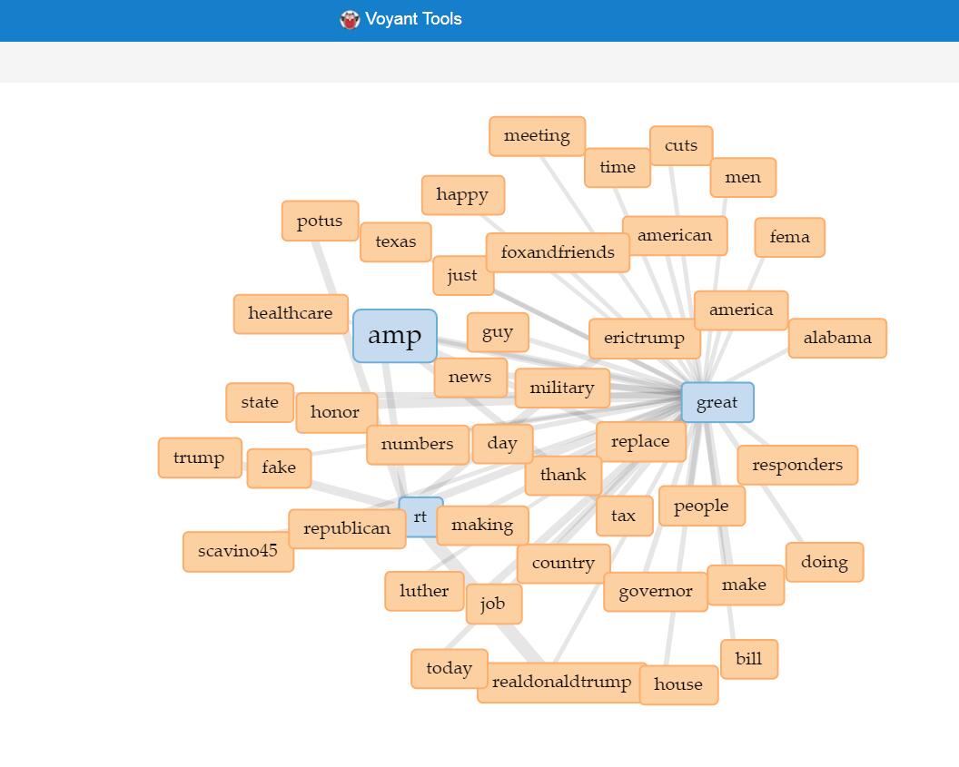
Since the wordtree functionality in Voyant only provides “America Great Again”, so I used link instead of word tree for Voyant. This functionality, like wordtree, provides information about words and their local relationship. The wordtree visualization in Jigsaw obviously shows the words’ local relationship in context, with different sizes representing different frequencies, which can offer direct knowledge to users. On the other hand, the link feature in Voyant produces better interactive visualization. Once selected the icons in the graph, users can either expand or remove icons, thus enjoying the benefit of iterative visualization. Also, the nice layout and colorful labels make the feature more user friendly.
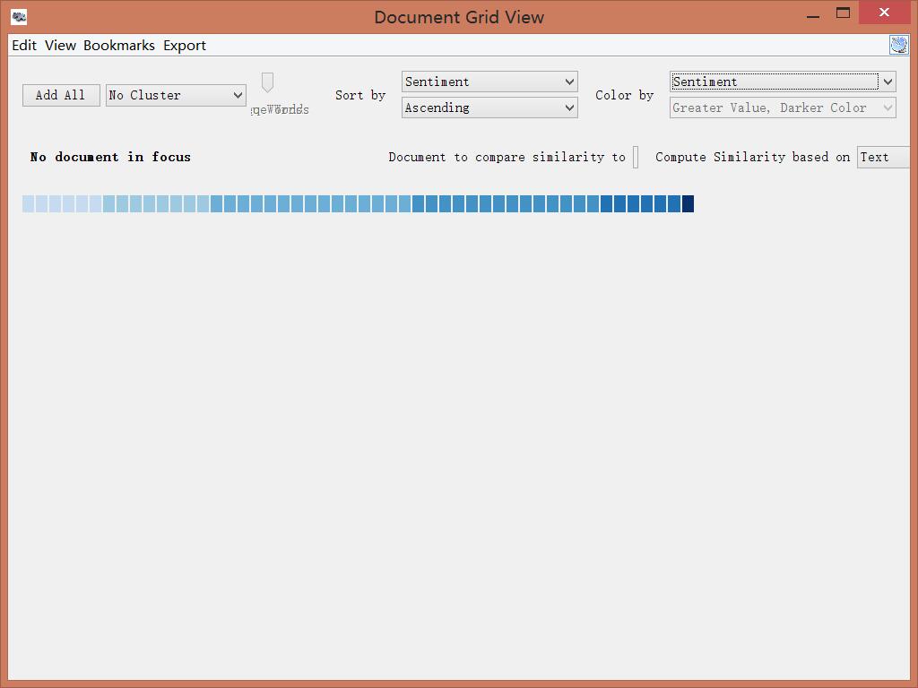
This feature is something unique in Jigsaw, not included in Voyant. This visualization shows the sentiment according to text analysis in different documents. Each block represents a file and darker color indicates greater sentiment value, in other words sadness or anger. This grid view tool can also do other analysis depending on different needs. It can produce special insight because it takes two variables into account. For example, it can produce a timeline showing the sentiment by choosing document date and sentiment for “sort by” and “color by” relatively.
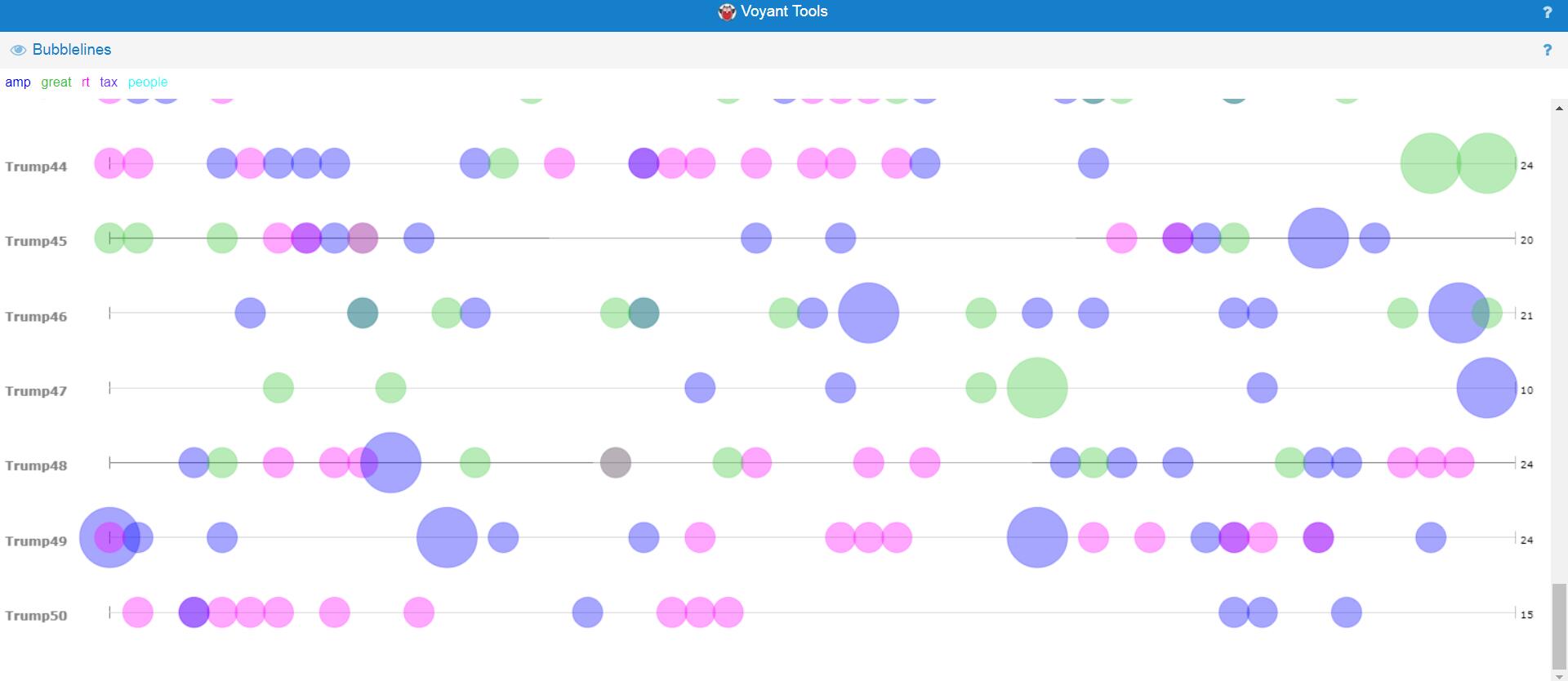
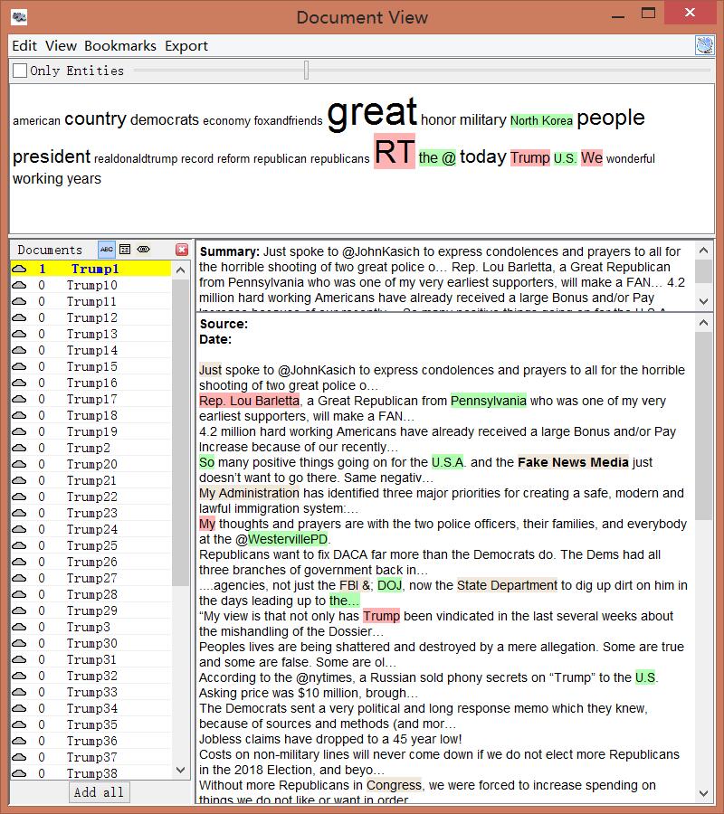
This feature is only provided by Voyant, indicating the frequencies of different words in different documents. It can provide direct impression and is convenient for users to compare different files. The lines indicate the text order and different sizes represent the frequencies. Additionally, different colors indicate different entities. Therefore, this visualization includes at least three different dimensions, which provides a thorough and broad view of the data set.
During the process of corpus construction and visualization analysis, I found Tanya Clement’s observation is verified. The first part of her argument is easy to understand. Using visualization platforms, I successfully combined different kinds of information and created some multidimensional viewpoints. For the second part of her argument, I understand that due to the unknown algorithms behind these visualization platforms, the results presented may be biased. Therefore, I should keep in mind that the results may not be exactly correct when I do research using these visualization platforms.