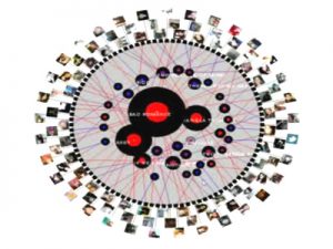
The first visualization I choose is called “Twitter Lyrics” which is a rating system which uses Twitter to track the number of times a song is being quoted this is done to help understand the impact songs have on people’s lives. I found this visualization interesting because I can personally relate to this visualization. I love listening to music especially rap. A lot of my tweets from Twitter are inspired by the lyrics I hear from the music I come across. I love the fact that I can find always find a song/quote and connect it with how I’m feeling that day. I use the quotes from these songs to uplift myself as well as for motivation. Twitter Lyrics provides many ways to interact with the data and be viewed from different perspectives. I believe the visualization enable an artist to see how their listeners are interacting with their music. This visualization resembles a dynamic visualization because viewers are able to build their own conclusions from the data presented without it being misleading in any way.
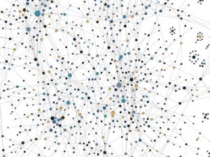
The next visualization is “The Seattle Band Map” which is also categorized under music. This visualization unlike Twitter Lyrics documents the bands from the northwest region of the United States. The visualization shows how they have connected whether it be personal relationships or working together on songs. The creators of this visualization believe Seattle is a prominent area for music so to keep the area relevant they came up decided to create this lineage. This visualization drew my attention because I was fascinated how the creators made the visualization very informational. I find this visualization unlike Twitter Lyrics to be very more hands-on and interactive. This visualization, in particular, exemplifies a dynamic visualization as well because it’s very detailed and it doesn’t try to persuade the viewer any type of way other than showing you the social network of these bands. Yes, the visualization provides multiple ways of interacting with the data allowing it be viewed from different perspectives. Lastly, I believe this visualization leads to new and emergent ways of understanding the material because even though the visualization looks complexes it’s rather simple and helpful if you want to learn more about these bands.
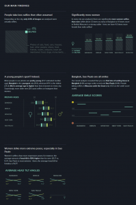
After looking at a couple of software’s I decided I enjoyed a program known as Selfiecity. This is mainly due to the huge impact social media has on everyday human life. This software “investigates the style of self-portraits” in places like Bangkok, Berlin, Moscow, New York, and Sao Paulo. The primary focus of the software is visualization. Throughout Selfiecity the creators use different graphs to show the data taken from their research. The ultimate goal of the software is to see if there are differences in the selfies being taken in different places across the world. The website is very interactive allowing the viewers to play around and explore with the website enabling them to see thousands of selfies and the correlation the selfies have from the same places.