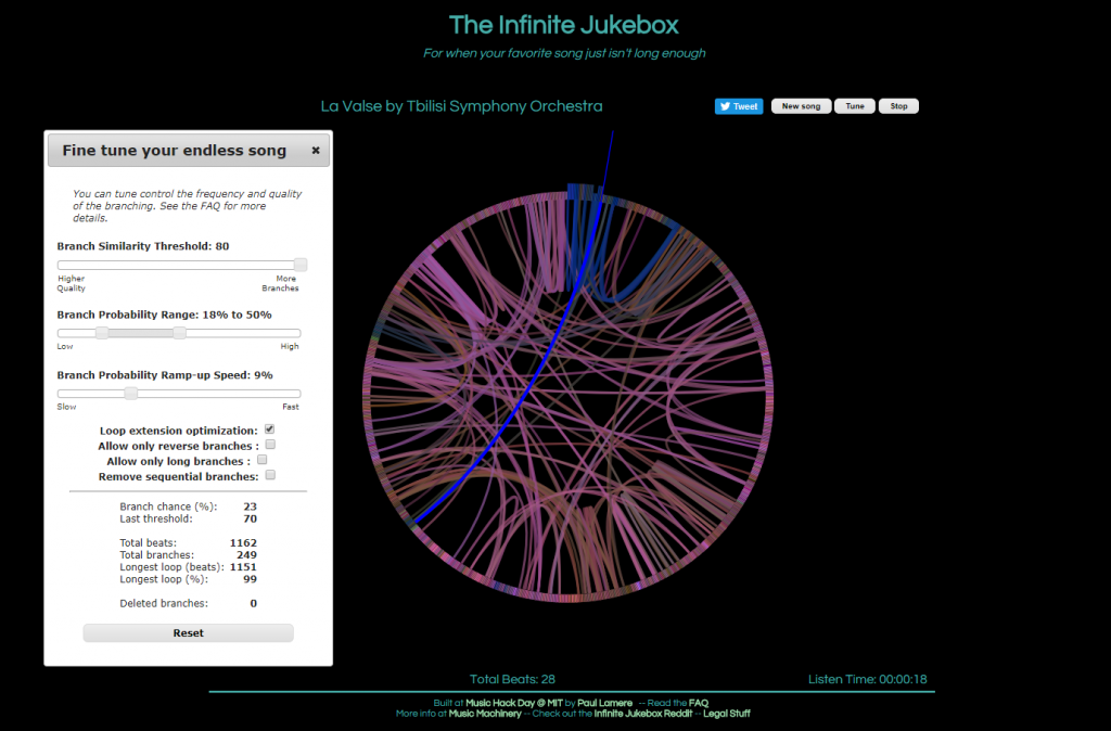
The first visualization, called The Infinite Jukebox, caught my attention as I listen to and practice music regularly, and have taken music theory classes here at Bucknell. First of all, the visualization is quite pleasing to look at. Second, the idea of listening to different versions of a song you like in an infinite loop is really cool, in my opinion, though it can be tiring at some point. Finally, and most importantly, this visualization is a great tool for reading music. Of course, one can look at the sheet of the song or simply just listen to it. However, music is, I think, quite linear, which makes it challenging to see the overall structure of a piece of music. On the Infinite Jukebox, however, one can see where musical ideas repeat by looking at the amount of connections. It would be really fascinating if the visualization allowed more than one song at a time, which could be used for analyzing similarities or influences between musicians (or for producing some awesome mashups).
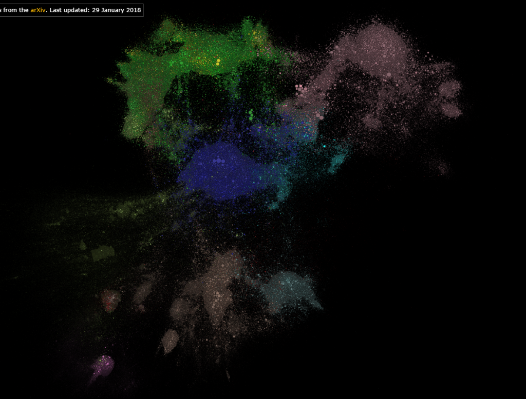
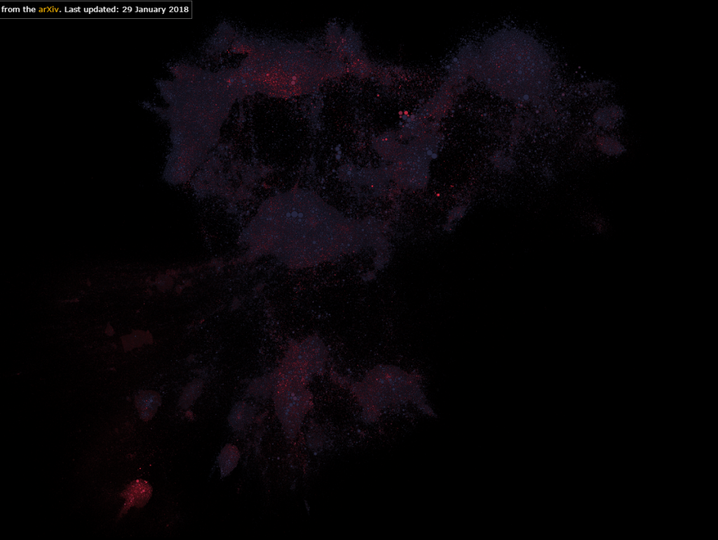
The second visualization that I found interesting was Paperspace. Firstly, it shows which fields in STEM are most researched. Secondly, it also shows research in one field interacts with those in another field. Finally, it also allows users to color the map by the age of the papers, which can reveal the current trend or topics of interest in STEM. In addition, one can tell, by interacting with this visualization, if a research topic is really “out there”.
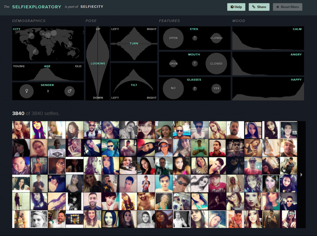
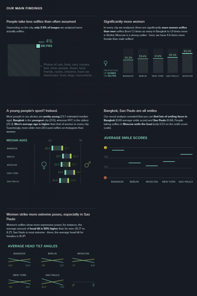
For the visualization from the DH Sample Book, I chose Selfiecity. First of all, the design of the website is clean and modern. Second, in addition to the researchers’ own findings, which I think are very interesting and comprehensive, they also provide a section called “Selfiexploratory” for users to interact with their data (images). The filters in the “Selfiexploratory” section are very responsive and well-designed. They represent the variables they are changing with visual mapping and, at the same time, show how the quantitative data change directly on the sliders themselves.
These visualizations definitely exemplify Sinclair’s observation on the difference between static and interactive visualizations. Instead of providing immutable perspectives on the data, the visualizations mentioned above all allow users to adjust the parameters and come to their own conclusions. For example, the Infinite Jukebox lets the users adjust the probability and the threshold that a song might switch to a different section. The Paperspace visualization allows users to change how the papers are categorized and also updates its database frequently. Selfiecity provides users with probably the same tools that the researchers used to get their results.