Comparison of “The Genealogy of Pop/Rock Music” and “IBM Watson News Explorer”
I chose these visualizations for their collaborative function as exemplar of the fact that networks can manifest themselves in remarkably different ways. When analyzed in tandem, “The Genealogy of Pop/Rock Music” and the “IBM Watson News Explorer” exemplify several distinctions between static and dynamic visualization. As a dynamic visualization, the latter allows individuals to interact with a massive news/media database that simultaneously sorts articles by location, keyword, actors, etc. By giving those engaging with the platform the freedom to “play” with the visualization of sources (ex: alter how they are presented and what is presented) as well as updating information in real time, this IBM interface demonstrates characteristic elements of dynamic visualization that the more static (cannot be altered or “played with” but does include a temporal dimension) musical genealogy does not. Both visualizations, by allowing for the studying of patterns of connections between elements (musicians, news sources, or whatever else) allow data to be viewed in novel ways. However, only the news explorer provides individuals with the opportunity to actively interact with the data in multiple ways (must also keep in mind that the genealogy’s multiple dimensions allow for pluralistic interpretive interaction with data). Although essentially static, the musical genealogy does serve a heuristic function for its ability to depict artistic longevity and influence that may not immediately be apparent to researchers (operates similarly to Priestly’s timeline). The IBM platform utilizes more dynamic qualities to create new knowledge about the interconnectedness of major global figures, organizations, etc. (and even can be used as a way to interrogate the media as an institution). In either case, the visualization does a magnificent job of contributing to novel ways of understanding their fields and many others (understand both relational and attribute data).


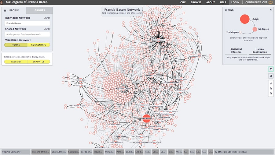
Analysis of “Six Degrees of Francis Bacon”
I selected this visualization based on its direct ties community network designs discussed by Meirelles and Lima. This network visualization entitled “Six Degrees of Francis Bacon” utilizes dynamic characteristics such as a mutable structure and variable presentations of biographical and connective information that can be accessed at the discretion of users (both things static visualizations do not necessarily present). More specifically, this visualization allows users to both interpretively interact with the data as well as more actively mutate the visualization (can be radial, force-directed, etc.). By visualizing myriad informational dimensions and including analytical ambiguity, this community network succeeds in allowing individuals to view the data from different perspectives and arrive at unique and valuable humanistic conclusions. “Six Degrees of Francis Bacon,” much like other community networks we have encountered, effectively contributes to new understanding of intellectual, political, and general social influence in England (shows connections, timelines, biographical information). If this particular visualization did not exist, it would seem nearly impossible to readily generate conclusions regarding the impact or magnitude of this particular social network tethered to its central node, Francis Bacon.