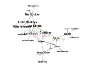
For the two above visualizations, I found them fascinating for distinctly different reasons. On the left is a picture of a sample visualization from a website (http://rama.inescporto.pt/) that takes musical artists, identifies both characteristics of their music and similar artists based on those characteristics, and then displays the links in a color coded, digital web. It also has a lot of cool interactive features including the ability to click on related artists based on highlighted or selected genres, characteristics, styles etc. and then offers information about selected choices. One can also create radio stations or see music playlists related to any of the items viewable in the chart which I thought was really cool. It reminds me of a visual analyzation of basically what Pandora is trying to assess through one’s thumbs up or down preferences which was very cool to see and may be useful to interact with. I found it to be very effective at accomplishing Stefan Sinclair’s vision for a well-done visualization when he stated, “The humanities approach consists not of converging toward a single interpretation that cannot be challenged but rather of examining the objects of study from as many reasonable and original perspectives as possible to develop convincing interpretation.” This visualization does just that with its user interactivity and lack of boundaries for how to manipulate the data to show different pictures.
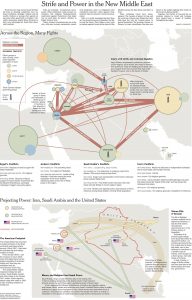
The second example above is a much more static visualization. It does not have any way to interact with the data, but it does provide a very detailed and analytical layout for a large amount of qualitative data. As a Palestinian, the culture and stability in the middle east has always been important to me, and like most, it is very difficult for me to understand. While it is not super interactive like many of the other visualizations on this site, I feel that it has a valuable place in promoting understanding about a complex topic. By addressing many topics and clearly showing links between related ideas, it provides a vast amount of knowledge that a reader can analyze. In the Sinclair reading, he proclaims, “a visualization that contributes to new and emergent ways of understanding the material is best.” He talks mostly about how interactive visualizations do this best, but I think this static visualization does it well in this instance because it simply provides facts in an easy to follow way without drawing any conclusions about morality for the reader. It’s a good example of knowing how to present your data in the best way given its content.
The visualization I chose from the DH sample book is called Kindred Britain. A picture of the general layout is below, but to get a grasp on the value of the visualization, it must be explored in its interactive capacity. It is a network of individuals of British decent, and shows blood relation as well as marriage connections through a lens of historical context. I actually found this visualization to be very difficult to understand. There is interesting material being presented, but it is hard to sort it out and in my opinion the formatting and style could be cleaned up a good bit. As Manuel Lima pointed out in his TED talk that we watched in class, a visualization is only as meaningful as how it speaks to those who are viewing it. I agree with this profoundly. If I can’t understand what’s happening, no matter how intricate and well put-together the data is, I’m still not going to get much out of it. I’m not particularly experienced with in depth data sets, and this makes it more difficult to interpret and make the most of a fairly complex data set such as this.