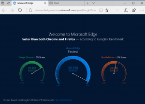
This is one is bad because the visualization is not to scale with the numbers. At quick glance, Microsoft Edge seems to be much faster than both its competitors. In reality, the raw numbers are pretty close.
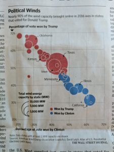
This one is bad because the graph gives no context whatsoever. I have no idea what this graph is trying to convey. Something to do with how each candidate won their respected states? It is hard to decipher.