Our group worked within the Baptized Indians database, which was confined to sections ID 175-225. We then compiled this data into the Gephi program to create visualizations to interpret the information. This platform was difficult at first but it became helpful with establishing connections. Using the data laboratory, we created 86 edges and 97 nodes which exemplified the relationship connections of our sample group. I must admit, we ran into a bit of trouble when we were creating the edges as the metadata had some error within the connections. We scanned all numbered individuals to locate spouses, children, etc. however, there were some connections that were impossible which we could not create that edge to be connected in our visualization.
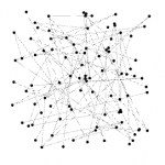
At first, when we viewed our data in Overview, it didn’t seem very meaningful without any labels or information. However, once we started to experiment more within the tools, we began to make progress. The first appearance change was made by selecting “modularity”. This added color to the dots which showed us the comm
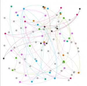
on relationships. This gives the viewer a clearer understanding with the connections and relationship between communities. This visualization was a minor change that made a significant difference in data recognition. Next, we decided to switch the size of the nodes according to class and rank to further support the similarities. This implies that Christianity began to expand and spread throughout society. The main component was marriage and the interesting connection was seen through certai
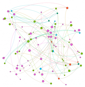
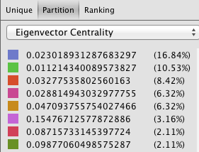
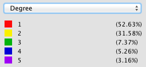
n nodes that connected twice to certain colors(blue and orange). In the data, there were individuals who had endured two marriages, being that they were divorced at one point. After playing around with the program, we explored the degree and eigenvector centrality which the data results changed but the appearance wasn’t altered much. Eventually, we came across noverlap which had labels and showed a different connection which
we were more accustomed to when viewing data information. The visualization shows their names and the various relationships between each baptized person. This indicates how each person is related or how they come in contact during some point of their lives. The color of the node revolves around an individuals relations with a certain number of people. We tended to gravitate towards this style more because it was clearer to understand and mapped out the community overlap that symbolizes the more important groups of people. Using this visualization along with the edge labels would help a person understand the relationships created and the relations between communities that have been created through marriage or the birth of a child. 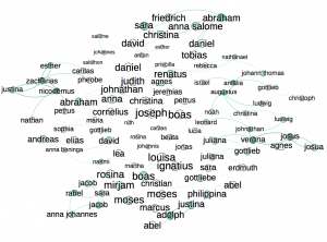 Overall, I’d say that Gephi was very helpful to our assignment. It allowed us to visualize a group of people in a creative way that brought many of them together. It’s always warming to create graphic expressions that tell a story without much text that we are accustomed to. It took us a while to understand the concepts and tools with using Gephi. There were some networks that didn’t run properly but we never gave up in trying. Also, the collected data translated into color coded was beyond helpful to distinguish certain levels and communities. Compared to the other platforms we used in the past, I would say that this was the most challenging and wasn’t very beginner friendly. Because of this, we didn’t uncover all the results that we hoped for but that’s fine because we learn a lot about ourselves and the power of visualizing. It was fun to play around and run test that generated different information, however jigsaw and voyant was easier to operate in which we could create visual masterpieces. However, it like we learned, it doesn’t always have to be cool or an attractive graph, as long as it is meaningful and could be interpreted by an audience.