Through using Gephi, the baptismal relationships between Native American Indians will be analyzed. From the initial dataset of 375 nodes, I closely analyzed the first 25 nodes, which each represented a unique Native American.
The main goal of these visualizations is to further understand the complex relationships between the various elements. As Isabelle Meirelles discusses in Design for Information, “Node-link representations use symbolic elements to stand for nodes and lines to represent the connections between them” (55). Using Gephi, a structure of nodes and link connections were created.
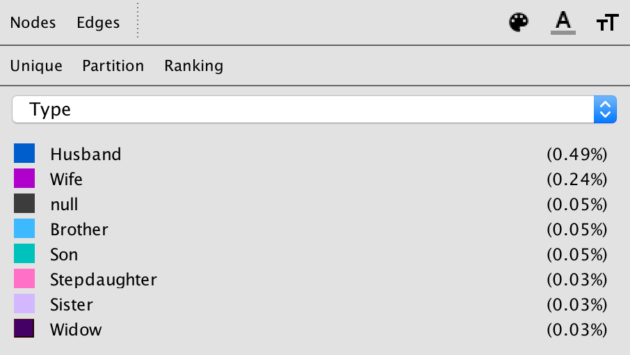
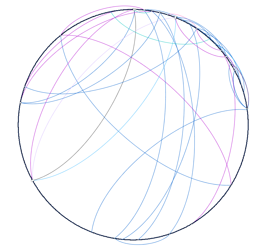
The given dataset was a Native America multidimensional, baptismal database. In the Gephi database, each element or person is represented by a node, and I connected the nodes with edges based on the relationships with one another. These edges in Gephi specifically represented husband, wife, brother, son, stepdaughter, widow, or null.
With these edges consistent throughout the visualizations, the three different dimensions that I examined closely were modularity, degree, and Eigenvector.
Modularity –
The first step of creating a visualization based on modularity was to color the nodes based on modularity class. To further emphasize differences in class, the node size was also adjusted based on rank.
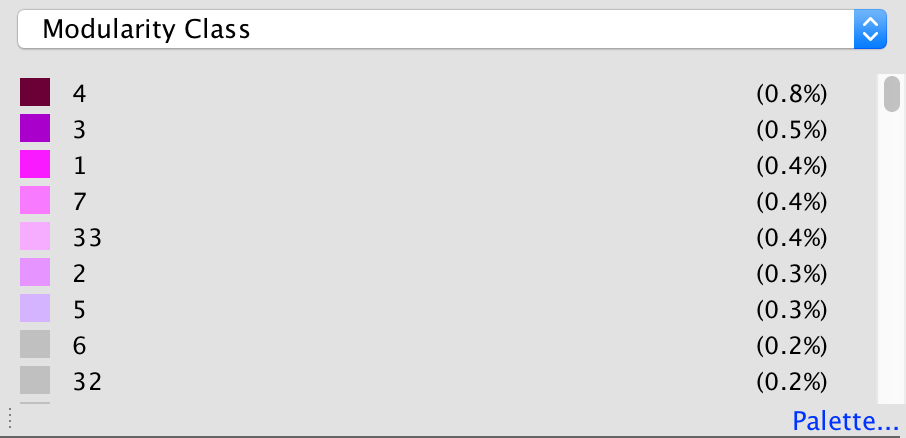
The attribute of color distinguishes different modularity classes from one another. With the colors, the reader is able to see the main clusters and different groups that the Native Americans were in. Since not all the edges were created for the full data set, many nodes are left gray in the visualization, which represents them being disconnected from the rest of the data set.
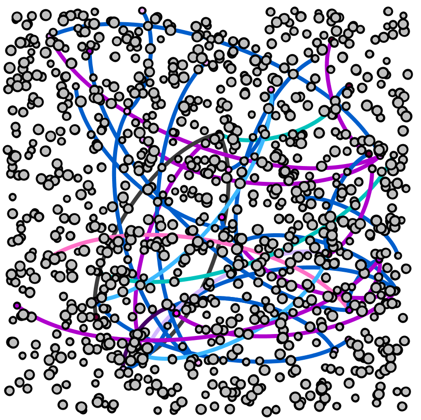
Without many groupings showing up with the red through gray modularity color scale for the nodes, the most striking part of the visualization are the edges between the nodes, which show various relationships between the baptized Indians, or adjacent nodes.
Degree –
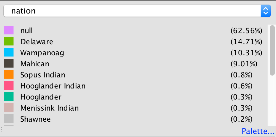
For the degree visualization, the nodes are colored based on the nation of the baptized Indian, and are sized based on the degree. This graphic visualizes the story of how nation and relationships between nodes are related.
Each node is colored based on nation.
The size of each node is based on the degree of the element.
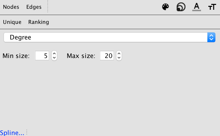
With these ways to partition and rank the data, below is the visualization created.
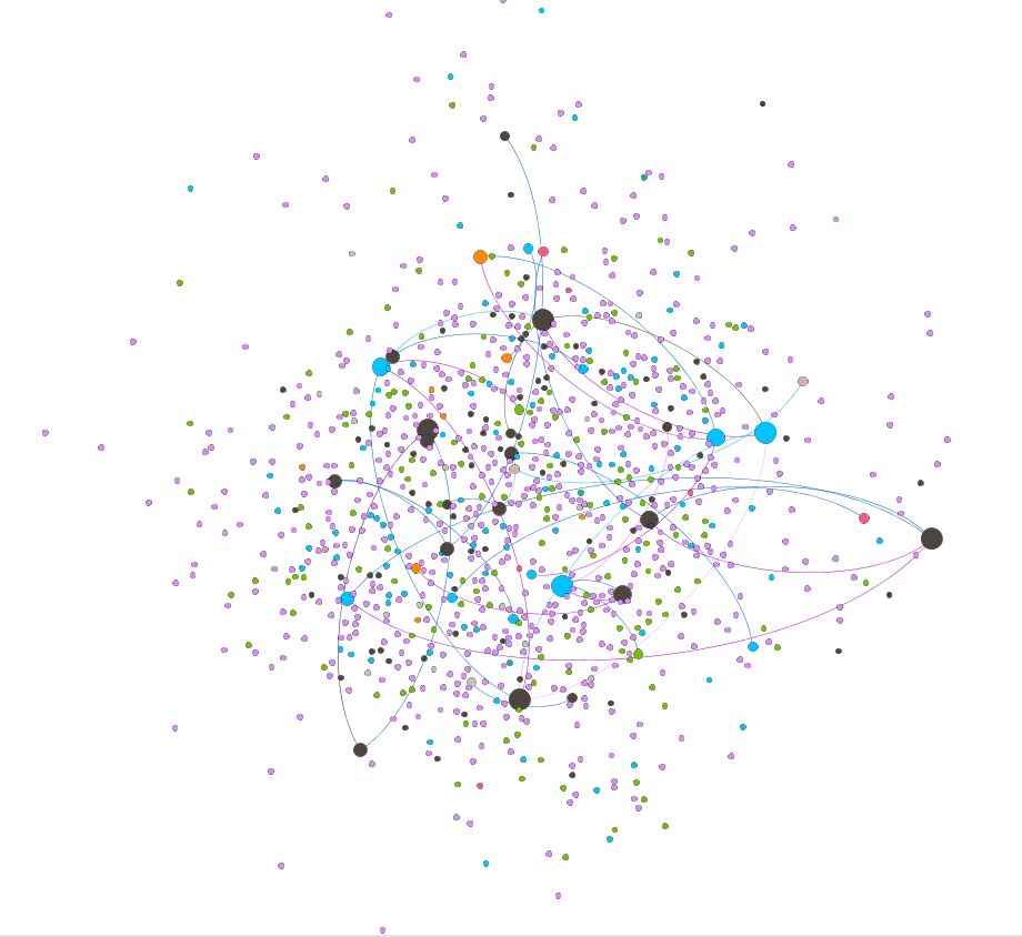
From this, the reader can interpret how baptized Indians are related to one another based on node size (strength of degree), node color (nation), and edge color (relationship between nodes).
Eigenvector –
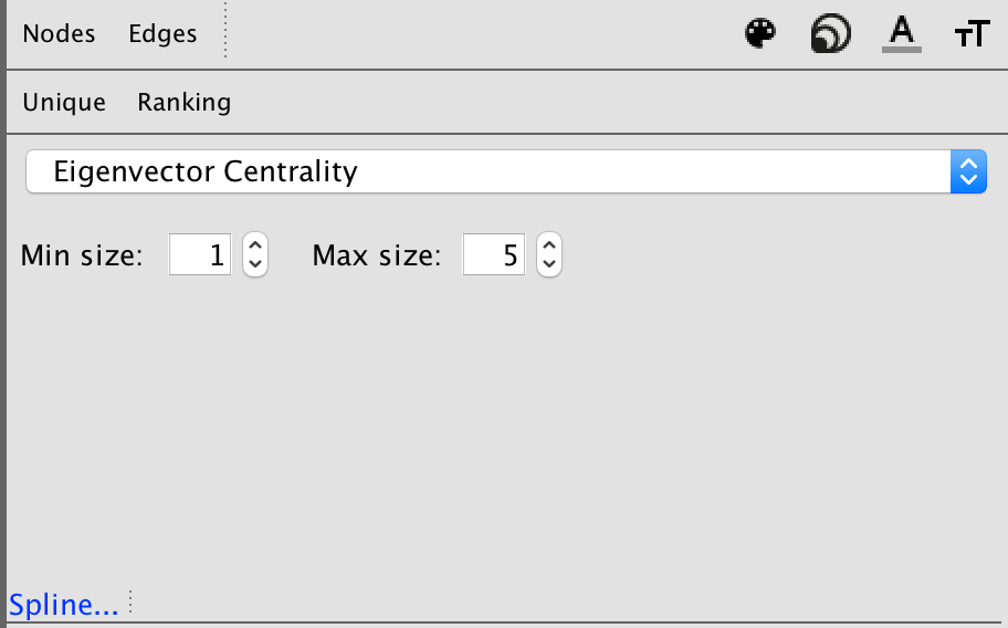
For the Eigenvector visualization, the nodes are colored based Eigenvector statistical calculation. This graphic visualizes the relationship between Eigenvector values and the relationships with adjacent nodes.
Each node is colored based on Eigenvector calculation.
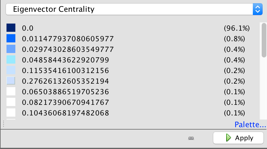
Each node is sized based on the Eigenvector statistical analysis as well.
With the visualization, the Eigenvector calculation takes into account the degrees of adjacent nodes.
Overall, this visualization is difficult to read, and would be a stronger visualization if there were more connections within the numerous data points. There is an unproportional amount of nodes to number of edges, and overall the set doesn’t create the most meaningful visual.
This is my main disagreement with visualizations in the Gephi platform. The platform is not user-friendly, and is extremely difficult to work with as an author. As an author, the statistical analysis logic and creation is complicated, resulting in extremely complex visualizations that are potentially too sophisticated for readers to completely understand.
In addition to that, unless the visualizations are exported with the Sigma.js extension, the visualizations are static and are not interactive. This results in even more difficulty in analyzing the data further as a visual form.
As the reader can see from these visualizations, it’s very difficult to interpret much from this small a dataset. As Meirelles discusses, “most problems faced by node-link representations are caused by the occlusion of nodes and link crossings, which obliterates the structure it is supposed to reveal” (56). Since there were many gaps in this data set, the full narrative could not be visualized. Overall, the visuals are telling in the connections between the various baptized Indians, and the colorful edges tell a story about the connections. However, without the full extent of the connections between all nodes, the visualizations are not capable of telling the full story that the Moravian missionaries were trying to capture through their records.