In this assignment, I created and analyzed network graphs by using the records of the Moravian missionaries in the mid-Atlantic states in the 18th century. After briefly looking at the data, there were a few questions that I wanted to explore:
- Were proximity and social connections important to the spread of Christianity?
- Who were the important people in the network?
- Were there any patterns in how the baptists choose people to baptize?
To be able to input the data into Gephi, I first ran a script using the original spreadsheet to generate an edge table, resulting in a database with 377 nodes and 490 undirected edges. Although my method is faster than manually extracting the data, due to my lack of text analysis knowledge, marriage, etc. relationships are all represented by the same kind of edge in my data (I feel like Drucker would not like this at all). This might hinder my further study of the data. However, for the questions that I proposed, I do not think it greatly influenced my interpretations.
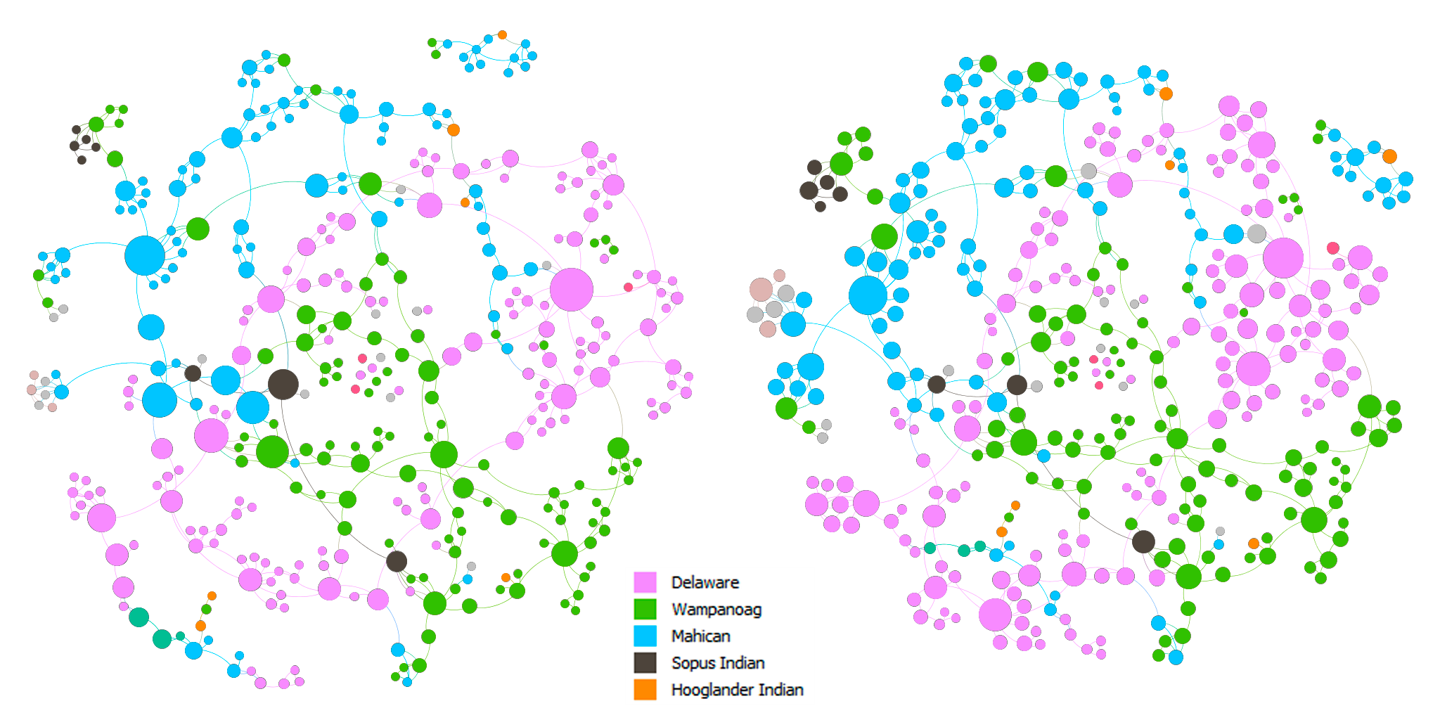
Above are the force-directed (Force Atlas layout) representations of the network. The nodes in both of the graphs are colored by nation. The nodes are sized by betweenness centrality in the left graph and by eigenvector centrality in the right graph. In both of the graphs, we can see that there are clusters of colors, which indicates that proximity did play a role in the spread of Christianity. In addition, there are also connections between clusters of different colors. This can imply that either Christianity expanded through marriage or those people married because they shared the same faith, which in turn, solidified the position of Christianity in the community.
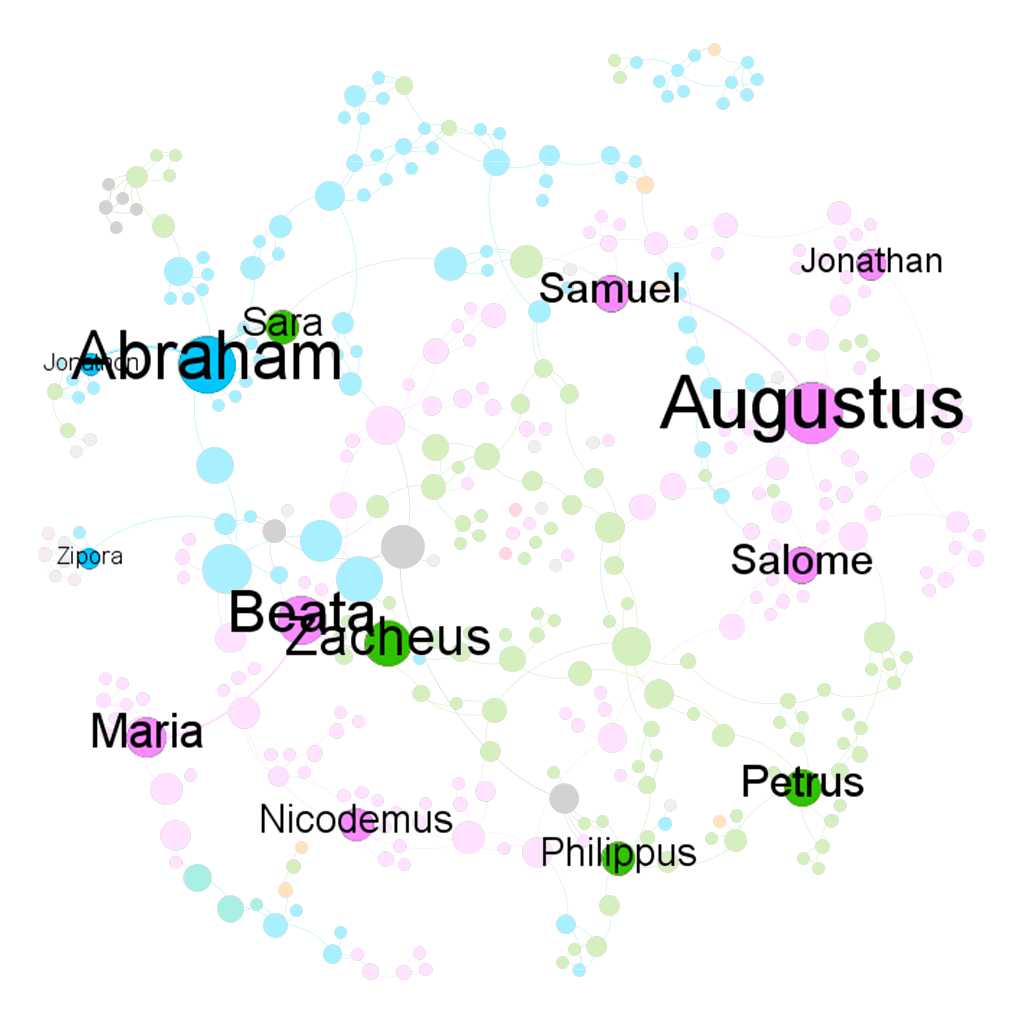
I made two slightly different graphs because I think that one can be in the shortest paths of many connections and be somewhat insignificant at the same time, which can be seen in the change in size of some nodes between the two graphs. On the other hand, one can be influential in a large community, but that community is only in the periphery of a larger community, which might result in a low betweenness score. Hence, to find the most important people in the network, I used the graph on the left and filtered out nodes with eigenvector centrality < 0.5. The result is shown in the graph below.
I think that the baptists were somehow also aware of the importance of these people. I created two more graphs using the Circle Pack Layout with the first hierarchy being the nations and the second hierarchy being the baptists. The nodes in both of the graphs are sized by eigenvector centrality. In the left graph, the nodes are colored by the nations and by the baptists in the right graph.
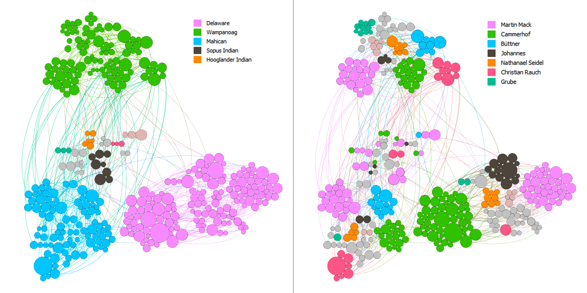
Most of the baptists seem to have focused on maximizing the number of regions they went to. In addition, they baptized the people with high eigenvector centrality in each nation. Although this is not rigorous, I arbitrarily checked the dates for some of the big nodes and the nodes surrounding them and found out that the bigger ones tend to be the ones that got baptized earlier. Thus, there seems to be a pattern among these baptists to baptize the most important people in as many regions as possible.
Overall, I think that Gephi is an amazingly versatile visualization tool with a quite usable interface. However, there are also some aspects of Gephi that I found limiting. For example, I was not able to embed a timescale in my visualizations, which is one of the four principles of network visualization mentioned in the 3rd chapter of Lima’s book. Nor was I able to easily put the nodes in a map layout as I could in Palladio.
While making these network graphs, I was also aware that they are not a representation of the data but rather a story that I wanted to tell about the data (again, Drucker would disagree with my method). I proposed questions about the data that I sought to answer. In other words, I chose to omit aspects of the data that I did not care about. I do not think that data visualizations can ever be subjective, even the act of collecting and organizing data contains biases in itself. However, as computer scientist Bret Victor said, “[a]n active reader doesn’t passively sponge up information, but uses the author’s argument as a springboard for critical thought and deep understanding.”