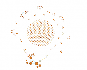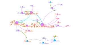
In this visualization, we are observing a small sub-group of Indians that appeared in my data of 75 people. To arrive to this data, this first step was tackling the use of gephi. Gephi turned out to be far easier to use than expected. With a little bit of tinkering all of the basics are readily available and fairly self explanatory. After creating roughly 80 edges for my nodes, I used the Yifan Hu layout to not only make the data more aesthetically easier to inspect, but to find anything interesting in the rather sparse amount of edges. Additionally, the data displayed multiple dimensions of the data, namely Indian nation, sex, and community connections (spousal, generational, and sibling). With all of these inputs the data still looked uninteresting, so I chose a small group of Delaware Indians to focus on. For analyzing purposes the size of the names/nodes is proportional to degree. The color of the names is sex, male and female are orange and purple respectively. The color of the nodes is the nation they are affiliated with, most important for us are the purple Delaware Indians and the blue Mahican Indians. Lastly the color of the edges is the relation of the edge, green for spousal, purple for parent to child, and blue for siblings. Some edges I’ve removed for the sake of clarity. With respect to our three calculations of modularity, degree, and eigenvectors I found them mostly inconclusive. Degree is well represented, and so is modularity by the communities displayed, however eigenvectors failed to make the visualization any more descriptive or interesting, and as such I left them out. Our story focuses on the family trifecta of Petrus, Nicodemus, and Gideon. These three brothers all appeared within my spread of 75 in some way. I think its just fun to observe that each has gone and done their own thing in life. Although difficult to visualize, each went their own ways, represented by them each dying in different places. Nicodemus ended up in Nain, and there he had 5 children. He was married to Lucinda, shown next to him in the visualization. Nicodemus was a randy fellow, as he had the most offspring of the lot. He also appears to have been fairly successful in what he made of himself. One of his children, Zacharias pictured in the top right actually married a daughter of a Mahican. Petrus holds a similar story. He married a Theodore, which may be in a error in the data, otherwise Indians were very forward thinking. Either way Petrus had two kids, one is explicitly mentioned to be adoptive, the other may be as well. If this isn’t an error in data, perhaps they were actually homosexual. Even more impressive is that Petrus clearly made a good name for his family as well.
One of his adoptive daughters married a man who was previously Mahican and married. After his divorce he married Abigail, the daughter. Of course we’ll never know what happened, but we could even postulate that whatever Petrus had going on for himself was enough for a man to divorce his first wife, switch camps to Petrus’s, and then marry one of his daughters, all while being gay in the era. Of course none of that may be true, but exploring these what if’s is what I think visualization is about. And then there’s Gideon, who just had a good life with a wife and some kids. I think this story I found is interesting because it doesn’t show anything incredibly interesting. It simply shows a small merging of people that likely had no huge impact, but we can see this little story play out with just a couple of data points.