In completing assignment 3, I decided to take a break from my Migos’ corpus and use the ‘Baptized Indians’ dataset. Mainly because I felt that the given dataset was more compatible with Palladio and Fusion tables. I inserted my original data but it didn’t offer much graphical expressions that I felt was meaningful, which is why I ultimately chose the alternative data. I extracted the data from the tables and converted them into a .csv file which I then transferred them into Palladio/Fusion tables.
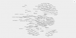
The first graph (left, palladio) displays an individuals’ name in relation to their corresponding nation of origin. This tool surprised me as it showed the similarities of how all these people were in some ways connected to one another. Then, I used a similar table tool in Google Fusion (right) and it’s graphic was similar as it displays the connection between the names of the individuals to their origin location. The symbols were connected to it’s relation but it lacked a detail that showed the “close-knit” relation towards the nations. I felt that the Palladio graphic helped me gain more knowledge as the visualization added another element to the data’s information.
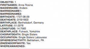

The first table(fusion) above provides a complete description of an indians bio followed by their life details. This supports the representation of a person and provides the viewer with a clear visualization of the basic facts of the people. The second table (palladio) wasn’t very useful in my opinion because the program restricted the creator to three linkages in the settings tab which only allowed me to show the data above rather than a full background which the fusion table provides. This may lead to a viewer misinterpreting a visualization due to a lack of information.
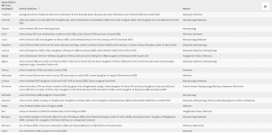 This palladio table allowed me show multiple layer tools into a column styled graphic which allows a viewer to view data clearly as their is no chance for misinterpretation being that these rows information is straightforward. It lays out the an individuals name and their family relation. Also, it displays their nation in which they ‘belong’ to. This visualization is interesting to me as it links the data together in a standard fashion but conveys a meaningful expression. The mapping tool(bott
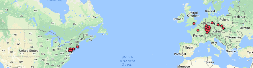
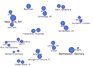
om right) from the fusion table pinpoints the geographical location of the baptized indians that make up the dataset. It is plotted by their latitude, longitude coordinates which provides a pin at it’s exact location rather than a relative distance. This tools serves as a knowledge generator, discussed by Drucker, as it models the data in a form that goes beyond charted data. It allows the viewer to analyze geographical regions from a spatial aspect and draw comparisons within places as their individuals relates together.
I think that all of my visualizations above all have their own meaning which allows the viewer to analyze information further than just viewing it on a standard data table. These graphical expressions use spatial forms to influence meaning to place as well as people. In the Drucker reading, it discussed how a viewer could take away lessons from “galleries of good and bad, best and worst…they are useful for teaching and research”(239) It doesn’t matter if the graph has flaws, there is always a learning experience that you could take from an expression and use to further knowledge and gathered information.