In creating my data set, I chose to look at the Fox TV show, “New Girl” and to analyze various aspects across the different episodes, including views, ratings, and descriptions of the episodes in correspondence to when the episodes were produced and the order in which they occurred in the season.
The raw data itself can be seen here. It consists of all episodes, directors, writers, genders, air dates, U.S. viewers, length, IMDb rating, images, and episode descriptions.
Due to the capacities of Palladio and Google Fusion, I decided to create visualizations of individual episodes and highlights of information with those, as well as various visualizations about the connections and correlations amongst data. In analyzing these connections, I used the season, release date, number of U.S. viewers and IMDb rating of each episode.
These aspects of each episode were chosen to as representations of each episode, therefore each visualization will have an inherent bias. As stated in Drucker’s work when discussing data in visualizations as capta, she states, “Capta is constructed and not given…the initial decisions about what will be counted and how shape every subsequent feature of the visualization process.” (244) This idea of data as capta must be considered in the graphics below, as the information and ways to present it was chosen by myself and therefore is no longer pure data.
All visualizations created both through Palladio and Google Fusion. The main goal of using these tools was to communicate the “New Girl” metadata through various graphic designs. As Drucker states, “Communicating the contents of a digital project is a knowledge design problem – since the multifaceted aspect of database structures offers different views into the materials.” (243) Because of this, multiple visualizations were created to allow for different perspectives on the data itself.
Below are various creations of visualizations done in Palladio.
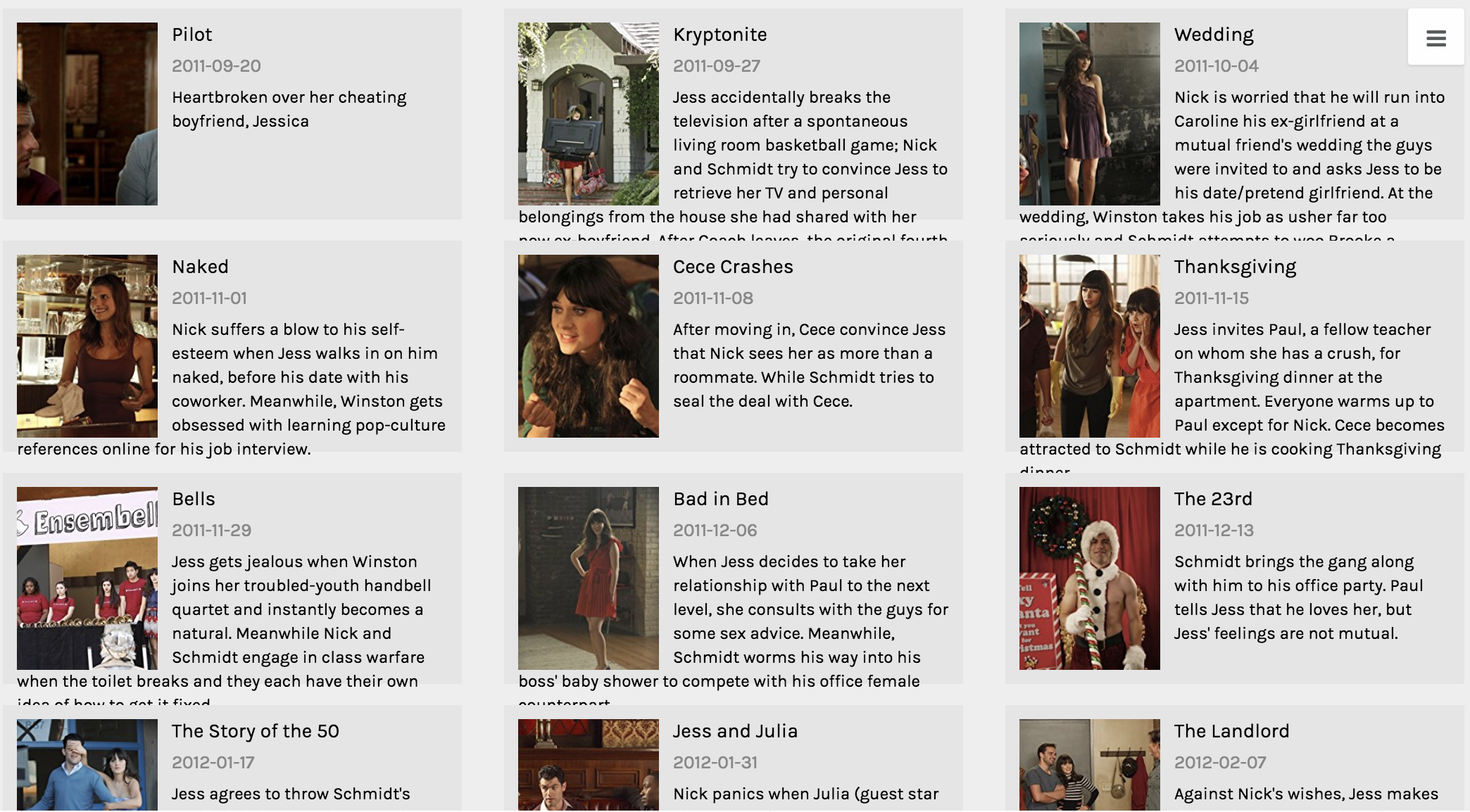
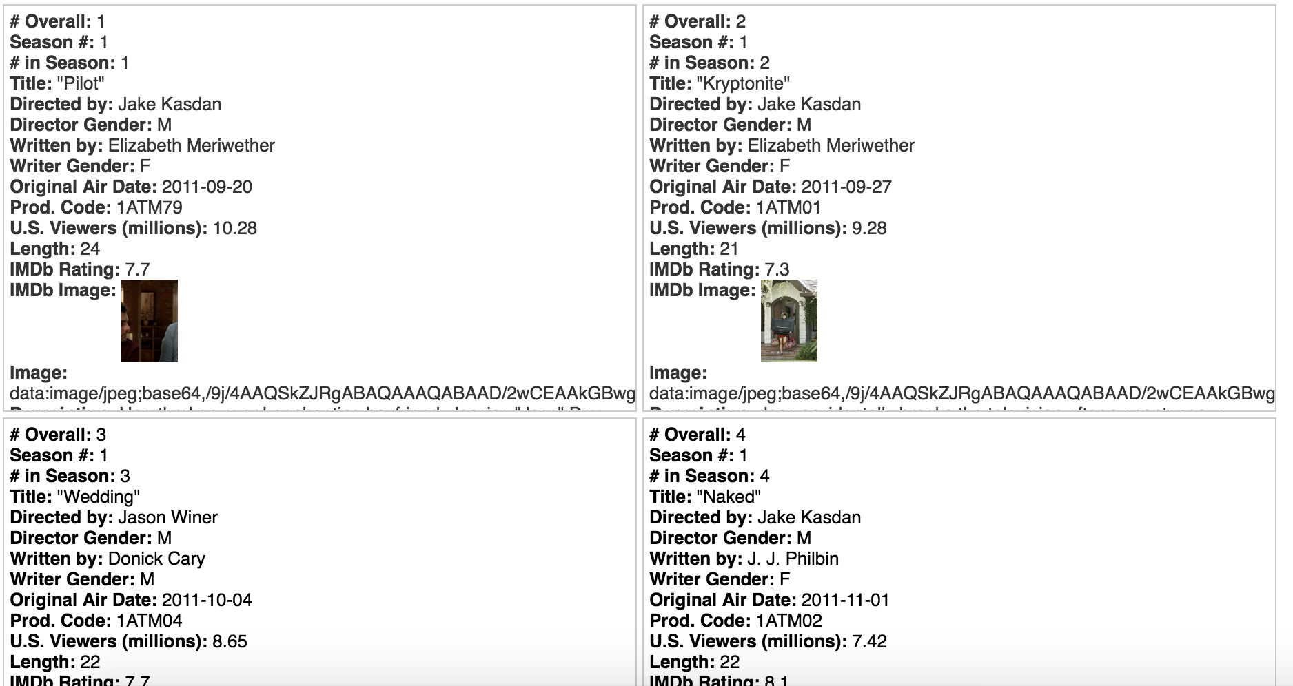
This first visualization was created using the Gallery function. The main purpose of this graphic is to give the viewer a visual and quick way of reference to each episode. One lacking feature to the Gallery function is that there should be a way to include additional information to the cards, because while I believe this visual is functional, it’s not the most effective at communicating all aspects of each data point from various aspects.
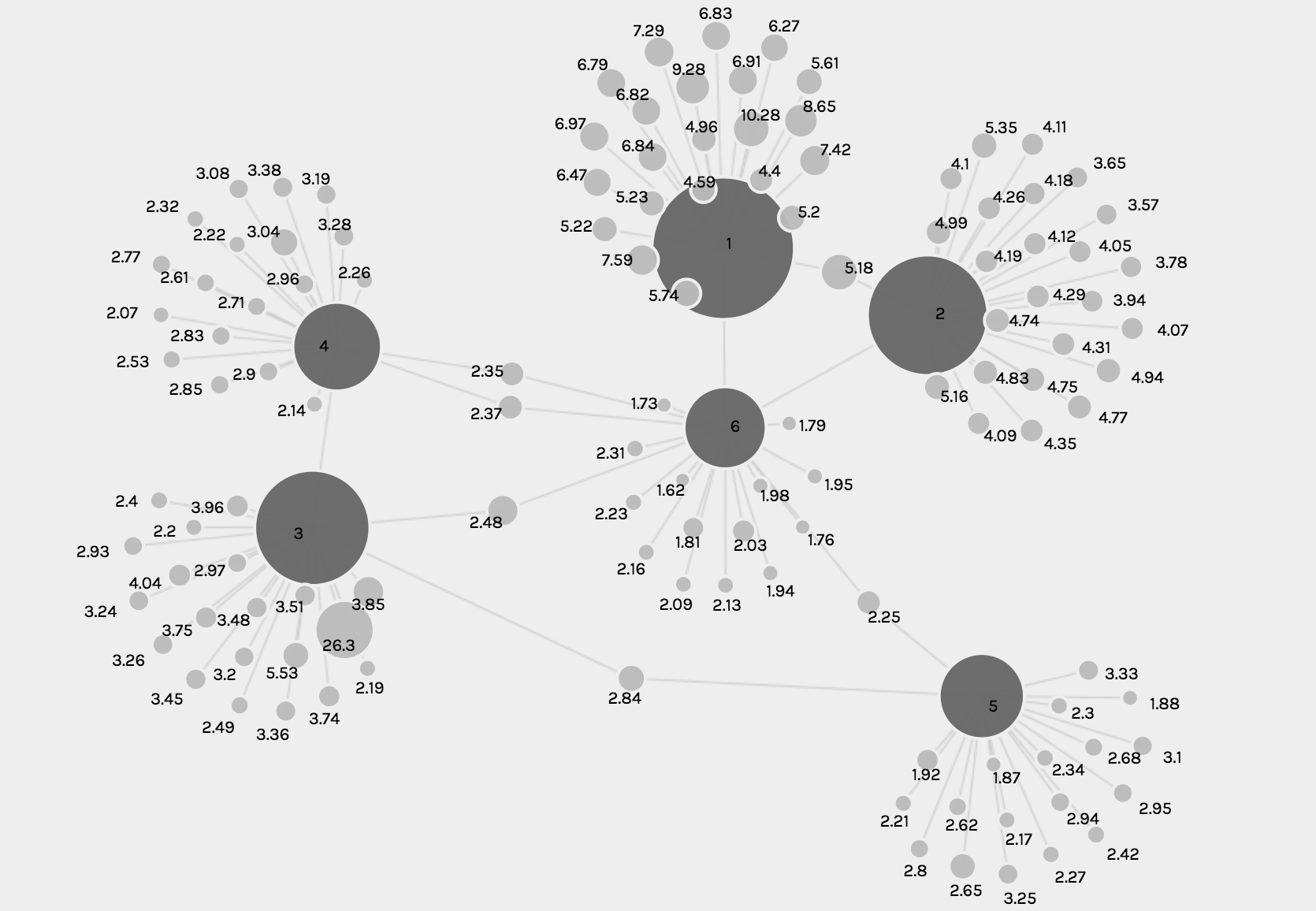
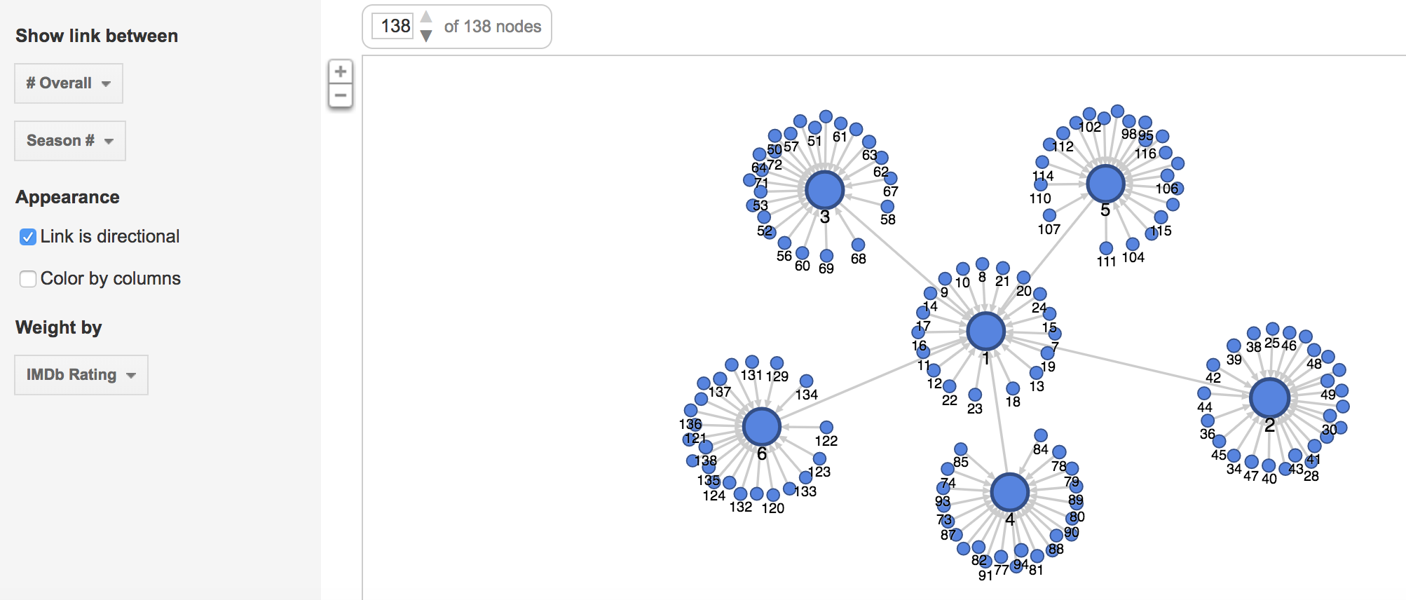
The following visualizations were created using the Graph function. The first shows the number of U.S. viewers to each episode, where the size of the node reflects the number of U.S. viewers.
The second and third visualizations are the same, just with different zoom views, and these show the relationship between each episode and the IMBd rating for each episode, where the size of the node reflects the rating.
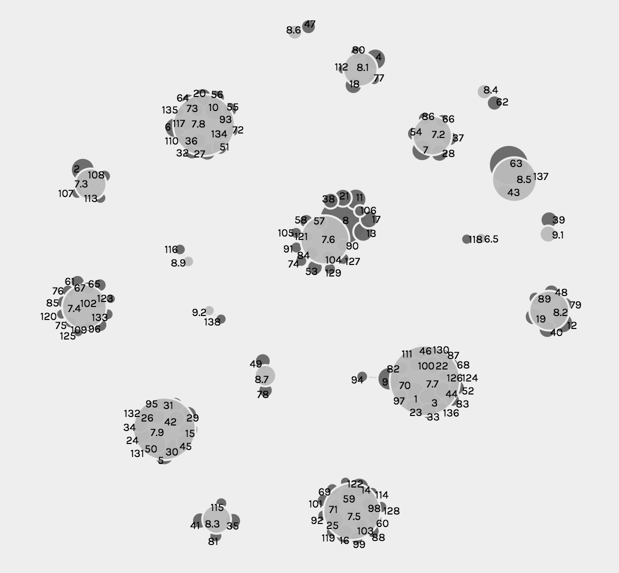
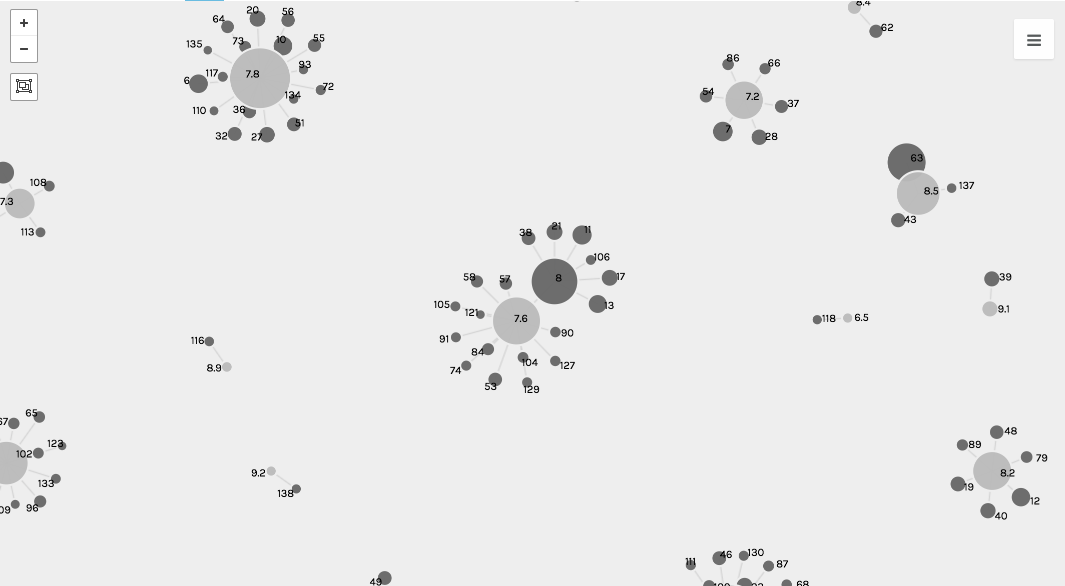
While the graph function creates detailed and intricate visualizations, from a user perspective, the visualizations are complex and difficult to read and comprehend, especially when they solely become static images.
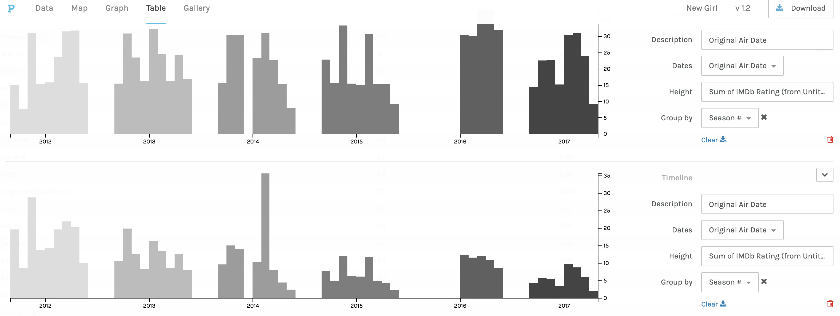
The third and fourth visualizations are bar graphs, which when Drucker explains the history she states, ““Bar charts came relatively late into the family of graphics, invented for accounting and statistical purposes, and thus pressed into service in the eighteenth century, with only rare exceptions beforehand. They depend on underlying statistical information that has been divided into discrete values before being mapped onto a bivariate graph.” (240) Both of these were used to clearly map out the changes in trends and numerical data from the original air date of the show to the present.
The first bar graph maps out the IMBd ratings over the air dates, and the second bar graph addresses the number of U.S. viewers over the air dates. While the charts are a clear visualization and one typically beneficial to numerical data, the Palladio platform for arranging these graphs was extremely difficult and had glitches.
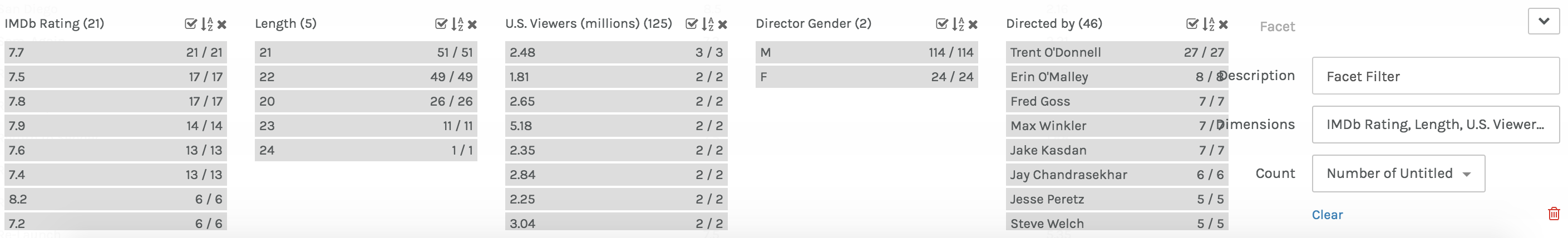
Lastly, in Palladio, there was the Facet Feature, which was complex and difficult to comprehend exactly how and what it was doing. That being said, it created a list-like visual, which is beneficial to users in search of quick information.
In Google Fusion, similar visualizations to those in Palladio were created. The gallery and graph functions were very similar to Palladio, but differed in terms of user interface. The visualizations are below.
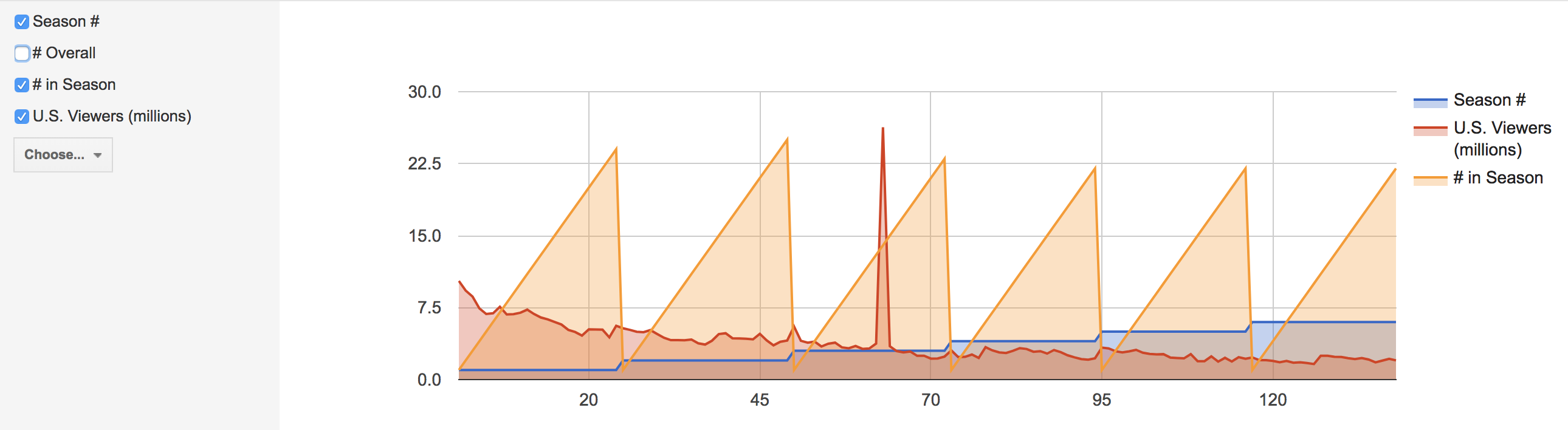
In comparison to Palladio, the gallery graphic in Google Fusion is not as aesthetically pleasing, however the graphing functions and graphics were much more user friendly and of equal level to the Palladio graphs.
While these visualizations are a convenient way to present information about New Girl and how trends in U.S. viewers and ratings have changed throughout the years, it is important to recognize that with all visualizations there is bias due to data used and aesthetic decisions, and as Drucker clearly states, “all data is capta, made, constructed, and produced, never given.” (249)