In the previous visualizations, I simply used 50 files of Trump’s tweets with 30 tweets in each file. This construction of corpus does not provide special meta data and thus is useless when analyzed by Palladio or Google Fusion Tables. In order to make the network visualization make more sense, I reconstructed my data set. My data set is now constructed with Trump’s tweets from 10/01/2017 to 02/25/2018, each file including all tweets posted that day. Also, I wrote code for extracting metadata from the original data set. The main parts of the metadata that I collected are date, day of week, number of tweets, time block in which Trump tweeted most in a particular day and so on. Enlightened by Professor Faull, I think although it’s not feasible to find out the relationship between tweets and events related to Trump, because I did not combine my data with Haipu, it may be interesting to figure out the living habits of Trump if I look into his usage of Twitter during different time blocks and number of tweets in different days of week.
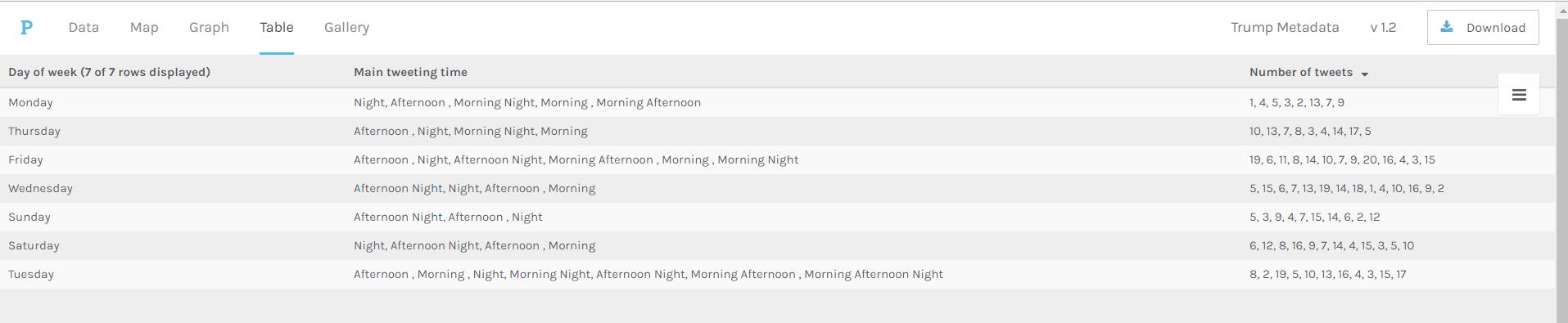
The above visualization shows the relationship among days of week, main tweeting time blocks and number of tweets in a day. It’s obvious that Trump mainly tweets in the afternoon and night on Sundays, which means he might sleep more on Sunday mornings. Also, on Wednesday, Friday and Saturday, he usually tweets more than on Monday and Sunday.
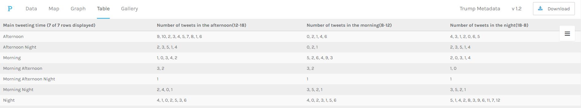
The above visualization shows the relationship between main tweeting time blocks and number of tweets in different time blocks. It’s evident that Trump is accustomed more to tweet in the afternoon and night, since there is no number more than 10 appearing in the “Number of tweets in the morning” column. Also, if he tends to tweet in the morning one day, he will not tweet much that day.
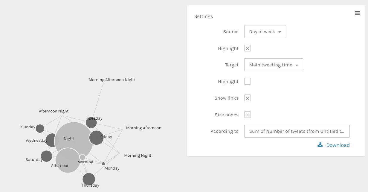
The above visualization can better show the relationship than the table ones. The size and color dimensions definitely provides me with more information. Since the size of nodes ‘Night’, ‘Afternoon’ and ‘morning’ are really different, I can say that Trump tweets much more in the evening than in the afternoon than in the morning. Similarly, I can see that Trump tweets more on Friday, Wednesday, Thursday and Saturday than other days of week.
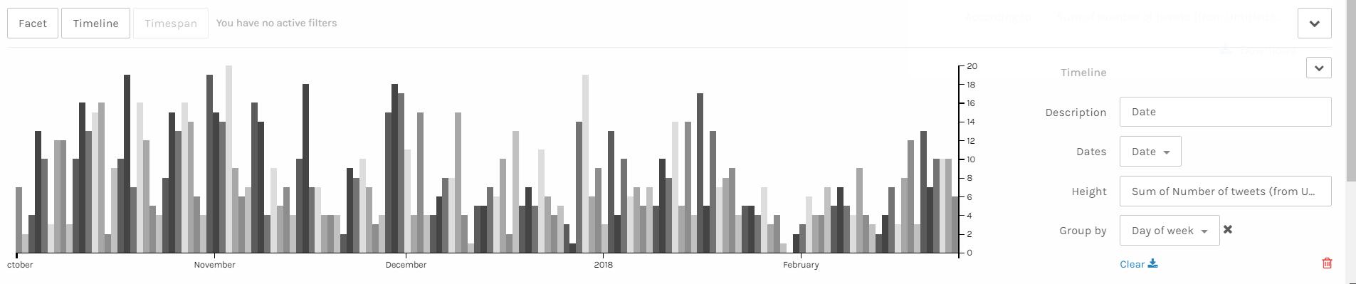
I think the above visualization is the best among all visualizations I made through Palladio. Since I have my corpus constructed in the order of date, I can easily make a nice looking timeline and see the trend of a period of nearly 5 months. It’s obvious that the number of tweets Trump made has a period. The number of tweets reaches the climax in the middle of week and declines after that and rises again when a new week begins. Also, it’s obvious that he tweets more in last year than in this year. Especially at the end of January and beginning of February, he tweeted much less than usual, which is strange. Some events might take place during that period and I hope after I combine my data with Haipu’s I can figure it out.
I think these visualizations are actually representations of information. A lot of information may be veiled at the first glance of data. However, after clever organization and visualization, these informative knowledge can be revealed. As discussed above, in the network visualization, the sizes and colors are dimensions that carry critical information. And I can make a guess that the distance between nodes shows how close relationship they have.