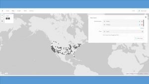
The data I used for the Palladio exercise is the meta-data from the Charles Weever Cushman Collection of photographs (the CSV file is taken from the sample set), located at Indiana University. I extracted about the first 3600 records from this data set and loaded into Palladio. The first image I created using Palladio’s map tool was a geographical representation of where the photos were taken.
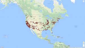
This output gave a good representation of the distribution of photos in the United States, but it lacked significant detail. I performed the same graphing exercise this time using Google Fusion for comparison reasons. For Google Fusions I uploaded the entire CSV file. As shown in the figure below, the Google Fusion map provides more details automatically. This includes the state boundaries, state names, and a clearer demarcation of individual photos. On the other hand, both tools confirm generally identical results- photos were taken across the nation with a concentration in the west coast with very little in the central north.
Using Palladio, I then created a timeline view to visualize the number of photos taken over the course of Charles Weever Cushman’s journey.
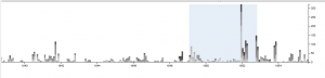
This demonstrates the most active years in Cushman’s endevour (1952). This shows he started slowly, hit a peak in 1952, and kept up the volume somewhat until he finished (through 1956). This simple to use tool lets researchers get a sense of the time perspective of the data they are observing.
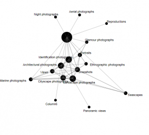
Next I used Palladio to create a network graph, which is a useful process for mapping a system of relations, which is up to researchers to define. Network graphs can be useful to find otherwise hidden patterns or trends in data being researched. For example, in the Cushman photo library, I created a network graph that showed the relationships of the kind of images depicted in each photo. For this graph, I related “genre 1” to “genre 2” categories, which produces a map of the relationships of the kind of images that simultaneously occur in each photo. For an additional layer of information, I chose the “size” option, which depicts the frequency of connections by the size of the network node between each genre.
In terms of Palladio’s ability to demonstrate Drucker’s notion of spatialization, I think the map view will be useful in triggering different ideas to research regarding the data being analyzed and its relationship to geography. In this example, the results are simple – the map shows the locations where photos were taken. However, with more complex data, there could be more interesting spatialization perspectives that can be discovered.