The dataset I used for this assignment was the same dataset I used for Voyant and Jigsaw. I am using the metadata from the Death Row inmates’ last words corpus. I had a lot of metadata from the website that I thought would be very interesting to investigate further. Although the last words themselves were extremely interesting to analyze, I was also very intrigued by other aspects of the data, such as the age, race, and county of the Death Row inmates. These three aspects of the dataset caught my attention because I figured that I would be able to paint a better picture of the inmates by looking at these other aspects in addition to their last words. It allowed me to see the breakdown of the inmates. I also decided on these three aspects because I figured if there were any underlying biases of which prisoners were sentenced to death, it would be evident in there race, age, or what kind of area they come from (such as a low socioeconomic county).
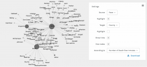
The screenshot above shows the racial breakdown of each county in Texas that at least one of the Death Row inmates was from. I found it interesting to organize it in this way because the counties in the middle that connect to each race node are more diverse in that they have people of more than one background. It is reasonable for me to assume that the counties on the outside of each of the three race nodes and that are not connected to more than one race are the counties that are more segregated. I found it interesting that the counties on the outside of the “White” node had significantly more counties without any other race or any type of diversity in comparison to the counties outside the “Black” node or the counties outside the “Hispanic” node.
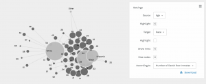
This screenshot shows the breakdown of each race by age. The most interesting part about this visualization is that the white prisoners tended to be much older than the black and hispanic prisoners. The white prisoners had the greatest spread of age in comparison to the other races represented.
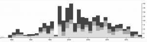
In this screenshot, I used the timeline function paired with the race of the prisoners. This shows how the racial breakdown of the prisoners on Death Row changed over time. From 1998 to 2006, it seems like the majority of prisoners executed were black and there were much more executions going on during those years. However, as we get closer and closer to present day, the number of prisoners executed drops significantly and the prisoners seem to be a little more diverse. I figured that the reason the number of executions dropped is because of the legal issues and heated debates that arose regarding capital punishment.
I also did another timeline visualization, but this time I paired it with the county the prisoners were from. This gave me insight into what some of these counties were like and how they might have changed over time. I figured that the counties that the most prisoners originated from are potentially the counties that are more dangerous or may have lower socio-economic status and higher crime rates. Harris county seemed to have the most prisoners and up until recently, it seemed to be very popular. Today it seems to be a little less represented.
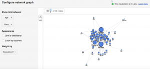
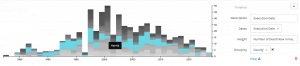
This screenshot is from Google Fusion and it shows age and race. I wanted to see how the Google Fusion visualization would compare with that of Palladio. I felt that it looks similar to the Palladio visualization and it tells me the same thing about the data, which is that the white prisoners seemed to be much older whereas the other races seemed to be much younger. The white prisoners had a wider age range than any other race represented.