Visual Complexity.com Examples:
“Universe of Emotions” – http://www.visualcomplexity.com/vc/project_details.cfm?id=926&index=44&domain=Semantic%20Networks
“Blooming Numbers” – http://www.visualcomplexity.com/vc/project_details.cfm?id=391&index=57&domain=Knowledge%20Networks
The “Universe of Emotions” and “Blooming Numbers” visualizations are extremely visually appealing to me. They are both extremely neat and colorful, as well as clean and simple. In the screenshots alone, the static visualizations are beautiful.
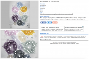
The “Universe of Emotions” visualization maps together the 307 emotions, showing the different groupings and relationships between the different emotions. The map was created to help people visualize and understand emotional health in order to improve learning and management of emotions.
The map truly speaks to me because emotions are intangible to begin with, yet with this visualization, the different levels and feelings and mental shifts can be simple to follow. The visualization itself is static, which is as Sinclair describes in his article, “aims to produce a single perspective on available information.” Although there aren’t various ways to view the data, which could definitely add depth and different perspectives of the content. However, since the data began as intangible material, the visualization helped to create a very tangible understanding of emotions.
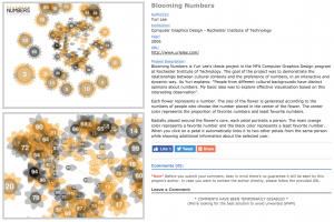
The “Blooming Numbers” visualization, as the author explains, maps out how “people from different cultural backgrounds have distinct opinions about numbers.” To do this, the flowers represent different numbers, with the size being in correspondence to the number of people who chose that number. The colors range from orange to black, where orange corresponds with people favoring that number and black, the opposite. The petals around the flowers represent the people affected by the number.
The dynamic visualizations, which Sinclair describes, “aim to explore available information, often as part of a process that is both sequential and iterative.” The “Blooming Numbers” allows users to interact with the data through clicks, which allows users to explore the information further. When a petal is clicked, the petal links to two other petals from the same person, with additional information about the person. Overall, I think that it presents data in a very different and interesting way, however, I would love to see a simpler way to compare the different preferences across cultures, which seems to have been lost in the beauty of the visualization.
DH Sample Book Example:
“SelfieCity” – http://selfiecity.net/selfiexploratory/
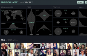
The “SelfieCity” visualization is easily one of my favorite visualizations. For starters, it’s such an interesting idea and concept. The visualization is extremely dynamic and focused on being user friendly, which allows the user to interact and become more familiar with the data. With being able to play with the data and make different connections, the visualization is extremely interactive.
As Sinclair states in his article, “humanities scholarship is often exploratory, we have also come to believe that interactive formats are in most cases preferable to static ones, since they allow the person using the system to add and subtract elements, experiment with different forms, pursue hunches or insights, and so on.” Through further exploring the data, the “Selfiexploratory” can be used to explore demographics, pose, features, and more.
Overall, the dynamic visualizations are super fun and interactive, but the end Findings are fascinating, and overall, SelfieCity does a fantastic job at showing data, analyzing it, and presenting it in user-friendly ways.