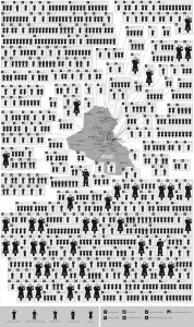
This busy visualization called “Mapping 31 Days in Iraq” depicts over 800 wartime deaths in January of 2006. I chose this because I felt it was a powerful visualization with emotional sentiment. This visualization is very dependent on its spatial organization. First, the image is separated by spatial regions that stem from the map located in the middle of the visualization. These regions are connected by touching subdivisions of boxes. Secondly, arranging the regions by icons that are moving from left to right and then down signifies the passing of time. Third, the icons represent a variety of victims that help the viewer distinguish who was killed and how they were killed. This is a static visualization because there are no interactive features and limited perspectives. The information is being summarized and is mostly meant to be used as a emotional visual to depict the fatalities of war.
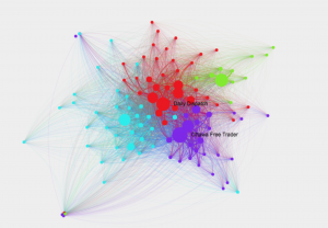
This network shows connections among 19th century newspapers, as well as which texts went viral and why. The circles or nodes represent the newspapers of that time. The lines represent their circulation. The larger the nodes and the thicker the lines means the more viral it was. The colors symbolize communities of closely-tied newspapers. The overall visualization is interactive because you can extract new information from it by clicking and exploring the relationships between the different newspapers, locations, and texts. Clicking on the nodes gives you more information about its connections and the node itself. I chose this because I found it visually appealing and wanted to explore what it represented.
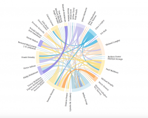
This chord diagram is very aesthetically pleasing. I really like the circular model and the organization of the words because it is very legible. When I explored it more, I realized the circular shape allows the reader to easily follow the chords as they go across in all directions. The thickness and colors are also important to exploring the connections. This is interactive because you can click on connections and names to learn more about them and you can view the groupsheets associated with their names. The lines also fade and highlight when you click. It is not just a summary of information, but a network of people and relationships that can be explored.