1. Invisible Residents

http://www.nytimes.com/interactive/2012/06/19/science/0619-microbiome.html?_r=0
This is a chart from the project called The Human Microbiome Project, which spent two years surveying and classifying the bacteria and microbes at different sites on 242 healthy people. This radial network chart aims to reveal the complexity inside the combinations of microbes living in or on the human body.
The first impression of this graph to me is complex, but After I read through the details of this graph, I was impressed with how this radial network chart manages to embed so much information. Although it is a 2-dimension graph, the circle is actually consisted of three related parts to show many dimensions of information. The inner one is a circle-like family tree of the microbes in the human body; the middle rings shows how much each microbes is found in each site of human body; the peripheral shows the significance of the abundance of each microbes on its most common site. The inner tree graph has classified different kinds of microbes and bacteria, as mentioned in Lima’s chapter 2 (page 62), tree diagram has been popular for its advantage of classification in hierarchy diagram. Therefore, this graph efficiently makes use of the increase the radius to show the information from classification to more detailed numerical charts. It is worth to mention that instead of simply present the graph, this chart uses black border to emphasize significant or extreme values with laconic explanations.
As a static visualization graph, it shows great relationships between each kind of microbes and clear comparisons on the abundance of them. It is regrettable that the this chart don’t provide any interaction for users; I think it would be much better if users can access more details about each branch of data on the graph by a link.
2. Zeus’s Affairs
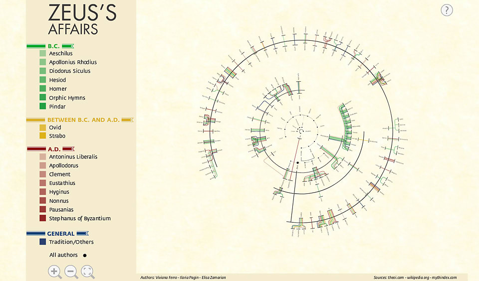
https://www.fastcodesign.com/1671501/infographic-mapping-every-affair-zeus-ever-had
The topic of this chart is very funny and the result is also amazing; it covers a large part of Greek gods. It shows every relationship Zeus ever had and many of them are with sisters, daughters and aunts.
Usually, relationships of lovers and offspring is presented in a standard top-down family tree, but in Zeus’s case, as the creators says, it would be impossible to represent all the unions between Zeus and other women, with their offspring, without repeating most of the names more than twice. Intuitively, it is a tree graph, but the “center” Zeus is a line instead of an element in graph. It is really interesting that instead of putting Zeus at the center of the circle, the god of gods is represented as a thick black line with his sexual partners on the inside and their offspring on the outside.
This graph of relationships is very interactive. Instead of gathering data only from the popular Homer’s Epic, it covers all texts of Homer, Ovid and many other historians of antiquity, each represented as a different color of line in the graph. Views can click on the color to see only ones delineated by certain historians (The link of the original project is not valid even after I tried after searching).
3.Belfast Group Poetry
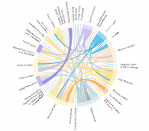
http://belfastgroup.digitalscholarship.emory.edu/network/chord/
This is a chord diagram to show the network of relationships among Belfast Group’s members. As an alternate visualization of the original network graph, this diagram is easier for viewers to see the connections and the strength of them.
The strength of each connection between two individuals is represented by the thickness of the line, and the color of the line is based on the stronger or more frequent source of the connection. Compare to the original graph, this chord diagram reveals more information in each connection and makes the whole network more visible by using different colors and thickness of lines.
This chord diagram is also very interactive; viewers can click on a certain person to see exclude the connection unrelated to him or her, and on the right hand side of the graph, a links of this person’s profile is provided. Sinclair (section Interactive Glyphs) also mentioned that the interactive tools here provide users with deeper insight into many details of the graph. The example provided by Sinclair is also about letters between a group of people; interactive tools provide users with better scope of possible patterns.
Summary
It is obvious that I have intentionally chosen three radial graphs so that I can make some comparisons. All those three graphs aim to show a relationship of network, and it is an advantage of radial graphs, because when elements are highly related, circle provides the better arrangement of elements and lines in visualization. Lima’s chapter 2 (page 62) also mentioned about the popularity of classification with tree method. Although Folksonomy uses bottom-up and DDC uses top-down method, both of them use hierarchy architecture (tree graph). Even though, it is still better to provide the functionality of extracting certain part of the network, especially when the graph is complex and highly connected. All those three graphs have their own good features like multi-dimensions or interactions.