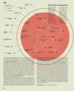

For my two selections , I tried to choose two that showed the different ways visualizations can be effective. The first visualization is very clean and easily legible. Its value is in being easily comprehensible and conveying that information efficiently. While its unfortunately not in English, you can see just from its neutral presentation how it will give very precise information for the reader to digest, while using imagery to assist the reading. The visualization depicts connections between contemporary works of fiction and non fiction. The nodes are works and the edges are concepts the connect them. This is a very intuitive design that sells its ideas very cleanly. It draws attention where needed and is visually pleasing. There aren’t too many dimensions going on as well, adding to its simplicity and ease of use. The second visualization is the opposite. Where as the first example was very literal, this one conveys the abstract. This visualization attempts to reveal the overlap in our deeply connected modern world. The creator took participants data and connected it abstractly with others. The result is messy and indefinite. A hundred people could have a hundred different interpretations. No key is given to decipher what this any color or strength of light means. All is up to the reader to decide. I think these two showcase two of the many ways data visualization can be used. The first comes from an almost empirical background. The connections are cleanly drawn and are easy to follow. The creator is clearly trying to suggest relationships between the works and has a clear message to share. The second is a free form experiment in art, showing our deep connections to strangers in a modern world, and allows for infinite interpretation while being extremely pleasing to look at. These don’t differ in the fact that they’re both very static in presentation, which makes the reader less able to interact with it as a whole.
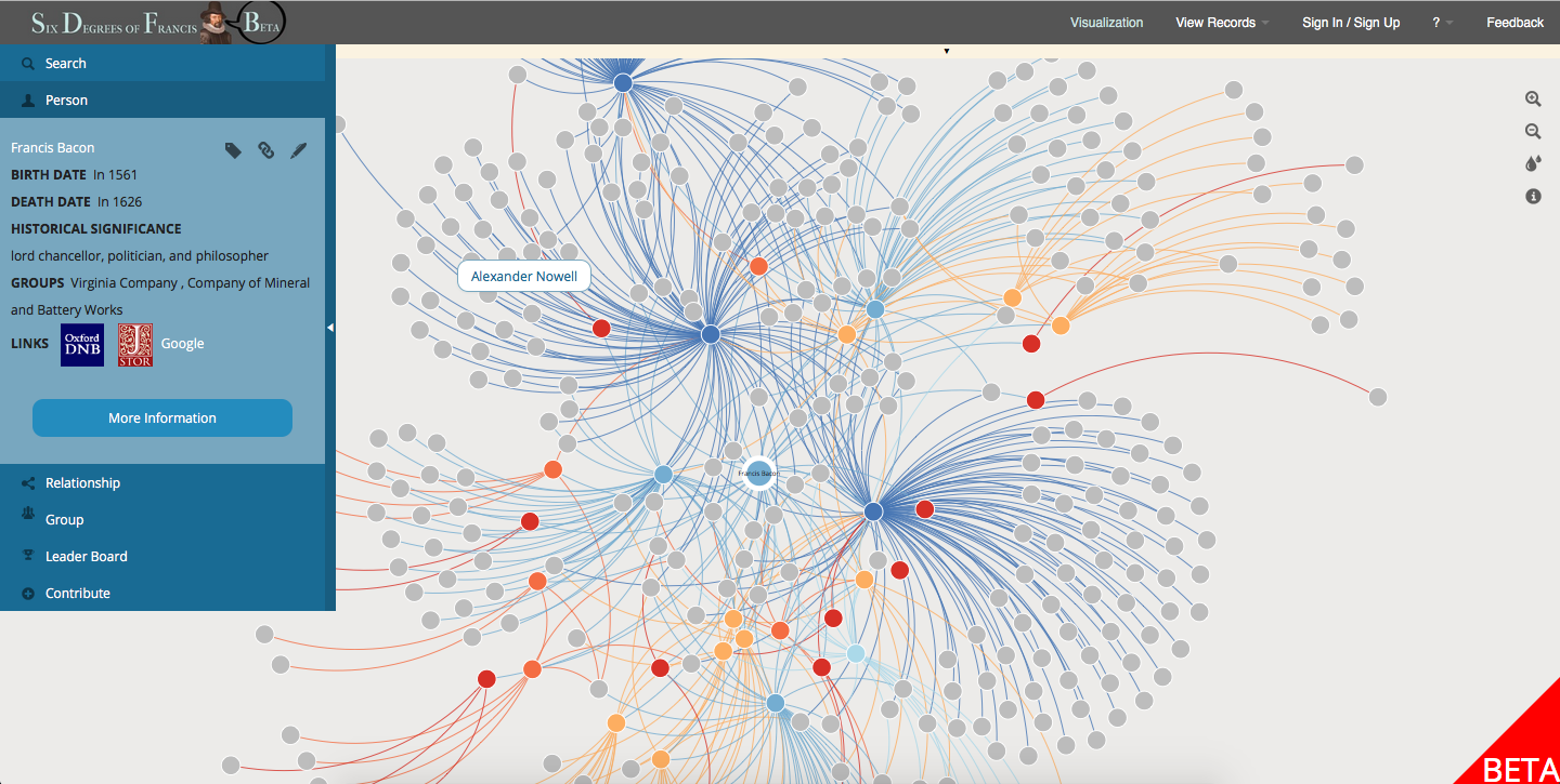
This example I feel straddles the two schools of thought. This can be difficult because doing either method poorly can result in a lackluster visualization. I feel this one works excellently however. Just to start, its incredibly clean to look at. One can easily understand the gist of each area of the visualization, but it has detail for when closer inspection is needed. Furthermore, the ability to change the person being observed adds dimensions to the data. This is a great humanist visualization because it gives the detail needed to quickly understand the information, but also leaves that data up for varied and strong conclusions.